



Segmented Progress — Multi-Step Progress HTML CSS JS
Segmented Progress · Loaders · Plain HTML, CSS & JS · Live preview
Copy & paste
Source Code
<div class="sg-card">
  <div class="sg-top"><span class="sg-label" id="sgLabel"></span><span class="sg-pct" id="sgPct"></span></div>
  <div class="sg-bar" id="sgBar"></div>
  <div class="sg-steps" id="sgSteps"></div>
  <div class="sg-controls">
    <button type="button" class="sg-btn sg-ghost" id="sgPrev">Back</button>
    <button type="button" class="sg-btn" id="sgNext">Next step</button>
  </div>
</div>*{box-sizing:border-box;margin:0;padding:0}
body{font-family:system-ui,-apple-system,sans-serif;background:#f1f5f9;min-height:100vh;display:flex;align-items:center;justify-content:center;padding:24px}
.sg-card{background:#fff;border-radius:16px;padding:24px;width:100%;max-width:420px;box-shadow:0 18px 44px rgba(15,23,42,.1)}
.sg-top{display:flex;align-items:baseline;justify-content:space-between;margin-bottom:10px}
.sg-label{font-size:14px;font-weight:800;color:#0f172a}
.sg-pct{font-size:12.5px;font-weight:700;color:#6366f1;font-variant-numeric:tabular-nums}
.sg-bar{display:flex;gap:5px;margin-bottom:16px}
.sg-seg{flex:1;height:8px;border-radius:5px;background:#e2e8f0;overflow:hidden;position:relative}
.sg-seg::after{content:'';position:absolute;inset:0;background:linear-gradient(90deg,#6366f1,#8b5cf6);transform:scaleX(0);transform-origin:left;transition:transform .45s cubic-bezier(.22,1,.36,1)}
.sg-seg.sg-fill::after{transform:scaleX(1)}
.sg-steps{display:flex;justify-content:space-between;margin-bottom:20px}
.sg-step{font-size:11px;font-weight:700;color:#94a3b8;text-align:center;flex:1;transition:color .2s}
.sg-step.sg-active{color:#6366f1}
.sg-step.sg-cleared{color:#16a34a}
.sg-controls{display:flex;gap:10px}
.sg-btn{flex:1;background:#6366f1;color:#fff;border:none;border-radius:10px;padding:11px;font-size:14px;font-weight:700;cursor:pointer;font-family:inherit;transition:background .15s}
.sg-btn:hover{background:#4f46e5}
.sg-btn:disabled{opacity:.45;cursor:not-allowed}
.sg-ghost{background:transparent;border:1.5px solid #e2e8f0;color:#475569}
.sg-ghost:hover{background:#f1f5f9}var STEPS = ['Cart', 'Address', 'Shipping', 'Payment', 'Done'];
var current = 0; // index of the step in progress (0..STEPS.length-1)
var bar = document.getElementById('sgBar');
var stepsEl = document.getElementById('sgSteps');
var prevBtn = document.getElementById('sgPrev');
var nextBtn = document.getElementById('sgNext');
// One segment between each pair of steps would be STEPS.length-1; here each step
// gets a segment that fills once that step is completed.
bar.innerHTML = STEPS.map(function () { return '<div class="sg-seg"></div>'; }).join('');
stepsEl.innerHTML = STEPS.map(function (s) { return '<span class="sg-step">' + s + '</span>'; }).join('');
var segs = bar.querySelectorAll('.sg-seg');
var labels = stepsEl.querySelectorAll('.sg-step');
function render() {
segs.forEach(function (seg, i) { seg.classList.toggle('sg-fill', i < current); });
labels.forEach(function (l, i) {
l.classList.toggle('sg-cleared', i < current);
l.classList.toggle('sg-active', i === current);
});
var pct = Math.round((current / (STEPS.length - 1)) * 100);
document.getElementById('sgPct').textContent = pct + '%';
document.getElementById('sgLabel').textContent = current >= STEPS.length - 1 ? 'Complete' : 'Step ' + (current + 1) + ' of ' + STEPS.length + ' — ' + STEPS[current];
prevBtn.disabled = current === 0;
nextBtn.disabled = current >= STEPS.length - 1;
nextBtn.textContent = current === STEPS.length - 2 ? 'Finish' : 'Next step';
}
nextBtn.addEventListener('click', function () { if (current < STEPS.length - 1) { current++; render(); } });
prevBtn.addEventListener('click', function () { if (current > 0) { current--; render(); } });
render();Extend with AI
Take This Snippet Further With AI
The AI prompt for this one is for Patreon supporters ($3 a month, 7 days free), along with a site with no ads. Supporters enter the passcode once and it is remembered in this browser.
What's included
Features
About this UI Snippet
Segmented Progress — One Fillable Segment Per Step with Active and Cleared States
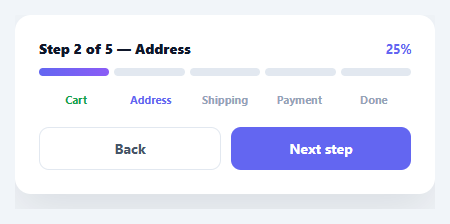
A segmented progress bar breaks a single bar into discrete chunks — one per step or task — that fill as the user advances, so progress through a known, finite sequence reads more clearly than a continuous bar. It's the indicator for checkouts, onboarding, multi-part uploads, and wizards. This snippet builds it in plain HTML, CSS, and vanilla JavaScript, with per-segment fills, step labels that mark active and cleared states, a live percentage, and back/next controls — no library.
Discrete segments, not a continuous bar
The bar is a flex row of equal segments, one per step, with a small gap between them. Each segment fills via a scaleX transform on a pseudo-element (transform-origin: left), so completing a step animates that segment growing left-to-right. Segments are the right choice over a single continuous bar when the total is a small, countable number of steps: the viewer can see *which* steps are done and *how many remain* at a glance, which a smooth bar can't convey.
Active vs. cleared vs. upcoming
The component tracks one current index and derives every visual from it: segments before the current step are filled, step labels before it are marked "cleared" (green), the current label is "active" (accent), and upcoming labels stay muted. Encoding three distinct states — done, here, and not-yet — is what makes a step indicator genuinely informative rather than just decorative; the user always knows exactly where they are in the flow.
Single source of truth
Everything — segment fills, label states, the percentage, the heading, and the disabled state of the buttons — is computed in one render() from the current index. There's no separate bookkeeping to drift out of sync, so advancing or retreating a step updates the whole component consistently. The percentage is derived from the step position, and Back disables at the start while Next becomes "Finish" on the last step and disables at the end.
Smooth, transform-based fills
Filling uses a CSS transition on the transform, so each segment glides as you progress rather than snapping — and because it animates a transform (not width or a layout property), it's GPU-friendly and jank-free. Reversing a step un-fills the relevant segment with the same smooth animation.
Data-driven and drop-in
The steps come from a STEPS array, so changing the flow is editing one list — the bar, labels, percentage, and controls all adapt to any number of steps. Wire current to your real flow state (validated each step) and it becomes the progress header for any wizard or multi-step process. It's a clear reference for segmented, state-aware progress indication. The percentage label is worth a second look too: it's computed as current / (STEPS.length - 1), not current / STEPS.length, so it reaches a clean 100% on the final step instead of stalling at 80% for a 5-step flow — a common off-by-one that makes a progress indicator feel like it never quite finishes.
Step by step
How to Use
- 1Paste HTML, CSS, and JSA segmented progress bar renders for a 5-step checkout with Back/Next controls.
- 2Advance stepsClick Next to fill the next segment, mark the step cleared, and update the percentage.
- 3Go backClick Back to retreat a step; the segment un-fills smoothly.
- 4Change the stepsEdit the STEPS array — the bar, labels, and controls adapt to any number.
- 5Wire to your flowDrive the current index from your real wizard state, advancing only after each step validates.
- 6Restyle itChange the fill gradient, segment height, or label colours to match your design.
Real-world uses
Common Use Cases
scaleX.Got questions?
Frequently Asked Questions
Use segments when the total is a small, countable number of discrete steps — a checkout, a wizard, a few upload chunks. Segments show which steps are complete and how many remain, which a smooth bar can't convey. Use a continuous bar for fine-grained or unknown-length progress (a file download percentage), where individual steps aren't meaningful.
Animating a transform like scaleX is GPU-accelerated and doesn't trigger layout recalculation, so the fill is smooth and jank-free. Animating width forces the browser to reflow on every frame. The segment uses transform-origin: left so the scale grows from the left edge, giving the natural left-to-right fill while staying on the fast path.
A single current index represents the step in progress. render() derives everything from it: segments with index < current are filled, labels before it are marked cleared, the label at current is active, and the rest are muted. Because one number drives all the visuals, advancing or retreating stays perfectly consistent — there's no separate per-segment state to keep in sync.
Drive the current index from your form's step state, and only increment it after the current step passes validation. Call render() (or, in a framework, update the state) whenever the step changes. The bar is a presentational header — keep your field logic separate and let this reflect the validated step position.
Hold the current step in state and derive the segment fills, label classes, and percentage from it in the render. In React use useState; in Vue a ref with computed classes; in Angular a component property with class bindings. The CSS transitions handle the animation, so only the current index and derived classes move into the framework.