

Quill Rich Text Editor with Custom Toolbar and Character Limit

CodeMirror JSON Editor with Validation Gutter
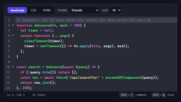
CodeMirror Code Editor with Line Numbers, Folding and Themes

Marked + DOMPurify Live Markdown Preview
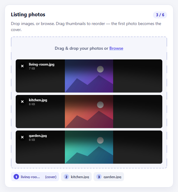
FilePond Image Upload with Preview and Reorder

Cropper.js Aspect-Ratio Presets for Social Posts
Quantity Stepper — Free HTML CSS JS Snippet
Quantity Stepper · Forms · Plain HTML, CSS & JS · Live preview
Copy & paste
Source Code
<div class="page">

  <!-- Basic stepper -->
  <div class="demo-row">
    <span class="demo-label">Basic</span>
    <div class="stepper" id="s1">
      <button class="step-btn" onclick="change('s1',-1)" aria-label="Decrease">−</button>
      <input class="step-val" id="s1-val" type="number" value="1" min="1" max="99" onchange="clamp(this,1,99)" aria-label="Quantity">
      <button class="step-btn" onclick="change('s1',1)" aria-label="Increase">+</button>
    </div>
  </div>

  <!-- With product info -->
  <div class="demo-row">
    <span class="demo-label">Product</span>
    <div class="product-row">
      <div class="product-info">
        <span class="product-name">Wireless Headphones</span>
        <span class="product-price" id="price">$89.00</span>
      </div>
      <div class="stepper compact" id="s2">
        <button class="step-btn" onclick="change('s2',-1)" aria-label="Decrease">−</button>
        <input class="step-val" id="s2-val" type="number" value="1" min="1" max="10" onchange="clamp(this,1,10)" aria-label="Quantity">
        <button class="step-btn" onclick="change('s2',1)" aria-label="Increase">+</button>
      </div>
    </div>
  </div>

  <!-- Pill style -->
  <div class="demo-row">
    <span class="demo-label">Pill</span>
    <div class="stepper pill" id="s3">
      <button class="step-btn" onclick="change('s3',-1)" aria-label="Decrease">−</button>
      <input class="step-val" id="s3-val" type="number" value="3" min="0" max="20" onchange="clamp(this,0,20)" aria-label="Quantity">
      <button class="step-btn" onclick="change('s3',1)" aria-label="Increase">+</button>
    </div>
  </div>

  <!-- Large with stock indicator -->
  <div class="demo-row">
    <span class="demo-label">With stock</span>
    <div class="stepper-wrap">
      <div class="stepper large" id="s4">
        <button class="step-btn" onclick="change('s4',-1)" aria-label="Decrease">−</button>
        <input class="step-val" id="s4-val" type="number" value="1" min="1" max="5" onchange="clamp(this,1,5)" aria-label="Quantity">
        <button class="step-btn" onclick="change('s4',1)" aria-label="Increase">+</button>
      </div>
      <span class="stock-badge" id="stock">5 left in stock</span>
    </div>
  </div>

  <button class="add-btn" onclick="addToCart()">Add to cart</button>
</div>
* { box-sizing: border-box; margin: 0; padding: 0; }
body { font-family: system-ui, sans-serif; background: #f8fafc; min-height: 100vh; display: flex; align-items: center; justify-content: center; padding: 32px 24px; }
.page { width: 100%; max-width: 380px; display: flex; flex-direction: column; gap: 20px; }
.demo-row { display: flex; align-items: center; justify-content: space-between; gap: 12px; }
.demo-label { font-size: 12px; font-weight: 600; color: #94a3b8; text-transform: uppercase; letter-spacing: 0.6px; width: 70px; flex-shrink: 0; }
/* Base stepper */
.stepper { display: inline-flex; align-items: center; background: #fff; border: 1.5px solid #e2e8f0; border-radius: 10px; overflow: hidden; }
.step-btn { width: 38px; height: 38px; border: none; background: transparent; color: #374151; font-size: 18px; font-weight: 300; cursor: pointer; display: flex; align-items: center; justify-content: center; transition: background 0.12s, color 0.12s; flex-shrink: 0; line-height: 1; }
.step-btn:hover { background: #f1f5f9; color: #0f172a; }
.step-btn:active { background: #e2e8f0; }
.step-val { width: 48px; height: 38px; border: none; border-left: 1px solid #e2e8f0; border-right: 1px solid #e2e8f0; text-align: center; font-size: 14px; font-weight: 700; color: #0f172a; background: transparent; outline: none; font-family: inherit; -moz-appearance: textfield; }
.step-val::-webkit-outer-spin-button, .step-val::-webkit-inner-spin-button { -webkit-appearance: none; }
/* Compact */
.stepper.compact .step-btn { width: 32px; height: 32px; font-size: 16px; }
.stepper.compact .step-val { width: 36px; height: 32px; font-size: 13px; }
/* Pill */
.stepper.pill { border-radius: 50px; border-color: #e2e8f0; }
.stepper.pill .step-btn { background: #6366f1; color: #fff; }
.stepper.pill .step-btn:hover { background: #4f46e5; }
.stepper.pill .step-val { border-color: #e2e8f0; }
/* Large */
.stepper.large .step-btn { width: 44px; height: 44px; font-size: 20px; }
.stepper.large .step-val { width: 52px; height: 44px; font-size: 16px; }
/* Product row */
.product-row { display: flex; align-items: center; gap: 12px; flex: 1; justify-content: flex-end; }
.product-info { display: flex; flex-direction: column; gap: 2px; }
.product-name { font-size: 13px; font-weight: 600; color: #0f172a; }
.product-price { font-size: 12px; color: #6366f1; font-weight: 700; }
/* Stepper wrap with stock */
.stepper-wrap { display: flex; align-items: center; gap: 10px; }
.stock-badge { font-size: 11px; font-weight: 600; color: #16a34a; background: rgba(22,163,74,0.1); padding: 3px 8px; border-radius: 6px; white-space: nowrap; }
/* Add to cart */
.add-btn { background: #6366f1; color: #fff; border: none; border-radius: 10px; padding: 13px; font-size: 14px; font-weight: 700; cursor: pointer; width: 100%; transition: background 0.15s; font-family: inherit; margin-top: 4px; }
.add-btn:hover { background: #4f46e5; }function change(id, delta) {
const input = document.getElementById(id + '-val');
const min = +input.min || 0;
const max = +input.max || 999;
const newVal = Math.min(max, Math.max(min, +input.value + delta));
input.value = newVal;
onUpdate(id, newVal);
}
function clamp(input, min, max) {
const v = Math.min(max, Math.max(min, +input.value || min));
input.value = v;
const id = input.closest('.stepper').id;
onUpdate(id, v);
}
function onUpdate(id, val) {
if (id === 's2') {
document.getElementById('price').textContent = '$' + (89 * val).toFixed(2);
}
if (id === 's4') {
const left = 5 - val + 1;
document.getElementById('stock').textContent = Math.max(0, 5 - val) + ' left in stock';
document.getElementById('stock').style.color = (5 - val) <= 2 ? '#dc2626' : '#16a34a';
}
}
function addToCart() {
const qty = +document.getElementById('s4-val').value;
const btn = document.querySelector('.add-btn');
btn.textContent = '✓ Added ' + qty + (qty > 1 ? ' items' : ' item') + ' to cart';
btn.style.background = '#16a34a';
setTimeout(() => { btn.textContent = 'Add to cart'; btn.style.background = ''; }, 2000);
}Extend with AI
Take This Snippet Further With AI
The AI prompt for this one is for Patreon supporters ($3 a month, 7 days free), along with a site with no ads. Supporters enter the passcode once and it is remembered in this browser.
What's included
Features
About this UI Snippet
Quantity Stepper — Four Variants, Spin Button Hidden, Min/Max Clamp & Live Price Update
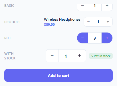
A quantity stepper is the essential form control for any e-commerce product page, cart, or booking form where users select a numeric quantity within a range. The native HTML number input with its browser-rendered spin buttons looks inconsistent across devices and cannot be styled to match a design system. This snippet provides four quantity stepper variants — basic, compact product row, pill style, and large with stock indicator — all with hidden native spinners, custom +/- buttons, min/max clamping, and live reactive updates.
Hiding the native spinner
The native up/down arrows on number inputs are hidden via two CSS rules: input::-webkit-outer-spin-button and ::-webkit-inner-spin-button with -webkit-appearance: none (for Chrome/Safari), and -moz-appearance: textfield on the input (for Firefox). This removes all browser-native styling, leaving a clean text-like input that only the custom buttons can increment.
The change() function
change(id, delta) reads the current input value, applies the delta (+1 or -1), clamps between min and max using Math.min(max, Math.max(min, val)), and writes back. Reading min and max from input.min and input.max attributes means the bounds are declared in HTML and read dynamically — no hardcoded values in JavaScript.
The clamp() function
Users can also type directly into the input. onchange fires when the input loses focus or Enter is pressed. clamp(input, min, max) validates and corrects any out-of-bounds value. This prevents users from entering 0, negative numbers, or values above the maximum stock.
Live reactive updates
The onUpdate() hook fires on every change event. In the product variant, it updates the displayed price (quantity × unit price). In the stock variant, it updates the remaining stock badge and changes its colour to red when fewer than 2 items remain — communicating urgency.
Accessibility
Each button has aria-label="Increase" and aria-label="Decrease". The input has aria-label="Quantity". Keyboard users can Tab to the input and type directly, or Tab to the buttons and press Space/Enter. The min/max attributes are also read by assistive technology.
Styling variants
All four variants share the same base .stepper CSS and JS — visual differences come from additional CSS classes (.compact, .pill, .large). This makes it easy to pick one variant and drop it into your project without carrying unused styles.
Connecting to a cart API
In the add() function (the same role as the add-to-cart button), replace the feedback animation with a fetch call: fetch("/api/cart", { method: "POST", headers: {"Content-Type":"application/json"}, body: JSON.stringify({ productId: "prod_123", qty: +document.getElementById("s4-val").value }) }). Show success state on resolve and revert to "Add to cart" on reject. The quantity value is always a valid number between min and max due to the clamp() guard.
Step by step
How to Use
- 1Click + and − buttons to increment or decrement valuesEach stepper has independent min/max bounds. The large stepper (bottom) shows a live stock count that decrements. The product stepper updates the total price with each change.
- 2Set your min, max, and initial valueUpdate the min, max, and value attributes on each input element. The change() function reads these attributes dynamically — no JavaScript changes needed.
- 3Choose your visual variantUse class="stepper" for the default, "stepper compact" for small inline contexts, "stepper pill" for a rounded pill with accent-coloured buttons, or "stepper large" for high-visibility product pages.
- 4Wire the onUpdate hook to your logicAdd your business logic inside onUpdate(id, val). Update a cart subtotal, remaining stock count, days preview, or any other derived value that depends on the quantity.
- 5Connect to a shopping cart APIIn addToCart(), replace the feedback animation with a POST to your cart API: fetch("/api/cart", { method:"POST", body: JSON.stringify({ productId, qty: +input.value }) }). Show a success state on resolve.
- 6Export in your formatClick "HTML" for a standalone file, "JSX" for a React component with controlled useState value, or "Tailwind" for a React + Tailwind CSS version.
Real-world uses
Common Use Cases
Got questions?
Frequently Asked Questions
Two CSS rules are required. For Chrome, Safari, and Edge: input[type=number]::-webkit-outer-spin-button, input[type=number]::-webkit-inner-spin-button { -webkit-appearance: none; margin: 0; }. For Firefox: input[type=number] { -moz-appearance: textfield; }. Both rules are needed for cross-browser support. Without the -moz rule, Firefox still shows its own spin arrows. After hiding the native arrows, the custom + and - buttons become the only way to increment.
Click "JSX" to download. Replace the input with a controlled React input: <input type="number" value={qty} onChange={e => setQty(Math.min(max, Math.max(min, +e.target.value)))} />. The + button calls setQty(prev => Math.min(max, prev + 1)) and the - button calls setQty(prev => Math.max(min, prev - 1)). Pass min, max, and initial qty as props. Derive dependent values (price, stock) with useMemo from the qty state.
Add dynamic disabled state: the + button has :disabled { opacity: 0.35; cursor: not-allowed; }. In the change() function, after updating the value, update both button states: minBtn.disabled = newVal <= min; maxBtn.disabled = newVal >= max. Query both buttons by their relative position: const btns = stepper.querySelectorAll(".step-btn"); btns[0].disabled = newVal <= min; btns[1].disabled = newVal >= max.
Set the min attribute to the minimum order quantity (e.g., min="5"). In clamp(), if the entered value is below the minimum, show a warning: if (v < minQty) { warningEl.textContent = "Minimum order is " + minQty; warningEl.style.display = "block"; } else { warningEl.style.display = "none"; }. The warning disappears when the value meets the minimum. This pattern is common on wholesale B2B product pages.