




Range Slider — Free HTML CSS JS Custom Slider Snippet
Range Slider · Forms · Plain HTML, CSS & JS · Live preview
Copy & paste
Source Code
<div class="demo">
  <div class="field">
    <div class="row"><label>Budget</label><span id="budget-val">$2,500</span></div>
    <input type="range" id="budget" min="0" max="10000" value="2500" step="100" oninput="updateBudget(this.value)" />
    <div class="ticks"><span>$0</span><span>$5k</span><span>$10k</span></div>
  </div>
  <div class="field">
    <div class="row"><label>Team size</label><span id="team-val">5 people</span></div>
    <input type="range" id="team" min="1" max="50" value="5" oninput="updateTeam(this.value)" />
  </div>
  <div class="field">
    <div class="row"><label>Opacity</label><span id="opacity-val">75%</span></div>
    <input type="range" id="opacity" min="0" max="100" value="75" class="purple" oninput="updateOpacity(this.value)" />
    <div class="preview-box" id="preview-box"></div>
  </div>
</div>
* { box-sizing: border-box; margin: 0; padding: 0; }
body { font-family: system-ui, sans-serif; background: #f8fafc; display: flex; align-items: center; justify-content: center; min-height: 100vh; padding: 20px; }
.demo { background: #fff; border-radius: 16px; padding: 28px 24px; width: 320px; display: flex; flex-direction: column; gap: 24px; box-shadow: 0 4px 20px rgba(0,0,0,0.07); }
.field { display: flex; flex-direction: column; gap: 10px; }
.row { display: flex; justify-content: space-between; align-items: center; }
label { font-size: 13px; font-weight: 600; color: #475569; }
.row span { font-size: 13px; font-weight: 700; color: #6366f1; }
input[type="range"] { -webkit-appearance: none; width: 100%; height: 4px; background: #e2e8f0; border-radius: 4px; outline: none; cursor: pointer; accent-color: #6366f1; }
input[type="range"].purple { accent-color: #8b5cf6; }
input[type="range"]::-webkit-slider-thumb { -webkit-appearance: none; width: 18px; height: 18px; border-radius: 50%; background: #6366f1; border: 3px solid #fff; box-shadow: 0 0 0 2px #6366f1; cursor: pointer; }
input[type="range"].purple::-webkit-slider-thumb { background: #8b5cf6; box-shadow: 0 0 0 2px #8b5cf6; }
.ticks { display: flex; justify-content: space-between; font-size: 11px; color: #94a3b8; }
.preview-box { height: 36px; border-radius: 8px; background: linear-gradient(135deg, #8b5cf6, #ec4899); opacity: 0.75; }function updateBudget(v) { document.getElementById('budget-val').textContent = '$' + (+v).toLocaleString(); }
function updateTeam(v) { document.getElementById('team-val').textContent = v + ' ' + (+v === 1 ? 'person' : 'people'); }
function updateOpacity(v){ document.getElementById('opacity-val').textContent = v + '%'; document.getElementById('preview-box').style.opacity = v / 100; }Extend with AI
Take This Snippet Further With AI
The AI prompt for this one is for Patreon supporters ($3 a month), along with a site with no ads. Supporters enter the passcode once and it is remembered in this browser.
What's included
Features
About this UI Snippet
Range Slider — Custom CSS Track & Thumb, accent-color, Live Value Display
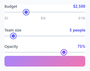
The range slider is one of the most useful but hardest-to-style native form elements — for a two-handle version see the multi-range slider, and for a circular control the rotary knob. The default <input type="range"> looks different on every browser and operating system. This snippet shows three techniques for styling it consistently and wiring live value display.
The accent-color approach
input[type="range"] { accent-color: #6366f1 } is the modern approach — it recolours the thumb and filled track portion using the browser's native accent-color support. This is the simplest cross-browser technique and works in all modern browsers without any pseudo-element overrides — the usage calculator builds on it for live pricing. For the purple variant, input[type="range"].purple { accent-color: #8b5cf6 } swaps the colour with a single property.
Custom WebKit thumb
For precise thumb styling in Chrome and Safari, ::-webkit-slider-thumb overrides the native thumb: width: 18px; height: 18px; border-radius: 50%; background: #6366f1; border: 3px solid #fff; box-shadow: 0 0 0 2px #6366f1. The white border and matching box-shadow create a ringed thumb that looks clean on any background.
Live value display
Each slider calls a dedicated update function via oninput. updateBudget(v) sets the text of a <span id="budget-val"> with formatted output: `'
The accent-color property
Modern browsers support accent-color: #6366f1 on range inputs to colour the track fill and thumb with one CSS property. For browsers that do not support it, the WebKit and Mozilla pseudo-element overrides provide consistent cross-browser styling. Both approaches are included in the snippet.
Customising the live value format
Each slider calls a dedicated update function on oninput. Change the format string in each function to match your use case: currency with toLocaleString(), distance as Nkm, time as Nh Nm, weight as Nkg. The format function runs on every input event at the native frame rate — no debounce is needed for simple text updates because range inputs only fire while the user is dragging.
Dual-handle range slider for price range selection
For a min/max selector with two handles, use two overlapping range inputs. Enforce constraints in JavaScript: the lower handle cannot exceed the upper, and vice versa. A CSS gradient between the two current values fills only the selected range area, giving users clear visual feedback about the selected window. Use input.value and the min/max attributes to enforce that neither handle crosses the other.
The accent-color property
Modern browsers support accent-color: #6366f1 on range inputs to colour the track fill and thumb with one CSS property. For browsers that do not support it, the WebKit and Mozilla pseudo-element overrides provide consistent cross-browser styling. Both approaches are included in the snippet.
Customising the live value format
Each slider calls a dedicated update function on oninput. Change the format string in each function to match your use case: currency with toLocaleString(), distance as Nkm, time as Nh Nm, weight as Nkg. The format function runs on every input event at the native frame rate — no debounce is needed for simple text updates because range inputs only fire while the user is dragging.
Dual-handle range slider for price range selection
For a min/max selector with two handles, use two overlapping range inputs. Enforce constraints in JavaScript: the lower handle cannot exceed the upper, and vice versa. A CSS gradient between the two current values fills only the selected range area, giving users clear visual feedback about the selected window.
The accent-color property
Modern browsers support accent-color: #6366f1 on range inputs to colour the track fill and thumb with one CSS property. For browsers that do not support it, the WebKit and Mozilla pseudo-element overrides provide consistent cross-browser styling. Both approaches are included in the snippet.
Customising the live value format
Each slider calls a dedicated update function on oninput. Change the format string in each function to match your use case: currency with toLocaleString(), distance as Nkm, time as Nh Nm, weight as Nkg. The format function runs on every input event at the native frame rate — no debounce is needed for simple text updates because range inputs only fire while the user is dragging.
Dual-handle range slider for price range selection
For a min/max selector with two handles, use two overlapping range inputs. Enforce constraints in JavaScript: the lower handle cannot exceed the upper, and vice versa. A CSS gradient between the two current values fills only the selected range area, giving users clear visual feedback about the selected window.
Step by step
How to Use
- 1Drag all three slidersDrag the Budget, Team size, and Opacity sliders in the preview. Each shows a different live value format and the third changes the preview box opacity.
- 2Change the min, max, and stepIn the HTML panel, update the min, max, and step attributes on each input[type="range"] to match your data range.
- 3Update the value formatIn the JS panel, update the update functions to format the value for your use case — currency, percentage, unit label.
- 4Change the accent colourUpdate accent-color: #6366f1 in the CSS panel to your brand colour. Also update the matching thumb background and box-shadow.
- 5Set the initial valueUpdate the value attribute on the input and call the corresponding update function once on page load to show the initial formatted value.
- 6Export in your formatClick "HTML" for a standalone file, "JSX" for a React component, or "Tailwind" for a React + Tailwind version.
Real-world uses
Common Use Cases
Got questions?
Frequently Asked Questions
accent-color: #6366f1 is a CSS property that recolours interactive elements — checkboxes, radios, progress bars, and range inputs — using the browser native rendering. It colours both the thumb and the filled track portion without requiring pseudo-element overrides. It is the simplest cross-browser approach for basic colour theming.
::-webkit-slider-thumb sets background: #6366f1 and border: 3px solid #fff (white border). box-shadow: 0 0 0 2px #6366f1 adds a matching outer ring. The white border separates the thumb from the ring, creating a bullseye appearance. This works in Chrome and Safari; Firefox uses -moz-range-thumb.
Each slider has an oninput="updateX(this.value)" attribute. The update function receives the string value, formats it (currency, plural, percentage), and sets the textContent of the matching display span. The +v coercion converts the string to a number for calculations.
Add a <datalist id="ticks"> with <option value="0">, <option value="50">, <option value="100"> etc. Add list="ticks" to the input. The browser renders native tick marks at each option value. The .ticks div in this snippet is a manual CSS alternative for more styling control.
Call the update function once on page load with the slider's initial value: updateBudget(document.querySelector("input").value). Or set the display span text directly in the HTML to match the input value attribute.
Yes. Click "JSX" for a React component. Use a controlled input: <input type="range" value={value} onChange={e => setValue(+e.target.value)} />. Display the formatted value next to the slider. The CSS accent-color and ::-webkit-slider-thumb styles work unchanged in React.