



Scroll Before After — Free GSAP Image Wipe Snippet
Scroll Before After · Scroll · Plain HTML, CSS & JS · Live preview
Copy & paste
Source Code
<section class="sba-top"><p>Scroll ↓</p></section>
<section class="sba-stage" id="sbaStage">
  <div class="sba-compare">
    <div class="sba-before">
      <div class="sba-scene sba-scene-before">
        <span class="sba-tag">Before</span>
        <div class="sba-sky"></div><div class="sba-hill"></div><div class="sba-sun"></div>
      </div>
    </div>
    <div class="sba-after" id="sbaAfter">
      <div class="sba-scene sba-scene-after">
        <span class="sba-tag">After</span>
        <div class="sba-sky"></div><div class="sba-hill"></div><div class="sba-sun"></div>
      </div>
    </div>
    <div class="sba-divider" id="sbaDivider"><span>⟷</span></div>
  </div>
  <p class="sba-hint">The wipe is driven by your scroll — not a drag handle.</p>
</section>
<section class="sba-bottom"><p>Fully wiped. Scroll up to restore the "before" view.</p></section>*{box-sizing:border-box;margin:0;padding:0}
body{font-family:system-ui,-apple-system,sans-serif;background:#07080d;color:#fff}
.sba-top,.sba-bottom{min-height:70vh;display:flex;justify-content:center;align-items:center;color:#8a90a8;font-size:15px;letter-spacing:.1em;text-transform:uppercase}
.sba-stage{height:100vh;display:flex;flex-direction:column;align-items:center;justify-content:center;gap:20px;overflow:hidden;background:radial-gradient(75% 65% at 50% 45%,#12172e,#07080d)}
.sba-compare{position:relative;width:min(760px,92vw);aspect-ratio:16/9;border-radius:20px;overflow:hidden;border:1px solid rgba(255,255,255,.1);box-shadow:0 30px 80px rgba(0,0,0,.55)}
.sba-before,.sba-after{position:absolute;inset:0;overflow:hidden}
.sba-after{width:0%}
.sba-scene{position:absolute;top:0;left:0;height:100%;width:min(760px,92vw)}
.sba-sky{position:absolute;inset:0}
.sba-scene-before .sba-sky{background:linear-gradient(180deg,#3b4463,#6b7391 70%)}
.sba-scene-after .sba-sky{background:linear-gradient(180deg,#ff9a62,#f5576c 55%,#5b2a86)}
.sba-hill{position:absolute;bottom:-38%;left:-10%;width:120%;height:70%;border-radius:50% 50% 0 0}
.sba-scene-before .sba-hill{background:#2b3149}
.sba-scene-after .sba-hill{background:#33144d}
.sba-sun{position:absolute;top:16%;right:18%;width:12%;aspect-ratio:1;border-radius:50%}
.sba-scene-before .sba-sun{background:#cdd3e8;opacity:.5}
.sba-scene-after .sba-sun{background:radial-gradient(circle,#ffe08a,#ff9a3d);box-shadow:0 0 44px #ff9a3d}
.sba-tag{position:absolute;top:14px;left:14px;z-index:2;font-size:12px;font-weight:700;letter-spacing:.14em;text-transform:uppercase;padding:6px 12px;border-radius:99px;background:rgba(0,0,0,.45);backdrop-filter:blur(4px)}
.sba-scene-after .sba-tag{left:auto;right:14px}
.sba-divider{position:absolute;top:0;bottom:0;left:0%;width:3px;background:#fff;box-shadow:0 0 18px rgba(255,255,255,.8);display:flex;align-items:center;justify-content:center}
.sba-divider span{position:absolute;width:40px;height:40px;border-radius:50%;background:#fff;color:#0b0e18;display:flex;align-items:center;justify-content:center;font-size:16px;box-shadow:0 6px 20px rgba(0,0,0,.45)}
.sba-hint{color:#8a90a8;font-size:13px;letter-spacing:.04em}gsap.registerPlugin(ScrollTrigger);
// The "after" layer is a zero-width window that widens with scroll.
// Its inner scene is fixed at the full frame width, so the image never
// squishes — the window simply uncovers more of it.
var wipe = { p: 0 };
var afterEl = document.getElementById('sbaAfter');
var dividerEl = document.getElementById('sbaDivider');
gsap.to(wipe, {
p: 100,
ease: 'none',
scrollTrigger: {
trigger: '#sbaStage',
start: 'top top',
end: '+=160%',
scrub: 0.3,
pin: true
},
onUpdate: function () {
afterEl.style.width = wipe.p + '%';
dividerEl.style.left = wipe.p + '%';
}
});Extend with AI
Take This Snippet Further With AI
The AI prompt for this one is for Patreon supporters ($3 a month, 7 days free), along with a site with no ads. Supporters enter the passcode once and it is remembered in this browser.
What's included
Features
About this UI Snippet
Scroll Before After — A Comparison Wipe Driven by the Scrollbar
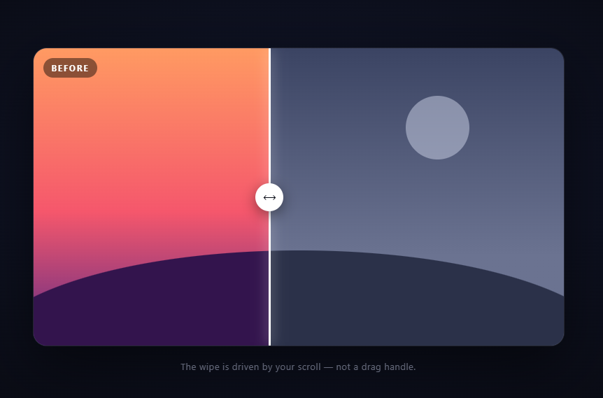
The scroll before/after is an image-comparison slider with the drag handle removed: the page's own scrollbar sweeps the divider. As you scroll through the pinned section, the "after" scene wipes across the "before" scene from left to right, and scrolling back restores it. It's a strong pattern for redesigns, photo edits, and renovation reveals because the user controls the reveal speed with a gesture they were already making. This snippet builds it with GSAP ScrollTrigger (from a CDN) and a two-layer clipping trick.
The wipe is a widening window, not a moving image
Both scenes are absolutely stacked in the frame. The .sba-after layer starts at width: 0% with overflow: hidden, while its inner .sba-scene is locked to the full frame width. Widening the outer layer therefore *uncovers* more of a stationary scene rather than stretching it — the classic comparison-slider clipping trick. Without the fixed-width inner element, the after image would squish horizontally as the window grew, which is the number-one bug in naive implementations.
One proxy tween drives both the window and the divider
GSAP tweens a plain { p: 0 } object to 100 on a pinned, scrubbed ScrollTrigger. The onUpdate callback writes the same percentage to two places: the after layer's width and the divider's left. Sharing one number guarantees the glowing seam always sits exactly on the reveal edge — there's no second animation that could drift out of phase.
Pinned scrub makes the reveal deliberate and reversible
start: 'top top' with end: '+=160%' pins the frame for 1.6 viewport-heights of scrolling, mapping the full 0–100% wipe onto that distance. scrub: 0.3 adds just enough smoothing that wheel ticks glide rather than jump. Because scrub ties progress to scroll position rather than playing a one-shot animation, the comparison is bidirectional — users naturally rock back and forth across the seam to compare details, which is exactly how people use drag-handle sliders.
The scenes are pure CSS, ready to swap for images
Each scene is a sky gradient, a rounded hill, and a sun — deliberately simple placeholders that make the wipe legible in the demo. In production you'd replace each .sba-scene with an <img> (or background-image) at the same fixed width; the clipping math is identical. Matching camera position between the two shots is what sells the effect.
Why width instead of clip-path
Animating clip-path: inset() also works, but a width-based window keeps the divider trivial to position (same percentage) and works in every browser that runs GSAP, including ones with patchy clip-path transition support. The layers are compositor-friendly because nothing outside the frame reflows — the frame's size never changes.
Labels stay anchored to their own layers
The "Before" tag lives on the base layer's left corner and "After" pins to the right corner *inside* the clipped layer, so it only becomes visible once enough of the after scene is revealed — a free bit of progressive labeling that reinforces which side is which.
Scroll-driven beats drag-driven on touch screens
Classic comparison sliders bind a horizontal drag to the divider — which collides head-on with vertical page scrolling on touch devices: the browser has to guess whether a diagonal swipe means "scroll the page" or "move the handle," and either choice frustrates someone. Driving the wipe from vertical scroll removes the entire input layer: no pointer handlers, no touch-action negotiations, no clamping math, and the one gesture mobile users already perform controls the comparison. The handle in this snippet is purely decorative — a landmark for the seam, not a control — which is also why it needs no hit area or focus handling.
Customizing it
Swap in real screenshots or photos, flip the wipe direction by anchoring the after layer to the right, or shorten end for a snappier reveal. For a drag-controlled version see the image comparison snippet; pair this one with a scroll zoom hero opener or a scroll curtain reveal transition into the next section.
Step by step
How to Use
- 1Add the GSAP CDNsInclude gsap and ScrollTrigger from the CDN panel.
- 2Paste HTML, CSS, and JSTwo stacked scenes with a zero-width after window.
- 3Scroll into the stageThe frame pins and the divider starts sweeping.
- 4Rock back and forthThe wipe is scrubbed — compare any region freely.
- 5Finish the wipeAt 100% the after scene fully replaces the before.
- 6Swap in real imagesReplace each scene with a fixed-width img or background.
Real-world uses
Common Use Cases
Got questions?
Frequently Asked Questions
A pinned ScrollTrigger scrubs a proxy object from p: 0 to p: 100 across 160% of scroll distance. Its onUpdate writes that one percentage to both the after layer's width and the divider's left offset, so the seam always sits exactly on the reveal edge and sweeping is fully reversible.
The after layer is only a clipping window — overflow: hidden with an animated width — while the scene inside it is locked to the full frame width. Widening the window uncovers more of a stationary image instead of resizing it. Skipping that fixed-width inner element is the classic bug that makes comparison sliders stretch.
Replace each .sba-scene's contents with an img styled to the same fixed frame width (width: min(760px, 92vw); height: 100%; object-fit: cover). Keep both shots aligned — same crop and camera position — because the wipe only reads as a true comparison when features line up across the seam.
Yes. For right-to-left, anchor the after layer to the right (right: 0 instead of left) and pin its inner scene to the right edge, updating the divider from the right. For a vertical wipe, animate height with a fixed-height inner scene and move the divider's top. The single-proxy pattern stays identical.
Horizontal drag handles fight vertical page scrolling on touch — the browser must guess whether a diagonal swipe scrolls or drags, and touch-action tuning only partially fixes it. Scroll-driving the wipe eliminates the conflict: the gesture users already make controls the comparison, there are zero pointer handlers to write, and the divider becomes a decorative landmark that needs no hit area, clamping, or focus management.
Build the tween in a mount effect (useEffect, onMounted, or ngAfterViewInit) with refs for the stage, after layer, and divider, and revert the gsap.context in the cleanup so the pin unregisters on unmount. Writing styles directly in onUpdate is deliberate — routing the percentage through framework state would re-render every scroll tick. Tailwind handles the frame styling cleanly.