




Scroll Rotate Gallery — Free GSAP 3D Carousel Scroll Snippet
Scroll Rotate Gallery · Scroll · Plain HTML, CSS & JS · Live preview
Copy & paste
Source Code
<section class="rt-top"><p>Scroll ↓</p></section>
<section class="rt-stage" id="rtStage">
  <div class="rt-ring" id="rtRing">
    <figure class="rt-card" style="--i:0;--g:linear-gradient(160deg,#6366f1,#22d3ee)"></figure>
    <figure class="rt-card" style="--i:1;--g:linear-gradient(160deg,#a855f7,#ec4899)"></figure>
    <figure class="rt-card" style="--i:2;--g:linear-gradient(160deg,#10b981,#84cc16)"></figure>
    <figure class="rt-card" style="--i:3;--g:linear-gradient(160deg,#f59e0b,#ef4444)"></figure>
    <figure class="rt-card" style="--i:4;--g:linear-gradient(160deg,#0ea5e9,#6366f1)"></figure>
    <figure class="rt-card" style="--i:5;--g:linear-gradient(160deg,#f43f5e,#f59e0b)"></figure>
  </div>
</section>
<section class="rt-bottom"><p>The carousel turned with your scroll.</p></section>*{box-sizing:border-box;margin:0;padding:0}
body{font-family:system-ui,-apple-system,sans-serif;background:#07080e;color:#fff}
.rt-top,.rt-bottom{min-height:70vh;display:flex;justify-content:center;align-items:center;color:#8a90a8;font-size:15px;letter-spacing:.1em;text-transform:uppercase}
.rt-stage{height:100vh;display:flex;align-items:center;justify-content:center;overflow:hidden;perspective:1100px}
.rt-ring{position:relative;width:220px;height:280px;transform-style:preserve-3d;will-change:transform}
.rt-card{position:absolute;inset:0;border-radius:20px;background:var(--g);box-shadow:0 24px 60px rgba(0,0,0,.45);backface-visibility:hidden;
/* Lay 6 cards around a cylinder: each rotated 60° and pushed out. */
transform:rotateY(calc(var(--i) * 60deg)) translateZ(230px)}
.rt-card::after{content:'';position:absolute;inset:0;border-radius:20px;background:rgba(7,8,14,.4);opacity:0;transition:none}gsap.registerPlugin(ScrollTrigger);
// Spin the cylinder of cards as the section is pinned and scrolled.
gsap.to('#rtRing', {
rotateY: -300, // a little over one full turn (6 cards × 60° minus the first)
ease: 'none',
scrollTrigger: {
trigger: '#rtStage',
start: 'top top',
end: '+=200%',
scrub: 1,
pin: true
}
});
// Optional gentle bob so the ring feels alive while it turns.
gsap.to('#rtRing', {
y: 14, duration: 2.4, ease: 'sine.inOut', repeat: -1, yoyo: true
});Extend with AI
Take This Snippet Further With AI
The AI prompt for this one is for Patreon supporters ($3 a month), along with a site with no ads. Supporters enter the passcode once and it is remembered in this browser.
What's included
Features
About this UI Snippet
Scroll Rotate Gallery — A 3D Carousel Driven by Scroll
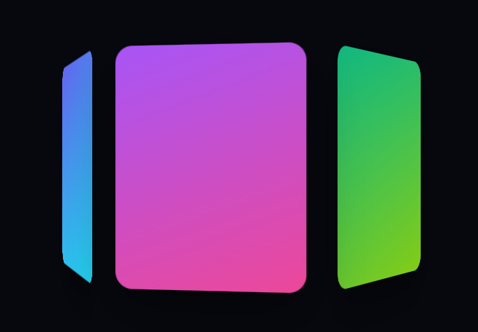
The scroll rotate gallery is a 3D cylinder of cards arranged in a ring that spins as you scroll, like a carousel turning under your control — an eye-catching way to present a set of images or features. This snippet builds it with GSAP and ScrollTrigger (from a CDN) and pure CSS 3D, no carousel library.
Arranging cards in a cylinder
Each card is positioned with CSS: transform: rotateY(i × 60deg) translateZ(230px). The rotateY fans the six cards evenly around a circle (360° ÷ 6 = 60° each), and the translateZ pushes each out from the center by the cylinder's radius — so they form a ring facing outward. The stage provides perspective and the ring uses transform-style: preserve-3d so the depth renders correctly. This is the classic CSS 3D carousel construction, done entirely with two transforms per card.
Scroll spins the ring
A single tween rotates the whole .rt-ring on its y-axis as the section is pinned and scrubbed over end: '+=200%'. Because the cards are children of the ring, rotating the parent turns the entire cylinder — the cards sweep toward and away from the viewer in sequence. scrub: 1 adds a touch of momentum so the spin feels weighty, and the pin holds the stage so the rotation plays over a controlled scroll distance.
Why rotate the parent, not the cards
Spinning the single ring container is far cheaper and simpler than re-rotating six cards every frame, and it keeps their relative arrangement locked — they stay a rigid cylinder while it turns. The cards' own transforms are set once on load and never change; only the parent's rotateY animates.
A subtle idle bob
An independent, infinitely repeating yoyo tween floats the ring up and down a few pixels with a sine ease, so even when you stop scrolling the carousel feels alive rather than frozen. Because it animates y on the same element while the ScrollTrigger animates rotateY, GSAP composes the two transforms without conflict.
Composited 3D
Everything animates transforms (rotateY, y), so the browser composites on the GPU with no reflow, and backface-visibility: hidden hides the reversed back faces of cards facing away. will-change: transform promotes the ring for a smooth spin.
Customizing it
Change the card count (update the 60deg to 360 ÷ count and the rotate distance), the radius (translateZ), the perspective for more or less drama, or swap gradients for real images. Pair it with a coverflow carousel, scroll perspective cards, or a scroll gallery pin.
Step by step
How to Use
- 1Add the GSAP CDNsInclude gsap and ScrollTrigger from the CDN panel.
- 2Paste HTML, CSS, and JSSix cards form a 3D cylinder.
- 3Scroll downThe carousel rotates through the section.
- 4PauseA gentle bob keeps the ring alive.
- 5Scroll back upThe ring spins backward — it is scrubbed.
- 6Change the countUpdate the per-card angle and radius.
Real-world uses
Common Use Cases
rotateY and translateZ, with scrub 1 giving the turn weight.Got questions?
Frequently Asked Questions
Each card uses transform: rotateY(i × 60deg) translateZ(230px). The rotateY fans the six cards evenly around a circle (360 divided by 6 is 60 degrees each) and the translateZ pushes each outward by the cylinder radius, so they face outward in a ring. The stage adds perspective and the ring uses preserve-3d so the depth renders.
Spinning the single ring container turns the whole cylinder at once, which is far cheaper than re-rotating six cards every frame and keeps their arrangement rigid. The cards' own transforms are set once on load and never change; only the parent's rotateY animates with scroll, so the cards sweep past the viewer in order.
An independent repeating yoyo tween animates the ring's y by a few pixels with a sine ease, while the ScrollTrigger animates the ring's rotateY. GSAP composes both transforms on the same element without conflict, so the carousel keeps a gentle float even when you stop scrolling, rather than freezing.
Yes. Everything animates transforms — rotateY and y — so the browser composites on the GPU with no layout reflow, backface-visibility: hidden removes the reversed back faces, and will-change promotes the ring. Because only the parent animates, adding more cards does not add per-frame animation cost.
Render the cards with their --i index, keep the cylinder transforms in CSS, and in a mount effect register ScrollTrigger and create the pinned rotateY tween plus the looping bob, scoped to a ref. Return a cleanup that reverts the GSAP context so the pin and the infinite tween stop on unmount. Update the per-card angle if you change the count.