



ScrollSmoother Parallax Page — Free GSAP Snippet
ScrollSmoother Parallax Page · Scroll · Plain HTML, CSS & JS · Live preview
Copy & paste
Source Code
<div id="smooth-wrapper">
  <div id="smooth-content">
    <section class="ssp-hero">
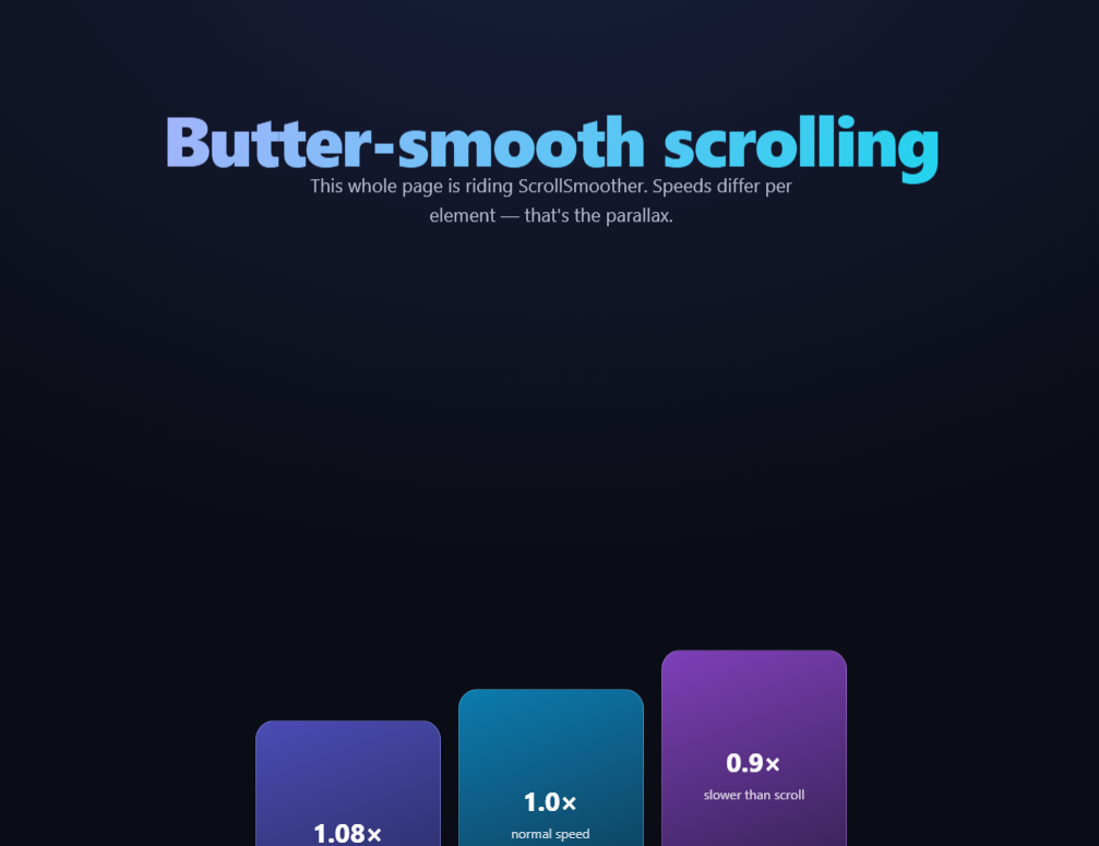
      <h1 data-speed="0.85">Butter-smooth scrolling</h1>
      <p data-speed="0.92">This whole page is riding ScrollSmoother. Speeds differ per element — that's the parallax.</p>
    </section>
    <section class="ssp-row">
      <div class="ssp-card" data-speed="1.08" style="--cc:#6366f1"><b>1.08×</b><span>faster than scroll</span></div>
      <div class="ssp-card" data-speed="1.0" style="--cc:#0ea5e9"><b>1.0×</b><span>normal speed</span></div>
      <div class="ssp-card" data-speed="0.9" style="--cc:#a855f7"><b>0.9×</b><span>slower than scroll</span></div>
    </section>
    <section class="ssp-band">
      <h2 data-speed="0.95">Lag makes things feel attached by springs</h2>
      <div class="ssp-chips">
        <span class="ssp-chip" data-lag="0.1">lag 0.1</span>
        <span class="ssp-chip" data-lag="0.3">lag 0.3</span>
        <span class="ssp-chip" data-lag="0.6">lag 0.6</span>
      </div>
    </section>
    <section class="ssp-end"><p>Native scrollbar, synthetic smoothness.</p></section>
  </div>
</div>*{box-sizing:border-box;margin:0;padding:0}
body{font-family:system-ui,-apple-system,sans-serif;background:#0b0d16;color:#fff}
.ssp-hero{min-height:100vh;display:flex;flex-direction:column;align-items:center;justify-content:center;gap:16px;text-align:center;padding:24px;background:radial-gradient(90% 80% at 50% 20%,#181f3d,#0b0d16)}
.ssp-hero h1{font-size:clamp(34px,6.6vw,64px);font-weight:800;letter-spacing:-.03em;background:linear-gradient(120deg,#a5b4fc,#22d3ee);-webkit-background-clip:text;background-clip:text;color:transparent}
.ssp-hero p{color:#aeb4ca;font-size:clamp(14px,2.2vw,17px);max-width:460px;line-height:1.6}
.ssp-row{display:flex;gap:16px;justify-content:center;align-items:flex-start;padding:16vh 24px;flex-wrap:wrap}
.ssp-card{display:flex;flex-direction:column;align-items:center;justify-content:center;gap:6px;width:170px;aspect-ratio:3/4;border-radius:18px;background:linear-gradient(160deg,color-mix(in srgb,var(--cc) 75%,#000),color-mix(in srgb,var(--cc) 25%,#0b0d16));border:1px solid rgba(255,255,255,.14)}
.ssp-card b{font-size:24px}
.ssp-card span{font-size:12px;color:rgba(255,255,255,.75)}
.ssp-band{min-height:70vh;display:flex;flex-direction:column;align-items:center;justify-content:center;gap:26px;text-align:center;padding:24px}
.ssp-band h2{font-size:clamp(22px,4vw,36px);font-weight:800;letter-spacing:-.02em;max-width:560px}
.ssp-chips{display:flex;gap:12px;flex-wrap:wrap;justify-content:center}
.ssp-chip{padding:12px 20px;border-radius:99px;background:#141a2e;border:1px solid rgba(255,255,255,.16);font-size:14px;font-weight:600;color:#c9d2f8}
.ssp-end{min-height:60vh;display:flex;align-items:center;justify-content:center;color:#8a90a8;font-size:15px;letter-spacing:.1em;text-transform:uppercase}gsap.registerPlugin(ScrollTrigger, ScrollSmoother);
// ScrollSmoother requires exactly this structure: a wrapper that gets
// pinned, and a content element that is translated smoothly while the
// native scrollbar (and native accessibility) keep working.
ScrollSmoother.create({
wrapper: '#smooth-wrapper',
content: '#smooth-content',
smooth: 1.2, // seconds to "catch up" to the scrollbar
effects: true, // activate data-speed and data-lag attributes
smoothTouch: 0.1 // a light touch of smoothing on mobile
});Extend with AI
Take This Snippet Further With AI
The AI prompt for this one is for Patreon supporters ($3 a month), along with a site with no ads. Supporters enter the passcode once and it is remembered in this browser.
What's included
Features
About this UI Snippet
ScrollSmoother Parallax — Smooth Scrolling With the Native Scrollbar Intact
"Smooth scrolling" libraries traditionally hijack the wheel, fake a scrollbar, and break accessibility. GSAP's ScrollSmoother (free on the CDN since 3.13) takes the opposite approach: the browser scrolls natively — real scrollbar, keyboard, find-in-page, anchor links all intact — while the visible content is *translated* to catch up smoothly. This snippet wires a whole page through it, with per-element data-speed parallax and data-lag spring effects declared entirely in markup.
How the wrapper/content trick works
ScrollSmoother requires exactly two elements: #smooth-wrapper (which it fixes in place) and #smooth-content (the actual page, which it moves with transform: translateY). The document retains its full natural height, so the native scrollbar reflects real position — but instead of the browser jumping content per scroll event, ScrollSmoother eases the transform toward the scroll position over smooth: 1.2 seconds. Scroll hard and content glides after the scrollbar like it has mass. Because it's transform-based, everything stays compositor-friendly.
data-speed is declarative parallax
With effects: true, any element carrying data-speed moves at that multiple of scroll speed: 0.85 drifts slower than the page (appearing deeper), 1.08 outruns it (appearing closer). The three demo cards sit side by side with 1.08 / 1.0 / 0.9 — scroll and watch them shear apart, a controlled experiment in perceived depth. Crucially, ScrollSmoother auto-compensates so each element is exactly at its natural position when it's centered in the viewport; parallax offsets grow toward the viewport edges. That's why speeds don't wreck layouts the way hand-rolled parallax does.
data-lag is parallax's springy cousin
Where speed changes an element's velocity, data-lag delays it: a lag of 0.3 means the element takes an extra 0.3 seconds to catch up to where it should be, then settles. The chip row (lags 0.1 / 0.3 / 0.6) turns a scroll stop into a little cascade of settling elements — the "attached by soft springs" feel that agencies charge for, in one attribute.
smoothTouch is deliberately tiny
Touch devices already have physical momentum scrolling; stacking 1.2s of synthetic smoothing on top feels drunk. smoothTouch: 0.1 applies just enough to keep effects working on mobile while respecting the platform's native feel — or set it false to disable entirely.
It's built on ScrollTrigger, and they compose
ScrollSmoother requires ScrollTrigger and registers itself as its scroller — meaning every ScrollTrigger technique (pins, scrubs, snap) works inside a smoothed page without changes. The pinned scroll effects across this library can drop into #smooth-content as-is.
What to watch out for
position: fixed elements must live *outside* #smooth-content (inside a transformed ancestor, fixed becomes absolute — a CSS spec behavior, not a plugin bug). And because content height is virtualized against the transform, dynamically injected content needs ScrollTrigger.refresh().
Customizing it
Tune smooth (0.8 subtle, 2 dramatic), spread data-speed/data-lag across real imagery, or add ScrollSmoother.create().effects() targets dynamically. Related: scrubbed depth in scroll parallax layers, row-shear in hero parallax grid, mouse parallax in parallax hero, and native-scroll pinning in scroll sticky features.
Step by step
How to Use
- 1Add the GSAP CDNsgsap, ScrollTrigger, and ScrollSmoother — order matters.
- 2Paste HTML, CSS, and JSThe wrapper/content structure is required exactly.
- 3Scroll the pageContent glides after the scrollbar with inertia.
- 4Watch the cardsdata-speed values shear them apart in depth.
- 5Stop scrolling abruptlydata-lag chips settle in a spring cascade.
- 6Add effects anywhereAny element takes data-speed or data-lag.
Real-world uses
Common Use Cases
data-speed, with the browser still scrolling natively and keeping its real scrollbar.Got questions?
Frequently Asked Questions
Philosophy: the browser keeps scrolling natively — real scrollbar, keyboard paging, anchor jumps, find-in-page — and ScrollSmoother only eases the content's transform toward the true scroll position. Hijack-style libraries intercept wheel events and synthesize scrolling, which breaks those native behaviors. It also registers itself with ScrollTrigger, so the entire pin/scrub ecosystem works unchanged.
The wrapper is fixed to the viewport (the window the user sees through) while the content element — the real page at its natural height — is translated within it. The document keeps its full height so the scrollbar stays honest, and the translate is what gets smoothed. Without that two-element split there'd be nothing to transform independently of the scroll position.
ScrollSmoother anchors every effect element to its natural position at the moment it's centered in the viewport — parallax offsets grow toward the edges and vanish at center. So a 0.9× image is exactly where CSS put it when the user looks straight at it, drifting only while entering and leaving. Hand-rolled parallax lacks that compensation, which is why it usually collides with neighbors.
Speed scales an element's scroll velocity (depth illusion); lag delays it — a data-lag of 0.3 lets the element fall behind its true position and spring back over 0.3 seconds when scrolling pauses. Speeds separate layers in space; lags separate them in time, producing that soft-spring settle when a fast scroll stops.
CSS spec: inside any transformed ancestor, fixed positioning resolves against that ancestor rather than the viewport — and #smooth-content is permanently transformed. Move genuinely fixed UI (navs, cookie bars, floating buttons) outside #smooth-content as siblings of the wrapper, where they'll behave normally while the page glides beneath them.
Create it in a mount effect — useEffect, onMounted, or ngAfterViewInit — after the wrapper/content DOM exists, and call smoother.kill() in the cleanup (plus ScrollTrigger.refresh() after route content changes). In SPAs, recreate per page or keep one instance at the layout level with content swapped inside. The required structure is two plain divs, so Tailwind handles all styling; keep fixed overlays outside the wrapper.
Yes — because the browser's real scroll position is what's driving everything, Page Down, arrow keys, Space, and Home/End all move the native scrollbar exactly as before, and ScrollSmoother just eases the visual transform to catch up. Screen readers that read document order and jump to headings or landmarks are unaffected since the DOM structure and focus order never change, only the transform applied for rendering.