



Sticky Scroll Features — Free HTML CSS JS Snippet
Sticky Scroll Features · Scroll · Plain HTML, CSS & JS · Live preview
Copy & paste
Source Code
<section class="ssf-intro"><p>Scroll ↓</p></section>
<section class="ssf-wrap">
  <div class="ssf-steps">
    <div class="ssf-step" data-panel="0">
      <span class="ssf-num">01</span>
      <h3>Connect your data</h3>
      <p>Point the importer at any source — a CSV, a database, or a live API — and watch it map fields automatically.</p>
    </div>
    <div class="ssf-step" data-panel="1">
      <span class="ssf-num">02</span>
      <h3>Build the pipeline</h3>
      <p>Drag transforms onto the canvas. Every step previews its output instantly on a sample of real rows.</p>
    </div>
    <div class="ssf-step" data-panel="2">
      <span class="ssf-num">03</span>
      <h3>Ship the dashboard</h3>
      <p>Publish to a live URL with access controls. Charts refresh on a schedule you set — no servers to babysit.</p>
    </div>
    <div class="ssf-step" data-panel="3">
      <span class="ssf-num">04</span>
      <h3>Alert on anomalies</h3>
      <p>Set thresholds once. When a metric drifts, the right person gets pinged in Slack within a minute.</p>
    </div>
  </div>
  <div class="ssf-media">
    <div class="ssf-frame">
      <div class="ssf-panel is-active" style="--pc1:#6366f1;--pc2:#22d3ee"><span>📥</span><em>Importer</em></div>
      <div class="ssf-panel" style="--pc1:#a855f7;--pc2:#ec4899"><span>🧩</span><em>Pipeline canvas</em></div>
      <div class="ssf-panel" style="--pc1:#10b981;--pc2:#84cc16"><span>📊</span><em>Live dashboard</em></div>
      <div class="ssf-panel" style="--pc1:#f59e0b;--pc2:#ef4444"><span>🔔</span><em>Alerting</em></div>
      <div class="ssf-dots" id="ssfDots"></div>
    </div>
  </div>
</section>
<section class="ssf-outro"><p>Four steps scrolled past one sticky panel.</p></section>*{box-sizing:border-box;margin:0;padding:0}
body{font-family:system-ui,-apple-system,sans-serif;background:#07080d;color:#fff}
.ssf-intro,.ssf-outro{min-height:60vh;display:flex;justify-content:center;align-items:center;color:#8a90a8;font-size:15px;letter-spacing:.1em;text-transform:uppercase}
.ssf-wrap{display:grid;grid-template-columns:1fr 1fr;gap:clamp(24px,5vw,72px);max-width:1080px;margin:0 auto;padding:0 24px}
.ssf-step{min-height:88vh;display:flex;flex-direction:column;justify-content:center;gap:12px;opacity:.28;transition:opacity .4s}
.ssf-step.is-active{opacity:1}
.ssf-num{font-size:13px;font-weight:700;letter-spacing:.2em;color:#9fb4ff}
.ssf-step h3{font-size:clamp(24px,3.6vw,36px);font-weight:800;letter-spacing:-.02em}
.ssf-step p{color:#aeb4ca;font-size:16px;line-height:1.65;max-width:400px}
.ssf-media{position:relative}
.ssf-frame{position:sticky;top:0;height:100vh;display:flex;align-items:center;justify-content:center}
.ssf-panel{position:absolute;width:min(380px,86%);aspect-ratio:4/3;border-radius:22px;display:flex;flex-direction:column;align-items:center;justify-content:center;gap:12px;background:linear-gradient(135deg,var(--pc1),var(--pc2));box-shadow:0 30px 70px rgba(0,0,0,.5);opacity:0;transform:scale(.9) translateY(26px);transition:opacity .5s,transform .5s cubic-bezier(.22,1,.36,1)}
.ssf-panel.is-active{opacity:1;transform:scale(1) translateY(0)}
.ssf-panel span{font-size:52px}
.ssf-panel em{font-style:normal;font-weight:700;font-size:17px;letter-spacing:.02em}
.ssf-dots{position:absolute;bottom:14vh;display:flex;gap:8px}
.ssf-dots i{width:8px;height:8px;border-radius:99px;background:rgba(255,255,255,.22);transition:background .3s,width .3s}
.ssf-dots i.is-active{background:#fff;width:22px}
@media (max-width:760px){.ssf-wrap{grid-template-columns:1fr}.ssf-media{display:none}.ssf-step{opacity:1;min-height:60vh}}var steps = Array.prototype.slice.call(document.querySelectorAll('.ssf-step'));
var panels = document.querySelectorAll('.ssf-panel');
var dotsWrap = document.getElementById('ssfDots');
// One dot per panel
panels.forEach(function () { dotsWrap.appendChild(document.createElement('i')); });
var dots = dotsWrap.children;
function activate(index) {
for (var i = 0; i < panels.length; i++) {
panels[i].classList.toggle('is-active', i === index);
dots[i].classList.toggle('is-active', i === index);
steps[i].classList.toggle('is-active', i === index);
}
}
activate(0);
// A step becomes active when it crosses the middle band of the viewport.
var observer = new IntersectionObserver(function (entries) {
entries.forEach(function (entry) {
if (entry.isIntersecting) {
activate(Number(entry.target.getAttribute('data-panel')));
}
});
}, { rootMargin: '-45% 0px -45% 0px', threshold: 0 });
steps.forEach(function (step) { observer.observe(step); });Extend with AI
Take This Snippet Further With AI
The AI prompt for this one is for Patreon supporters ($3 a month), along with a site with no ads. Supporters enter the passcode once and it is remembered in this browser.
What's included
Features
About this UI Snippet
Sticky Scroll Features — Text Scrolls, the Media Panel Stays and Swaps
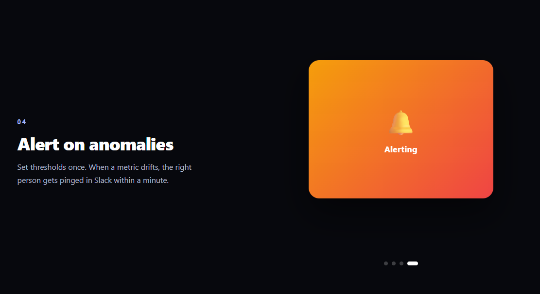
The sticky scroll feature section is the two-column layout on nearly every modern SaaS landing page: feature copy scrolls up the left column while a media panel on the right stays pinned in place, swapping its content each time a new step reaches the middle of the viewport. This snippet builds it with plain HTML, CSS position: sticky, and an IntersectionObserver — no animation library required.
position: sticky does the pinning, not JavaScript
The right column's .ssf-frame is position: sticky; top: 0; height: 100vh. Because its parent .ssf-media grid track is as tall as all four steps combined, the frame rides along fixed on screen for the entire section and releases naturally at both ends. That's the whole pinning mechanism — no scroll listeners, no transform math, and no layout jump when the section starts or ends, which is the classic bug in JS-pinned versions.
A middle-band IntersectionObserver picks the active step
Each text step is observed with rootMargin: '-45% 0px -45% 0px', which shrinks the observer's viewport to a thin 10%-tall band across the middle of the screen. A step only "intersects" while it occupies that band, so exactly one step is active at a time and the swap happens when a step's content is centered — where the reader is actually looking — rather than when its edge touches the viewport top.
Panels crossfade by class, animated purely in CSS
All four media panels are absolutely stacked inside the sticky frame. activate(i) toggles a single is-active class; CSS transitions handle the rest — inactive panels sit at opacity: 0; transform: scale(.9) translateY(26px), and the active one eases up to full size with a cubic-bezier(.22,1,.36,1) overshoot curve. Keeping the animation in CSS means the observer callback does no style math and the crossfade runs compositor-only.
Steps dim instead of disappearing
Inactive text steps stay visible at opacity: .28, so the reader always sees the sequence context — what came before, what's next — while the active step reads at full contrast. The dots under the media panel mirror the same index, stretching the active dot into a pill for a subtle progress affordance.
Each step is 88vh tall on purpose
Step height controls pacing: at ~88vh, each feature owns almost a full screen of scrolling, long enough to read the copy before the next swap fires. Shorten min-height for a snappier section or lengthen it for slower storytelling — the observer logic is height-agnostic.
Mobile collapses to a single column
Below 760px the media column is hidden and steps stack at full opacity, because a sticky side panel has no room on narrow screens. If you want media on mobile, an inline image per step beats a sticky frame there.
How the middle band actually computes
Negative rootMargin percentages shrink the observation rectangle relative to the viewport itself: -45% from the top and -45% from the bottom leaves a band spanning from 45% to 55% of the screen height. With threshold: 0, a step intersects the moment any pixel of it enters that band — so tall steps activate as soon as their leading edge reaches the center, and because two 88vh steps can't both occupy a 10%-tall band, the "exactly one active" guarantee falls out of the geometry rather than any bookkeeping code. That's also why no debouncing is needed on fast scrolls: the browser coalesces crossings into ordered callbacks.
Customizing it
Swap the gradient placeholder panels for screenshots, videos, or live components; add steps by duplicating a text block and a panel (the dots generate automatically). Pair it with a scroll pin steps section for a GSAP-pinned variant, a scroll reveal grid below, or a scroll spy nav for page-level navigation.
Step by step
How to Use
- 1Paste HTML, CSS, and JSNo CDN needed — sticky positioning and an observer do everything.
- 2Scroll into the sectionThe media panel pins while text steps scroll past.
- 3Watch the swap pointPanels change when a step reaches mid-viewport.
- 4Check the dotsThe active dot stretches into a pill per step.
- 5Resize under 760pxThe layout collapses to a clean single column.
- 6Swap in real mediaReplace gradient panels with screenshots or video.
Real-world uses
Common Use Cases
position: sticky pinning the frame and rootMargin of minus 45% activating centred steps.is-active class crossfading each panel.Got questions?
Frequently Asked Questions
The frame is position: sticky with top: 0 and height: 100vh inside a grid column as tall as all four steps combined. Sticky elements ride along with the viewport within their parent's bounds, so the browser pins and releases the panel natively — no scroll listeners, no transforms, and no jump at the section boundaries.
An IntersectionObserver watches every step with rootMargin: '-45% 0px -45% 0px', which shrinks the detection area to a thin band across the middle of the viewport. A step only intersects while it occupies that band, so exactly one is active at a time and swaps fire when content is centered under the reader's eyes.
The observer callback only toggles is-active; CSS transitions on opacity and transform do the visual work with a cubic-bezier(.22,1,.36,1) overshoot. That keeps the crossfade compositor-only and means you can retune timing, easing, or the entrance direction entirely in the stylesheet without touching the logic.
Duplicate one .ssf-step block (bump its data-panel index) and one .ssf-panel with new --pc1/--pc2 gradient stops — the dots are generated from the panel count so they update automatically. Step min-height controls pacing: shorten it for a snappier section, lengthen it to give each feature more reading time.
Yes — the panels are just absolutely stacked divs, so anything renders inside them. For videos, use the activate() hook to also play the incoming panel's video and pause the outgoing one, keeping only one decoding at a time; muted + playsinline lets them autoplay. Live components (charts, mini-demos) work the same way, though heavy ones should defer initialization until their first activation to keep initial load light.
Keep the sticky CSS as-is (Tailwind: sticky top-0 h-screen) and move the observer into a mount effect — useEffect, onMounted, or ngAfterViewInit — storing the active index in state instead of toggling classes manually. Render panels and dots from a features array, and disconnect the observer in the cleanup so it doesn't fire after unmount.