



Scroll Timeline Dots — Free GSAP ScrollTrigger Snippet
Scroll Timeline Dots · Scroll · Plain HTML, CSS & JS · Live preview
Copy & paste
Source Code
<section class="tl-top"><p>Scroll the story ↓</p></section>
<section class="tl-wrap" id="tlWrap">
  <div class="tl-line"><span class="tl-fill" id="tlFill"></span></div>
  <div class="tl-steps">
    <div class="tl-step"><span class="tl-dot"></span><div class="tl-card"><time>2019</time><h3>Founded</h3><p>Two people, one laptop, a stubborn idea.</p></div></div>
    <div class="tl-step"><span class="tl-dot"></span><div class="tl-card"><time>2021</time><h3>First 1,000 users</h3><p>Word of mouth turned into a waitlist.</p></div></div>
    <div class="tl-step"><span class="tl-dot"></span><div class="tl-card"><time>2023</time><h3>Series A</h3><p>We grew the team to thirty across four cities.</p></div></div>
    <div class="tl-step"><span class="tl-dot"></span><div class="tl-card"><time>2025</time><h3>One million</h3><p>A milestone we once only dreamed about.</p></div></div>
  </div>
</section>
<section class="tl-bottom"><p>The line filled and dots lit as you scrolled.</p></section>*{box-sizing:border-box;margin:0;padding:0}
body{font-family:system-ui,-apple-system,sans-serif;background:#0a0b13;color:#fff}
.tl-top,.tl-bottom{min-height:60vh;display:flex;justify-content:center;align-items:center;color:#8a90a8;font-size:15px;letter-spacing:.1em;text-transform:uppercase}
.tl-wrap{position:relative;max-width:620px;margin:0 auto;padding:8vh 24px 8vh 0}
.tl-line{position:absolute;left:24px;top:8vh;bottom:8vh;width:3px;background:#1e2335;border-radius:999px;overflow:hidden}
.tl-fill{position:absolute;left:0;top:0;width:100%;height:0;background:linear-gradient(180deg,#6366f1,#22d3ee)}
.tl-steps{display:flex;flex-direction:column;gap:9vh;padding-left:60px}
.tl-step{position:relative}
.tl-dot{position:absolute;left:-43.5px;top:6px;width:18px;height:18px;border-radius:50%;background:#11131f;border:3px solid #2c3346;transition:none;will-change:transform}
.tl-card{background:linear-gradient(150deg,#161b2c,#11131d);border:1px solid #242b40;border-radius:16px;padding:18px 20px;will-change:transform,opacity}
.tl-card time{font-size:13px;font-weight:800;letter-spacing:.05em;color:#7c8cff}
.tl-card h3{font-size:21px;letter-spacing:-.01em;margin:4px 0 6px}
.tl-card p{color:#a7adc4;font-size:14.5px;line-height:1.55}gsap.registerPlugin(ScrollTrigger);
var fill = document.getElementById('tlFill');
var dots = gsap.utils.toArray('.tl-dot');
var cards = gsap.utils.toArray('.tl-card');
// 1) The vertical line fills as you scroll through the timeline.
gsap.to(fill, {
height: '100%', ease: 'none',
scrollTrigger: { trigger: '#tlWrap', start: 'top 60%', end: 'bottom 70%', scrub: true }
});
// 2) Each card slides in and its dot lights up as it reaches the viewport.
cards.forEach(function (card, i) {
gsap.from(card, {
x: 36, opacity: 0, duration: 0.6, ease: 'power3.out',
scrollTrigger: { trigger: card, start: 'top 78%', toggleActions: 'play none none reverse' }
});
ScrollTrigger.create({
trigger: card, start: 'top 70%', end: 'bottom 60%',
onToggle: function (self) {
gsap.to(dots[i], {
backgroundColor: self.isActive ? '#22d3ee' : '#11131f',
borderColor: self.isActive ? '#22d3ee' : '#2c3346',
scale: self.isActive ? 1.25 : 1, duration: 0.3
});
}
});
});Extend with AI
Take This Snippet Further With AI
The AI prompt for this one is for Patreon supporters ($3 a month), along with a site with no ads. Supporters enter the passcode once and it is remembered in this browser.
What's included
Features
About this UI Snippet
Scroll Timeline Dots — A Timeline That Fills as You Scroll
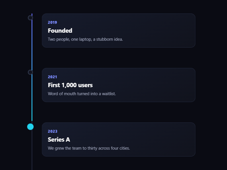
Scroll timeline dots is the animated vertical timeline where a progress line fills from top to bottom as you scroll, each milestone's dot lights up when you reach it, and the cards slide in beside them — the storytelling layout for company histories, roadmaps, and changelogs. This snippet builds it with GSAP and ScrollTrigger (from a CDN), combining a scrubbed fill with per-step toggles.
The filling spine
A track runs down the left edge with a gradient fill inside it. One scrubbed tween animates the fill's height from 0 to 100% across the timeline (start: 'top 60%' to end: 'bottom 70%'), so the line grows exactly in step with the scrollbar — scroll halfway and the spine is half full, scroll back and it recedes. This continuous fill is the backbone that ties the milestones together visually.
Cards that slide in once
Each milestone card gets a gsap.from that slides it in from the side and fades it up, triggered at start: 'top 78%' with toggleActions: 'play none none reverse' — so it animates in as it enters and reverses if you scroll it back out, replaying on re-entry. Using a discrete entrance (not scrub) here means each card has a crisp arrival rather than being half-drawn mid-scroll.
Dots that light at the right moment
Separately, each dot has a ScrollTrigger.create with an onToggle that fires when its card spans a band near the viewport center. While active, the dot tweens to a bright fill, accent border, and a slight scale-up; when the card leaves, it reverts. This makes the dots a live "you are here" indicator that tracks reading position, distinct from the one-time card entrance.
Two trigger styles, on purpose
The snippet deliberately mixes ScrollTrigger modes: a single scrub for the continuous fill, discrete toggleActions for the card entrances, and onToggle for the dot state. Each effect uses the mode that fits it — continuous value, play-once-on-enter, and active-while-in-range — which is exactly how ScrollTrigger is meant to be composed, and keeps every piece simple.
Smooth and reversible
The fill animates height within an overflow: hidden track (cheap, contained), and the cards and dots animate transforms, colors, and scale — all reversible, so scrolling up unwinds the whole timeline cleanly. will-change hints keep the motion smooth.
Customizing it
Add milestones (each is a step with a dot and card), change the fill gradient, the slide direction, the active dot color, or the trigger points. Pair it with a vertical timeline, a scroll svg path draw, or scroll pin steps.
Step by step
How to Use
- 1Add the GSAP CDNsInclude gsap and ScrollTrigger from the CDN panel.
- 2Paste HTML, CSS, and JSA vertical timeline of milestones renders.
- 3Scroll downThe spine fills and cards slide in.
- 4Watch the dotsEach dot lights as its card reaches center.
- 5Scroll back upThe fill recedes and dots dim.
- 6Add a milestoneCopy a .tl-step with its dot and card.
Real-world uses
Common Use Cases
toggleActions and onToggle triggers.Got questions?
Frequently Asked Questions
A track with an inner gradient fill runs down the side, and one scrubbed tween animates the fill's height from 0 to 100% across the timeline (start: top 60% to end: bottom 70%). Because it is scrubbed, the line grows in step with the scrollbar and recedes when you scroll up — a continuous progress backbone for the milestones.
The cards need a one-time entrance, so toggleActions: play none none reverse plays them in on enter and reverses on leave. The dots need to reflect the current reading position, so onToggle lights the dot while its card is in a center band and reverts when it leaves. Each effect uses the ScrollTrigger mode that fits its behaviour.
Each dot has a ScrollTrigger whose start and end define a band near the viewport center; its onToggle fires when the card enters or leaves that band, tweening the dot to a bright fill, accent border, and slight scale while active. This makes the dots a live you-are-here indicator that tracks scroll position independently of the card entrances.
Yes. The fill is scrubbed, the cards use a reversible toggleActions, and the dots revert on toggle-off, so scrolling up unwinds the spine, slides the cards back out, and dims the dots cleanly. Everything animates transforms, colors, height, and scale, all of which GSAP can play in both directions.
In a mount effect, register ScrollTrigger and create the fill scrub plus per-card entrance and per-dot toggle triggers, scoped to refs. Return a cleanup that reverts the GSAP context so all triggers are removed on unmount. If milestones are dynamic, create the triggers after they render and call ScrollTrigger.refresh(). The CSS ports unchanged.