



Stage Progress Fill Checklist — Per-Step Progress Bar Loader JS
Stage Progress Fill Checklist · Loaders · Plain HTML, CSS & JS · Live preview
Copy & paste
Source Code
<div class="pf-card">
  <div class="pf-head">
    <h2 class="pf-title">Processing your video</h2>
    <p class="pf-sub" id="pfSub">This can take a minute…</p>
  </div>
  <ul class="pf-list" id="pfList">
    <li class="pf-item" data-label="Uploading file"><span class="pf-icon"></span><div class="pf-body"><span class="pf-text">Uploading file</span><div class="pf-track"><div class="pf-fill"></div></div></div></li>
    <li class="pf-item" data-label="Transcoding"><span class="pf-icon"></span><div class="pf-body"><span class="pf-text">Transcoding</span><div class="pf-track"><div class="pf-fill"></div></div></div></li>
    <li class="pf-item" data-label="Generating thumbnails"><span class="pf-icon"></span><div class="pf-body"><span class="pf-text">Generating thumbnails</span><div class="pf-track"><div class="pf-fill"></div></div></div></li>
    <li class="pf-item" data-label="Publishing"><span class="pf-icon"></span><div class="pf-body"><span class="pf-text">Publishing</span><div class="pf-track"><div class="pf-fill"></div></div></div></li>
  </ul>
  <button class="pf-replay" id="pfReplay" type="button">↻ Replay</button>
</div>*{box-sizing:border-box;margin:0;padding:0}
body{font-family:system-ui,-apple-system,sans-serif;background:#0b0f1a;min-height:100vh;display:flex;align-items:center;justify-content:center;padding:24px}
.pf-card{width:100%;max-width:400px;background:#12162a;border:1px solid #232a45;border-radius:16px;padding:22px;box-shadow:0 18px 44px rgba(0,0,0,.4)}
.pf-title{font-size:15px;font-weight:700;color:#e7e9f5;margin-bottom:4px}
.pf-sub{font-size:12px;color:#7d8296;margin-bottom:18px}
.pf-list{list-style:none;display:flex;flex-direction:column;gap:14px}
.pf-item{display:flex;gap:11px;align-items:flex-start;opacity:.45;transition:opacity .3s}
.pf-item.pf-active,.pf-item.pf-complete{opacity:1}
.pf-icon{width:20px;height:20px;border-radius:50%;flex-shrink:0;margin-top:1px;border:2px solid #2b3157;position:relative;transition:border-color .3s}
.pf-item.pf-active .pf-icon{border-color:#6366f1;border-top-color:transparent;animation:pfSpin .7s linear infinite}
.pf-item.pf-complete .pf-icon{border:none;background:#173829}
.pf-item.pf-complete .pf-icon::after{content:'';position:absolute;left:6px;top:3px;width:4px;height:9px;border:solid #4ade80;border-width:0 2px 2px 0;transform:rotate(45deg)}
@keyframes pfSpin{to{transform:rotate(360deg)}}
.pf-body{flex:1;display:flex;flex-direction:column;gap:6px}
.pf-text{font-size:12.5px;font-weight:600;color:#c8cbdb}
.pf-item.pf-complete .pf-text{color:#7d8296}
.pf-track{height:5px;border-radius:4px;background:#1a1f36;overflow:hidden;display:none}
.pf-item.pf-active .pf-track{display:block}
.pf-fill{height:100%;width:0%;border-radius:4px;background:linear-gradient(90deg,#6366f1,#a78bfa)}
.pf-replay{margin-top:18px;width:100%;padding:9px;background:#181c2b;color:#c8cbdb;border:1px solid #2b3044;border-radius:9px;font-size:12.5px;font-weight:700;cursor:pointer;font-family:inherit}
.pf-replay:hover{background:#1e2333}
.pf-replay:disabled{opacity:.5;cursor:not-allowed}// Unlike a checklist where each item instantly flips from spinner to
// checkmark, every stage here gets its own real 0-100% fill bar that
// completes BEFORE that item is marked done \u2014 so users can see how far
// into a specific stage they are, not just which stage is "current."
var STAGES = [
{ label: 'Uploading file', minMs: 700, maxMs: 1300 },
{ label: 'Transcoding', minMs: 1400, maxMs: 2200 },
{ label: 'Generating thumbnails', minMs: 600, maxMs: 1000 },
{ label: 'Publishing', minMs: 500, maxMs: 900 },
];
var listEl = document.getElementById('pfList');
var subEl = document.getElementById('pfSub');
var replayBtn = document.getElementById('pfReplay');
var items = Array.prototype.slice.call(listEl.querySelectorAll('.pf-item'));
function resetItems() {
items.forEach(function (item) {
item.classList.remove('pf-active', 'pf-complete');
item.querySelector('.pf-fill').style.width = '0%';
});
subEl.textContent = 'This can take a minute…';
}
function runStage(index) {
if (index >= STAGES.length) {
subEl.textContent = 'Done — your video is live.';
replayBtn.disabled = false;
return;
}
var stage = STAGES[index];
var item = items[index];
var fillEl = item.querySelector('.pf-fill');
item.classList.add('pf-active');
subEl.textContent = stage.label + '…';
var duration = stage.minMs + Math.random() * (stage.maxMs - stage.minMs);
var start = Date.now();
var tick = setInterval(function () {
var pct = Math.min(100, ((Date.now() - start) / duration) * 100);
fillEl.style.width = pct + '%';
if (pct >= 100) {
clearInterval(tick);
item.classList.remove('pf-active');
item.classList.add('pf-complete');
runStage(index + 1);
}
}, 45);
}
function runAll() {
replayBtn.disabled = true;
resetItems();
runStage(0);
}
replayBtn.addEventListener('click', runAll);
runAll();Extend with AI
Take This Snippet Further With AI
The AI prompt for this one is for Patreon supporters ($3 a month), along with a site with no ads. Supporters enter the passcode once and it is remembered in this browser.
What's included
Features
About this UI Snippet
Stage Progress Fill Checklist \u2014 A Multi-Stage Loader Where Each Step Gets Its Own Real Fill Bar
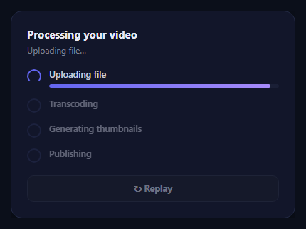
A typical multi-stage checklist loader shows each item flipping instantly from a spinner to a checkmark, which communicates which stage is current but nothing about how far into that stage you actually are. This snippet adds a real per-stage progress bar: the currently active item expands to show its own 0% \u2192 100% fill, driven by a real elapsed-time calculation against that stage's expected duration, and only becomes a checkmark once its own bar genuinely reaches 100%.
One real fill bar per active stage
Each .pf-item has a hidden .pf-track/.pf-fill pair that only becomes visible (display: block) while that item carries the .pf-active class. runStage(index) starts a setInterval that computes (Date.now() - start) / duration roughly every 45ms and sets fillEl.style.width directly to that percentage \u2014 a genuine incremental progress read for the currently running stage, not a single CSS transition jumping straight from 0 to 100.
Strict sequencing with per-stage randomized duration
runStage() only calls itself for the next stage after the current stage's fill interval reports 100% completion, guaranteeing stages run one at a time in order. Each stage's duration is randomized between its own minMs and maxMs \u2014 Transcoding is deliberately given a longer range than Publishing, since real video processing pipelines genuinely spend more time on some stages than others, and a viewer watching the transcoding bar move slower than the publishing bar reads as more honest than four identically-paced steps.
Dimmed, idle, and complete states
Items that haven't started yet sit at reduced opacity with a plain empty ring icon and no visible fill track. The active item brightens, shows a spinning-border icon, and reveals its fill bar. A completed item shows a checkmark built from a rotated CSS border pseudo-element, its label dims to a muted tone, and its fill track hides again \u2014 so the finished list reads cleanly without four permanently-visible full progress bars cluttering the view.
A running subtitle
The subtitle line above the list mirrors the active stage's label (Transcoding…) and switches to a completion message once every stage has genuinely finished, giving a second, textual confirmation of the same real state the bars and icons are showing.
Customizing it
Replace each stage's simulated duration range with your real backend's actual processing time estimates, or better, drive fillEl.style.width directly from real percentage-complete events reported by your job queue for that specific stage, skipping the internal setInterval entirely. Pair it with an agent task segment tracker for a compact horizontal alternative to this vertical checklist layout.
Step by step
How to Use
- 1Paste HTML, CSS, and JSThe first stage ("Uploading file") activates immediately and its fill bar begins filling.
- 2Watch each stage fillThe active item\u2019s own progress bar climbs from 0% to 100% before it becomes a checkmark.
- 3Watch stages advance in orderOnly one stage is ever active at a time; the next begins the instant the previous completes.
- 4Reach completionThe subtitle switches to a done message and the replay button re-enables.
- 5Click "Replay"Every item resets and the sequence runs again with fresh randomized durations.
- 6Edit the STAGES arrayRename stages and adjust their minMs/maxMs duration ranges to match your real pipeline.
Real-world uses
Common Use Cases
Got questions?
Frequently Asked Questions
A plain checklist swaps a spinner icon for a checkmark the moment a stage starts and finishes, with no sense of how far along that stage actually is. This component adds a real per-stage fill bar, visible only on the currently active item, that climbs from 0% to 100% based on a genuine elapsed-time calculation before the checkmark appears.
No. runStage(index) only calls itself for the next stage inside the current stage\u2019s own completion branch, once its fill interval reports 100%. Stages always run strictly one at a time, in order, never overlapping.
Each STAGES entry defines its own minMs and maxMs, and Transcoding is given a longer range than Publishing because real video pipelines genuinely spend more time on some stages than others. Giving every stage an identical duration would read as obviously fake once a viewer compares a "quick" step to a "slow" one.
Replace the internal setInterval-driven fraction calculation with real percentage updates pushed from your job queue or processing backend (e.g. over SSE or polling) \u2014 call fillEl.style.width = realPercent + "%" directly whenever a new value arrives for the currently active stage, and call the same completion branch (removing pf-active, adding pf-complete, calling runStage for the next index) once that stage reports 100%.
The .pf-track element is only shown via display: block while its parent .pf-item carries the pf-active class; that class is removed the instant the stage completes. This keeps the finished checklist visually clean, since a fully-filled bar sitting next to a checkmark for every completed item would be redundant and cluttered.
Yes. Keep an activeIndex and a per-stage percentage in state, advancing activeIndex only once the active stage\u2019s percentage state reaches 100 inside an effect-driven interval or real progress event handler. Render each item\u2019s icon, label, and conditional fill bar from that state; the CSS classes and transitions carry over directly.