

Quill Rich Text Editor with Custom Toolbar and Character Limit

CodeMirror JSON Editor with Validation Gutter
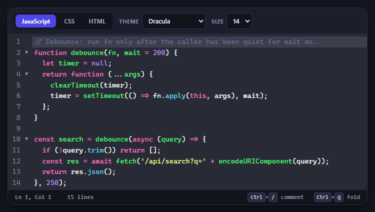
CodeMirror Code Editor with Line Numbers, Folding and Themes

Marked + DOMPurify Live Markdown Preview
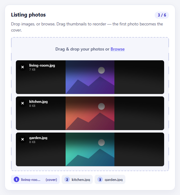
FilePond Image Upload with Preview and Reorder

Cropper.js Aspect-Ratio Presets for Social Posts
Star Rating — Free HTML CSS JS Snippet
Star Rating · Forms · Plain HTML, CSS & JS · Live preview
Copy & paste
Source Code
<div class="demo">
  <div class="label">Rate your experience</div>
  <div class="stars" id="stars">
    <span data-v="1">★</span><span data-v="2">★</span><span data-v="3">★</span>
    <span data-v="4">★</span><span data-v="5">★</span>
  </div>
  <div class="hint" id="hint">Click to rate</div>
</div>
* { box-sizing: border-box; margin: 0; padding: 0; }
body { font-family: system-ui, sans-serif; background: #f8fafc; display: flex; align-items: center; justify-content: center; min-height: 100vh; }
.demo { text-align: center; display: flex; flex-direction: column; align-items: center; gap: 12px; }
.label { font-size: 15px; font-weight: 600; color: #1e293b; }
.stars { display: flex; gap: 4px; }
.stars span { font-size: 36px; color: #e2e8f0; cursor: pointer; transition: color 0.1s, transform 0.1s; line-height: 1; }
.stars span:hover, .stars span.active { color: #f59e0b; }
.stars span:hover { transform: scale(1.15); }
.hint { font-size: 13px; color: #94a3b8; min-height: 18px; }const labels = ['', 'Poor', 'Fair', 'Good', 'Great', 'Excellent!'];
let selected = 0;
const stars = document.querySelectorAll('#stars span');
const hint = document.getElementById('hint');
stars.forEach(s => {
s.addEventListener('mouseenter', () => {
const v = +s.dataset.v;
stars.forEach(x => x.classList.toggle('active', +x.dataset.v <= v));
hint.textContent = labels[v];
});
s.addEventListener('click', () => { selected = +s.dataset.v; hint.textContent = labels[selected] + ' — thanks!'; });
});
document.getElementById('stars').addEventListener('mouseleave', () => {
stars.forEach(x => x.classList.toggle('active', +x.dataset.v <= selected));
hint.textContent = selected ? labels[selected] + ' — thanks!' : 'Click to rate';
});Extend with AI
Take This Snippet Further With AI
The AI prompt for this one is for Patreon supporters ($3 a month, 7 days free), along with a site with no ads. Supporters enter the passcode once and it is remembered in this browser.
What's included
Features
About this UI Snippet
Star Rating — Hover Preview, Click-to-Set & Label Feedback

A star rating component collects user satisfaction input — product reviews, service ratings (aggregated in a rating breakdown), survey responses. The interaction pattern is well-established: stars highlight as you hover to preview the rating, click to lock it in, and the selection persists when you move the mouse away. This snippet implements the full pattern with hover preview, click-to-set, mouseleave restore, and descriptive text labels.
How the hover preview works
Each star is a span with a data-v attribute (1–5). The mouseenter handler uses classList.toggle('active', +x.dataset.v <= v) to compare each star's value to the hovered value and adds .active (amber) to all stars at or below the cursor.
Storing the selected rating
A selected variable stores the clicked value. On mouseleave from the container, the stars reset to show the selected value. If selected is 0, all stars go grey.
The label feedback
The labels array maps indices to descriptive words: Poor, Fair, Good, Great, Excellent at positions 1–5. The .hint element shows the current hover label during hover and the selected label plus thanks after click.
Reading the value
After the user clicks, selected holds the value 1–5. Add a hidden input and update its value: document.getElementById('rating').value = selected. Submit the hidden input with your form data.
Hover preview with CSS sibling selectors
The star rating uses the CSS general sibling combinator (~) in reverse order trick. The input elements are hidden radio buttons ordered 5 to 1. When a star is hovered, CSS .star:hover ~ .star selects all subsequent siblings and removes their colour, while the hovered star and all stars before it get the accent colour. This creates the hover preview effect without any JavaScript — just CSS sibling relationships.
Click-to-set with radio inputs
Each star is a label associated with a hidden radio input. Clicking a label checks its radio input. The :checked pseudo-class then applies the filled colour to that star and all preceding stars via the same sibling combinator logic. The rating is accessible via standard form input — a form POST includes the rating value automatically.
The half-star pattern
For half-star ratings (3.5, 4.5), use two overlapping label elements per star: one for the left half and one for the right. Each half has its own radio input value (3.0, 3.5, 4.0, 4.5, etc.). The clip-path: inset(0 50% 0 0) clips each half-star to its respective side.
Step by step
How to Use
- 1Hover and click in the previewHover over the stars to see the highlight preview. Click a star to lock the rating. Move the mouse away to confirm the selection persists.
- 2Update the label textIn the JS panel, update the labels array. The hint text uses these labels on hover and after selection.
- 3Change the star sizeIn the CSS panel, update font-size: 36px on .stars span to resize all stars.
- 4Change the active star colourUpdate color: #f59e0b on .stars span.active to any amber, yellow, or brand colour.
- 5Submit the valueAfter click, the selected variable holds 1–5. Add document.getElementById(your-input).value = selected in the click handler to populate a hidden form input.
- 6Export in your formatClick HTML for a standalone file, JSX for a React component, or Tailwind for a React + Tailwind version.
Real-world uses
Common Use Cases
Got questions?
Frequently Asked Questions
Each star span has a data-v attribute (1–5). The mouseenter handler captures the hovered value v, then loops through all stars with classList.toggle(active, +x.dataset.v <= v). Stars with a value at or below the hovered star get the .active class.
A selected variable (initialised to 0) stores the clicked value. On mouseleave, the stars reset to show the selected value. If selected is 0, all stars are grey.
Add a hidden input to your form. In the click handler, set document.getElementById(rating-input).value = selected. The form will submit the rating value.
Remove event listeners. Pre-compute the number of full stars and add .active to that many spans. For a fractional average, use clip-path on the last star.
Yes. Add or remove span elements and update the labels array length. The toggle logic uses data-v attributes so it works with any count.
Yes. Click JSX to download a React component. Replace selected with useState and highlight stars up to the hovered or selected index in render.