


Aurora Text — Free HTML CSS Animated Gradient Text Snippet
Aurora Text · Text Animation · Plain HTML, CSS & JS · Live preview
Copy & paste
Source Code
<div class="at-stage">
  <p class="at-eyebrow">Northern lights</p>
  <h1 class="at-text">Aurora</h1>
  <p class="at-sub">A flowing aurora gradient drifts through the letters — clipped to the text, animated forever.</p>
</div>*{box-sizing:border-box;margin:0;padding:0}
body{font-family:system-ui,-apple-system,sans-serif;background:#04040c;color:#fff;display:flex;flex-direction:column;align-items:center;justify-content:center;min-height:100vh;gap:16px;text-align:center;padding:24px}
.at-eyebrow{font-size:12px;font-weight:700;letter-spacing:.18em;text-transform:uppercase;color:#3f7a6b}
.at-text{font-size:clamp(56px,16vw,160px);font-weight:900;letter-spacing:-.04em;line-height:1;
background-image:linear-gradient(110deg,#22d3ee,#34d399,#a78bfa,#22d3ee,#34d399);
background-size:200% 200%;
-webkit-background-clip:text;background-clip:text;color:transparent;
animation:atFlow 8s ease-in-out infinite;
filter:drop-shadow(0 0 30px rgba(52,211,153,.25))}
@keyframes atFlow{
0%{background-position:0% 50%}
50%{background-position:100% 50%}
100%{background-position:0% 50%}
}
.at-sub{color:#7a8a92;font-size:15px;max-width:440px;line-height:1.55;margin-top:6px}// The aurora is pure CSS. JS only honours reduced-motion and exposes a tiny
// helper to recolour the gradient at runtime.
var el = document.querySelector('.at-text');
if (window.matchMedia('(prefers-reduced-motion: reduce)').matches) {
el.style.animation = 'none';
}
window.auroraText = {
colors: function (list) {
// list: array of CSS colors -> rebuild the flowing gradient
el.style.backgroundImage = 'linear-gradient(110deg,' + list.concat(list[0]).join(',') + ')';
}
};Extend with AI
Take This Snippet Further With AI
The AI prompt for this one is for Patreon supporters ($3 a month), along with a site with no ads. Supporters enter the passcode once and it is remembered in this browser.
What's included
Features
About this UI Snippet
Aurora Text — A Flowing Aurora Gradient Inside the Letters
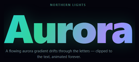
Aurora text fills a headline with a slowly flowing, multi-color gradient — teal, green, and violet drifting through the letters like the northern lights — clipped to the glyph shapes so the color lives inside the type. This snippet builds it with pure CSS, plus a couple of optional JavaScript lines for accessibility and runtime recoloring.
A gradient clipped to the glyphs
The text color is set to transparent and filled with a linear-gradient via background-clip: text, so the gradient shows only through the letter shapes. The gradient repeats its aurora colors and is sized at 200% so there is room to move it around. Clipping to text means the color automatically follows the exact contours of the glyphs — including counters and serifs — across any number of lines, without masks or extra elements.
The flowing animation
The atFlow keyframe animates background-position from 0% 50% to 100% 50% and back on an 8-second ease-in-out loop. Because the gradient is larger than the text and its color stops repeat, sliding the position drifts the bands of color slowly through the letters, never quite repeating — the gentle, organic shimmer of an aurora. The ease-in-out (rather than linear) gives it a breathing, tidal quality instead of a constant scroll. A soft green drop-shadow adds an ambient glow around the type.
Why this looks like an aurora, not a rainbow
The palette and motion are deliberately restrained: cool teals and greens with a single violet accent, drifting slowly. That cool, limited palette plus the slow ease is what evokes the northern lights specifically, versus a fast, saturated rainbow which reads as generic. Swapping the colors changes the mood entirely while keeping the same mechanic.
Accessibility and runtime control
The animation is pure CSS, but the script checks prefers-reduced-motion and disables it for users who request less motion — the text still shows the gradient, just static. A tiny window.auroraText.colors([...]) helper rebuilds the flowing gradient from any list of CSS colors at runtime (it appends the first color to the end so the loop stays seamless), handy for theming or letting users pick a palette. Neither script is required for the core effect.
Performance
Only background-position animates, on a single element, which the browser composites cheaply — so even a giant headline shimmers smoothly. There is no canvas, no SVG, and no per-frame JavaScript.
Customizing it
Change the gradient colors and angle for a different aurora (or a warm sunset, or a metallic sheen), adjust the background-size and keyframe range to control how far the bands travel, retime the loop for a faster or calmer flow, or tune the drop-shadow glow. Provide a solid fallback color for contexts where background-clip: text is unsupported. Pair it with a retro grid or particle network backdrop for a striking hero.
Step by step
How to Use
- 1Paste HTML, CSS, and JSA large headline fills with a flowing aurora gradient.
- 2Watch the flowBands of teal, green, and violet drift through the letters.
- 3Note the glowA soft drop-shadow halos the type.
- 4Recolor at runtimeCall window.auroraText.colors([...]) with your palette.
- 5Check reduced motionEnable the OS setting and the flow stops.
- 6Retime the loopAdjust the keyframe duration and gradient size.
Real-world uses
Common Use Cases
background-position eases gently back and forth across the letters.Got questions?
Frequently Asked Questions
The text color is set to transparent and filled with a linear-gradient via background-clip: text, so the gradient only shows through the glyph shapes. It automatically follows the exact contours of the letters, including counters, across multiple lines, with no masks or extra elements.
The gradient is sized at 200% so it is larger than the text, and the atFlow keyframe animates background-position back and forth on an 8-second ease-in-out loop. Because the color stops repeat and the gradient is oversized, the bands of color drift slowly through the letters without an obvious seam, giving the aurora shimmer.
The palette and motion are restrained: cool teals and greens with a single violet accent, drifting slowly on an ease-in-out curve. That limited, cool palette plus the tidal motion evokes the northern lights, whereas a fast, fully-saturated rainbow reads as a generic gradient. Swapping colors changes the mood while keeping the mechanic.
The script checks prefers-reduced-motion and disables the animation when set, so the text still shows the gradient but does not move for users who want less motion. Provide a solid fallback color too, since background-clip: text needs the text to be transparent and is unsupported in a few old contexts.
Make a small component that applies the class to its children, read prefers-reduced-motion in a mount effect to disable the animation when requested, and expose a colors prop that sets the gradient via inline style. The effect is pure CSS. In Tailwind, define the flow keyframe in the config and use bg-clip-text with text-transparent and an arbitrary gradient image.