




Retro Grid — Free HTML CSS Synthwave Hero Background Snippet
Retro Grid · Heroes · Plain HTML, CSS & JS · Live preview
Copy & paste
Source Code
<section class="rg-hero">
  <div class="rg-grid" aria-hidden="true"><div class="rg-plane"></div></div>
  <div class="rg-sun" aria-hidden="true"></div>
  <div class="rg-content">
    <span class="rg-tag">★ SYNTHWAVE</span>
    <h1>Outrun the night</h1>
    <p>An animated neon grid floor racing toward the horizon — pure CSS perspective.</p>
  </div>
</section>*{box-sizing:border-box;margin:0;padding:0}
body{font-family:system-ui,-apple-system,sans-serif;background:#0a0420;color:#fff}
.rg-hero{position:relative;min-height:100vh;overflow:hidden;display:flex;align-items:center;justify-content:center;text-align:center;background:linear-gradient(180deg,#1a0b3a 0%,#2d0b4e 45%,#0a0420 75%)}
.rg-grid{position:absolute;left:0;right:0;bottom:0;height:55%;perspective:240px;overflow:hidden}
.rg-plane{position:absolute;inset:-60% 0 0 0;background-image:linear-gradient(rgba(236,72,153,.55) 1px,transparent 1px),linear-gradient(90deg,rgba(34,211,238,.55) 1px,transparent 1px);background-size:44px 44px;transform:rotateX(72deg);transform-origin:bottom;animation:rgRun 1.6s linear infinite}
@keyframes rgRun{to{background-position:0 44px}}
.rg-sun{position:absolute;top:24%;left:50%;width:260px;height:260px;border-radius:50%;transform:translate(-50%,-50%);background:linear-gradient(180deg,#fde047,#ec4899);box-shadow:0 0 90px 20px rgba(236,72,153,.45)}
.rg-sun::after{content:'';position:absolute;inset:0;border-radius:50%;background:repeating-linear-gradient(180deg,transparent 0 14px,#0a0420 14px 18px);-webkit-mask:linear-gradient(180deg,transparent 55%,#000 55%);mask:linear-gradient(180deg,transparent 55%,#000 55%)}
.rg-content{position:relative;z-index:1;padding:0 20px;max-width:600px}
.rg-tag{display:inline-block;font-size:12px;font-weight:800;letter-spacing:.2em;color:#22d3ee;margin-bottom:16px;text-shadow:0 0 12px rgba(34,211,238,.7)}
.rg-content h1{font-size:clamp(38px,9vw,84px);font-weight:900;letter-spacing:-.02em;text-transform:uppercase;background:linear-gradient(180deg,#fff,#f0abfc);-webkit-background-clip:text;background-clip:text;color:transparent;text-shadow:0 0 40px rgba(240,171,252,.4)}
.rg-content p{margin-top:14px;font-size:16px;color:#c4b5fd}// The grid is 100% CSS. This optional script lets you change the scroll speed
// and pause it when the tab is hidden to save the GPU.
var plane = document.querySelector('.rg-plane');
document.addEventListener('visibilitychange', function () {
plane.style.animationPlayState = document.hidden ? 'paused' : 'running';
});
// Expose a tiny API: window.retroGrid.speed(seconds) to retune the run speed.
window.retroGrid = {
speed: function (s) { plane.style.animationDuration = s + 's'; }
};Extend with AI
Take This Snippet Further With AI
The AI prompt for this one is for Patreon supporters ($3 a month, 7 days free), along with a site with no ads. Supporters enter the passcode once and it is remembered in this browser.
What's included
Features
About this UI Snippet
Retro Grid — Animated Synthwave Perspective Floor
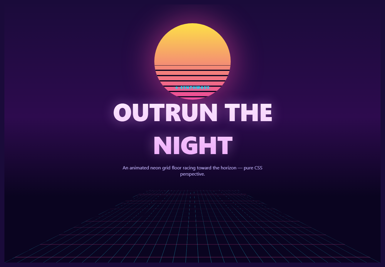
The retro grid is the 80s synthwave staple: a glowing neon grid floor that recedes to a horizon and races endlessly toward the viewer, lit by a striped retro sun. It is the backdrop of choice for vaporwave, outrun, and game-themed sites. This snippet builds the whole scene with pure CSS perspective and a couple of optional lines of JavaScript — no canvas, no images.
The perspective floor
The grid lives in a container with perspective: 240px and a child plane that is rotated flat with transform: rotateX(72deg) and transform-origin: bottom. That low perspective value combined with the steep rotation tips the plane almost flat and exaggerates the foreshortening, so the lines compress toward a vanishing point — the signature receding-floor look. The plane itself is just two layered linear-gradient backgrounds (pink horizontals, cyan verticals) tiled at 44px, the same graph-paper trick used for any CSS grid, here viewed in 3D.
Making it race forward
Animating the plane toward the viewer is a one-line keyframe: rgRun shifts background-position down by exactly one tile (44px) over 1.6 seconds and loops. Because the grid pattern repeats every 44px, moving by one full cell lands on an identical pattern, so the loop is seamless — the lines appear to stream continuously toward you with no visible jump. The plane is oversized (inset: -60% at the top) so the scrolling lines fill the perspective without revealing an edge near the horizon.
The retro sun
The sun is a circle filled with a vertical yellow-to-pink gradient and a soft glowing box-shadow. Its iconic horizontal slats come from an ::after pseudo-element: a repeating-linear-gradient of background-colored bars, masked so the stripes only appear across the lower half (mask: linear-gradient(transparent 55%, #000 55%)). That mask is what gives the classic synthwave sun its half-banded look without drawing each stripe by hand.
The color story
A vertical background gradient runs from deep indigo at the top through magenta to near-black at the bottom, so the sky glows behind the sun and darkens toward the grid. The headline uses a top-down background-clip: text gradient with a soft text-shadow glow, and the tag and copy use neon cyan and violet — all the hallmarks of the outrun palette. Everything is CSS, so recoloring the whole scene is a handful of values.
The optional script
The animation is entirely CSS, but two small JavaScript conveniences are included: a visibilitychange listener pauses the grid when the tab is hidden to spare the GPU, and a tiny window.retroGrid.speed(seconds) helper lets you retune the run speed at runtime (for example, to accelerate on a button press). Neither is required for the effect to work.
Customizing it
Change the perspective and rotateX to steepen or flatten the floor, adjust the 44px tile size for a denser or wider grid, retime rgRun for a faster or slower race, recolor the line gradients and sun, or move the horizon by resizing the grid container. Pair it with an aurora text headline or a pulse button for a complete retro hero.
Step by step
How to Use
- 1Paste HTML, CSS, and JSA neon grid floor and a striped sun fill the hero.
- 2Watch it raceThe grid lines stream endlessly toward the horizon.
- 3Note the sunHorizontal slats band its lower half, synthwave style.
- 4Switch tabsThe grid pauses while hidden to save the GPU.
- 5Retune the speedCall window.retroGrid.speed(seconds) at runtime.
- 6Recolor the sceneEdit the gradient and sun colors.
Real-world uses
Common Use Cases
background-position shift producing a seamless forward race.rotateX with low perspective as a reference for receding planes.Got questions?
Frequently Asked Questions
The grid container has perspective: 240px and its child plane is rotated with rotateX(72deg) and transform-origin: bottom. The low perspective value plus the steep rotation tips the plane nearly flat and exaggerates the foreshortening, so the gridlines compress toward a vanishing point — the classic receding-floor look, all in CSS.
The rgRun keyframe shifts the plane background-position down by exactly one 44px tile and loops. Because the grid pattern repeats every 44px, moving by one full cell lands on an identical pattern, so the restart is invisible and the lines appear to stream continuously toward the viewer.
The sun is a circle with a vertical yellow-to-pink gradient and a glowing box-shadow. Its horizontal slats come from an ::after repeating-linear-gradient of background-colored bars, masked with a linear-gradient so the stripes only show across the lower half. The mask gives the iconic half-banded sun without drawing each stripe manually.
Not very — it animates only background-position on one element, which the compositor handles efficiently. A visibilitychange listener also pauses it when the tab is hidden to spare the GPU. For very low-end targets you can slow the keyframe or enlarge the tile size to reduce the number of lines.
The scene is pure CSS, so drop the markup into a component and keep the classes. Add the visibilitychange listener in a mount effect with cleanup, and expose the speed control as a prop that sets the animation-duration via a ref or inline style instead of the global helper. In Tailwind, build the plane with a bg-[linear-gradient(...)] arbitrary value and define the run keyframe in the config.