



Bezier Curve Editor — Visual cubic-bezier() Easing Tool
Bezier Curve Editor · Tools · Plain HTML, CSS & JS · Live preview
Copy & paste
Source Code
<div class="bz-card">
  <div class="bz-stage">
    <svg class="bz-svg" id="bzSvg" viewBox="0 0 200 200" aria-label="Easing curve editor">
      <line class="bz-axis" x1="0" y1="200" x2="200" y2="200"/>
      <line class="bz-axis" x1="0" y1="0" x2="0" y2="200"/>
      <line class="bz-handleline" id="bzL1" x1="0" y1="200" x2="0" y2="0"/>
      <line class="bz-handleline" id="bzL2" x1="200" y1="0" x2="200" y2="200"/>
      <path class="bz-curve" id="bzCurve" d=""/>
      <circle class="bz-pt" id="bzP1" r="8" cx="50" cy="150" tabindex="0" role="slider" aria-label="Control point 1"/>
      <circle class="bz-pt" id="bzP2" r="8" cx="150" cy="50" tabindex="0" role="slider" aria-label="Control point 2"/>
    </svg>
    <div class="bz-demo"><span class="bz-ball" id="bzBall"></span></div>
  </div>
  <code class="bz-code" id="bzCode">cubic-bezier(0.25, 0.25, 0.75, 0.75)</code>
  <div class="bz-presets" id="bzPresets">
    <button type="button" class="bz-chip" data-v="0.25,0.1,0.25,1">ease</button>
    <button type="button" class="bz-chip" data-v="0.42,0,1,1">ease-in</button>
    <button type="button" class="bz-chip" data-v="0,0,0.58,1">ease-out</button>
    <button type="button" class="bz-chip" data-v="0.34,1.56,0.64,1">overshoot</button>
  </div>
</div>*{box-sizing:border-box;margin:0;padding:0}
body{font-family:system-ui,-apple-system,sans-serif;background:#0f172a;color:#e2e8f0;display:flex;justify-content:center;padding:36px 18px}
.bz-card{background:#1e293b;border:1px solid #334155;border-radius:18px;padding:18px;width:100%;max-width:330px}
.bz-stage{display:flex;gap:14px;align-items:stretch}
.bz-svg{width:200px;height:200px;background:#0f172a;border:1px solid #334155;border-radius:10px;touch-action:none;overflow:visible}
.bz-axis{stroke:#334155;stroke-width:1}
.bz-handleline{stroke:#475569;stroke-width:1.5;stroke-dasharray:3 3}
.bz-curve{fill:none;stroke:#818cf8;stroke-width:2.5}
.bz-pt{fill:#6366f1;stroke:#fff;stroke-width:2;cursor:grab}
.bz-pt:active{cursor:grabbing}
.bz-pt:focus{outline:none;fill:#a5b4fc}
#bzP2{fill:#22d3ee}
.bz-demo{flex:1;position:relative;background:#0f172a;border:1px solid #334155;border-radius:10px;overflow:hidden}
.bz-ball{position:absolute;top:50%;left:8px;width:18px;height:18px;margin-top:-9px;border-radius:50%;background:linear-gradient(135deg,#818cf8,#22d3ee)}
.bz-code{display:block;margin:14px 0 12px;background:#0f172a;border:1px solid #334155;border-radius:8px;padding:9px 12px;font-family:ui-monospace,monospace;font-size:12px;color:#7dd3fc;text-align:center;cursor:pointer}
.bz-presets{display:flex;gap:6px;flex-wrap:wrap;justify-content:center}
.bz-chip{background:#0f172a;border:1px solid #334155;color:#cbd5e1;border-radius:20px;padding:5px 12px;font-size:11.5px;font-weight:600;cursor:pointer;font-family:inherit}
.bz-chip:hover{border-color:#6366f1;color:#a5b4fc}var svg = document.getElementById('bzSvg');
var p1 = document.getElementById('bzP1'), p2 = document.getElementById('bzP2');
var l1 = document.getElementById('bzL1'), l2 = document.getElementById('bzL2');
var curve = document.getElementById('bzCurve');
var code = document.getElementById('bzCode');
var ball = document.getElementById('bzBall');
// SVG is 200x200; curve space maps x:0..200, y:200(bottom)=0 .. 0(top)=1.
// Control point y is allowed outside 0..1 (overshoot) so we clamp x only.
var pts = { p1: { x: 50, y: 150 }, p2: { x: 150, y: 50 } };
function toCss(v) { return Math.round(v * 1000) / 1000; }
function values() {
return [pts.p1.x / 200, (200 - pts.p1.y) / 200, pts.p2.x / 200, (200 - pts.p2.y) / 200].map(toCss);
}
function render() {
p1.setAttribute('cx', pts.p1.x); p1.setAttribute('cy', pts.p1.y);
p2.setAttribute('cx', pts.p2.x); p2.setAttribute('cy', pts.p2.y);
l1.setAttribute('x2', pts.p1.x); l1.setAttribute('y2', pts.p1.y);
l2.setAttribute('x2', pts.p2.x); l2.setAttribute('y2', pts.p2.y);
curve.setAttribute('d', 'M0 200 C ' + pts.p1.x + ' ' + pts.p1.y + ' ' + pts.p2.x + ' ' + pts.p2.y + ' 200 0');
var v = values();
code.textContent = 'cubic-bezier(' + v.join(', ') + ')';
play(v);
}
function play(v) {
ball.style.transition = 'none';
ball.style.left = '8px';
// restart the animation on the next frame with the new easing
requestAnimationFrame(function () {
requestAnimationFrame(function () {
ball.style.transition = 'left 1.1s cubic-bezier(' + v.join(',') + ')';
ball.style.left = 'calc(100% - 26px)';
});
});
}
function pointFromEvent(e) {
var rect = svg.getBoundingClientRect();
var x = (e.clientX - rect.left) / rect.width * 200;
var y = (e.clientY - rect.top) / rect.height * 200;
return { x: Math.max(0, Math.min(200, x)), y: y }; // y unclamped for overshoot
}
function drag(which, startEvt) {
startEvt.preventDefault();
function moveTo(e) { var pt = pointFromEvent(e.touches ? e.touches[0] : e); pts[which] = pt; render(); }
function up() { document.removeEventListener('pointermove', moveTo); document.removeEventListener('pointerup', up); }
document.addEventListener('pointermove', moveTo);
document.addEventListener('pointerup', up);
}
p1.addEventListener('pointerdown', function (e) { drag('p1', e); });
p2.addEventListener('pointerdown', function (e) { drag('p2', e); });
[p1, p2].forEach(function (pt, idx) {
var which = idx === 0 ? 'p1' : 'p2';
pt.addEventListener('keydown', function (e) {
var step = e.shiftKey ? 10 : 2;
if (e.key === 'ArrowLeft') pts[which].x = Math.max(0, pts[which].x - step);
else if (e.key === 'ArrowRight') pts[which].x = Math.min(200, pts[which].x + step);
else if (e.key === 'ArrowUp') pts[which].y -= step;
else if (e.key === 'ArrowDown') pts[which].y += step;
else return;
e.preventDefault(); render();
});
});
document.getElementById('bzPresets').addEventListener('click', function (e) {
var chip = e.target.closest('.bz-chip'); if (!chip) return;
var v = chip.getAttribute('data-v').split(',').map(Number);
pts.p1 = { x: v[0] * 200, y: 200 - v[1] * 200 };
pts.p2 = { x: v[2] * 200, y: 200 - v[3] * 200 };
render();
});
code.addEventListener('click', function () { navigator.clipboard && navigator.clipboard.writeText(code.textContent); });
render();Extend with AI
Take This Snippet Further With AI
The AI prompt for this one is for Patreon supporters ($3 a month), along with a site with no ads. Supporters enter the passcode once and it is remembered in this browser.
What's included
Features
About this UI Snippet
Bezier Curve Editor — Drag-Handle cubic-bezier() Easing with Live Preview
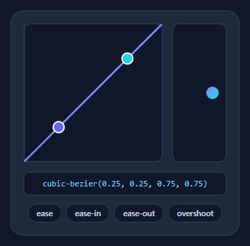
A bezier curve editor lets you shape a CSS cubic-bezier() easing by dragging two control points and watching the motion play in real time — the tool behind every "tweak the animation feel" workflow. This snippet builds a fully interactive one in SVG with draggable handles, a live ball preview, presets, and copyable output, in plain HTML, CSS, and vanilla JavaScript.
SVG curve, mapped to easing space
The editor draws a cubic Bézier path from the bottom-left (0,0) to the top-right (1,1) corner — the fixed endpoints of every CSS easing curve — with two draggable control points in between. The 200×200 SVG is mapped so x runs 0→1 left to right and y runs 0→1 bottom to top, with the conversion x/200 and (200 - y)/200. Crucially, the y axis is left unclamped so you can drag a handle above the top or below the bottom to create overshoot and anticipation curves (values outside 0–1), exactly like the bouncy cubic-bezier(0.34, 1.56, 0.64, 1).
Pointer dragging that works on touch
Handles use Pointer Events, so the same code drives mouse, trackpad, and touch. Pressing a handle attaches document-level pointermove/pointerup listeners, so the drag keeps tracking even when the cursor leaves the SVG — the detail that makes dragging feel solid. touch-action: none on the SVG stops the page scrolling while you drag on mobile.
Live preview that re-triggers
Below the curve, a ball animates left-to-right using the current easing. Every edit re-runs the animation: the script sets transition: none, resets the position, then on the next two animation frames applies the new cubic-bezier() and moves the ball — the double-rAF trick that forces the browser to restart a CSS transition. You feel the easing, not just see the curve, which is how you actually judge whether motion looks right.
Presets and copyable output
Chips load the named CSS easings (ease, ease-in, ease-out) plus an overshoot, instantly positioning the handles — a fast starting point you then fine-tune. The live cubic-bezier(…) string updates as you drag, rounded to three decimals, and clicking it copies it to the clipboard ready to paste into your CSS or a transition.
Keyboard accessible
Each handle is focusable with role="slider" and responds to arrow keys (Shift for larger steps), so the curve can be adjusted without a mouse. The whole editor is self-contained and dependency-free — a clean reference for building an easing picker into a design tool, theme editor, or animation playground.
Step by step
How to Use
- 1Paste HTML, CSS, and JSA curve editor renders with two handles and a ball preview.
- 2Drag the handlesMove the two control points to shape the easing; drag past the top for overshoot.
- 3Watch the previewThe ball replays with the new easing on every change.
- 4Try a presetChips load ease, ease-in, ease-out, and overshoot as starting points.
- 5Copy the valueClick the cubic-bezier() string to copy it for your CSS.
- 6Use the keyboardFocus a handle and nudge it with arrow keys (Shift for bigger steps).
Real-world uses
Common Use Cases
cubic-bezier() string once the curve feels right.Got questions?
Frequently Asked Questions
The SVG is 200×200 with the curve fixed from corner (0,0) to (1,1). Each handle's position converts to easing coordinates with x/200 across and (200 − y)/200 up, then rounds to three decimals. The two resulting (x, y) pairs are the four numbers in cubic-bezier(x1, y1, x2, y2), exactly what CSS expects.
Yes — drag a handle above the top edge or below the bottom edge of the box. The y coordinate is intentionally not clamped, so control points can exceed the 0–1 range, producing easings like cubic-bezier(0.34, 1.56, 0.64, 1) that overshoot and settle. The x coordinate is clamped to 0–1 because CSS requires it.
To feel an easing you have to see the motion, so the ball re-animates whenever the curve changes. Restarting a CSS transition mid-flight requires removing the transition, forcing a reflow, then reapplying it — done here with a double requestAnimationFrame so the browser registers the reset before the new transition. That is the reliable cross-browser way to retrigger a transition.
Yes. The handles use Pointer Events, which unify mouse and touch, and the move/up listeners are attached to the document so a drag keeps tracking even if your finger leaves the SVG. touch-action: none on the SVG prevents the page from scrolling while you drag a handle on a phone.
Hold the two control points in state and render the SVG path, handles, and cubic-bezier string from them. Move the pointer drag into handlers that update state (attach window listeners in an effect and clean them up), and drive the preview by toggling an inline transition. Tailwind users replace the classes with utilities; the coordinate math and transition-restart trick are unchanged.