
Bookmark Toggle — Free Save Button HTML CSS JS Snippet
Bookmark Toggle · Buttons · Plain HTML, CSS & JS · Live preview
Copy & paste
Source Code
<div class="bk-list" id="bkList"></div>*{box-sizing:border-box;margin:0;padding:0}
body{font-family:system-ui,-apple-system,sans-serif;background:#f1f5f9;color:#0f172a;display:flex;justify-content:center;padding:28px 18px}
.bk-list{width:100%;max-width:380px;display:flex;flex-direction:column;gap:10px}
.bk-item{display:flex;align-items:center;gap:12px;background:#fff;border:1px solid #e2e8f0;border-radius:12px;padding:12px 14px;box-shadow:0 10px 28px -22px rgba(0,0,0,.3)}
.bk-meta{min-width:0;flex:1}
.bk-title{font-size:13.5px;font-weight:700;white-space:nowrap;overflow:hidden;text-overflow:ellipsis}
.bk-sub{font-size:11.5px;color:#94a3b8;margin-top:2px}
.bk-btn{flex-shrink:0;width:38px;height:38px;border:1px solid #e2e8f0;border-radius:10px;background:#f8fafc;cursor:pointer;display:flex;align-items:center;justify-content:center;color:#94a3b8;transition:background .15s,color .15s,border-color .15s}
.bk-btn:hover{background:#f1f5f9;color:#64748b}
.bk-btn svg{width:19px;height:19px;transition:transform .25s cubic-bezier(.34,1.56,.64,1)}
.bk-btn .bk-flag{fill:none;stroke:currentColor;stroke-width:2;transition:fill .2s}
.bk-btn.on{color:#f59e0b;border-color:#fde68a;background:#fffbeb}
.bk-btn.on .bk-flag{fill:#f59e0b}
.bk-btn.pop svg{animation:bkPop .4s ease}
@keyframes bkPop{30%{transform:scale(1.35)}60%{transform:scale(.9)}}
.bk-count{font-size:11px;font-weight:700;color:#94a3b8;min-width:30px;text-align:left}var DATA = [
{ id: 1, title: 'Designing for accessibility', sub: 'a11y-weekly.com', saves: 1240, saved: false },
{ id: 2, title: 'The cost of abstraction', sub: 'engineering blog', saves: 884, saved: true },
{ id: 3, title: 'CSS container queries in depth', sub: 'web.dev', saves: 2310, saved: false },
{ id: 4, title: 'Writing better commit messages', sub: 'github guide', saves: 567, saved: false }
];
var list = document.getElementById('bkList');
var FLAG = '<svg viewBox="0 0 24 24"><path class="bk-flag" d="M6 3h12a1 1 0 0 1 1 1v17l-7-4-7 4V4a1 1 0 0 1 1-1z"></path></svg>';
function fmt(n) { return n >= 1000 ? (n / 1000).toFixed(1).replace('.0', '') + 'k' : String(n); }
DATA.forEach(function (item) {
var row = document.createElement('div');
row.className = 'bk-item';
var meta = document.createElement('div');
meta.className = 'bk-meta';
meta.innerHTML = '<div class="bk-title">' + item.title + '</div><div class="bk-sub">' + item.sub + '</div>';
var count = document.createElement('span');
count.className = 'bk-count';
var btn = document.createElement('button');
btn.type = 'button';
btn.className = 'bk-btn';
btn.innerHTML = FLAG;
btn.setAttribute('aria-label', 'Bookmark');
function paint(animate) {
btn.classList.toggle('on', item.saved);
btn.setAttribute('aria-pressed', item.saved ? 'true' : 'false');
count.textContent = fmt(item.saves);
if (animate && item.saved) {
btn.classList.remove('pop'); void btn.offsetWidth; btn.classList.add('pop');
}
}
btn.addEventListener('click', function () {
item.saved = !item.saved;
item.saves += item.saved ? 1 : -1; // optimistic count update
paint(true);
});
row.appendChild(meta); row.appendChild(count); row.appendChild(btn);
list.appendChild(row);
paint(false);
});Extend with AI
Take This Snippet Further With AI
The AI prompt for this one is for Patreon supporters ($3 a month, 7 days free), along with a site with no ads. Supporters enter the passcode once and it is remembered in this browser.
What's included
Features
About this UI Snippet
Bookmark Toggle — Animated Save Button with Count
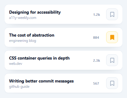
A bookmark toggle is the save-for-later button beside an article, product, or post — the flag or ribbon that fills when you tap it and tracks how many people saved the item. This snippet builds a polished, accessible one in plain HTML, CSS, and vanilla JavaScript: an outline-to-filled icon with a springy pop animation and an optimistic save count, all with no dependency.
Outline-to-filled with one SVG path
The icon is a single <path> whose fill is none by default and switches to the accent color when saved — toggled purely by an .on class on the button. There's no icon swap or second graphic: the same flag morphs from outline to solid via CSS, which keeps the markup tiny and the transition (fill .2s) clean.
A spring "pop" on save
When you bookmark an item the icon plays a bkPop keyframe — scaling up past 1 then settling — using a cubic-bezier(.34,1.56,.64,1) overshoot ease that gives it a tactile, rewarding snap. The animation is restarted reliably with the void btn.offsetWidth reflow trick so it replays on every save, and it only fires on the save direction (not un-save) to reinforce the positive action.
Optimistic count updates
Clicking flips item.saved and immediately adjusts item.saves by ±1, then re-renders — the count moves the instant you tap rather than waiting for a server round-trip. This optimistic pattern is what makes save buttons feel responsive; in production you'd POST the change and only roll back if the request fails. A fmt() helper abbreviates large counts (1240 → 1.2k) the way social UIs do.
Accessible toggle semantics
Each button is a real <button> with aria-label and an aria-pressed that reflects the saved state, so screen readers announce "Bookmark, pressed" and keyboard users can Tab and toggle with Enter or Space — no roles or key handling to wire up.
Per-item encapsulation
Each row builds its own paint() closure over its data, so state stays local to the item and there's no shared lookup or re-render of the whole list on every click. That structure scales to long feeds and maps directly onto a component model where each card owns its saved state.
Step by step
How to Use
- 1Paste HTML, CSS, and JSA list of items renders, each with a save count and a bookmark button.
- 2Click the bookmarkThe flag fills with color and pops with a springy animation.
- 3Watch the countThe save count increments immediately as an optimistic update.
- 4Click again to un-saveThe flag returns to an outline and the count decrements.
- 5Tab and press EnterThe button is keyboard operable with an aria-pressed state.
- 6Wire to your APIPOST the change inside the click handler and roll back on error.
Real-world uses
Common Use Cases
.on class on the same SVG path.aria-pressed conveys state and the displayed number moves plus or minus one.Got questions?
Frequently Asked Questions
The bookmark is a single SVG path with fill: none. Adding an .on class to the button sets fill to the accent color with a short CSS transition, so the same outline shape becomes solid. There's no second icon or image — one path handles both states.
Clicking immediately flips the saved flag and adjusts the count by plus or minus one before any network call, so the number reacts the instant you tap. In production you'd send the change to your server in the same handler and only revert if the request fails, which keeps the UI feeling instant.
The pop is a positive reinforcement for the save action, so paint() triggers it only when the new state is saved, not when un-saving. It's restarted with the void offsetWidth reflow trick so it replays reliably on every save rather than only the first time.
Yes. Each control is a native button with an aria-label and an aria-pressed attribute that mirrors the saved state, so assistive tech announces it as a pressed or unpressed toggle. Being a real button, it's focusable and operable with Enter or Space without any extra key handling.
Hold the saved flag and count in state per item and bind the .on class and aria-pressed to it. Do the optimistic ±1 in the click handler alongside your API call. For the pop, toggle an animation class with a key change or by removing and re-adding it. In Tailwind, switch the path fill with a conditional class on the saved state.