



Bootstrap Feature Flag Toggle Panel — Free HTML CSS JS Snippet
Bootstrap Feature Flag Toggle Panel · Dashboards · Plain HTML, CSS & JS · Live preview
Copy & paste
Source Code
<div class="container py-5 d-flex justify-content-center">
  <div class="card bsflag-card">
    <div class="card-body p-3">
      <h6 class="fw-bold mb-2">Feature flags</h6>
      <ul class="list-unstyled mb-0" id="bsflagList"></ul>
    </div>
  </div>
</div>
.bsflag-card { width: 400px; max-width: 100%; border: 1px solid #eceef1; border-radius: 14px; }
.bsflag-row { padding: 10px 0; border-bottom: 1px solid #f1f2f5; }
.bsflag-row:last-child { border-bottom: none; }
.bsflag-top { display: flex; justify-content: space-between; align-items: center; }
.bsflag-name { font-size: 13.5px; font-weight: 600; }
.bsflag-desc { font-size: 11.5px; color: #9ca3af; }
.bsflag-rollout { margin-top: 6px; }
.bsflag-rollout.d-none { display: none; }const FLAGS = [
{ id: 'new-nav', name: 'New navigation', desc: 'Redesigned top nav with mega menu', on: true, rollout: 100 },
{ id: 'ai-summary', name: 'AI summaries', desc: 'Auto-generated summaries on reports', on: true, rollout: 25 },
{ id: 'dark-mode', name: 'Dark mode', desc: 'System-aware dark theme', on: false, rollout: 0 },
{ id: 'bulk-export', name: 'Bulk export', desc: 'Export more than 500 rows at once', on: false, rollout: 0 },
];
const list = document.getElementById('bsflagList');
let flags = FLAGS.map(f => ({ ...f }));
function render() {
list.innerHTML = flags.map(f =>
'<li class="bsflag-row" data-id="' + f.id + '">' +
'<div class="bsflag-top">' +
'<div><div class="bsflag-name">' + f.name + '</div><div class="bsflag-desc">' + f.desc + '</div></div>' +
'<div class="form-check form-switch mb-0">' +
'<input class="form-check-input bsflag-toggle" type="checkbox" role="switch" data-id="' + f.id + '"' + (f.on ? ' checked' : '') + '>' +
'</div>' +
'</div>' +
'<div class="bsflag-rollout' + (f.on ? '' : ' d-none') + '">' +
'<div class="d-flex justify-content-between small text-muted mb-1">' +
'<span>Rollout</span><span>' + f.rollout + '%</span>' +
'</div>' +
'<input type="range" class="form-range bsflag-slider" min="0" max="100" value="' + f.rollout + '" data-id="' + f.id + '">' +
'</div>' +
'</li>'
).join('');
}
list.addEventListener('change', e => {
if (!e.target.classList.contains('bsflag-toggle')) return;
const flag = flags.find(f => f.id === e.target.dataset.id);
flag.on = e.target.checked;
// Turning a flag off resets its rollout to 0 rather than leaving a stale
// percentage that would be misleading the next time it's switched back on.
if (!flag.on) flag.rollout = 0;
else if (flag.rollout === 0) flag.rollout = 100;
render();
});
list.addEventListener('input', e => {
if (!e.target.classList.contains('bsflag-slider')) return;
const flag = flags.find(f => f.id === e.target.dataset.id);
flag.rollout = Number(e.target.value);
const label = e.target.closest('.bsflag-rollout').querySelector('span:last-child');
label.textContent = flag.rollout + '%';
});
render();Extend with AI
Take This Snippet Further With AI
The AI prompt for this one is for Patreon supporters ($3 a month, 7 days free), along with a site with no ads. Supporters enter the passcode once and it is remembered in this browser.
What's included
Features
About this UI Snippet
Bootstrap Feature Flag Toggle Panel — HTML, CSS & JavaScript
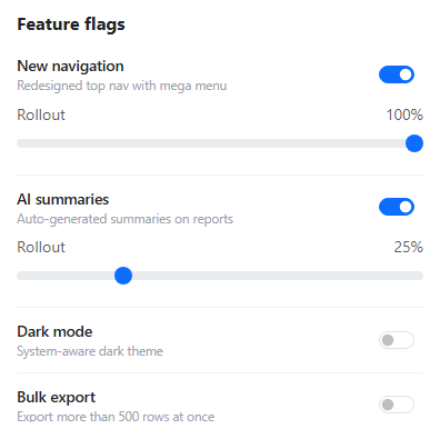
Each flag is a small object carrying both an on boolean and a rollout percentage, and the two are kept honest with respect to each other rather than tracked independently — switching a flag off sets rollout = 0, since a disabled flag showing a stale "25%" the next time someone glances at it would misrepresent what's actually happening in production. Switching a flag back on from a zeroed rollout jumps it to 100%, on the assumption that re-enabling a flag most often means "turn it back on for everyone," not "quietly resume some old partial rollout."
The rollout slider only renders at all while its flag is on — d-none toggles alongside the switch's own checked state — so there's no way to see (or accidentally drag) a rollout percentage for a flag that's currently off, which would be a meaningless value to display or edit in the first place.
The switch and the slider are handled by two separate, narrowly-scoped listeners on the same list — one listening for change events matching .bsflag-toggle, the other for input events matching .bsflag-slider — using event delegation on the parent <ul> rather than attaching a listener to every individual row, so newly rendered rows are automatically covered without re-binding anything after every render() call.
Step by step
How to Use
- 1Load the snippetFour flags show, two enabled with visible rollout sliders and two disabled with no slider showing.
- 2Drag the "AI summaries" rollout sliderThe percentage label updates live as you drag, without needing to release first.
- 3Turn off "New navigation"Its rollout slider disappears entirely, and its rollout resets to 0% internally.
- 4Turn "New navigation" back onIt jumps straight to 100% rollout rather than an ambiguous or stale prior value.
- 5Turn on "Dark mode"Its rollout slider appears fresh, ready to be adjusted from 100%.
Real-world uses
Common Use Cases
Got questions?
Frequently Asked Questions
A disabled flag with a leftover "25%" showing (even if hidden from view) would misrepresent the flag's actual state the next time someone re-enables it and expects a fresh decision, not a silently resumed old value.
This demo treats re-enabling as a deliberate "turn it back on" decision defaulting to full rollout; a real system might instead ask explicitly, or genuinely remember the last rollout value if that behavior is preferred — both are reasonable, differing product decisions.
Live — it listens for the "input" event, which fires continuously while dragging, rather than "change", which only fires once the drag ends.
Yes. Keep the flags array in component state, update the relevant flag's on/rollout fields immutably on toggle or slider change, and conditionally render the rollout slider based on that flag's on value.