



Bootstrap Social Login Buttons — Free HTML CSS JS Snippet
Bootstrap Social Login Buttons · Buttons · Plain HTML, CSS & JS · Live preview
Copy & paste
Source Code
<div class="container py-5 d-flex justify-content-center">
<div class="card bssoc-card">
<div class="card-body p-4">
<h5 class="fw-bold mb-1 text-center">Continue with</h5>
<p class="text-muted small mb-4 text-center">Choose a provider to sign in.</p>
<div class="d-grid gap-2">
<button class="btn btn-outline-dark bssoc-btn d-flex align-items-center justify-content-center" data-provider="Google">
<span class="bssoc-icon me-2">
<svg width="18" height="18" viewBox="0 0 18 18"><path fill="#4285F4" d="M17.64 9.2c0-.64-.06-1.25-.16-1.84H9v3.48h4.84a4.14 4.14 0 0 1-1.8 2.72v2.26h2.91c1.7-1.57 2.69-3.88 2.69-6.62z"/><path fill="#34A853" d="M9 18c2.43 0 4.47-.8 5.96-2.18l-2.91-2.26c-.81.54-1.84.86-3.05.86-2.34 0-4.33-1.58-5.04-3.71H.94v2.33A9 9 0 0 0 9 18z"/><path fill="#FBBC05" d="M3.96 10.71A5.4 5.4 0 0 1 3.68 9c0-.59.1-1.17.28-1.71V4.96H.94A9 9 0 0 0 0 9c0 1.45.35 2.83.94 4.04l3.02-2.33z"/><path fill="#EA4335" d="M9 3.58c1.32 0 2.5.45 3.44 1.35l2.58-2.58C13.46.89 11.43 0 9 0A9 9 0 0 0 .94 4.96l3.02 2.33C4.67 5.16 6.66 3.58 9 3.58z"/></svg>
</span>
<span class="bssoc-label">Continue with Google</span>
<span class="spinner-border spinner-border-sm ms-2 d-none" role="status" aria-hidden="true"></span>
</button>
<button class="btn btn-dark bssoc-btn d-flex align-items-center justify-content-center" data-provider="GitHub">
<span class="bssoc-icon me-2">
<svg width="18" height="18" viewBox="0 0 16 16" fill="#fff"><path d="M8 0C3.58 0 0 3.58 0 8c0 3.54 2.29 6.53 5.47 7.59.4.07.55-.17.55-.38 0-.19-.01-.82-.01-1.49-2.01.37-2.53-.49-2.69-.94-.09-.23-.48-.94-.82-1.13-.28-.15-.68-.52-.01-.53.63-.01 1.08.58 1.23.82.72 1.21 1.87.87 2.33.66.07-.52.28-.87.51-1.07-1.78-.2-3.64-.89-3.64-3.95 0-.87.31-1.59.82-2.15-.08-.2-.36-1.02.08-2.12 0 0 .67-.21 2.2.82a7.6 7.6 0 0 1 4 0c1.53-1.04 2.2-.82 2.2-.82.44 1.1.16 1.92.08 2.12.51.56.82 1.27.82 2.15 0 3.07-1.87 3.75-3.65 3.95.29.25.54.73.54 1.48 0 1.07-.01 1.93-.01 2.2 0 .21.15.46.55.38A8.01 8.01 0 0 0 16 8c0-4.42-3.58-8-8-8z"/></svg>
</span>
<span class="bssoc-label">Continue with GitHub</span>
<span class="spinner-border spinner-border-sm ms-2 d-none" role="status" aria-hidden="true"></span>
</button>
<button class="btn btn-primary bssoc-btn d-flex align-items-center justify-content-center" data-provider="Facebook">
<span class="bssoc-icon me-2">
<svg width="18" height="18" viewBox="0 0 24 24" fill="#fff"><path d="M22 12.06C22 6.5 17.52 2 12 2S2 6.5 2 12.06c0 5 3.66 9.15 8.44 9.94v-7.03H7.9v-2.91h2.54V9.85c0-2.51 1.49-3.9 3.77-3.9 1.09 0 2.24.2 2.24.2v2.47h-1.26c-1.24 0-1.63.77-1.63 1.56v1.88h2.78l-.44 2.91h-2.34V22c4.78-.79 8.44-4.94 8.44-9.94z"/></svg>
</span>
<span class="bssoc-label">Continue with Facebook</span>
<span class="spinner-border spinner-border-sm ms-2 d-none" role="status" aria-hidden="true"></span>
</button>
<button class="btn btn-outline-dark bssoc-btn d-flex align-items-center justify-content-center" data-provider="Apple">
<span class="bssoc-icon me-2">
<svg width="16" height="18" viewBox="0 0 14 18" fill="#000"><path d="M11.6 9.5c-.02-2 1.63-2.96 1.7-3.01-.93-1.36-2.38-1.55-2.9-1.57-1.23-.13-2.4.72-3.03.72-.62 0-1.58-.7-2.6-.68-1.34.02-2.57.78-3.26 1.98-1.4 2.42-.36 6 1 7.97.67.96 1.46 2.04 2.5 2 1-.04 1.38-.65 2.6-.65 1.21 0 1.55.65 2.6.63 1.08-.02 1.76-.98 2.42-1.95.76-1.12 1.08-2.2 1.09-2.26-.02-.01-2.1-.81-2.12-3.18zM9.87 3.35c.55-.67.92-1.6.82-2.53-.79.03-1.75.53-2.32 1.19-.51.59-.96 1.54-.84 2.44.88.07 1.79-.44 2.34-1.1z"/></svg>
</span>
<span class="bssoc-label">Continue with Apple</span>
<span class="spinner-border spinner-border-sm ms-2 d-none" role="status" aria-hidden="true"></span>
</button>
</div>
<p class="small text-center mt-3 mb-0" id="bssocStatus"> </p>
</div>
</div>
</div>.bssoc-card { width: 380px; border: 1px solid #eceef1; border-radius: 14px; }
.bssoc-btn { position: relative; font-weight: 600; padding: .55rem 1rem; }
.bssoc-btn:disabled { opacity: .85; }
.bssoc-icon svg { display: block; }const buttons = Array.from(document.querySelectorAll('.bssoc-btn'));
const status = document.getElementById('bssocStatus');
// Clicking one provider button disables all of them for the duration of the
// simulated redirect, so a user can't fire off two competing auth flows.
buttons.forEach(btn => {
btn.addEventListener('click', () => {
const provider = btn.dataset.provider;
const label = btn.querySelector('.bssoc-label');
const spinner = btn.querySelector('.spinner-border');
const originalText = label.textContent;
buttons.forEach(b => (b.disabled = true));
label.textContent = 'Connecting to ' + provider + '…';
spinner.classList.remove('d-none');
status.textContent = '\u00a0';
setTimeout(() => {
buttons.forEach(b => (b.disabled = false));
label.textContent = originalText;
spinner.classList.add('d-none');
status.textContent = 'Simulated ' + provider + ' sign-in complete.';
status.className = 'small text-center mt-3 mb-0 text-success';
}, 1600);
});
});Extend with AI
Take This Snippet Further With AI
The AI prompt for this one is for Patreon supporters ($3 a month), along with a site with no ads. Supporters enter the passcode once and it is remembered in this browser.
What's included
Features
About this UI Snippet
Bootstrap Social Login Buttons — HTML, CSS & JavaScript
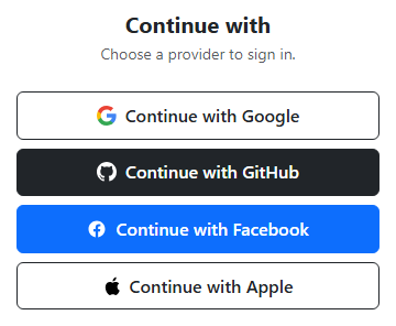
Each provider button here is a genuine Bootstrap btn — btn-outline-dark for Google and Apple, btn-dark for GitHub, btn-primary for Facebook — stacked full-width inside a d-grid gap-2 container, which is Bootstrap's own recommended pattern for evenly spaced stacked buttons rather than manual margins. Each brand icon is inline <svg> markup with the provider's real multi-color paths (Google's four-color mark, GitHub's octocat silhouette, Facebook's "f", and Apple's logo), so nothing depends on an external icon font or image request — the icons render immediately and scale cleanly at any size.
The interactive piece is the loading state. Every button already contains a Bootstrap spinner-border spinner-border-sm element with d-none applied, so it exists in the DOM from the start but stays invisible until needed. A single click handler is attached to all four buttons in a loop; on click it reads the provider name from a data-provider attribute, swaps the button's .bssoc-label text to "Connecting to Google…" (using the real provider name, not a generic placeholder), removes d-none from that button's spinner, and — importantly — sets disabled = true on every button in the group, not just the one clicked. That prevents a user from starting a second, competing auth attempt with a different provider while the first is still "in flight," which would be a realistic bug in a naive implementation that only disabled the clicked button.
After a setTimeout of 1600ms simulates the redirect round-trip, the handler restores the original label text (captured up front as originalText before it was overwritten, rather than hardcoding the string back), re-hides the spinner, re-enables all four buttons, and writes a success message into #bssocStatus naming the exact provider that was used. Using the captured originalText variable instead of retyping "Continue with Google" avoids a subtle bug where a copy-paste change to the button's label in HTML would silently desync from a hardcoded revert string in the JS.
Styling stays intentionally light: .bssoc-btn only adds position: relative (so a future absolutely-positioned spinner overlay would have a containing block) and font-weight/padding tweaks, and .bssoc-icon svg { display: block } removes the small inline-baseline gap browsers add under inline SVGs so the icon sits centered against the text. Everything else — colors, borders, spacing, the spinner animation itself — is stock Bootstrap.
The click handler is attached once, in a single buttons.forEach(btn => btn.addEventListener(...)) loop, rather than four separate near-duplicate handlers written out individually for Google, GitHub, Facebook, and Apple. That structure is what makes the "disable every button, not just the clicked one" behavior trivial to implement correctly: inside the shared handler, buttons.forEach(b => (b.disabled = true)) runs against the same array the loop was built from, so adding a fifth provider button later automatically participates in the same disable-all/re-enable-all logic with zero additional JavaScript. Each button's own querySelector('.bssoc-label') and querySelector('.spinner-border') calls scope the DOM lookups to that specific button rather than the whole document, which avoids a subtle bug where a naive document.querySelector call would always find and animate the first spinner in the page regardless of which button was actually clicked.
Step by step
How to Use
- 1Load the snippetFour full-width buttons appear stacked in a card: Google, GitHub, Facebook, and Apple, each with its real brand icon.
- 2Click "Continue with Google"That button's text changes to "Connecting to Google…" and a small spinner appears inside it next to the label.
- 3Try clicking a different button while it spinsEvery button is disabled during the simulated redirect, so no other provider can be started at the same time.
- 4Wait about 1.6 secondsThe spinner disappears, the button label reverts to its original text, and all buttons re-enable.
- 5Check the status line below the buttonsIt confirms which provider "completed" sign-in, naming the exact provider you clicked.
Real-world uses
Common Use Cases
Got questions?
Frequently Asked Questions
No — this is a front-end demo that simulates the loading state with a setTimeout. In production, the click handler would redirect to the provider's real OAuth authorization URL or open a popup, and the spinner would stay visible until that flow actually returns.
Yes. In React, track a loading provider in useState and render the spinner conditionally instead of toggling d-none directly; in Vue, use a reactive loading ref with v-if on the spinner; in Angular, bind [disabled] and *ngIf to a component property set inside the click handler, calling your real auth service instead of setTimeout.
To prevent starting two competing authentication redirects at once — if only the clicked button were disabled, a user could click a second provider mid-flow, which would be confusing and could leave the app in an inconsistent auth state.
They are inline SVG paths matching each provider's actual brand mark (Google's four-color G, GitHub's mark, Facebook's f, and Apple's logo), so they render crisply at any size with zero external requests and no icon-font dependency.
Keep the HTML structure and JS logic as-is, then replace the Bootstrap btn/btn-outline-dark/btn-dark/btn-primary classes with Tailwind utilities like w-full flex items-center justify-center rounded-lg border px-4 py-2 font-semibold, and swap spinner-border for a Tailwind-based spin animation.
Yes — duplicate one of the existing button blocks, swap in the provider's SVG icon and data-provider value, and the shared click handler (attached via a loop over .bssoc-btn) will automatically pick up the new button with no other JS changes.