


Border Beam — Free HTML CSS JS Traveling Border Snippet
Border Beam · Cards · Plain HTML, CSS & JS · Live preview
Copy & paste
Source Code
<div class="bm-stage">
  <article class="bm-card">
    <span class="bm-beam" aria-hidden="true"></span>
    <span class="bm-beam bm-beam2" aria-hidden="true"></span>
    <div class="bm-body">
      <div class="bm-icon">◆</div>
      <h3>Pro plan</h3>
      <p>A bead of light travels the card border on an SVG-free, GPU-friendly path.</p>
      <button type="button" class="bm-btn">Upgrade</button>
    </div>
  </article>
</div>*{box-sizing:border-box;margin:0;padding:0}
body{font-family:system-ui,-apple-system,sans-serif;background:#07070f;color:#fff;display:flex;justify-content:center;align-items:center;min-height:100vh;padding:24px}
.bm-card{position:relative;width:300px;border-radius:18px;background:#10101e;border:1px solid #232338;padding:26px;overflow:hidden;isolation:isolate}
/* A small bright bead is offset-anchored to the rounded-rect border path and
travels it on a loop, leaving a fading comet tail. */
.bm-beam{position:absolute;top:0;left:0;width:90px;height:5px;border-radius:5px;
background:linear-gradient(90deg,transparent,#6366f1,#a78bfa,transparent);
offset-path:rect(0 100% 100% 0 round 18px);
offset-distance:0%;offset-rotate:auto;
filter:drop-shadow(0 0 6px rgba(129,140,248,.9));
animation:bmRun 4s linear infinite}
.bm-beam2{background:linear-gradient(90deg,transparent,#22d3ee,#34d399,transparent);animation-delay:-2s}
@keyframes bmRun{to{offset-distance:100%}}
.bm-body{position:relative;z-index:1}
.bm-icon{width:46px;height:46px;border-radius:12px;background:rgba(99,102,241,.16);border:1px solid rgba(99,102,241,.4);display:flex;align-items:center;justify-content:center;font-size:20px;color:#c7d2fe;margin-bottom:16px}
.bm-card h3{font-size:20px;font-weight:800;margin-bottom:8px}
.bm-card p{font-size:13.5px;color:#a3a3c2;line-height:1.6;margin-bottom:18px}
.bm-btn{width:100%;background:#6366f1;color:#fff;border:none;border-radius:11px;padding:12px;font-family:inherit;font-size:14px;font-weight:700;cursor:pointer;transition:background .2s}
.bm-btn:hover{background:#4f46e5}// The beam is pure CSS (offset-path). This script provides a fallback for the
// rare browser without CSS Motion Path: it animates a beam manually on a loop.
var supportsPath = CSS && CSS.supports && CSS.supports('offset-path', 'rect(0 100% 100% 0)');
if (!supportsPath) {
document.querySelectorAll('.bm-beam').forEach(function (beam, idx) {
var card = beam.closest('.bm-card');
var t = idx * 0.5;
function frame() {
var r = card.getBoundingClientRect();
var w = r.width, h = r.height, per = 2 * (w + h);
var d = (t % 1) * per; // position along the perimeter
var x, y;
if (d < w) { x = d; y = 0; }
else if (d < w + h) { x = w; y = d - w; }
else if (d < 2 * w + h) { x = w - (d - w - h); y = h; }
else { x = 0; y = h - (d - 2 * w - h); }
beam.style.transform = 'translate(' + (x - 45) + 'px,' + (y - 2) + 'px)';
t += 0.0025;
requestAnimationFrame(frame);
}
requestAnimationFrame(frame);
});
}Extend with AI
Take This Snippet Further With AI
The AI prompt for this one is for Patreon supporters ($3 a month), along with a site with no ads. Supporters enter the passcode once and it is remembered in this browser.
What's included
Features
About this UI Snippet
Border Beam — A Light Bead Tracing the Card Border
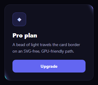
The border beam is the popular accent where a small bright bead of light travels continuously around a card border, tracing the rounded rectangle like a comet on a track. This snippet builds it primarily with CSS Motion Path — the modern offset-path API — so the beam follows the exact border with almost no code, and it includes a JavaScript fallback for older browsers.
CSS Motion Path does the work
The beam is a small gradient pill, and its position is controlled by offset-path: rect(0 100% 100% 0 round 18px), which defines a rounded-rectangle track matching the card border. Animating offset-distance from 0% to 100% slides the beam along that path, and offset-rotate: auto keeps the pill oriented along the direction of travel, so it banks around the corners naturally. This is the entire animation — no SVG path, no per-frame JavaScript, and the browser composites it on the GPU.
A comet, not a dot
The bead is a 90px-wide pill with a linear-gradient that fades from transparent to bright and back, plus a colored drop-shadow. Because it is elongated and oriented along the path, it reads as a streak of light with a glowing head rather than a plain dot — the comet look. A second beam with a different color and a -2s animation delay travels the same path on the opposite side, so two beams chase each other around the border.
Confined to the card
The card uses overflow: hidden and isolation: isolate, so the beams and their glow are clipped to the rounded shape and the stacking context stays self-contained. The card body sits above the beams via z-index, so the light passes behind the content along the edge without obscuring the icon, text, or button.
The fallback
CSS Motion Path is widely supported, but the script checks CSS.supports('offset-path', ...) and, only if unsupported, animates each beam manually. The fallback computes the card perimeter and walks a position parameter around it each frame, mapping the distance to x/y coordinates along the four edges and translating the beam there. This guarantees the effect still runs everywhere, while modern browsers get the cheaper pure-CSS path. Most users never execute the fallback at all.
Why offset-path over alternatives
Older border-light effects rotate a huge conic gradient behind a masked panel (like a spinning ring) or animate an SVG stroke. offset-path is more precise — the beam genuinely follows the border including the corner radius — and lighter, since it animates a single property on a tiny element. It also makes the speed and direction trivial to control through the animation, and supports multiple independent beams on one path.
Customizing it
Change the round radius in offset-path to match your card, recolor the beam gradients, lengthen the pill for a longer tail, retime the loop for a faster or slower orbit, or add more beams with staggered delays. Use it on buttons or inputs by giving them the same beam and a matching path. Pair it with a shimmer button or a meteor card for a coordinated set of glowing components.
Step by step
How to Use
- 1Paste HTML, CSS, and JSA card renders with a bead of light circling its border.
- 2Watch the beamIt traces the rounded rectangle and banks around corners.
- 3Spot the second beamA different-colored beam chases it from the opposite side.
- 4Match your radiusSet the offset-path round value to your card radius.
- 5Recolor the beamsEdit the gradient colors and glow.
- 6Add more beamsDuplicate with staggered animation delays.
Real-world uses
Common Use Cases
offset-path so the beam follows the exact rounded border.offset-rotate banking the bead around corners.Got questions?
Frequently Asked Questions
The beam uses CSS Motion Path: offset-path defines a rounded-rectangle track matching the card border, and animating offset-distance from 0% to 100% slides the beam along it. offset-rotate: auto keeps the pill oriented along the direction of travel so it banks around the corners. That single animation is the whole effect — no SVG and no per-frame JavaScript.
The bead is a 90px-wide pill filled with a gradient that fades from transparent to bright and back, plus a colored drop-shadow. Because it is elongated and oriented along the path, it reads as a streak of light with a glowing head rather than a round dot, giving the comet appearance.
The script checks CSS.supports for offset-path and, only when it is unsupported, animates each beam manually. The fallback computes the card perimeter and walks a position around the four edges each frame, translating the beam to the matching x/y. Modern browsers skip this entirely and use the cheaper pure-CSS path.
A conic-gradient ring spins a large element behind a mask, which approximates a border. offset-path is more precise — the beam genuinely follows the border including the corner radius — and lighter, animating one property on a tiny element. It also supports multiple independent beams on the same path with staggered delays.
The CSS, including offset-path, ports directly — wrap it in a component and set the path radius to match your card. Run the support check and fallback in a mount effect with cleanup that cancels the animation frame on unmount, using refs for the beams. In Tailwind, apply the offset-path and animation via arbitrary values and keep the fallback in the component logic.