


Direction-Aware Hover — Free HTML CSS JS Reveal Snippet
Direction-Aware Hover · Cards · Plain HTML, CSS & JS · Live preview
Copy & paste
Source Code
<div class="da-grid" id="daGrid">
  <article class="da-card" style="--bg:linear-gradient(135deg,#6366f1,#0a0a18)"><div class="da-overlay"><h3>Aurora</h3><p>View set →</p></div></article>
  <article class="da-card" style="--bg:linear-gradient(135deg,#ec4899,#0a0a18)"><div class="da-overlay"><h3>Ember</h3><p>View set →</p></div></article>
  <article class="da-card" style="--bg:linear-gradient(135deg,#22d3ee,#0a0a18)"><div class="da-overlay"><h3>Tide</h3><p>View set →</p></div></article>
  <article class="da-card" style="--bg:linear-gradient(135deg,#34d399,#0a0a18)"><div class="da-overlay"><h3>Fern</h3><p>View set →</p></div></article>
</div>*{box-sizing:border-box;margin:0;padding:0}
body{font-family:system-ui,-apple-system,sans-serif;background:#0a0a18;color:#fff;display:flex;justify-content:center;align-items:center;min-height:100vh;padding:24px}
.da-grid{display:grid;grid-template-columns:repeat(2,1fr);gap:16px;width:100%;max-width:560px}
.da-card{position:relative;aspect-ratio:4/3;border-radius:16px;background:var(--bg);overflow:hidden;cursor:pointer}
.da-overlay{position:absolute;inset:0;display:flex;flex-direction:column;justify-content:flex-end;gap:4px;padding:20px;background:linear-gradient(0deg,rgba(8,8,18,.92),rgba(8,8,18,.4));
/* start position is set inline by JS based on entry direction */
transform:translate(var(--tx,0),var(--ty,100%));transition:transform .35s cubic-bezier(.4,0,.2,1)}
.da-card:hover .da-overlay,.da-card.show .da-overlay{transform:translate(0,0)}
.da-overlay h3{font-size:20px;font-weight:800}
.da-overlay p{font-size:13px;color:#c7c7dd}
@media(max-width:460px){.da-grid{grid-template-columns:1fr}}var cards = Array.prototype.slice.call(document.querySelectorAll('.da-card'));
// Determine which edge (top/right/bottom/left) the pointer crossed by comparing
// the entry point to the card center, then set the overlay's start offset so it
// slides IN from that edge — and slides back OUT the same edge on exit.
function edge(card, e) {
var r = card.getBoundingClientRect();
var x = (e.clientX - r.left) / r.width - 0.5;
var y = (e.clientY - r.top) / r.height - 0.5;
// angle-free quadrant test using which magnitude dominates
if (Math.abs(x) > Math.abs(y)) return x > 0 ? 'right' : 'left';
return y > 0 ? 'bottom' : 'top';
}
function setStart(card, dir) {
var map = {
top: ['0', '-100%'], bottom: ['0', '100%'],
left: ['-100%', '0'], right: ['100%', '0']
};
card.style.setProperty('--tx', map[dir][0]);
card.style.setProperty('--ty', map[dir][1]);
}
cards.forEach(function (card) {
card.addEventListener('pointerenter', function (e) {
setStart(card, edge(card, e));
// next frame: hover rule animates it to translate(0,0)
requestAnimationFrame(function () { card.classList.add('show'); });
});
card.addEventListener('pointerleave', function (e) {
card.classList.remove('show');
setStart(card, edge(card, e)); // exit toward the leaving edge
});
});Extend with AI
Take This Snippet Further With AI
The AI prompt for this one is for Patreon supporters ($3 a month), along with a site with no ads. Supporters enter the passcode once and it is remembered in this browser.
What's included
Features
About this UI Snippet
Direction-Aware Hover — Overlays That Enter From the Cursor Edge
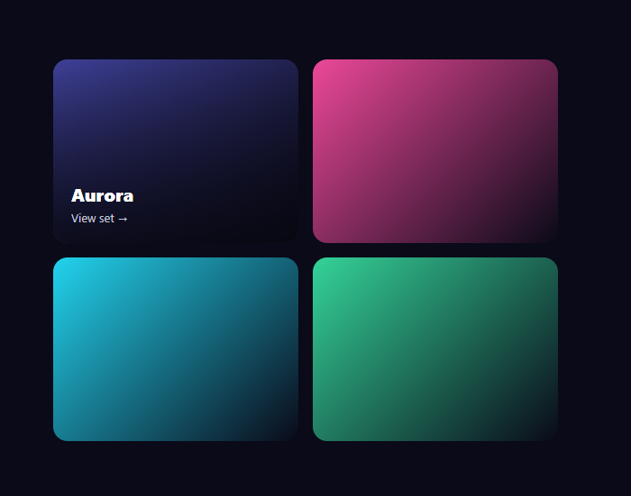
Direction-aware hover is the refined gallery effect where a card's caption overlay slides in from the precise edge your cursor crossed — enter from the left and it comes from the left, enter from the bottom and it rises up — and then slides back out toward whichever edge you leave by. This snippet implements that classic interaction with plain HTML, CSS, and a small vanilla JavaScript edge detector.
Detecting the entry edge
The whole effect hinges on knowing which side the pointer crossed. On pointerenter, the edge() function reads the cursor's position relative to the card center as -0.5…0.5 fractions on each axis, then asks which magnitude dominates: if the horizontal offset is larger, the pointer came from the left or right; otherwise from the top or bottom. The sign picks the specific edge. This dominant-axis test is a fast, trig-free way to classify entry into one of four directions accurately.
Driving the slide with two variables
The overlay's start position is two CSS custom properties, --tx and --ty. setStart() maps the detected edge to an off-screen offset — (-100%, 0) for left, (0, 100%) for bottom, and so on — so the overlay is parked just outside the matching edge. The CSS transitions transform: translate(var(--tx), var(--ty)) to translate(0, 0) when the .show class is added, sliding the overlay in from exactly that side. Passing the geometry through variables keeps the animation itself a single CSS rule.
The next-frame trigger
After setting the start offset, the code adds .show inside a requestAnimationFrame callback. That one-frame gap lets the browser register the overlay at its off-screen start before the transition target is applied, so the slide animates rather than jumping straight to visible. It's the same double-frame technique used for any "set start, then animate" CSS transition.
Exiting toward the leaving edge
On pointerleave, the code removes .show and recomputes the edge from the exit point, setting --tx/--ty to that side. Because .show is gone, the overlay transitions back to its start offset — which now points at the edge you left through — so it slides out the way you exited. This symmetry (in from entry, out toward exit) is what makes the effect feel physically correct rather than scripted.
A reusable grid
Each card is a simple gradient tile with an overlay containing a title and a call-to-action, set up identically, so the same handlers apply to every card in the grid via a shared loop. The background is themed per card through an inline --bg variable, and the grid collapses to a single column on narrow screens.
Customizing it
Swap the gradient tiles for real images, change the overlay content and its background scrim, adjust the .35s transition for a faster or slower slide, or change the easing. Because the direction logic is generic, you can apply it to any hoverable element. Pair it with a focus cards grid or an Instagram gallery for a polished media section.
Step by step
How to Use
- 1Paste HTML, CSS, and JSA grid of four gradient cards renders with hidden overlays.
- 2Enter a card from the leftThe caption overlay slides in from the left.
- 3Enter from the bottomThe overlay rises up from the bottom edge instead.
- 4Leave the cardThe overlay slides out toward the edge you exit by.
- 5Swap in imagesReplace the gradient tiles with real photos.
- 6Tune the slideAdjust the transition duration and easing.
Real-world uses
Common Use Cases
--tx and --ty variables setting the starting offset per edge.Got questions?
Frequently Asked Questions
On pointerenter, the edge() function reads the cursor's position relative to the card center as -0.5 to 0.5 on each axis and checks which magnitude is larger. If horizontal dominates, entry was left or right; otherwise top or bottom, with the sign choosing the exact edge. This dominant-axis comparison classifies the direction without any trigonometry.
The detected edge maps to an off-screen offset stored in two CSS variables, --tx and --ty, so the overlay is parked just outside that edge. The CSS transitions translate(var(--tx), var(--ty)) to translate(0,0) when the show class is added, animating the overlay in from exactly the side the cursor crossed.
On pointerleave the code removes the show class and recomputes the edge from the exit point, setting --tx/--ty to that side. With show gone, the overlay transitions back to its start offset — now pointing at the exit edge — so it leaves the way you went out. That in-from-entry, out-toward-exit symmetry makes it feel physically correct.
After setting the off-screen start offset, the browser needs to paint that start state before the animation target is applied, or it would jump straight to visible. Deferring the class to the next frame with requestAnimationFrame guarantees the start position is registered first, so the slide actually animates.
Render the cards from data and attach pointerenter and pointerleave handlers that compute the edge and set the --tx/--ty inline style and a show state per card. Use refs to measure each card. The transition CSS stays the same. In Tailwind, drive the overlay with translate utilities and arbitrary inline variables, toggling a data attribute for the shown state.