





CSS Animated Gradient Border — Free HTML CSS Snippet
CSS Animated Gradient Border · Animations · Plain HTML, CSS & JS · Live preview
Copy & paste
Source Code
<div class="demo">
  <h2 class="demo-title">CSS Animated Borders</h2>
  <p class="demo-sub">Three techniques — hover to see them in action</p>

  <div class="cards-row">
    <!-- Technique 1: @property conic-gradient spin -->
    <div class="card card-conic">
      <div class="card-inner">
        <div class="badge">@property</div>
        <h3>Conic Gradient Spin</h3>
        <p>Uses CSS @property to register --angle as a custom property, then animates it from 0deg to 360deg. The conic-gradient rotates the colour wheel continuously.</p>
        <button class="btn btn-conic">Get started</button>
      </div>
    </div>
    <!-- Technique 2: pseudo-element glow pulse -->
    <div class="card card-glow">
      <div class="card-inner">
        <div class="badge badge-pink">::before</div>
        <h3>Blur Glow Pulse</h3>
        <p>A blurred ::before pseudo-element with an animated background-position creates a rotating glow halo. No @property required — works in all browsers.</p>
        <button class="btn btn-glow">Get started</button>
      </div>
    </div>
    <!-- Technique 3: border-image gradient sweep -->
    <div class="card card-sweep">
      <div class="card-inner">
        <div class="badge badge-teal">border-image</div>
        <h3>Border Image Sweep</h3>
        <p>Animates background-position on a gradient applied via a ::before mask technique, producing a sweeping colour wash around the card border.</p>
        <button class="btn btn-sweep">Get started</button>
      </div>
    </div>
  </div>
</div>
@property --angle {
syntax: '<angle>';
initial-value: 0deg;
inherits: false;
}
*,*::before,*::after{box-sizing:border-box;margin:0;padding:0}
body{font-family:system-ui,sans-serif;background:#0a0a0f;display:flex;align-items:center;justify-content:center;min-height:100vh;padding:32px 20px}
.demo{text-align:center;width:100%;max-width:960px}
.demo-title{font-size:24px;font-weight:800;color:#f1f5f9;margin-bottom:8px}
.demo-sub{font-size:14px;color:#64748b;margin-bottom:40px}
.cards-row{display:grid;grid-template-columns:repeat(auto-fit,minmax(240px,1fr));gap:20px}
/* shared card shell */
.card{position:relative;border-radius:16px;padding:2px}
.card-inner{background:#0f0f1a;border-radius:14px;padding:28px;display:flex;flex-direction:column;gap:14px;height:100%}
.card h3{font-size:16px;font-weight:700;color:#f1f5f9}
.card p{font-size:13px;color:#94a3b8;line-height:1.6;flex:1}
.badge{font-size:10px;font-weight:700;letter-spacing:.08em;text-transform:uppercase;
background:rgba(99,102,241,.2);color:#818cf8;padding:3px 10px;border-radius:20px;align-self:flex-start}
.badge-pink{background:rgba(244,114,182,.15);color:#f472b6}
.badge-teal{background:rgba(20,184,166,.15);color:#2dd4bf}
.btn{margin-top:auto;padding:10px 20px;border:none;border-radius:8px;font-size:13px;font-weight:600;cursor:pointer;transition:opacity .2s}
.btn:hover{opacity:.85}
.btn-conic{background:#6366f1;color:#fff}
.btn-glow{background:#ec4899;color:#fff}
.btn-sweep{background:#14b8a6;color:#fff}
/* ── TECHNIQUE 1: @property conic spin ── */
.card-conic{
background:conic-gradient(from var(--angle), #6366f1, #a855f7, #06b6d4, #6366f1);
animation:spin 3s linear infinite;
}
@keyframes spin { to { --angle: 360deg } }
/* ── TECHNIQUE 2: blur glow pulse ── */
.card-glow{background:#1e1b4b;overflow:visible}
.card-glow::before{
content:'';
position:absolute;inset:-3px;
border-radius:18px;
background:linear-gradient(135deg,#ec4899,#8b5cf6,#06b6d4,#ec4899);
background-size:300% 300%;
animation:glowPulse 3s ease infinite;
filter:blur(8px);
z-index:-1;
opacity:.9;
}
.card-glow::after{
content:'';
position:absolute;inset:2px;
border-radius:14px;
background:#0f0f1a;
z-index:0;
}
.card-glow .card-inner{position:relative;z-index:1}
@keyframes glowPulse{
0%,100%{background-position:0% 50%}
50%{background-position:100% 50%}
}
/* ── TECHNIQUE 3: border sweep (padding mask) ── */
.card-sweep{
background:linear-gradient(#0f0f1a,#0f0f1a) padding-box,
linear-gradient(var(--angle),#2dd4bf,#0891b2,#6366f1,#2dd4bf) border-box;
border:2px solid transparent;
border-radius:16px;
padding:0;
animation:spin 4s linear infinite;
}
.card-sweep .card-inner{border-radius:14px}// No JS required — all three border animations are pure CSS.
// This script just demonstrates programmatic control.
const cards = document.querySelectorAll('.card');
// Pause animation when the user prefers reduced motion
if (window.matchMedia('(prefers-reduced-motion: reduce)').matches) {
cards.forEach(card => {
card.style.animationPlayState = 'paused';
const pseudo = card.querySelector('::before');
if (pseudo) pseudo.style.animationPlayState = 'paused';
});
}
// Toggle play/pause on click for demo purposes
cards.forEach(card => {
card.addEventListener('click', () => {
const state = getComputedStyle(card).animationPlayState;
card.style.animationPlayState = state === 'running' ? 'paused' : 'running';
// also toggle the ::before glow pulse via a CSS var on the card-glow
if (card.classList.contains('card-glow')) {
const before = card;
before.style.setProperty('--glow-play', state === 'running' ? 'paused' : 'running');
}
});
});Extend with AI
Take This Snippet Further With AI
The AI prompt for this one is for Patreon supporters ($3 a month), along with a site with no ads. Supporters enter the passcode once and it is remembered in this browser.
What's included
Features
--angle as a typed CSS property so the browser can interpolate it inside conic-gradient(), enabling a clean continuous rotation animation.::before pseudo-element with filter: blur and animated background-position works in all browsers without @property, producing a soft colour-shifting halo.(prefers-reduced-motion: reduce) and pauses all animations for users who have opted out of motion effects in their OS settings.#0a0a0f background with semi-transparent card interiors makes the glowing borders pop. Colours are CSS variables easy to swap for light mode.About this UI Snippet
CSS Animated Gradient Border — @property Conic Spin, Blur Glow & Border-Image Sweep Techniques
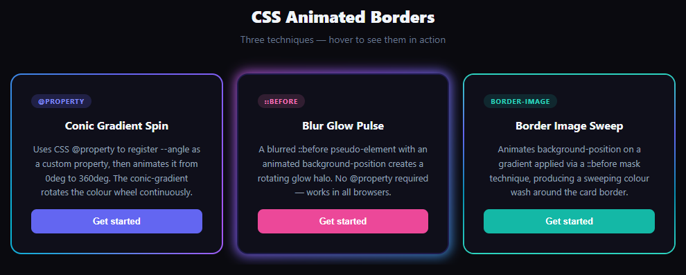
Glowing animated borders are one of the most-searched CSS effects — they appear on SaaS landing pages, developer portfolios, and premium component libraries. This snippet demonstrates three production-ready techniques side by side: a CSS @property conic-gradient rotation, a blurred pseudo-element glow pulse, and a padding-box / border-box background clip sweep — all animating continuously with zero JavaScript.
Animated gradient borders appear on countless SaaS product pages, developer portfolio cards, and UI component showcases. They signal premium quality and draw the eye to calls-to-action. Until recently, achieving them required JavaScript-driven canvas or SVG hacks, but modern CSS provides three clean, GPU-accelerated approaches — all demonstrated side by side in this snippet.
Technique 1: CSS @property conic-gradient spin
@property lets you register a custom CSS property with a type annotation. By registering --angle as syntax: '<angle>', the browser knows how to interpolate between angle values. A @keyframes spin { to { --angle: 360deg } } then animates the property from 0° to 360°. The card's background is a conic-gradient(from var(--angle), ...) — as --angle increments each frame, the gradient rotates continuously. Without @property, animating a custom property used inside a gradient is impossible because the browser treats unregistered custom properties as opaque strings and cannot interpolate them.
Technique 2: blurred ::before pseudo-element glow
The glow technique uses a ::before pseudo-element positioned with inset: -3px (3px outside the card on all sides), a background: linear-gradient with background-size: 300% 300%, and a filter: blur(8px). The @keyframes glowPulse animates background-position from 0% 50% to 100% 50% — moving the oversized gradient horizontally creates a colour wash effect. A ::after pseudo-element with the same background as the card interior covers the blurred gradient except at the edges, producing the halo border. This approach has broader browser support than @property since it uses only background-position animation.
Technique 3: padding-box / border-box background clip
CSS allows two background layers with different background-clip values using a shorthand: linear-gradient(#bg, #bg) padding-box, gradient border-box. The first layer fills only the content area (padding-box), while the second fills the entire element including the border area (border-box). Setting border: 2px solid transparent makes the border transparent so the gradient shows through it. Combined with the @property --angle animation on the border-image gradient, the border colour rotates. This technique is the most layout-friendly because it doesn't require a positioned pseudo-element and doesn't affect stacking context.
Browser support and fallbacks
@property is supported in Chrome 85+, Edge 85+, Safari 16.4+, and Firefox 128+. For older Firefox, techniques 2 and 3 degrade gracefully: the glow pulse still works (it only uses background-position animation), and the border-image sweep falls back to a static gradient border. A prefers-reduced-motion media query check in the JS pauses all animations for users who have opted out of motion.
Using animated borders in your project
Apply technique 1 to a .card or .button wrapper by copying the @property registration and the conic-gradient background. For a button with just a border glow (no filled gradient background), use technique 3 with background: #yourColor padding-box, gradient border-box and border: 2px solid transparent. Combine with a neon glow effect on the text for a full cyberpunk aesthetic.
Step by step
How to Use
- 1Load the snippetPaste the HTML, CSS, and JS into your page. Three dark cards appear — the left one has a spinning conic gradient border, the middle has a blurred glow halo, and the right has a sweeping teal border.
- 2Observe the @property techniqueThe left card's entire background rotates as a conic gradient — a
--anglecustom property animates from 0° to 360° via CSS@keyframes spin. - 3Compare the glow pulse techniqueThe middle card has no
border— a blurred::beforepseudo-element positioned outside the card creates the halo. The colour shifts from pink to purple to cyan on a 3-second loop. - 4See the border-image sweepThe right card uses the padding-box/border-box trick: a transparent
borderreveals the rotating gradient behind it. The border width is 2px — increase it in CSS for a thicker glow. - 5Click any card to pause/resumeThe JS click handler toggles
animationPlayStatebetweenrunningandpausedon the clicked card for interactive demos. - 6Apply to your own elementsCopy the technique that fits your browser support requirements. Paste the
@propertyregistration andbackgroundrule onto any element withborder-radiusand you're done.
Real-world uses
Common Use Cases
animation-duration: 6s for a subtle effect.Got questions?
Frequently Asked Questions
@property is supported in Firefox 128+ (released June 2024). For earlier Firefox, use technique 2 (blurred pseudo-element glow) which only relies on background-position animation and has universal support. Check caniuse.com/css-at-property for the current support table.
Wrap your <button> in a <div class="card-conic"> (or use the padding-box/border-box technique directly on the button). For technique 3, add @property, set border: 2px solid transparent, and set background: #yourButtonColor padding-box, conic-gradient(from var(--angle), ...) border-box.
The ::before pseudo-element needs to extend beyond the card boundary to create the glow halo. inset: -3px places it 3px outside on all sides. It's then pushed behind the card with z-index: -1. The ::after element covers the centre to prevent the glow from showing through the card body.
Yes. All three techniques are pure CSS — copy the styles into your component's stylesheet or CSS module. In React with Tailwind, technique 2 needs arbitrary values ([filter:blur(8px)]); techniques 1 and 3 need the @property registration in a global CSS file. In Vue, place the @property block in a <style> tag without scoped. In Angular, add it to styles.css.
Add .card:hover { animation-play-state: paused; }. For the glow technique, also add .card-glow:hover::before { animation-play-state: paused; }. This freezes the gradient at whatever angle it's at when the cursor enters.