

Confetti Button — Free HTML CSS JS Snippet
Confetti Button · Buttons · Plain HTML, CSS & JS · Live preview
Copy & paste
Source Code
<div class="scene">
  <button class="btn" id="btn" onclick="fire()">
    🎉 Celebrate!
  </button>
  <p class="hint">Click to launch confetti</p>
</div>
* { box-sizing: border-box; margin: 0; padding: 0; }
body { font-family: system-ui, sans-serif; background: #0f172a; display: flex; align-items: center; justify-content: center; min-height: 100vh; overflow: hidden; }
.scene { display: flex; flex-direction: column; align-items: center; gap: 16px; }
.btn {
padding: 14px 36px; font-size: 16px; font-weight: 700;
border: none; border-radius: 50px;
background: linear-gradient(135deg, #f97316, #ec4899);
color: #fff; cursor: pointer; font-family: inherit;
box-shadow: 0 4px 24px rgba(249,115,22,0.4);
transition: transform 0.1s, box-shadow 0.15s;
}
.btn:active { transform: scale(0.95); }
.btn:hover { box-shadow: 0 8px 32px rgba(249,115,22,0.6); }
.hint { font-size: 12px; color: #475569; }
.confetti-piece {
position: fixed;
width: 8px; height: 12px;
border-radius: 2px;
pointer-events: none;
animation: fall var(--dur) var(--delay) ease-in forwards;
z-index: 999;
}
@keyframes fall {
0% { transform: translate(0,0) rotate(0deg) scale(1); opacity: 1; }
80% { opacity: 1; }
100% { transform: translate(var(--dx), var(--dy)) rotate(var(--rot)) scale(0.5); opacity: 0; }
}function fire() {
const btn = document.getElementById('btn');
const rect = btn.getBoundingClientRect();
const cx = rect.left + rect.width / 2;
const cy = rect.top + rect.height / 2;
const colors = ['#f97316','#ec4899','#6366f1','#22c55e','#fbbf24','#06b6d4','#a78bfa'];
for (let i = 0; i < 80; i++) {
const el = document.createElement('div');
el.className = 'confetti-piece';
const angle = (Math.random() * 360) * Math.PI / 180;
const dist = 120 + Math.random() * 240;
el.style.cssText = [
`left:${cx}px`, `top:${cy}px`,
`background:${colors[i % colors.length]}`,
`--dx:${Math.cos(angle) * dist}px`,
`--dy:${Math.sin(angle) * dist + 200}px`,
`--rot:${Math.random() * 720 - 360}deg`,
`--dur:${0.8 + Math.random() * 0.8}s`,
`--delay:${Math.random() * 0.2}s`,
`border-radius:${Math.random() > 0.5 ? '50%' : '2px'}`,
].join(';');
document.body.appendChild(el);
el.addEventListener('animationend', () => el.remove());
}
}Extend with AI
Take This Snippet Further With AI
The AI prompt for this one is for Patreon supporters ($3 a month, 7 days free), along with a site with no ads. Supporters enter the passcode once and it is remembered in this browser.
What's included
Features
About this UI Snippet
Confetti Button — CSS Custom Property Particles with Polar Coordinate Physics
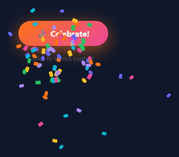
A confetti burst on click is one of the most satisfying micro-interactions — like the ripple button, 80 coloured particles explode from the button and fall with simulated gravity. Used on purchase confirmations (pair with an animated success checkmark), achievements, and any celebratory moment worth rewarding — see also the full-card confetti celebration.
How particles are created
fire() uses getBoundingClientRect() to find the button centre. It creates 80 div.confetti-piece elements appended to document.body, all starting at the button centre.
CSS custom properties drive physics
Each particle has five inline CSS custom properties: --dx (horizontal offset), --dy (vertical offset + 200px gravity), --rot (random rotation), --dur (duration 0.8–1.6s), --delay (0–0.2s). The @keyframes confetti reads them: transform: translate(var(--dx), var(--dy)) rotate(var(--rot)). Each of 80 identical divs follows a unique trajectory purely from CSS.
Polar coordinate direction
Random angle in radians × distance gives Math.cos(angle)*dist for --dx and Math.sin(angle)*dist + 200 for --dy. The +200 shifts the burst centroid downward, simulating gravity.
Auto cleanup
animationend listener calls el.remove() — no DOM accumulation even with rapid clicking.
The physics simulation
Each confetti particle is created at the click position with random polar coordinates: vx = speed * Math.cos(angle), vy = speed * Math.sin(angle). A gravity constant (gy = 0.15) adds to vy every frame, causing particles to arc downward naturally. Each particle has an alpha value that decrements each frame until it reaches 0, at which point the particle is removed from the array. The result is 80 particles that burst outward, arc downward with gravity, and fade as they travel.
CSS custom properties for trajectories
Each particle div has CSS custom properties (--tx, --ty, --r) set as inline styles at creation time. A CSS @keyframes animation uses these properties for the movement: transform: translate(var(--tx), var(--ty)) rotate(var(--r)). This delegates the heavy per-frame position calculation to CSS instead of JavaScript DOM manipulation, keeping the main thread free during the animation burst.
Preventing multiple bursts
A simple isAnimating boolean prevents overlapping burst cycles. When the button is clicked and isAnimating is true, the click handler returns immediately. The flag resets after all particles have faded — typically 1.2–1.5 seconds after the burst.
Customising the burst
Change PARTICLE_COUNT from 80 to adjust density. Increase gravity (gy) for a quicker arc; decrease for a flatter trajectory. Change the colour generator from random hsl to specific colours: const colours = ["#6366f1","#ec4899","#f59e0b"]; const colour = colours[Math.floor(Math.random()*colours.length)]. For a brand-specific confetti palette, this keeps the burst on-brand while still feeling celebratory.
Step by step
How to Use
- 1Click the buttonClick "Celebrate!" in the preview to see 80 particles burst from the button centre in all directions with random colours, sizes, and timings.
- 2Change particle coloursIn the JS panel, update the colors array. The 7 colours cycle via i % colors.length — more colours give a richer burst.
- 3Change particle countUpdate the 80 in the for loop to more or fewer particles.
- 4Adjust the spread radiusUpdate the 120 + Math.random() * 240 expression to change the minimum and range of particle distances.
- 5Change the button styleUpdate the gradient, border-radius, and padding in the CSS panel.
- 6Export in your formatClick "HTML" for a standalone file, "JSX" for a React component, or "Tailwind" for a React + Tailwind version.
Real-world uses
Common Use Cases
Got questions?
Frequently Asked Questions
Each particle div has inline style properties --dx, --dy, --rot, --dur, --delay set by JS with random values. The CSS @keyframes rule reads these variables: transform: translate(var(--dx), var(--dy)) rotate(var(--rot)). All 80 particles share the same CSS class but follow unique paths.
Adding 200 to --dy shifts the vertical endpoint of every particle downward by 200px. Since all particles end lower than they start regardless of direction, the burst appears to fall with gravity.
Each particle has el.addEventListener("animationend", () => el.remove()). After the keyframe animation completes (0.8-1.6s), the event fires and removes the element from the DOM.
Refactor fire() to accept a button element parameter: fire(btn). Use btn.getBoundingClientRect() inside. Add onclick="fire(this)" to each button.
Yes. Click "JSX" for a React component. Call fire() from the onClick handler. Since particles append to document.body, they work identically in React. For a state-based approach, manage particles as an array and render positioned divs.
Update the for loop condition: for (let i = 0; i < 80; i++). Fewer particles (30-40) are more subtle; more (120-150) are more dramatic but slightly more expensive to animate.