


Encrypt Reveal Card — Free HTML CSS JS Cipher Hover Snippet
Encrypt Reveal Card · Cards · Plain HTML, CSS & JS · Live preview
Copy & paste
Source Code
<div class="ev-stage">
  <article class="ev-card" id="evCard">
    <div class="ev-stream" id="evStream" aria-hidden="true"></div>
    <div class="ev-mask" id="evMask" aria-hidden="true"></div>
    <div class="ev-center">
      <div class="ev-icon">🔒</div>
      <span class="ev-label">Encrypted</span>
    </div>
  </article>
  <p class="ev-hint">Move your cursor over the card</p>
</div>*{box-sizing:border-box;margin:0;padding:0}
body{font-family:ui-monospace,SFMono-Regular,Menlo,monospace;background:#06060c;color:#fff;display:flex;justify-content:center;align-items:center;min-height:100vh;flex-direction:column;gap:18px;padding:24px}
.ev-card{position:relative;width:300px;height:300px;border-radius:20px;border:1px solid #23233a;background:#0b0b16;overflow:hidden;cursor:crosshair}
/* The scrolling characters fill the card but are hidden, revealed only inside
a radial mask centred on the cursor. */
.ev-stream{position:absolute;inset:0;padding:8px;font-size:13px;line-height:1.35;letter-spacing:1px;color:#7c3aed;word-break:break-all;opacity:0;transition:opacity .2s;
-webkit-mask-image:radial-gradient(140px circle at var(--mx,50%) var(--my,50%),#000 0%,transparent 60%);
mask-image:radial-gradient(140px circle at var(--mx,50%) var(--my,50%),#000 0%,transparent 60%)}
.ev-card:hover .ev-stream{opacity:1}
.ev-mask{position:absolute;inset:0;pointer-events:none;opacity:0;transition:opacity .25s;
background:radial-gradient(180px circle at var(--mx,50%) var(--my,50%),rgba(124,58,237,.35),transparent 60%)}
.ev-card:hover .ev-mask{opacity:1}
.ev-center{position:absolute;inset:0;z-index:1;display:flex;flex-direction:column;align-items:center;justify-content:center;gap:10px;transition:opacity .25s}
.ev-card:hover .ev-center{opacity:.15}
.ev-icon{width:54px;height:54px;border-radius:14px;background:rgba(124,58,237,.15);border:1px solid rgba(124,58,237,.4);display:flex;align-items:center;justify-content:center;font-size:24px}
.ev-label{font-size:12px;letter-spacing:.15em;text-transform:uppercase;color:#a78bfa}
.ev-hint{font-size:12px;color:#56566e;letter-spacing:.05em}var card = document.getElementById('evCard');
var stream = document.getElementById('evStream');
var CHARS = 'ABCDEF0123456789abcdef!@#$%&*<>{}[]/\\=+'.split('');
function randomString(n) {
var s = '';
for (var i = 0; i < n; i++) s += CHARS[Math.floor(Math.random() * CHARS.length)];
return s;
}
// Fill once, then re-randomise on each move so the "ciphertext" keeps churning.
stream.textContent = randomString(900);
card.addEventListener('pointermove', function (e) {
var r = card.getBoundingClientRect();
card.style.setProperty('--mx', (e.clientX - r.left) + 'px');
card.style.setProperty('--my', (e.clientY - r.top) + 'px');
// Only regenerate occasionally to keep it cheap.
if (Math.random() < 0.25) stream.textContent = randomString(900);
});Extend with AI
Take This Snippet Further With AI
The AI prompt for this one is for Patreon supporters ($3 a month), along with a site with no ads. Supporters enter the passcode once and it is remembered in this browser.
What's included
Features
About this UI Snippet
Encrypt Reveal Card — Cipher Characters Unmasked by the Cursor
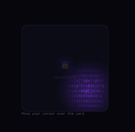
The encrypt-reveal card is the security-themed effect popularized by Evervault's site: a card shows a locked icon at rest, but as you move your cursor over it, a field of constantly-churning encrypted characters becomes visible only inside a circular window that follows the pointer — as if you're decrypting the surface in real time. This snippet recreates it with plain HTML, CSS masks, and a small vanilla JavaScript generator.
A masked window that follows the cursor
The character stream fills the whole card but is revealed through a mask-image radial gradient centered on two CSS custom properties, --mx and --my. A pointermove handler writes the cursor's position into those variables, so the opaque part of the mask — a 140px circle — tracks under the pointer while everything outside it is masked to transparent. The effect is a moving porthole that exposes the "ciphertext" only where you point, which is the core illusion. Updating the reveal through CSS variables keeps the handler extremely cheap.
Churning ciphertext
The text is a random 900-character string drawn from a hex-and-symbol alphabet (ABCDEF0123456789...!@#$%) that looks like encrypted data. To make it feel alive rather than static, the handler regenerates the string on roughly a quarter of pointer moves (Math.random() < 0.25). That throttle is deliberate: regenerating on every move would be wasteful and visually too frantic, while occasional regeneration reads as data actively scrambling under your cursor. Because only the masked region is visible, you mostly perceive the churn happening right where you look.
A glow that reinforces the reveal
A second layer, .ev-mask, is a soft radial purple glow also centered on --mx/--my. It fades in on hover and sits over the card to make the revealed region feel lit, like a scanner passing over the surface. Pairing a glow with the character mask gives the reveal depth instead of looking like a flat cut-out.
The resting state
At rest the card shows a centered lock icon and an "Encrypted" label, and the character stream is at opacity: 0. On hover the stream fades to full opacity (within its mask) while the lock label dims to opacity: .15, so the card transitions from "secured" to "decrypting" as you interact. This clear before/after state communicates the metaphor without any copy.
Why masks instead of clip
Using mask-image rather than clip-path lets the reveal have a soft, feathered edge — the radial gradient fades from opaque to transparent over its radius, so the porthole blends smoothly into the hidden area rather than showing a hard circular cut. That softness is what makes it feel like a scanning beam.
Customizing it
Change the mask circle radius to widen or tighten the reveal, edit the CHARS alphabet (Katakana for a Matrix look, or 0/1 for binary), recolor the stream and glow, or adjust the 0.25 regeneration probability for calmer or busier churn. Swap the lock icon for your brand. Pair it with a glow input on a security product page or a background boxes hero.
Step by step
How to Use
- 1Paste HTML, CSS, and JSA card shows a lock icon labeled Encrypted at rest.
- 2Move the cursor over itA circular window reveals churning encrypted characters.
- 3Move aroundThe reveal window follows the pointer like a scanner.
- 4Watch it churnThe ciphertext scrambles as you move.
- 5Change the alphabetEdit CHARS for binary, hex, or Katakana.
- 6Resize the windowAdjust the mask circle radius and glow.
Real-world uses
Common Use Cases
--mx and --my moving the mask cheaply.Got questions?
Frequently Asked Questions
The character stream fills the card but is shown through a mask-image radial gradient centered on the --mx and --my CSS variables. A pointermove handler writes the cursor position into those variables, so the opaque 140px circle of the mask tracks under the pointer while everything outside is masked to transparent — a moving porthole over the ciphertext.
The 900-character random string is regenerated on roughly a quarter of pointer moves (Math.random() < 0.25). Throttling it that way keeps the work cheap and the churn from looking too frantic, while still reading as data actively scrambling. Since only the masked region is visible, you perceive the churn right where you point.
mask-image with a radial gradient gives a soft, feathered edge — it fades from opaque to transparent across its radius, so the revealed area blends smoothly into the hidden surface. clip-path would produce a hard circular cut. The feathering is what makes the porthole feel like a scanning beam rather than a stencil.
No. The reveal moves purely by updating two CSS variables, which is very cheap, and the text only regenerates on about 25% of moves. There's no per-frame loop and no layout thrashing — the mask and glow are GPU-composited, so it stays smooth even on modest devices.
Keep the ciphertext in a ref and a pointermove handler that updates the --mx/--my inline style and occasionally regenerates the string. Avoid putting the churning text in state, since that would re-render constantly — write it directly to a ref'd element. The mask CSS ports as-is; in Tailwind use arbitrary mask-image values with the inline variables.