


Flip Card to Modal: GSAP Flip Shared-Element Animation
Flip Card to Modal · Modals · Plain HTML, CSS & JS · Live preview
Copy & paste
Source Code
<div class="fcm-wrap">
<header class="fcm-head">
<span class="fcm-eyebrow">New arrivals</span>
<h2>Pick your gear</h2>
<p class="fcm-hint">Click a card: it grows into its own modal.</p>
</header>
<div class="fcm-grid">
<div class="fcm-slot">
<article class="fcm-card" style="--cc:#6366f1" role="button" tabindex="0" aria-expanded="false" data-label="Studio Pods, $249. Open details">
<span class="fcm-badge">Best seller</span>
<span class="fcm-emoji" aria-hidden="true">🎧</span>
<h3 id="fcm-t1">Studio Pods</h3>
<p class="fcm-tag">Noise-cancelling earbuds</p>
<span class="fcm-price-tag">$249</span>
<div class="fcm-more">
<p>Adaptive ANC, 40-hour battery, and a case that doubles as a Bluetooth transmitter for flights.</p>
<ul class="fcm-specs"><li>Adaptive ANC</li><li>40 h battery</li><li>USB-C</li></ul>
<div class="fcm-actions"><b class="fcm-price">$249</b><button class="fcm-buy" type="button">Add to cart</button></div>
</div>
<button class="fcm-close" type="button" aria-label="Close details">×</button>
</article>
</div>
<div class="fcm-slot">
<article class="fcm-card" style="--cc:#0ea5e9" role="button" tabindex="0" aria-expanded="false" data-label="Pulse Watch, $329. Open details">
<span class="fcm-badge">New</span>
<span class="fcm-emoji" aria-hidden="true">⌚</span>
<h3 id="fcm-t2">Pulse Watch</h3>
<p class="fcm-tag">GPS training watch</p>
<span class="fcm-price-tag">$329</span>
<div class="fcm-more">
<p>Dual-band GPS, 10-day battery, and recovery scores that actually change how you train.</p>
<ul class="fcm-specs"><li>Dual-band GPS</li><li>10-day battery</li><li>5 ATM</li></ul>
<div class="fcm-actions"><b class="fcm-price">$329</b><button class="fcm-buy" type="button">Add to cart</button></div>
</div>
<button class="fcm-close" type="button" aria-label="Close details">×</button>
</article>
</div>
<div class="fcm-slot">
<article class="fcm-card" style="--cc:#a855f7" role="button" tabindex="0" aria-expanded="false" data-label="Drift Pad, $89. Open details">
<span class="fcm-badge">Value</span>
<span class="fcm-emoji" aria-hidden="true">🎮</span>
<h3 id="fcm-t3">Drift Pad</h3>
<p class="fcm-tag">Wireless game controller</p>
<span class="fcm-price-tag">$89</span>
<div class="fcm-more">
<p>Hall-effect sticks that never drift, 1000Hz polling, and remappable paddles.</p>
<ul class="fcm-specs"><li>Hall-effect sticks</li><li>1000Hz polling</li><li>Back paddles</li></ul>
<div class="fcm-actions"><b class="fcm-price">$89</b><button class="fcm-buy" type="button">Add to cart</button></div>
</div>
<button class="fcm-close" type="button" aria-label="Close details">×</button>
</article>
</div>
</div>
<div class="fcm-backdrop" id="fcmBackdrop"></div>
</div>*{box-sizing:border-box;margin:0;padding:0}
body{font-family:system-ui,-apple-system,"Segoe UI",sans-serif;background:radial-gradient(1100px 560px at 15% -10%,#1b1f3a 0,transparent 60%),radial-gradient(900px 500px at 105% 110%,#2a1240 0,transparent 55%),#0b0d16;color:#fff;min-height:100vh;display:flex;align-items:center;justify-content:center;padding:24px}
.fcm-wrap{width:min(600px,94vw)}
.fcm-head{text-align:center;margin-bottom:22px}
.fcm-eyebrow{display:inline-block;font-size:11px;font-weight:700;letter-spacing:.14em;text-transform:uppercase;color:#a5b4fc;background:rgba(99,102,241,.14);border:1px solid rgba(165,180,252,.25);padding:4px 11px;border-radius:99px}
.fcm-head h2{font-size:clamp(22px,4vw,28px);font-weight:800;letter-spacing:-.02em;margin:12px 0 6px}
.fcm-hint{color:#8a90a8;font-size:13px}
.fcm-grid{display:grid;grid-template-columns:repeat(3,1fr);gap:14px}
@media(max-width:460px){.fcm-grid{grid-template-columns:repeat(2,1fr)}.fcm-slot:last-child{grid-column:1/-1;aspect-ratio:2/1}}
/* Every card sits in a slot that keeps its place in the grid while the card is open, so nothing shifts */
.fcm-slot{position:relative;aspect-ratio:3/4}
.fcm-card{position:absolute;inset:0;display:flex;flex-direction:column;align-items:center;justify-content:center;gap:5px;padding:14px;border-radius:18px;text-align:center;cursor:pointer;overflow:hidden;will-change:transform;
background:linear-gradient(160deg,color-mix(in srgb,var(--cc) 78%,#000),color-mix(in srgb,var(--cc) 28%,#0b0d16));
border:1px solid rgba(255,255,255,.16);
box-shadow:0 14px 30px -16px var(--cc),inset 0 1px 0 rgba(255,255,255,.18);
transition:box-shadow .25s,border-color .25s}
.fcm-card::before{content:"";position:absolute;inset:0;background:radial-gradient(120% 70% at 50% 0%,rgba(255,255,255,.22),transparent 60%);pointer-events:none}
.fcm-card>*{z-index:1}
.fcm-card:not(.is-open):hover{border-color:rgba(255,255,255,.4);box-shadow:0 18px 36px -14px var(--cc),inset 0 1px 0 rgba(255,255,255,.25)}
.fcm-card:focus-visible{outline:2px solid #fff;outline-offset:3px}
.fcm-badge{position:absolute;top:10px;left:10px;font-size:10px;font-weight:700;letter-spacing:.04em;padding:3px 8px;border-radius:99px;background:rgba(0,0,0,.3);border:1px solid rgba(255,255,255,.18)}
.fcm-emoji{font-size:40px;line-height:1;filter:drop-shadow(0 6px 10px rgba(0,0,0,.35))}
.fcm-card h3{font-size:15px;font-weight:800;letter-spacing:-.01em}
.fcm-tag{font-size:12px;color:rgba(255,255,255,.72)}
.fcm-price-tag{margin-top:6px;font-size:13px;font-weight:800;padding:4px 11px;border-radius:99px;background:rgba(0,0,0,.28)}
.fcm-more,.fcm-close{display:none}
/* The open state is just a class: fixed, centred with margin:auto (no transform), wider. No coordinates in JavaScript. */
.fcm-card.is-open{position:fixed;inset:0;margin:auto;width:min(440px,92vw);height:fit-content;min-height:380px;z-index:20;cursor:default;padding:34px 28px 26px;gap:8px}
.fcm-card.is-flying{z-index:30}
.fcm-card.is-open .fcm-badge,.fcm-card.is-open .fcm-price-tag{display:none}
.fcm-card.is-open .fcm-emoji{font-size:66px}
.fcm-card.is-open h3{font-size:26px}
.fcm-card.is-open .fcm-tag{font-size:13px}
.fcm-card.is-open .fcm-more{display:block}
.fcm-card.is-open .fcm-close{display:grid}
.fcm-more{width:100%;margin-top:8px}
.fcm-more>p{font-size:14px;line-height:1.6;color:rgba(255,255,255,.88)}
.fcm-specs{display:flex;flex-wrap:wrap;gap:6px;justify-content:center;list-style:none;margin:16px 0 4px}
.fcm-specs li{font-size:12px;font-weight:600;padding:5px 11px;border-radius:99px;background:rgba(255,255,255,.12);border:1px solid rgba(255,255,255,.16)}
.fcm-actions{display:flex;align-items:center;justify-content:space-between;gap:16px;margin-top:18px}
.fcm-price{font-size:26px;font-weight:800;letter-spacing:-.02em}
.fcm-buy{border:0;border-radius:12px;padding:12px 22px;font:700 14px system-ui,sans-serif;color:#0b0d16;background:#fff;cursor:pointer;transition:transform .15s,background .15s}
.fcm-buy:hover{transform:translateY(-1px);background:#eef2ff}
.fcm-buy:focus-visible,.fcm-close:focus-visible{outline:2px solid #fff;outline-offset:2px}
.fcm-close{position:absolute;top:12px;right:12px;width:36px;height:36px;place-items:center;border-radius:50%;border:1px solid rgba(255,255,255,.25);background:rgba(0,0,0,.28);color:#fff;font-size:22px;line-height:1;cursor:pointer}
.fcm-close:hover{background:rgba(0,0,0,.45)}
.fcm-backdrop{position:fixed;inset:0;background:rgba(5,6,12,.72);backdrop-filter:blur(5px);opacity:0;pointer-events:none;transition:opacity .35s;z-index:10}
.fcm-backdrop.is-on{opacity:1;pointer-events:auto}
@media(prefers-reduced-motion:reduce){.fcm-backdrop,.fcm-card,.fcm-buy{transition:none}}gsap.registerPlugin(Flip);
var backdrop = document.getElementById('fcmBackdrop');
var cards = document.querySelectorAll('.fcm-card');
var slots = document.querySelectorAll('.fcm-slot');
var reduce = window.matchMedia('(prefers-reduced-motion: reduce)').matches;
var openCard = null;
var animating = false;
// Switch the card between "button in a grid" and "modal dialog" for assistive tech
function setA11y(card, opening) {
if (opening) {
card.setAttribute('role', 'dialog');
card.setAttribute('aria-modal', 'true');
card.setAttribute('aria-labelledby', card.querySelector('h3').id);
card.removeAttribute('aria-label');
card.removeAttribute('aria-expanded');
card.removeAttribute('tabindex');
} else {
card.setAttribute('role', 'button');
card.setAttribute('aria-expanded', 'false');
card.setAttribute('aria-label', card.dataset.label);
card.removeAttribute('aria-modal');
card.removeAttribute('aria-labelledby');
card.setAttribute('tabindex', '0');
}
// the rest of the page cannot be tabbed to or read while the dialog is open
slots.forEach(function (slot) { if (!slot.contains(card)) slot.inert = opening; });
}
// The pieces of content each layout shows, so they can fade out of one layout and into the other
function parts(card, layout) {
var q = function (sel) { return Array.prototype.slice.call(card.querySelectorAll(sel)); };
return layout === 'open'
? q('.fcm-emoji, h3, .fcm-tag, .fcm-more > *, .fcm-close')
: q('.fcm-badge, .fcm-emoji, h3, .fcm-tag, .fcm-price-tag');
}
function toggle(card) {
if (animating) return;
animating = true;
var opening = !card.classList.contains('is-open');
// 1. Fade the current content out, so its size change in the next step is never seen.
gsap.to(parts(card, opening ? 'closed' : 'open'), {
opacity: 0, duration: reduce ? 0 : 0.14, ease: 'power1.out', onComplete: flip
});
function flip() {
// 2. First: capture the card exactly as it sits in (or out of) the grid.
var state = Flip.getState(card, { props: 'borderRadius' });
// Last: flip the class. CSS moves the card to its modal (or grid) layout.
card.classList.add('is-flying'); // keep the card above the backdrop for the whole flight
card.classList.toggle('is-open', opening);
backdrop.classList.toggle('is-on', opening);
openCard = opening ? card : null;
setA11y(card, opening);
// Invert + Play: only the empty container moves, so there is nothing to jump while it travels.
var incoming = parts(card, opening ? 'open' : 'closed');
gsap.set(incoming, { opacity: 0 });
Flip.from(state, {
duration: reduce ? 0 : 0.55,
ease: 'power3.inOut',
scale: true, // animate with transforms, so margin:auto centring is never disturbed
onComplete: function () {
card.classList.remove('is-flying');
animating = false;
(opening ? card.querySelector('.fcm-close') : card).focus({ preventScroll: true });
}
});
// 3. Once the container has mostly landed, the new content fades up, one piece after another.
gsap.to(incoming, {
opacity: 1, duration: reduce ? 0 : 0.35, delay: reduce ? 0 : 0.32, stagger: reduce ? 0 : 0.05, ease: 'power2.out'
});
}
}
cards.forEach(function (card) {
card.addEventListener('click', function () {
if (!card.classList.contains('is-open')) toggle(card);
});
card.addEventListener('keydown', function (e) {
if ((e.key === 'Enter' || e.key === ' ') && e.target === card && !card.classList.contains('is-open')) {
e.preventDefault();
toggle(card);
}
});
card.querySelector('.fcm-close').addEventListener('click', function (e) {
e.stopPropagation();
toggle(card);
});
card.querySelector('.fcm-buy').addEventListener('click', function (e) {
e.target.textContent = 'Added \u2713';
});
});
backdrop.addEventListener('click', function () {
if (openCard) toggle(openCard);
});
document.addEventListener('keydown', function (e) {
if (!openCard) return;
if (e.key === 'Escape') { toggle(openCard); return; }
if (e.key === 'Tab') { // keep focus inside the dialog
var f = openCard.querySelectorAll('button');
var first = f[0], last = f[f.length - 1];
if (e.shiftKey && document.activeElement === first) { e.preventDefault(); last.focus(); }
else if (!e.shiftKey && document.activeElement === last) { e.preventDefault(); first.focus(); }
}
});Extend with AI
Take This Snippet Further With AI
The AI prompt for this one is for Patreon supporters ($3 a month), along with a site with no ads. Supporters enter the passcode once and it is remembered in this browser.
What's included
Features
About this UI Snippet
Flip Card to Modal: A Shared-Element Transition Built on One DOM Node
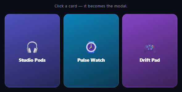
The card-to-modal morph is the shared-element transition that app stores and galleries made familiar: tap a card and it *becomes* the detail view, growing from its place in the grid to the centre of the screen with no break in continuity. Most implementations fake it with a cloned overlay. This snippet does it for real: the same DOM node is both the card and the modal, and GSAP's Flip plugin animates between two CSS layouts. It also handles the parts that tutorials skip: the grid does not jump, keyboard and screen-reader users can use it, and it respects reduced-motion settings.
One element, two layouts, no coordinates in JavaScript
The modal state is just a class. .is-open switches the card to position: fixed, centres it with inset: 0 and margin: auto (no transform, so Flip has a plain target), widens it and reveals the hidden detail block. The animation is the standard FLIP sequence (First, Last, Invert, Play): Flip.getState(card) records where the card is before the class flips, the class flips, and Flip.from(state) animates from the recorded position and size to wherever CSS just put the card. JavaScript never computes a position, so redesigning the modal or the grid means editing only CSS.
A slot keeps the grid steady
A fixed-position card leaves the document flow, which would make the other cards jump into its place the moment it opens. To avoid that, every card lives inside a .fcm-slot wrapper that owns the grid cell and its size (aspect-ratio: 3/4), while the card inside is absolutely positioned to fill it. When the card flies out to the centre, the slot stays exactly where it was, so the grid does not reflow, and the card has a clear place to fly back to. It is also why the Flip call does not need absolute: true: nothing in the grid reflows, so the card can simply animate with transforms.
Why the real node beats a clone
A clone-based modal has to copy the content, mirror any state between the two copies and hide the original, and those three jobs are where the bugs live. With a single node, event listeners, form values and media playback carry straight through the transition. The only extra work is the slot placeholder described above.
Layering during the flight
The backdrop sits at z-index: 10 and the open card at 20, but the card needs to stay above the backdrop on the way back as well, when the .is-open class has already been removed. A temporary .is-flying class (z-index 30) is added before every flip and removed in onComplete, so the card never dips behind the dimmed page in either direction. The props: 'borderRadius' option shows the pattern for style changes: any property the class swap changes can be recorded and tweened instead of snapping.
Fade-through keeps the motion smooth
Because one node plays both roles, its text changes size the instant the class flips (the title goes from 15px to 26px, the emoji from 40px to 66px). If that happened while the container was still small, the content would visibly jump and re-wrap. So the content is choreographed in three steps: the current content fades out in 0.14 seconds, the empty container flips to its new layout, and the new content fades up in a staggered tween that starts about 0.3 seconds into the morph, once the container has mostly landed. Splitting the container's motion from the content's change is what makes shared-element interfaces feel polished (it is the "fade through" pattern from Material Design's container transform).
Accessible by default
While closed, each card is a role="button" with a label and a tab stop, and Enter or Space opens it. While open, the same element becomes a role="dialog" with aria-modal="true" and aria-labelledby pointing at its heading. The other cards are made inert, so neither Tab nor a screen reader can reach them, and Tab is trapped between the close button and the buy button. Focus moves to the close button when the dialog opens and returns to the card when it closes, and Escape, the close button and a click on the backdrop all close it. If the visitor prefers reduced motion, the flip and the content entrance are skipped.
Interaction guards
An animating flag ignores clicks while a flip is in flight, because capturing a moving element as the "first" state is the classic way to strand cards between layouts. Clicks on the open card are ignored so text can be selected, and clicks inside it, such as the buy button, never reopen or close it.
Customising it
Swap the emoji for a product image that scales with the card (give the image object-fit: cover so its crop transitions during the morph), replace the demo copy with real content, or flip the card back to a different grid position after a sort. Related patterns: reordering in flip grid shuffle, the CSS-only expandable card, a classic modal, and a product quick view.
Step by step
How to Use
- 1Add GSAP and the Flip pluginLoad gsap.min.js and Flip.min.js from the CDN panel (or install the gsap package), then call gsap.registerPlugin(Flip).
- 2Paste the HTML, CSS and JSEach card sits in a .fcm-slot inside the grid. Add as many slot and card pairs as you need.
- 3Click or press Enter on a cardIt flies from its grid slot to the centre of the screen and becomes a modal dialog, with the rest of the page dimmed.
- 4Watch the details arriveThe old content fades out, the empty card flies to the centre, and the description, spec chips and buy row fade up one after another once it has landed.
- 5Close it three waysClick the close button, click the backdrop or press Escape, and the card flies back into its slot.
- 6Restyle either stateBoth layouts are plain CSS (the card and the .is-open rule), and Flip adapts to whatever you change.
Real-world uses
Common Use Cases
is-open class swap for the layout and GSAP Flip animating the change. See also the product quick view.props option.Got questions?
Frequently Asked Questions
The modal is just another CSS state: .is-open makes the same element position: fixed, centred and wider. Flip.getState records the card's geometry in the grid before the class changes, and Flip.from animates from that record to wherever CSS has put the card. One element, two layouts, and GSAP animates the difference, so no clone ever exists.
A position: fixed card leaves the normal flow, so without a wrapper the other cards would jump into its grid cell as soon as it opens, and the opening card would have nowhere to fly back to. The slot owns the cell and its aspect ratio while the card inside is absolutely positioned, so the grid stays still while the card is out.
Clones must duplicate content, mirror any state and hide the original, and they still go out of sync if the content updates during the transition. With one node, click handlers, media playback and form values persist through the morph. The only price is the slot placeholder, which is a few lines of CSS.
The card is one node, so its text changes size the moment the class flips (the title jumps from 15px to 26px), and flipping that while the container is small would make it jump and re-wrap. The script fades the content out first, flips the empty container, and fades the new content up about 0.3 seconds into the morph, once the container has mostly landed. Splitting container motion from content change is what makes shared-element UIs feel polished.
While open, the card switches to role="dialog" with aria-modal="true" and aria-labelledby pointing at its heading. The other cards are set inert so they cannot be tabbed to or read, Tab is trapped between the close and buy buttons, focus moves to the close button on open and back to the card on close, and Escape closes it. While closed, each card is a role="button" with a label that opens with Enter or Space.
An animating boolean is set before Flip.from and cleared in its onComplete. Without it, a second click in mid-flight would record a moving element as the starting state and stack a conflicting animation, which is the usual way FLIP interfaces strand elements between layouts. Clicks on the open card are also ignored so visitors can select text.
Yes. The script reads prefers-reduced-motion once. If it is set, the Flip duration is 0, so the card simply appears in its new place, and the staggered content entrance is skipped. The backdrop fade is also switched off in a CSS media query.
Yes. GSAP, including the Flip plugin, is free to use, including in commercial projects, under GSAP's standard licence. Load gsap.min.js and Flip.min.js from a CDN or install the gsap package from npm, then call gsap.registerPlugin(Flip) once.
Drive the is-open class from state, but record the Flip state before the state change: call Flip.getState in the click handler, then call Flip.from in useLayoutEffect (React), nextTick (Vue) or afterNextRender (Angular) once the class has been applied. Register Flip at module scope, keep an animating ref as the guard, and clean up with gsap.context on unmount. Both layouts translate directly to conditional Tailwind classes.