


Modal Dialog — Free HTML CSS JS Popup Snippet
Modal / Dialog · Modals · Plain HTML, CSS & JS · Live preview
Copy & paste
Source Code
<div class="demo">
  <button class="btn" onclick="openModal()">Open modal</button>
</div>
<div class="overlay" id="overlay" onclick="closeModal()"></div>
<div class="modal" id="modal">
  <button class="close" onclick="closeModal()">
    <svg width="16" height="16" viewBox="0 0 24 24" fill="none" stroke="currentColor" stroke-width="2.5"><line x1="18" y1="6" x2="6" y2="18"/><line x1="6" y1="6" x2="18" y2="18"/></svg>
  </button>
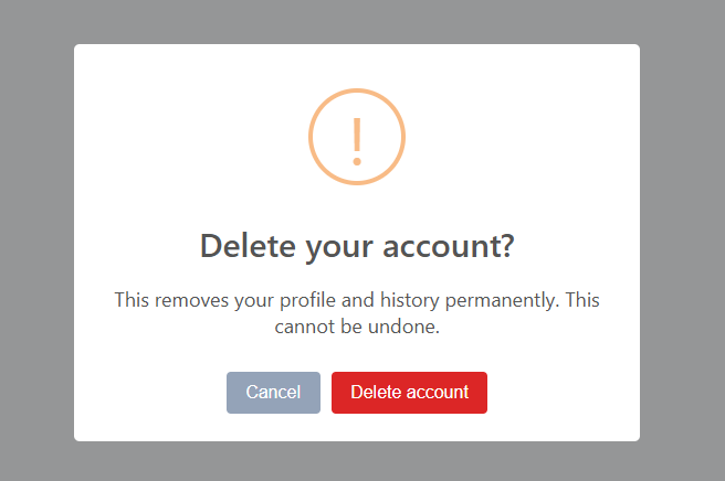
  <div class="modal-icon">🗑️</div>
  <h3>Delete project?</h3>
  <p>This will permanently delete <strong>My Project</strong> and all associated data. This action cannot be undone.</p>
  <div class="modal-actions">
    <button class="btn-cancel" onclick="closeModal()">Cancel</button>
    <button class="btn-confirm">Delete project</button>
  </div>
</div>
* { box-sizing: border-box; margin: 0; padding: 0; }
body { font-family: system-ui, sans-serif; background: #f8fafc; display: flex; align-items: center; justify-content: center; min-height: 100vh; }
.demo { display: flex; align-items: center; justify-content: center; }
.btn { padding: 10px 22px; background: #6366f1; color: #fff; border: none; border-radius: 8px; font-size: 14px; font-weight: 600; cursor: pointer; font-family: inherit; }
.btn:hover { background: #4f46e5; }
.overlay { position: fixed; inset: 0; background: rgba(0,0,0,0.4); backdrop-filter: blur(2px); opacity: 0; pointer-events: none; transition: opacity 0.2s; z-index: 10; }
.overlay.show { opacity: 1; pointer-events: all; }
.modal { position: fixed; top: 50%; left: 50%; transform: translate(-50%, -48%) scale(0.95); background: #fff; border-radius: 18px; padding: 32px 28px; width: 340px; box-shadow: 0 20px 60px rgba(0,0,0,0.2); opacity: 0; pointer-events: none; transition: opacity 0.2s, transform 0.2s; z-index: 20; text-align: center; }
.modal.show { opacity: 1; pointer-events: all; transform: translate(-50%, -50%) scale(1); }
.close { position: absolute; top: 14px; right: 14px; background: none; border: none; color: #94a3b8; cursor: pointer; padding: 4px; border-radius: 6px; }
.close:hover { background: #f1f5f9; color: #1e293b; }
.modal-icon { font-size: 36px; margin-bottom: 14px; }
h3 { font-size: 18px; font-weight: 700; color: #1e293b; margin-bottom: 10px; }
p { font-size: 14px; color: #64748b; line-height: 1.6; margin-bottom: 24px; }
p strong { color: #1e293b; }
.modal-actions { display: flex; gap: 10px; }
.btn-cancel { flex: 1; padding: 10px; background: #f1f5f9; color: #475569; border: 1.5px solid #e2e8f0; border-radius: 8px; font-size: 14px; font-weight: 600; cursor: pointer; font-family: inherit; }
.btn-cancel:hover { background: #e2e8f0; }
.btn-confirm { flex: 1; padding: 10px; background: #dc2626; color: #fff; border: none; border-radius: 8px; font-size: 14px; font-weight: 600; cursor: pointer; font-family: inherit; }
.btn-confirm:hover { background: #b91c1c; }function openModal() { document.getElementById('modal').classList.add('show'); document.getElementById('overlay').classList.add('show'); }
function closeModal() { document.getElementById('modal').classList.remove('show'); document.getElementById('overlay').classList.remove('show'); }
document.addEventListener('keydown', e => { if (e.key === 'Escape') closeModal(); });Extend with AI
Take This Snippet Further With AI
The AI prompt for this one is for Patreon supporters ($3 a month), along with a site with no ads. Supporters enter the passcode once and it is remembered in this browser.
What's included
Features
About this UI Snippet
Modal Dialog — Backdrop Blur Overlay, Scale Entry & Three Close Mechanisms

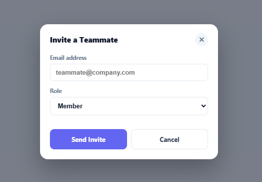
A modal dialog temporarily blocks the rest of the page while the user handles a critical action — a delete confirmation, a form submission, an authentication prompt, or an upgrade gate. The design communicates urgency through the overlay and forces focus through the blurred background. This snippet implements a production-quality modal with three ways to close it and a polished entry animation.
The backdrop blur overlay
.overlay uses background: rgba(0,0,0,0.4) with backdrop-filter: blur(2px). The rgba provides a semi-transparent dark dim. The backdrop-filter blurs everything rendered behind the overlay. The overlay starts at opacity: 0; pointer-events: none. Adding .show transitions to opacity: 1 and restores pointer events. The modal sits on top of the overlay via z-index layering.
The scale entry animation
The modal starts at transform: translate(-50%, -48%) scale(0.95) — centred using the left: 50%; top: 50% absolute positioning trick, but scaled down 5% and shifted 2% upward. Adding .show transitions to translate(-50%, -50%) scale(1). The 5% scale-up and 2px upward movement make the modal appear to emerge from just above centre — a subtle but polished entrance.
Three close mechanisms
openModal() adds .show to both the modal and overlay. closeModal() removes it. Three triggers call closeModal(): the Cancel button, the × close button in the top-right corner, and a document.addEventListener('keydown', e => { if (e.key === 'Escape') closeModal(); }) listener. The overlay div has onclick="closeModal()" so clicking the dim background also closes.
Preventing scroll under the modal
Add document.body.style.overflow = 'hidden' in openModal() and document.body.style.overflow = '' in closeModal(). This prevents the page from scrolling while the modal is open.
Adding accessibility attributes
Add role="dialog", aria-modal="true", and aria-labelledby="modal-title" to the modal div. Give the h3 id="modal-title". Move focus to the first interactive element (the cancel button) when the modal opens.
The three close mechanisms
Production modals need three independent close paths: (1) An explicit × close button in the modal header — covers users who do not know keyboard shortcuts. (2) Click-outside detection on the backdrop — the most natural close gesture on desktop. (3) ESC keydown on document — the universal keyboard escape for any overlay. Implementing all three reduces friction and matches expected behaviour across user profiles. Removing any one of them frustrates a segment of users.
The backdrop blur
backdrop-filter: blur(8px) on the overlay creates the frosted glass effect behind the modal. This requires the overlay to have a partially transparent background (rgba) — a fully opaque overlay has no content behind it to blur. The blur property is GPU-composited and does not trigger layout recalculation.
The entry animation
The modal dialog uses transform: scale(0.95) + opacity: 0 as the initial state, transitioning to scale(1) + opacity: 1 on open. This scale-up-from-slightly-small animation is the standard modal entry across macOS apps, iOS, and most web design systems. It communicates "appearing" more naturally than a slide-in from an edge.
Step by step
How to Use
- 1Open and close the modalClick "Open modal" to see the blur overlay and scale entry animation. Close via Cancel, the × button, the overlay, or ESC key.
- 2Update the modal contentIn the HTML panel, change the icon, h3 title, and p description to your specific action. Keep the action-confirm pattern for destructive actions.
- 3Change the confirm button colourUpdate background: #dc2626 on .btn-confirm to match your action type — red for delete, blue for save, green for confirm.
- 4Add a form insideReplace the paragraph and button row with a form element containing inputs. The 340px max-width accommodates compact forms with 2-3 fields.
- 5Prevent scrollIn the JS panel, add document.body.style.overflow = "hidden" in openModal() and document.body.style.overflow = "" in closeModal().
- 6Export in your formatClick "HTML" for a standalone file, "JSX" for a React component, or "Tailwind" for a React + Tailwind version.
Real-world uses
Common Use Cases
Got questions?
Frequently Asked Questions
backdrop-filter: blur(2px) blurs everything rendered behind the overlay element. The overlay must have a semi-transparent background (rgba) — a fully opaque background would cover the content before the blur can show. The blur effect requires a transparent path to the content below.
The modal uses position: fixed; left: 50%; top: 50%. The initial transform is translate(-50%, -48%) scale(0.95) — centred but scaled down and shifted 2% up. Adding .show transitions to translate(-50%, -50%) scale(1). The scale change creates the grow effect; the Y shift makes it appear to rise into position.
In openModal(), add document.body.style.overflow = "hidden". In closeModal(), restore it: document.body.style.overflow = "". This blocks scroll events on the body while the modal is visible.
Add role="dialog" aria-modal="true" aria-labelledby="modal-title" to the modal div. Give the h3 id="modal-title". In openModal(), move focus to the first interactive element: document.querySelector(".btn-cancel").focus(). This ensures screen readers announce the modal and keyboard users can navigate it.
Yes. Give each modal div a unique id. Create separate open/close functions for each, or modify openModal() to accept an id parameter: function openModal(id) { document.getElementById(id).classList.add("show"); }.
Yes. Click "JSX" to download a React component. In React, replace the JS open/close functions with useState: const [isOpen, setIsOpen] = useState(false). Render the modal and overlay conditionally based on isOpen. The CSS animations work unchanged.