


Confirm Dialog — Type to Confirm HTML CSS JS Snippet
Confirm Dialog · Modals · Plain HTML, CSS & JS · Live preview
Copy & paste
Source Code
<div class="cd-page">
  <button class="cd-trigger" onclick="openDialog()">
    <svg viewBox="0 0 24 24" width="16" height="16" fill="none" stroke="currentColor" stroke-width="2" stroke-linecap="round" stroke-linejoin="round"><path d="M3 6h18M8 6V4a2 2 0 0 1 2-2h4a2 2 0 0 1 2 2v2m2 0v14a2 2 0 0 1-2 2H7a2 2 0 0 1-2-2V6"/></svg>
    Delete project
  </button>

  <div class="cd-overlay" id="cdOverlay" onclick="overlayClick(event)">
    <div class="cd-dialog" role="alertdialog" aria-modal="true" aria-labelledby="cdTitle">
      <div class="cd-icon">
        <svg viewBox="0 0 24 24" width="24" height="24" fill="none" stroke="#dc2626" stroke-width="2" stroke-linecap="round" stroke-linejoin="round"><path d="M12 9v4m0 4h.01M10.3 3.9 1.8 18a2 2 0 0 0 1.7 3h17a2 2 0 0 0 1.7-3L13.7 3.9a2 2 0 0 0-3.4 0z"/></svg>
      </div>
      <h2 class="cd-title" id="cdTitle">Delete this project?</h2>
      <p class="cd-text">This permanently deletes <strong>aurora-api</strong> and all of its deployments, logs, and secrets. This action <strong>cannot be undone</strong>.</p>

      <label class="cd-label">Type <code id="cdPhrase">aurora-api</code> to confirm</label>
      <input class="cd-input" id="cdInput" type="text" placeholder="aurora-api" autocomplete="off" spellcheck="false" oninput="checkPhrase(this)">

      <div class="cd-actions">
        <button class="cd-cancel" onclick="closeDialog()">Cancel</button>
        <button class="cd-confirm" id="cdConfirm" onclick="confirmDelete()" disabled>Delete project</button>
      </div>
    </div>
  </div>
</div>*{box-sizing:border-box;margin:0;padding:0}
body{font-family:system-ui,-apple-system,sans-serif;background:#f1f5f9;min-height:100vh;display:flex;align-items:center;justify-content:center;padding:24px}
.cd-trigger{display:inline-flex;align-items:center;gap:8px;background:#fff;color:#dc2626;border:1.5px solid #fecaca;border-radius:11px;padding:11px 18px;font-size:14px;font-weight:700;cursor:pointer;font-family:inherit;transition:background .15s,border-color .15s}
.cd-trigger:hover{background:#fef2f2;border-color:#fca5a5}
.cd-overlay{position:fixed;inset:0;background:rgba(15,23,42,.5);backdrop-filter:blur(4px);display:flex;align-items:center;justify-content:center;padding:20px;opacity:0;visibility:hidden;transition:opacity .25s,visibility .25s;z-index:50}
.cd-overlay.show{opacity:1;visibility:visible}
.cd-dialog{background:#fff;border-radius:18px;padding:26px;width:100%;max-width:380px;box-shadow:0 25px 60px rgba(0,0,0,.3);transform:scale(.94) translateY(10px);transition:transform .25s cubic-bezier(.2,1.1,.4,1)}
.cd-overlay.show .cd-dialog{transform:scale(1) translateY(0)}
.cd-icon{width:48px;height:48px;border-radius:50%;background:#fee2e2;display:flex;align-items:center;justify-content:center;margin-bottom:14px}
.cd-title{font-size:18px;font-weight:800;color:#1e293b;margin-bottom:8px}
.cd-text{font-size:13px;color:#64748b;line-height:1.55;margin-bottom:18px}
.cd-text strong{color:#1e293b;font-weight:700}
.cd-label{display:block;font-size:12px;color:#475569;margin-bottom:7px}
.cd-label code{background:#f1f5f9;color:#dc2626;font-weight:700;padding:2px 6px;border-radius:5px;font-family:ui-monospace,monospace;font-size:12px}
.cd-input{width:100%;padding:10px 12px;border:1.5px solid #e2e8f0;border-radius:10px;font-size:14px;color:#1e293b;outline:none;font-family:ui-monospace,monospace;transition:border-color .15s,box-shadow .15s;margin-bottom:18px}
.cd-input:focus{border-color:#6366f1;box-shadow:0 0 0 3px rgba(99,102,241,.12)}
.cd-input.match{border-color:#10b981}
.cd-actions{display:flex;gap:10px}
.cd-cancel,.cd-confirm{flex:1;padding:11px;border:none;border-radius:10px;font-size:14px;font-weight:700;cursor:pointer;font-family:inherit;transition:background .15s,opacity .15s}
.cd-cancel{background:#f1f5f9;color:#475569}
.cd-cancel:hover{background:#e2e8f0}
.cd-confirm{background:#dc2626;color:#fff}
.cd-confirm:hover:not(:disabled){background:#b91c1c}
.cd-confirm:disabled{background:#fca5a5;cursor:not-allowed;opacity:.7}
.cd-confirm.done{background:#10b981!important}var overlay = document.getElementById('cdOverlay');
var input = document.getElementById('cdInput');
var confirm = document.getElementById('cdConfirm');
var PHRASE = document.getElementById('cdPhrase').textContent;
var busy = false;
function openDialog() {
overlay.classList.add('show');
setTimeout(function () { input.focus(); }, 120);
}
function closeDialog() {
if (busy) return;
overlay.classList.remove('show');
input.value = '';
input.classList.remove('match');
confirm.disabled = true;
confirm.classList.remove('done');
confirm.textContent = 'Delete project';
}
function overlayClick(e) {
if (e.target === overlay) closeDialog();
}
function checkPhrase(el) {
var match = el.value.trim() === PHRASE;
confirm.disabled = !match;
el.classList.toggle('match', match);
}
function confirmDelete() {
if (confirm.disabled || busy) return;
busy = true;
confirm.textContent = 'Deleting…';
setTimeout(function () {
confirm.textContent = '✓ Deleted';
confirm.classList.add('done');
setTimeout(function () { busy = false; closeDialog(); }, 1000);
}, 850);
}
document.addEventListener('keydown', function (e) {
if (e.key === 'Escape') closeDialog();
});Extend with AI
Take This Snippet Further With AI
The AI prompt for this one is for Patreon supporters ($3 a month), along with a site with no ads. Supporters enter the passcode once and it is remembered in this browser.
What's included
Features
checkPhrase enables Delete only when the input exactly matches the required phrase, forcing deliberate intent.<code>, so changing the displayed name updates the check automatically.backdrop-filter: blur dims and frosts the page; the dialog scales/slides in with transform+opacity for a smooth, export-safe entrance.e.target === overlay), and Escape all route through closeDialog.confirmDelete transitions the button through "Deleting…" and "✓ Deleted", a clear async lifecycle stand-in.busy flag blocks dismissal and repeat clicks during the delete sequence so the action cannot double-fire.About this UI Snippet
Confirm Dialog — Type-to-Confirm Guard, Backdrop Blur & Deleting→Done State
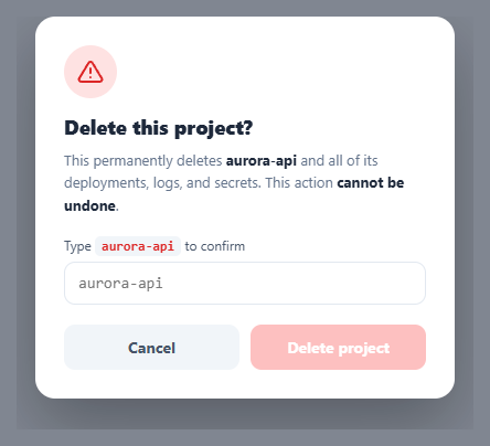
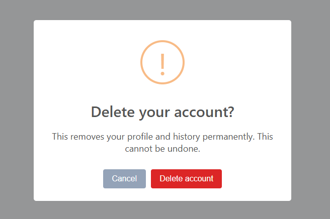
For genuinely destructive actions — deleting a project, dropping a database, closing an account — a plain "Are you sure? [OK]" is too easy to click through on autopilot. The stronger pattern, used by GitHub, Stripe, and Vercel, is type-to-confirm: the user must type the exact name of the thing being destroyed before the confirm button unlocks. That deliberate friction is the point. This snippet implements it in plain HTML, CSS, and vanilla JavaScript: a type-to-confirm guard, a blurred modal overlay, the standard dismissal behaviours, and a deleting→done state.
The type-to-confirm guard
The Delete button starts disabled. checkPhrase runs on every keystroke and compares the trimmed input against the required PHRASE (read from the on-screen <code> so the markup is the source of truth). Only an exact match enables the button and turns the input border green. This forces the user to consciously read and reproduce the resource's name, which all but eliminates accidental deletions and "muscle-memory" confirmations — the entire reason the pattern exists.
A real modal, dismissed the expected ways
The dialog uses role="alertdialog" and aria-modal, with a blurred, dimmed overlay (backdrop-filter: blur). It animates in by scaling and sliding from scale(.94) to scale(1) with opacity — transform/opacity only, so it is smooth and exports cleanly. It can be dismissed three ways: the Cancel button, clicking the backdrop (overlayClick checks e.target === overlay so clicks inside the dialog do not close it), and pressing Escape. Every dismissal path runs closeDialog, which also resets the input and re-disables the button so the guard is fresh next time.
Deleting → done state with a re-entrancy lock
On confirm, confirmDelete switches the button to "Deleting…", then to a green "✓ Deleted", then closes — standing in for an async request. A busy flag locks the dialog during this sequence so Escape, the backdrop, and repeat clicks cannot interrupt or double-fire the action mid-delete. Once finished, closeDialog fully resets the dialog for reuse.
Focus and reset
Opening the dialog focuses the input after the animation so the user can start typing immediately, and closing clears the field, the match style, and the button label — so reopening always presents a clean, locked confirm.
Wire your real delete call into confirmDelete (before the success state) and you have a production-grade safeguard. Pair this with a slide to confirm for an alternative deliberate gesture, a snackbar with undo for reversible deletes, or a modal for non-destructive dialogs.
Step by step
How to Use
- 1Paste HTML, CSS, and JSA red "Delete project" button appears; clicking it opens a blurred modal asking you to type the project name.
- 2See the locked confirmThe Delete button inside the dialog is disabled — you cannot click it until you prove intent.
- 3Type the phraseType
aurora-apiexactly — the input border turns green and the Delete button unlocks the moment it matches. - 4ConfirmClick Delete — it shows "Deleting…", then a green "✓ Deleted", then the dialog closes.
- 5Dismiss itCancel, click the dimmed backdrop, or press Escape to close without deleting; the guard resets for next time.
- 6Wire your actionPut your real delete API call in
confirmDeletebefore the success state — it only runs once the typed name matches.
Real-world uses
Common Use Cases
Got questions?
Frequently Asked Questions
Put your API call inside confirmDelete before showing the success state: keep the busy lock set, await the request, then switch to "✓ Deleted" and close on success. On failure, clear busy, restore the button label, and show an error message instead of closing — so the user can retry without losing the dialog.
The phrase is read from the #cdPhrase element's text, so render the actual resource name into both that <code> and the warning text when you open the dialog. checkPhrase compares against whatever is shown, so per-item dialogs (deleting "billing-prod" vs "aurora-api") work with no code change.
By default this matches exactly (case-sensitive), which is the safest and matches GitHub's behaviour — it forces careful reproduction. If your resource names are case-insensitive, compare with .toLowerCase() on both sides. Keep the trim (already applied) so trailing spaces from autocomplete do not block a correct match.
It uses role="alertdialog" and aria-modal with an aria-labelledby pointing at the title. For full compliance, trap focus inside the dialog while open (cycle Tab between the input and buttons), return focus to the trigger on close, and ensure Escape closes it (it does). The green match state should be paired with the unlocked button, not colour alone, so the cue is not purely visual.
In React, hold open, the typed value, and a busy flag in useState; derive the button's disabled state from value === phrase, and add an Escape useEffect. In Vue, use refs with v-model and a computed match. In Angular, track state on the component and bind [disabled]. The overlay/scale-in CSS and guard logic port unchanged.