

Animated Dialog and Popover with @starting-style CSS
Animated Dialog and Popover with @starting-style CSS · Modals · Plain HTML, CSS & JS · Live preview
About this UI Snippet
Animating display:none Without a Library: @starting-style in Practice
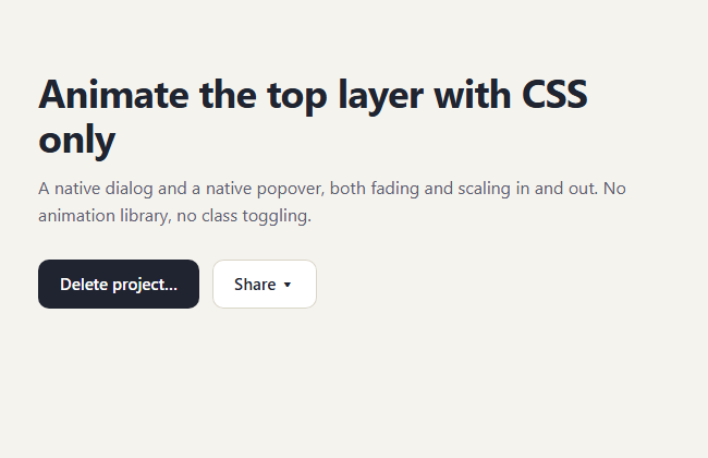
Native <dialog> and popover elements are removed from rendering when closed, so for years a CSS transition could not play when they appeared or disappeared. Two newer features fix that. @starting-style defines how an element looks on its first frame, and transition-behavior: allow-discrete lets display and overlay take part in a transition. This snippet uses both on a confirm dialog and a share menu.
The enter animation
The resting style of .ds-dialog is transparent and slightly lowered and shrunk. .ds-dialog[open] is fully visible. Inside @starting-style the open state repeats the transparent values, so the browser starts from there when the element first renders and interpolates to the visible state.
The exit animation
Closing works because display and overlay are in the transition list with allow-discrete. The browser keeps the element rendered, and in the top layer, until the opacity and transform transitions finish, then flips it to display: none. No animationend listeners and no timeouts.
The backdrop
::backdrop is transitioned the same way: background colour and backdrop-filter blur go from nothing to a dim, blurred page, with their own starting-style rule. Clicking the backdrop is handled by comparing event.target to the dialog.
Native behaviour kept
showModal() gives focus trapping, Escape to close and an inert page. The popover gets light-dismiss and Escape from the popover attribute, and popovertarget wires the button with no script. Where anchor-name is supported the menu is placed under its button with anchor positioning.
Where it fits
Use it for confirmations, share menus, filters and anything that should feel smooth without adding a package. For a script-driven version see the modal and the plain popover snippets.
Accessibility and motion
The dialog is labelled with aria-labelledby, focus returns to the button that opened it, and the result line is an aria-live region so the outcome is announced. Under prefers-reduced-motion the durations drop to almost nothing, so the dialog still works but no longer moves.
What's included
Features
Step by step
How to Use
- 1Write the closed look as the base styleGive .ds-dialog opacity: 0 and a small translate and scale. The [open] rule then sets opacity: 1 and transform: none.
- 2Add @starting-style for the first frameRepeat the closed values inside @starting-style { .ds-dialog[open] { ... } }. Without it the browser has nothing to animate from when the element first appears.
- 3List display and overlay in the transitionAdd overlay and display with allow-discrete to the transition list so the dialog stays on screen until the fade finishes on close.
- 4Fade the backdrop tooTransition ::backdrop background and backdrop-filter, and give it its own @starting-style rule.
- 5Open with showModal(), wire the popover with an attributeThe dialog needs one call; the share menu needs only popovertarget="dsMenu" on the button and popover on the div.
- 6Place the menu under its buttonInside @supports (anchor-name: --a) set anchor-name on the button and top: calc(anchor(bottom) + 8px) on the popover.
Real-world uses
Common Use Cases
Got questions?
Frequently Asked Questions
@starting-style supplies the first-frame values so the enter transition has a starting point. allow-discrete on display and overlay keeps the element in the top layer while the exit transition runs. One handles entry, the other handles exit.
The dialog and popover still open and close correctly because they are native elements. The only difference is that they appear and disappear instantly instead of animating, so there is nothing to polyfill.
You can animate entry with keyframes, but exit is harder because display none removes the element immediately. Transitions with allow-discrete handle both directions with the same declarations, which is why this pattern replaces most keyframe workarounds.
Yes, mostly through the platform. showModal traps focus and restores it on close, Escape works, and the dialog is labelled with aria-labelledby. Keep the transitions short and respect prefers-reduced-motion, which this snippet does.
Copy & paste
Source Code
<main class="ds-page">
<h1>Animate the top layer with CSS only</h1>
<p class="ds-sub">A native dialog and a native popover, both fading and scaling in and out. No animation library, no class toggling.</p>
<div class="ds-row">
<button class="ds-btn" type="button" id="dsOpen">Delete project…</button>
<button class="ds-btn ds-ghost" type="button" popovertarget="dsMenu">Share ▾</button>
</div>
<dialog class="ds-dialog" id="dsDialog" aria-labelledby="dsTitle">
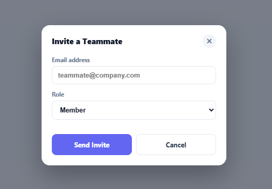
<h2 id="dsTitle">Delete “Autumn campaign”?</h2>
<p>This removes 14 files and cannot be undone. Anyone with the link will lose access.</p>
<form method="dialog" class="ds-actions">
<button class="ds-btn ds-ghost" value="cancel">Cancel</button>
<button class="ds-btn ds-danger" value="delete">Delete</button>
</form>
</dialog>
<div class="ds-menu" id="dsMenu" popover>
<button type="button">Copy link</button>
<button type="button">Invite by email</button>
<button type="button">Export as PDF</button>
</div>
<p class="ds-result" id="dsResult" aria-live="polite"></p>
</main>*{box-sizing:border-box;margin:0;padding:0}
body{font-family:system-ui,-apple-system,'Segoe UI',sans-serif;background:#f5f3ee;color:#1f2430;min-height:100vh}
.ds-page{max-width:620px;margin:0 auto;padding:64px 20px}
h1{font-size:clamp(26px,5vw,36px);letter-spacing:-.02em;line-height:1.15}
.ds-sub{margin:12px 0 28px;color:#5b6070;line-height:1.6}
.ds-row{display:flex;gap:12px;flex-wrap:wrap}
.ds-btn{font:600 15px system-ui,sans-serif;padding:12px 20px;border:0;border-radius:10px;background:#1f2430;color:#fff;cursor:pointer}
.ds-btn:focus-visible,.ds-menu button:focus-visible{outline:3px solid #6366f1;outline-offset:2px}
.ds-ghost{background:#fff;color:#1f2430;box-shadow:inset 0 0 0 1px #d9d5c8}
.ds-danger{background:#c92a2a}
.ds-result{margin-top:22px;font-size:15px;color:#5b6070;min-height:22px}
/* Dialog: closed state is the default look, [open] is the visible one */
.ds-dialog{margin:auto;width:min(420px,calc(100vw - 32px));padding:28px;border:0;border-radius:18px;background:#fff;box-shadow:0 24px 60px rgb(20 24 40 / .28);
opacity:0;transform:translateY(18px) scale(.96);
transition:opacity .28s ease,transform .28s ease,overlay .28s allow-discrete,display .28s allow-discrete}
.ds-dialog[open]{opacity:1;transform:none}
@starting-style{.ds-dialog[open]{opacity:0;transform:translateY(18px) scale(.96)}}
.ds-dialog h2{font-size:20px;margin-bottom:8px}
.ds-dialog p{color:#5b6070;line-height:1.6}
.ds-actions{display:flex;justify-content:flex-end;gap:10px;margin-top:22px}
/* The backdrop fades with the dialog */
.ds-dialog::backdrop{background:rgb(15 18 30 / 0);backdrop-filter:blur(0);transition:background .28s ease,backdrop-filter .28s ease,overlay .28s allow-discrete,display .28s allow-discrete}
.ds-dialog[open]::backdrop{background:rgb(15 18 30 / .5);backdrop-filter:blur(4px)}
@starting-style{.ds-dialog[open]::backdrop{background:rgb(15 18 30 / 0);backdrop-filter:blur(0)}}
/* Popover: same pattern, anchored under its button */
.ds-menu{position:fixed;inset:auto;margin:0;padding:6px;border:0;border-radius:12px;background:#fff;box-shadow:0 12px 32px rgb(20 24 40 / .22),0 0 0 1px #e4e0d5;min-width:190px;
opacity:0;transform:translateY(-8px) scale(.97);transform-origin:top left;
transition:opacity .2s ease,transform .2s ease,overlay .2s allow-discrete,display .2s allow-discrete}
.ds-menu:popover-open{opacity:1;transform:none}
@starting-style{.ds-menu:popover-open{opacity:0;transform:translateY(-8px) scale(.97)}}
.ds-menu button{display:block;width:100%;text-align:left;padding:10px 12px;border:0;border-radius:8px;background:none;font:500 15px system-ui,sans-serif;color:#1f2430;cursor:pointer}
.ds-menu button:hover{background:#eeece4}
@supports (anchor-name:--a){
[popovertarget="dsMenu"]{anchor-name:--share}
.ds-menu{position-anchor:--share;top:calc(anchor(bottom) + 8px);left:anchor(left)}
}
@media (prefers-reduced-motion:reduce){.ds-dialog,.ds-dialog::backdrop,.ds-menu{transition-duration:.01ms}}var dialog = document.getElementById('dsDialog');
var result = document.getElementById('dsResult');
var menu = document.getElementById('dsMenu');
document.getElementById('dsOpen').addEventListener('click', function () {
dialog.showModal();
});
// Closing is just dialog.close(); the CSS transition plays because of transition-behavior: allow-discrete.
dialog.addEventListener('close', function () {
result.textContent = dialog.returnValue === 'delete' ? 'Project deleted (demo only).' : 'Cancelled.';
});
// Click on the backdrop closes the dialog
dialog.addEventListener('click', function (e) {
if (e.target === dialog) dialog.close('cancel');
});
menu.addEventListener('click', function (e) {
var b = e.target.closest('button');
if (!b) return;
result.textContent = b.textContent + ' selected.';
menu.hidePopover();
});Extend with AI
Take This Snippet Further With AI
Paste this snippet into an AI coding assistant and ask it to explain how @starting-style and transition-behavior allow-discrete make the open and close animations work. Useful follow-ups: add a slide-from-right drawer variant, animate a toast popover stack, or add a spring easing with linear(). Ask it to keep reduced-motion support and the native focus behaviour.
Prompt to recreate it
Copy this into your AI assistant of choice to build the effect from scratch, or as a jumping-off point for your own variant:
Build an animated native dialog and popover using only CSS transitions, in plain HTML, CSS and a few lines of JavaScript.

Requirements:
- A button that calls dialog.showModal() on a <dialog> containing a heading (aria-labelledby), a sentence, and a form method="dialog" with Cancel and Delete buttons that return their value. Show the returned value in an aria-live line.
- The dialog's base style is opacity 0, translateY(18px) and scale(.96); the [open] style is opacity 1 with no transform. Repeat the closed values inside @starting-style for the [open] rule. Transition opacity, transform, overlay and display with transition-behavior allow-discrete (list display and overlay explicitly).
- Animate ::backdrop the same way, from transparent to a dark tint with backdrop-filter blur, including a @starting-style rule.
- A second button with popovertarget opens a div[popover] menu with three actions. Animate it with :popover-open plus @starting-style, anchor it under the trigger using anchor-name and position-anchor inside @supports, and call hidePopover after choosing an item.
- Clicking the dialog backdrop closes it. Respect prefers-reduced-motion and keep visible focus styles. Work at phone width.
Want to tighten it up first? Run this prompt through the AI Prompt Studio to score it across 8 quality dimensions, catch anti-patterns, and tune the wording for Claude, ChatGPT, or Gemini before you paste it in.