


Floating Pill Nav — Free HTML CSS JS Navbar Snippet
Floating Pill Nav · Navigation · Plain HTML, CSS & JS · Live preview
Copy & paste
Source Code
<div class="fp-page">
  <nav class="fp-nav" id="fpNav" aria-label="Primary">
    <a href="#" class="fp-brand">◆ Lumen</a>
    <ul class="fp-links" id="fpLinks">
      <li><a href="#home" class="fp-link active">Home</a></li>
      <li><a href="#features" class="fp-link">Features</a></li>
      <li><a href="#pricing" class="fp-link">Pricing</a></li>
      <li><a href="#docs" class="fp-link">Docs</a></li>
    </ul>
    <a href="#" class="fp-cta">Sign up</a>
  </nav>

  <header class="fp-hero"><h1>Scroll down</h1><p>The pill nav shrinks and lifts as you go.</p></header>
  <section class="fp-fill"></section>
</div>*{box-sizing:border-box;margin:0;padding:0}
body{font-family:system-ui,-apple-system,sans-serif;background:#0b1120;color:#e2e8f0}
.fp-page{min-height:200vh}
.fp-nav{position:fixed;top:20px;left:50%;transform:translateX(-50%);display:flex;align-items:center;gap:24px;width:min(720px,calc(100% - 32px));padding:13px 13px 13px 22px;background:rgba(17,24,39,.55);border:1px solid rgba(148,163,184,.16);border-radius:999px;backdrop-filter:blur(10px);-webkit-backdrop-filter:blur(10px);box-shadow:0 8px 30px -12px rgba(0,0,0,.5);transition:width .35s cubic-bezier(.4,0,.2,1),top .35s,padding .35s,background .35s,box-shadow .35s;z-index:50}
.fp-nav.shrink{width:min(560px,calc(100% - 32px));top:12px;padding:9px 9px 9px 18px;background:rgba(17,24,39,.82);box-shadow:0 12px 34px -10px rgba(0,0,0,.7)}
.fp-brand{font-weight:800;font-size:15px;color:#fff;text-decoration:none;letter-spacing:-.01em;white-space:nowrap}
.fp-brand{color:#a78bfa}
.fp-links{list-style:none;display:flex;gap:4px;margin:0 auto;position:relative}
.fp-link{position:relative;display:block;padding:7px 14px;font-size:13.5px;font-weight:600;color:#94a3b8;text-decoration:none;border-radius:999px;transition:color .2s;z-index:1}
.fp-link:hover{color:#e2e8f0}
.fp-link.active{color:#fff}
.fp-pill{position:absolute;top:0;height:100%;border-radius:999px;background:rgba(167,139,250,.18);border:1px solid rgba(167,139,250,.4);transition:transform .3s cubic-bezier(.4,0,.2,1),width .3s;z-index:0}
.fp-cta{background:#a78bfa;color:#1e1b4b;font-size:13px;font-weight:800;text-decoration:none;padding:9px 17px;border-radius:999px;white-space:nowrap;transition:transform .15s}
.fp-cta:hover{transform:translateY(-1px)}
.fp-hero{height:100vh;display:flex;flex-direction:column;align-items:center;justify-content:center;gap:10px;text-align:center}
.fp-hero h1{font-size:clamp(32px,7vw,64px);font-weight:800;background:linear-gradient(120deg,#a78bfa,#22d3ee);-webkit-background-clip:text;background-clip:text;color:transparent}
.fp-hero p{color:#64748b}
.fp-fill{height:100vh;background:radial-gradient(circle at 50% 0,rgba(167,139,250,.08),transparent 60%)}
@media(max-width:560px){.fp-links{display:none}}var nav = document.getElementById('fpNav');
var linksWrap = document.getElementById('fpLinks');
var links = Array.prototype.slice.call(linksWrap.querySelectorAll('.fp-link'));
// 1) Sliding pill indicator that follows the active/hovered link.
var pill = document.createElement('span');
pill.className = 'fp-pill';
linksWrap.appendChild(pill);
function movePill(el) {
pill.style.width = el.offsetWidth + 'px';
pill.style.transform = 'translateX(' + el.offsetLeft + 'px)';
}
function activeEl() { return linksWrap.querySelector('.fp-link.active'); }
requestAnimationFrame(function () { movePill(activeEl()); });
links.forEach(function (link) {
link.addEventListener('mouseenter', function () { movePill(link); });
link.addEventListener('click', function (e) {
e.preventDefault();
links.forEach(function (l) { l.classList.remove('active'); });
link.classList.add('active');
movePill(link);
});
});
linksWrap.addEventListener('mouseleave', function () { movePill(activeEl()); });
window.addEventListener('resize', function () { movePill(activeEl()); });
// 2) Condense the whole bar after a small scroll using a passive listener.
var ticking = false;
window.addEventListener('scroll', function () {
if (ticking) return;
ticking = true;
requestAnimationFrame(function () {
nav.classList.toggle('shrink', window.scrollY > 40);
ticking = false;
});
}, { passive: true });Extend with AI
Take This Snippet Further With AI
The AI prompt for this one is for Patreon supporters ($3 a month), along with a site with no ads. Supporters enter the passcode once and it is remembered in this browser.
What's included
Features
About this UI Snippet
Floating Pill Nav — Shrinking Glass Bar with Sliding Indicator
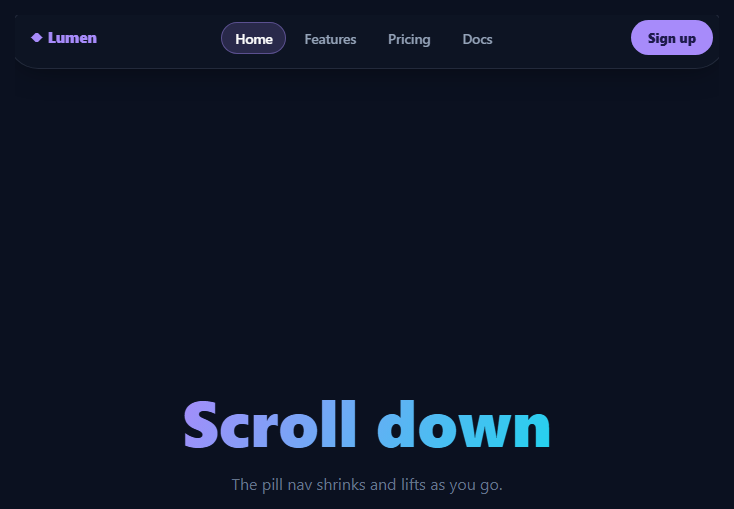
The floating pill navbar is the navigation style popularized by modern SaaS and product sites: instead of a full-width bar stuck to the top edge, the menu is a rounded "pill" that floats a few pixels below the top, centered, with a frosted-glass background — and it gently condenses as you scroll down. This snippet implements the complete pattern in plain HTML, CSS, and vanilla JavaScript, including a sliding indicator that tracks the active and hovered links.
The floating glass container
The nav is position: fixed and centered with the classic left: 50%; transform: translateX(-50%) trick, then capped at min(720px, calc(100% - 32px)) so it never touches the screen edges. The frosted look comes from a semi-transparent rgba background plus backdrop-filter: blur(10px), which samples and blurs whatever scrolls behind it. A hairline 1px border and a soft drop shadow lift it off the page so it reads as a floating object rather than a docked bar.
Condensing on scroll
A scroll listener — registered as { passive: true } and throttled with requestAnimationFrame so it never blocks the main thread — toggles a .shrink class once window.scrollY passes 40px. That single class narrows the pill from 720px to 560px, raises it closer to the top, tightens the padding, and deepens both the background opacity and the shadow. Every one of those changes is driven by CSS transitions on width, top, padding, background, and box-shadow, so the JavaScript only flips a class while CSS animates the morph smoothly with a cubic-bezier ease.
The sliding active indicator
A .fp-pill element is created in JavaScript and appended behind the links. The movePill function reads the target link's offsetLeft and offsetWidth and applies them as a translateX and width, so the highlight glides to sit exactly under any link. It follows the mouse on mouseenter, snaps to the clicked link as the new active item, and returns to the active link when the cursor leaves the list via mouseleave. Because it animates transform and width rather than left, the motion is GPU-accelerated and stays at 60fps.
Staying correct on resize
Link positions change when the viewport resizes, so a resize listener re-measures and repositions the indicator under the current active link. On first paint the position is set inside a requestAnimationFrame callback to guarantee layout has been computed before measuring offsetLeft — measuring too early would place the pill at zero.
Responsive behavior
Below 560px the center link list is hidden with a media query, leaving the brand and the call-to-action button — the typical mobile collapse point where you would swap in a hamburger nav or a bottom nav. The CTA keeps a subtle hover lift so the primary action stays obvious at any size.
Customizing it
Change the two width values to control how dramatically the bar condenses, adjust the scrollY > 40 threshold to shrink sooner or later, and recolor the indicator's rgba background to match your accent. Because the shrink is just a class toggle, you can add more changes — hide the brand text, swap the logo, or fade in a search icon — purely by extending the .shrink rules in CSS.
Step by step
How to Use
- 1Paste HTML, CSS, and JSA frosted pill navbar floats centered near the top of the page.
- 2Hover the linksA soft indicator slides under whichever link you point at.
- 3Click a linkThe indicator snaps to it and it becomes the active item.
- 4Scroll downThe whole pill narrows, rises, and deepens its glass background.
- 5Resize the windowThe indicator re-measures so it stays aligned under the active link.
- 6Tune the thresholdsAdjust the width values and scrollY trigger to taste.
Real-world uses
Common Use Cases
Got questions?
Frequently Asked Questions
JavaScript only toggles a .shrink class when scrollY passes 40px; all the actual change — narrower width, higher top, tighter padding, denser background — lives in CSS transitions with a cubic-bezier ease. The scroll listener is passive and wrapped in requestAnimationFrame, so measuring and the class flip never block scrolling.
movePill reads the target link's offsetLeft and offsetWidth and applies them as a translateX and width on an absolutely-positioned pill behind the links. It animates transform and width (GPU-friendly) rather than the left property, so it glides smoothly under the hovered link and snaps to the active one on click.
offsetLeft and offsetWidth return zero until the browser has computed layout. Deferring the first movePill call to a requestAnimationFrame guarantees the links have been laid out, so the pill appears correctly under the initial active link instead of at the far left.
Yes. A resize listener calls movePill on the current active link whenever the viewport changes, recalculating its offset. Below 560px a media query hides the center links entirely, which is the natural breakpoint to swap in a hamburger or bottom-nav menu.
Render the links from an array and keep an activeIndex in state. Use a ref to the active link element and recompute the indicator's left/width in a layout effect (useLayoutEffect in React, onMounted plus a watcher in Vue, ngAfterViewInit in Angular). Attach the scroll and resize listeners in the same effect and return a cleanup that removes them. In Tailwind, build the pill with backdrop-blur, bg-white/10, and rounded-full utilities.
Yes. While the Floating Pill Nav snippet gives you one pattern to copy, the free Responsive Navbar Builder at webdevpuneet.com/navbar-builder/ designs a whole navigation bar: logo, links and dropdown menus, a mobile hamburger menu (dropdown panel, slide-in drawer or full screen) and a scroll effect (sticky, shrink, hide on scroll or transparent). It has six presets, a live preview that runs the real code, and exports HTML + CSS + vanilla JS, React, Tailwind, Vue 3 or Angular — or you can click Fork & Edit to keep editing it in My Code.