




Gradient Progress Bars — Animated HTML CSS JS Snippet
Gradient Progress Bars · Loaders · Plain HTML, CSS & JS · Live preview
Copy & paste
Source Code
<div class="page">
  <section class="group">
    <h3 class="group-title">Animated Gradient</h3>
    <div class="prog-wrap">
      <div class="prog-header"><span class="prog-label">Storage Used</span><span class="prog-val">72%</span></div>
      <div class="prog-track"><div class="prog-bar bar-indigo" style="--p:72%"></div></div>
    </div>
    <div class="prog-wrap">
      <div class="prog-header"><span class="prog-label">CPU Usage</span><span class="prog-val">48%</span></div>
      <div class="prog-track"><div class="prog-bar bar-cyan" style="--p:48%"></div></div>
    </div>
    <div class="prog-wrap">
      <div class="prog-header"><span class="prog-label">Memory</span><span class="prog-val">89%</span></div>
      <div class="prog-track"><div class="prog-bar bar-red" style="--p:89%"></div></div>
    </div>
  </section>

  <section class="group">
    <h3 class="group-title">Striped Animated</h3>
    <div class="prog-wrap">
      <div class="prog-header"><span class="prog-label">Uploading files…</span><span class="prog-val">63%</span></div>
      <div class="prog-track"><div class="prog-bar bar-stripe bar-green" style="--p:63%"></div></div>
    </div>
    <div class="prog-wrap">
      <div class="prog-header"><span class="prog-label">Syncing database</span><span class="prog-val">31%</span></div>
      <div class="prog-track"><div class="prog-bar bar-stripe bar-purple" style="--p:31%"></div></div>
    </div>
  </section>

  <section class="group">
    <h3 class="group-title">Segmented / Steps</h3>
    <div class="prog-wrap">
      <div class="prog-header"><span class="prog-label">Onboarding progress</span><span class="prog-val">Step 3 of 5</span></div>
      <div class="seg-track">
        <div class="seg done"></div>
        <div class="seg done"></div>
        <div class="seg active"></div>
        <div class="seg"></div>
        <div class="seg"></div>
      </div>
    </div>
  </section>

  <section class="group">
    <h3 class="group-title">Skill Bars</h3>
    <div class="skills">
      <div class="skill-row">
        <span class="skill-name">React</span>
        <div class="skill-track"><div class="skill-bar" data-p="90"></div></div>
        <span class="skill-pct">90%</span>
      </div>
      <div class="skill-row">
        <span class="skill-name">TypeScript</span>
        <div class="skill-track"><div class="skill-bar" data-p="78"></div></div>
        <span class="skill-pct">78%</span>
      </div>
      <div class="skill-row">
        <span class="skill-name">Node.js</span>
        <div class="skill-track"><div class="skill-bar" data-p="65"></div></div>
        <span class="skill-pct">65%</span>
      </div>
      <div class="skill-row">
        <span class="skill-name">CSS / Design</span>
        <div class="skill-track"><div class="skill-bar" data-p="85"></div></div>
        <span class="skill-pct">85%</span>
      </div>
    </div>
  </section>

  <section class="group">
    <h3 class="group-title">Interactive — Click to update</h3>
    <div class="prog-wrap">
      <div class="prog-header"><span class="prog-label">Project completion</span><span class="prog-val" id="liveVal">55%</span></div>
      <div class="prog-track"><div class="prog-bar bar-indigo" id="liveBar" style="--p:55%"></div></div>
    </div>
    <div class="btn-row">
      <button class="ctrl-btn" onclick="adjustBar(-10)">−10%</button>
      <button class="ctrl-btn" onclick="adjustBar(-5)">−5%</button>
      <button class="ctrl-btn primary" onclick="adjustBar(5)">+5%</button>
      <button class="ctrl-btn primary" onclick="adjustBar(10)">+10%</button>
    </div>
  </section>
</div>*{box-sizing:border-box;margin:0;padding:0}
body{font-family:system-ui,sans-serif;background:#f8fafc;min-height:100vh;padding:28px 20px}
.page{max-width:580px;margin:0 auto;display:flex;flex-direction:column;gap:28px}
.group{background:#fff;border:1.5px solid #e2e8f0;border-radius:16px;padding:20px 22px;display:flex;flex-direction:column;gap:16px}
.group-title{font-size:12px;font-weight:700;letter-spacing:.06em;text-transform:uppercase;color:#94a3b8;margin-bottom:2px}
.prog-wrap{display:flex;flex-direction:column;gap:6px}
.prog-header{display:flex;justify-content:space-between;align-items:center}
.prog-label{font-size:13px;font-weight:600;color:#334155}
.prog-val{font-size:12px;font-weight:700;color:#64748b}
.prog-track{height:8px;background:#f1f5f9;border-radius:20px;overflow:hidden}
.prog-bar{height:100%;border-radius:20px;width:var(--p,0%);transition:width .6s cubic-bezier(.4,0,.2,1);background-size:200% 100%;animation:shimmer 2s linear infinite}
.bar-indigo{background:linear-gradient(90deg,#6366f1,#8b5cf6,#6366f1)}
.bar-cyan{background:linear-gradient(90deg,#0ea5e9,#06b6d4,#0ea5e9)}
.bar-red{background:linear-gradient(90deg,#f59e0b,#ef4444,#f59e0b)}
.bar-green{background:linear-gradient(90deg,#10b981,#059669,#10b981)}
.bar-purple{background:linear-gradient(90deg,#8b5cf6,#6366f1,#8b5cf6)}
@keyframes shimmer{0%{background-position:200% 0}100%{background-position:-200% 0}}
.bar-stripe{background-image:repeating-linear-gradient(
45deg,
transparent,transparent 6px,
rgba(255,255,255,.18) 6px,rgba(255,255,255,.18) 12px
),linear-gradient(90deg,#10b981,#059669)}
.bar-stripe.bar-purple{background-image:repeating-linear-gradient(
45deg,
transparent,transparent 6px,
rgba(255,255,255,.18) 6px,rgba(255,255,255,.18) 12px
),linear-gradient(90deg,#8b5cf6,#6366f1);animation:stripe-move 1s linear infinite}
.bar-stripe{animation:stripe-move 1s linear infinite}
@keyframes stripe-move{0%{background-position:0 0}100%{background-position:24px 0}}
.seg-track{display:flex;gap:4px}
.seg{flex:1;height:6px;border-radius:4px;background:#e2e8f0;transition:background .3s}
.seg.done{background:#6366f1}
.seg.active{background:linear-gradient(90deg,#6366f1,#8b5cf6);animation:pulse-seg 1.4s ease-in-out infinite}
@keyframes pulse-seg{0%,100%{opacity:1}50%{opacity:.6}}
.skills{display:flex;flex-direction:column;gap:10px}
.skill-row{display:grid;grid-template-columns:100px 1fr 36px;align-items:center;gap:10px}
.skill-name{font-size:12px;font-weight:600;color:#334155}
.skill-track{height:7px;background:#f1f5f9;border-radius:20px;overflow:hidden}
.skill-bar{height:100%;border-radius:20px;background:linear-gradient(90deg,#6366f1,#8b5cf6);width:0%;transition:width .8s cubic-bezier(.4,0,.2,1)}
.skill-pct{font-size:11px;font-weight:700;color:#6366f1;text-align:right}
.btn-row{display:flex;gap:8px;flex-wrap:wrap}
.ctrl-btn{padding:6px 14px;border-radius:8px;border:1.5px solid #e2e8f0;background:#fff;color:#475569;font-size:12px;font-weight:600;cursor:pointer;transition:all .15s;font-family:inherit}
.ctrl-btn:hover{border-color:#c7d2fe;color:#6366f1}
.ctrl-btn.primary{background:#6366f1;border-color:#6366f1;color:#fff}
.ctrl-btn.primary:hover{background:#4f46e5}// Animate skill bars on load
window.addEventListener('DOMContentLoaded', () => {
document.querySelectorAll('.skill-bar').forEach(bar => {
setTimeout(() => { bar.style.width = bar.dataset.p + '%'; }, 200);
});
});
// Interactive progress bar
let liveP = 55;
function adjustBar(delta) {
liveP = Math.min(100, Math.max(0, liveP + delta));
const bar = document.getElementById('liveBar');
bar.style.setProperty('--p', liveP + '%');
document.getElementById('liveVal').textContent = liveP + '%';
}Extend with AI
Take This Snippet Further With AI
The AI prompt for this one is for Patreon supporters ($3 a month, 7 days free), along with a site with no ads. Supporters enter the passcode once and it is remembered in this browser.
What's included
Features
background-size: 200% 100% + background-position keyframe animation creates a continuous shimmer sweep without JavaScript.repeating-linear-gradient(45deg, ...) layered over a gradient base, animated with background-position — creates diagonal moving stripe pattern.--p custom property on each bar drives width: var(--p) — set fill amount with a single inline style attribute..done, .active, and default states. Active segment pulses with an opacity keyframe animation.width: 0% on init, animated to data-p + '%' via a 200ms-delayed setTimeout — ensures visible animation after first paint.adjustBar(delta) clamps value to 0–100 and updates both the CSS custom property and label text simultaneously.cubic-bezier(.4,0,.2,1) easing on width — smooth deceleration that feels physical rather than linear.About this UI Snippet
Gradient Progress Bars — CSS Shimmer, Stripe Animation, Segmented Steps & Skill Bars
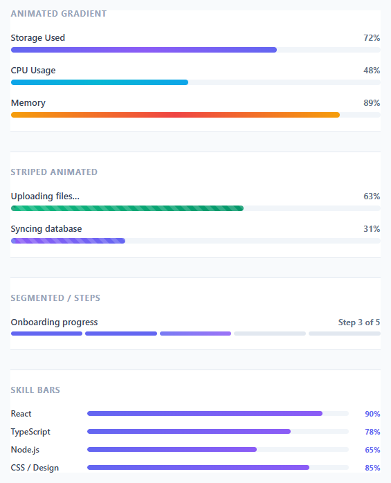
Progress bars are among the most versatile UI components — used for file uploads, page load indicators, onboarding completion, skill showcases, storage usage displays, and interactive data visualisations. This snippet delivers five distinct progress bar styles in a single cohesive component: animated gradient shimmer bars, moving stripe bars, segmented step indicators, animating-in skill bars, and an interactive bar with +/- controls.
Getting progress bars right requires solving several CSS challenges simultaneously: the fill width must animate smoothly, the gradient must feel alive (not static), stripes must animate without background-position glitches, and the on-load animation must feel purposeful rather than mechanical.
Animated gradient shimmer
The shimmer effect uses a wider-than-container gradient: background: linear-gradient(90deg, #6366f1, #8b5cf6, #6366f1) with background-size: 200% 100%. The @keyframes shimmer animates background-position from 200% 0 to -200% 0 over 2 seconds — this creates a continuous sweep of lighter purple across the bar. The background-size: 200% means the gradient repeats: as the right edge exits, the left edge enters, creating a seamless loop.
The fill width is driven by a --p CSS custom property set inline on each bar: style="--p:72%". The width: var(--p, 0%) in CSS reads this property. Animating from 0% to the target width is handled by transition: width .6s cubic-bezier(.4,0,.2,1) — the same Material Design easing used for panel motions.
Striped moving bars
Striped bars layer two backgrounds: a repeating diagonal stripe pattern using repeating-linear-gradient(45deg, ...) over a solid gradient base. The stripe animation uses background-position increments — moving by one stripe-width (24px) per second creates the illusion of movement. The key implementation detail is setting background-position as the animation property (not background-image) since position-only animation avoids repaints.
Segmented step indicator
The step bar uses a flex row of equal-width <div class="seg"> elements with 4px gaps. Completed steps get .done (solid indigo), the active step gets .active (gradient with a pulsing opacity animation at 1.4s ease-in-out), and future steps remain light grey. This pattern is used in multi-step forms and onboarding flows.
Skill bars with load animation
Skill bars start at width: 0% and animate to their target via a setTimeout on DOMContentLoaded — the 200ms delay ensures the page has painted before the animation runs, making it feel like a triggered reveal rather than a flash. The data-p attribute stores the target percentage, read by JS and set as bar.style.width.
Step by step
How to Use
- 1Paste HTML, CSS, and JSFive grouped sections appear: gradient shimmer bars, striped animated bars, segmented steps, skill bars, and an interactive bar with controls.
- 2Watch the animationsGradient bars shimmer continuously. Striped bars have diagonal lines moving right-to-left. Skill bars animate in from 0% to their target width on load.
- 3Use the +/- buttonsThe interactive bar section adjusts "Project completion" in 5% or 10% steps. The bar animates smoothly between values.
- 4Set progress valuesChange
style="--p:72%"on any.prog-barto set its fill width. Values from 0% to 100% work directly. - 5Change the colour variantSwap
bar-indigo,bar-cyan,bar-red,bar-green, orbar-purpleon any.prog-barto change the gradient colour scheme. - 6Update the segmented stepsAdd or remove
<div class="seg">elements. Apply.doneto completed steps and.activeto the current step. The flex layout adjusts automatically.
Real-world uses
Common Use Cases
Got questions?
Frequently Asked Questions
Use an IntersectionObserver on each .prog-bar. When the bar enters the viewport, set bar.style.setProperty('--p', targetWidth). Start with --p: 0% in CSS so bars don't animate before they're visible. See the reveal on scroll snippet for the observer pattern.
Make the bar position: relative and add a <span class="label"> child with position: absolute; right: 6px; top: 50%; transform: translateY(-50%). Ensure the bar height is at least 18px. Hide the label when --p < 15% to avoid overflow.
Call bar.style.setProperty('--p', value + '%') to update the fill width. For upload progress: read event.loaded / event.total * 100 from an XHR or Fetch progress event and call setProperty on each progress update.
Create a ProgressBar component with {label, value, variant, striped} props. value drives style={{['--p']: value + '%'}}. variant applies the colour class. striped conditionally adds the stripe class. The skill bar animation uses useEffect with a setTimeout(() => setWidth(targetValue), 200).