


GSAP Flip Layout Transition — Free Grid/List Reorder Snippet
GSAP Flip Layout Transition · Animations · Plain HTML, CSS & JS · Live preview
Copy & paste
Source Code
<div class="fl-wrap">
  <div class="fl-bar">
    <button class="fl-btn is-active" data-view="grid">Grid</button>
    <button class="fl-btn" data-view="list">List</button>
    <button class="fl-btn fl-shuffle" data-action="shuffle">Shuffle</button>
  </div>
  <div class="fl-board" id="flBoard">
    <div class="fl-card" data-id="1"><span class="fl-num">01</span><h3>Nova</h3></div>
    <div class="fl-card" data-id="2"><span class="fl-num">02</span><h3>Ridge</h3></div>
    <div class="fl-card" data-id="3"><span class="fl-num">03</span><h3>Ember</h3></div>
    <div class="fl-card" data-id="4"><span class="fl-num">04</span><h3>Lumen</h3></div>
    <div class="fl-card" data-id="5"><span class="fl-num">05</span><h3>Cove</h3></div>
    <div class="fl-card" data-id="6"><span class="fl-num">06</span><h3>Drift</h3></div>
  </div>
</div>*{box-sizing:border-box;margin:0;padding:0}
body{font-family:system-ui,-apple-system,sans-serif;background:#0b0d12;color:#fff;min-height:100vh;padding:32px 20px}
.fl-wrap{max-width:720px;margin:0 auto;display:flex;flex-direction:column;gap:20px}
.fl-bar{display:flex;gap:8px}
.fl-btn{padding:9px 18px;border-radius:99px;border:1px solid rgba(255,255,255,.14);background:#151a22;color:#a9b0c4;font:600 13px system-ui;cursor:pointer;transition:background .2s,color .2s,border-color .2s}
.fl-btn:hover{color:#fff}
.fl-btn.is-active{background:#22d3a8;color:#04231b;border-color:#22d3a8}
.fl-shuffle{margin-left:auto;background:#1b2230;border-color:#2c3547}
.fl-board{display:grid;grid-template-columns:repeat(3,1fr);gap:14px}
.fl-board.is-list{grid-template-columns:1fr}
.fl-card{background:linear-gradient(160deg,#161c28,#0e131c);border:1px solid #232b3a;border-radius:14px;padding:18px;display:flex;flex-direction:column;gap:8px;aspect-ratio:1/1;justify-content:flex-end}
.fl-board.is-list .fl-card{aspect-ratio:auto;flex-direction:row;align-items:center;gap:16px;justify-content:flex-start}
.fl-num{font-size:11px;font-weight:700;letter-spacing:.08em;color:#22d3a8}
.fl-card h3{font-size:18px;letter-spacing:-.01em}gsap.registerPlugin(Flip);
const board = document.getElementById('flBoard');
const viewBtns = document.querySelectorAll('[data-view]');
const shuffleBtn = document.querySelector('[data-action="shuffle"]');
function runFlip(mutate) {
// Capture the current position/size of every card before the DOM changes.
const state = Flip.getState('#flBoard .fl-card');
mutate();
// After the layout has changed, animate every card from its old state to the new one.
Flip.from(state, {
duration: 0.55,
ease: 'power2.inOut',
stagger: 0.03,
absolute: true
});
}
viewBtns.forEach(btn => {
btn.addEventListener('click', () => {
if (btn.classList.contains('is-active')) return;
viewBtns.forEach(b => b.classList.remove('is-active'));
btn.classList.add('is-active');
runFlip(() => {
board.classList.toggle('is-list', btn.dataset.view === 'list');
});
});
});
shuffleBtn.addEventListener('click', () => {
runFlip(() => {
const cards = Array.from(board.children);
cards.sort(() => Math.random() - 0.5).forEach(card => board.appendChild(card));
});
});Extend with AI
Take This Snippet Further With AI
The AI prompt for this one is for Patreon supporters ($3 a month), along with a site with no ads. Supporters enter the passcode once and it is remembered in this browser.
What's included
Features
About this UI Snippet
GSAP Flip Layout Transition — Smoothly Morph Between Layouts
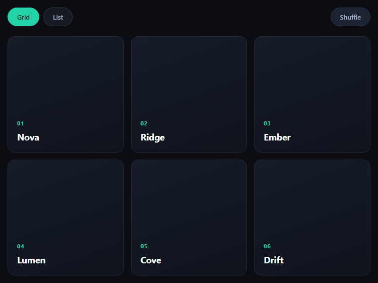
The GSAP Flip layout transition snippet solves a problem that's genuinely hard to animate by hand: when a layout changes — grid to list, or cards reordering — every element's position and size changes at once, and animating that manually means calculating deltas yourself. GSAP's Flip plugin (First, Last, Invert, Play) does it for you, loaded from a CDN alongside GSAP core.
Capture, mutate, animate
The pattern is three steps, wrapped in one runFlip helper. First, Flip.getState('#flBoard .fl-card') records the current position and size ("First") of every card. Then the DOM mutation runs — toggling the is-list class or reordering the cards — which jumps the layout to its new state ("Last") instantly, with no visible animation. Finally Flip.from(state, ...) compares the recorded state to the new layout, inverts each card back to where it used to be, and plays it forward to its new position — the actual "Play" step, all handled internally.
Two very different triggers, one helper
Both the grid/list toggle and the shuffle button call the same runFlip function with a different mutation callback. That's the point of Flip: it doesn't care why the layout changed — a class toggle, a re-sort, or a filter — it just diffs before and after and animates the gap. Any DOM change that alters position, size, or existence of matched elements can be Flipped this way.
Options that shape the feel
stagger: 0.03 offsets each card's animation slightly so a full-board reflow doesn't move as one rigid block. absolute: true temporarily takes cards out of flow during the animation so they can cross over each other without fighting the grid's own reflow. ease: 'power2.inOut' gives the motion a smooth accelerate-decelerate curve appropriate for a layout shift rather than an entrance.
Preventing double-clicks
The view buttons guard against re-triggering on the already-active view (if (btn.classList.contains('is-active')) return), so clicking Grid while already in grid view doesn't run a no-op Flip.
Customizing it
Add more layout variants (masonry, single column), animate additions/removals with Flip.fit or the onEnter/onLeave callbacks, or combine it with a filter UI. Pair it with a drag sort list or bento grid for a fuller layout toolkit.
Step by step
How to Use
- 1Add the GSAP CDNsInclude gsap and Flip from the CDN panel.
- 2Paste HTML, CSS, and JSA card board with Grid/List/Shuffle controls renders.
- 3Click ListCards smoothly morph from a grid into a stacked list.
- 4Click GridThey morph back, animated the same way.
- 5Click ShuffleCards reorder and animate from old to new position.
- 6Resize the windowLayout stays responsive; the next Flip still works.
Real-world uses
Common Use Cases
getState, mutate and Flip.from in one helper.Got questions?
Frequently Asked Questions
Flip doesn't animate properties you specify — it animates the difference between two DOM states it measures itself. Flip.getState captures each element's position and size before a change; after your mutation runs, Flip.from measures the new layout and animates every matched element from its old bounding box to its new one.
Flip.getState must run while the layout is still in its original arrangement, so it has something to diff against. The mutation (toggling a class, reordering nodes) then happens instantly with no animation, and Flip.from immediately inverts the visual result back to the recorded start state and animates it forward — that's what makes the transition look continuous.
Without it, cards animating to new positions can be shoved around by the CSS grid's own live reflow while mid-transition, especially when several cards cross paths during a shuffle. absolute: true temporarily takes matched elements out of normal flow for the duration of the Flip so they can move freely and settle into their final grid position.
Flip supports that too, via onEnter and onLeave callbacks passed to Flip.from, which let you animate newly-added or about-to-be-removed elements separately from the ones simply changing position. This snippet only covers reorder and layout-class changes, but the same getState/mutate/Flip.from pattern extends to insertions and removals.
Call Flip.getState before you update the state that drives the DOM change (e.g. before setState), let the framework re-render, then call Flip.from in a layout effect that runs after the DOM update. In React, useLayoutEffect is the right place; keep the getState snapshot in a ref so it survives the render.