


Hero with Floating Glassmorphic Cards — Free HTML CSS Snippet
Hero with Floating Glassmorphic Cards · Heroes · Plain HTML & CSS · Live preview
Copy & paste
Source Code
<section class="gcf-hero">
  <div class="gcf-blob gcf-blob1"></div>
  <div class="gcf-blob gcf-blob2"></div>
  <div class="gcf-blob gcf-blob3"></div>

  <div class="gcf-inner">
    <span class="gcf-badge">Design system, reimagined</span>
    <h1 class="gcf-title">Interfaces that feel <span>weightless.</span></h1>
    <p class="gcf-sub">A component library built around depth, light, and motion — so every screen you ship looks like it's floating above the page.</p>
    <div class="gcf-cta-row">
      <a href="#" class="gcf-btn-primary">Start building</a>
      <a href="#" class="gcf-btn-secondary">View components</a>
    </div>
  </div>

  <div class="gcf-card gcf-card1">
    <div class="gcf-card-icon">☀</div>
    <strong>Live weather</strong>
    <small>72°F · Clear skies</small>
  </div>
  <div class="gcf-card gcf-card2">
    <div class="gcf-card-icon">♪</div>
    <strong>Now playing</strong>
    <small>Ambient — Drift Vol. 2</small>
  </div>
  <div class="gcf-card gcf-card3">
    <div class="gcf-card-icon">✓</div>
    <strong>Focus session</strong>
    <small>25:00 remaining</small>
  </div>
</section>
* { box-sizing: border-box; margin: 0; padding: 0; }
body { font-family: system-ui, -apple-system, sans-serif; }
.gcf-hero { position: relative; min-height: 100vh; display: flex; align-items: center; justify-content: center; overflow: hidden; padding: 40px 24px; background: linear-gradient(160deg, #1e1b4b, #0f172a 60%); }
.gcf-blob { position: absolute; border-radius: 50%; filter: blur(60px); opacity: 0.55; }
.gcf-blob1 { width: 420px; height: 420px; top: -10%; left: -8%; background: radial-gradient(circle, #f472b6, transparent 70%); animation: gcfDrift1 14s ease-in-out infinite; }
.gcf-blob2 { width: 460px; height: 460px; bottom: -15%; right: -10%; background: radial-gradient(circle, #22d3ee, transparent 70%); animation: gcfDrift2 18s ease-in-out infinite; }
.gcf-blob3 { width: 320px; height: 320px; top: 30%; right: 15%; background: radial-gradient(circle, #a78bfa, transparent 70%); animation: gcfDrift1 20s ease-in-out infinite reverse; }
@keyframes gcfDrift1 { 0%,100% { transform: translate(0,0) scale(1); } 50% { transform: translate(30px,-20px) scale(1.08); } }
@keyframes gcfDrift2 { 0%,100% { transform: translate(0,0) scale(1); } 50% { transform: translate(-25px,25px) scale(1.05); } }
.gcf-inner { position: relative; z-index: 2; max-width: 560px; text-align: center; }
.gcf-badge { display: inline-block; padding: 6px 14px; background: rgba(255,255,255,0.08); backdrop-filter: blur(10px); border: 1px solid rgba(255,255,255,0.16); border-radius: 999px; color: #e0e7ff; font-size: 12.5px; font-weight: 700; }
.gcf-title { margin-top: 20px; font-size: 46px; font-weight: 800; line-height: 1.12; letter-spacing: -0.02em; color: #f8fafc; }
.gcf-title span { background: linear-gradient(135deg, #f472b6, #a78bfa); -webkit-background-clip: text; background-clip: text; -webkit-text-fill-color: transparent; }
.gcf-sub { margin: 16px auto 0; max-width: 440px; font-size: 15.5px; line-height: 1.65; color: #cbd5e1; }
.gcf-cta-row { display: flex; gap: 12px; justify-content: center; margin-top: 28px; flex-wrap: wrap; }
.gcf-btn-primary { padding: 13px 24px; background: #fff; color: #1e1b4b; border-radius: 10px; text-decoration: none; font-size: 14px; font-weight: 800; transition: transform .15s; }
.gcf-btn-primary:hover { transform: translateY(-1px); }
.gcf-btn-secondary { padding: 13px 24px; background: rgba(255,255,255,0.06); backdrop-filter: blur(8px); color: #e2e8f0; border: 1px solid rgba(255,255,255,0.16); border-radius: 10px; text-decoration: none; font-size: 14px; font-weight: 700; transition: border-color .15s; }
.gcf-btn-secondary:hover { border-color: rgba(255,255,255,0.4); }
.gcf-card { position: absolute; z-index: 2; display: flex; flex-direction: column; gap: 3px; padding: 16px 18px; background: rgba(255,255,255,0.1); backdrop-filter: blur(16px); -webkit-backdrop-filter: blur(16px); border: 1px solid rgba(255,255,255,0.22); border-radius: 16px; box-shadow: 0 12px 30px rgba(0,0,0,0.2); color: #f1f5f9; min-width: 168px; }
.gcf-card strong { font-size: 13.5px; }
.gcf-card small { font-size: 11.5px; color: #cbd5e1; }
.gcf-card-icon { font-size: 18px; margin-bottom: 4px; }
.gcf-card1 { top: 14%; left: 8%; animation: gcfFloat1 6s ease-in-out infinite; }
.gcf-card2 { bottom: 18%; left: 12%; animation: gcfFloat2 7.5s ease-in-out infinite; }
.gcf-card3 { top: 20%; right: 8%; animation: gcfFloat3 5.2s ease-in-out infinite; }
@keyframes gcfFloat1 { 0%,100% { transform: translateY(0); } 50% { transform: translateY(-14px); } }
@keyframes gcfFloat2 { 0%,100% { transform: translateY(0); } 50% { transform: translateY(12px); } }
@keyframes gcfFloat3 { 0%,100% { transform: translateY(0); } 50% { transform: translateY(-10px); } }
@media (max-width: 900px) {
.gcf-card1, .gcf-card2, .gcf-card3 { display: none; }
.gcf-title { font-size: 32px; }
}Extend with AI
Take This Snippet Further With AI
The AI prompt for this one is for Patreon supporters ($3 a month, 7 days free), along with a site with no ads. Supporters enter the passcode once and it is remembered in this browser.
What's included
Features
About this UI Snippet
Hero with Floating Glassmorphic Cards — Frosted Panels Drifting Over an Animated Blob Backdrop
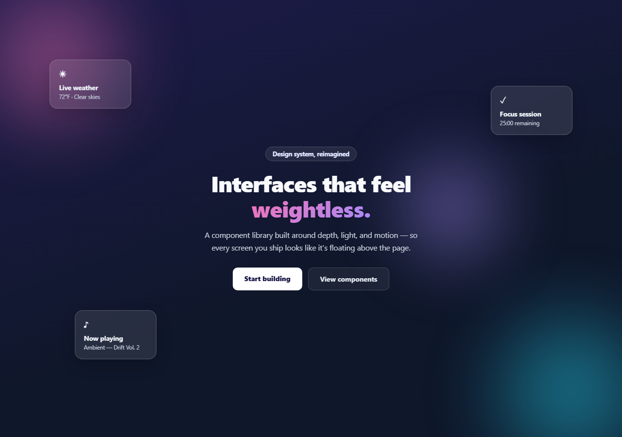
Glassmorphism reads as flat and lifeless the moment every frosted panel sits perfectly still. This hero fixes that with three floating glass cards drifting gently at different speeds and offsets over a slowly moving gradient-blob backdrop — pure HTML and CSS, no JavaScript, no canvas.
The blob backdrop
Three large, heavily blurred radial-gradient circles (.gcf-blob1/2/3) sit behind the content, each with its own drift keyframe animation moving it a short distance and gently scaling it up and down over 14–20 seconds. Because the durations differ and one runs in reverse, the blobs never fall into a synchronized rhythm — the backdrop keeps subtly reshaping itself instead of visibly looping. filter: blur(60px) turns hard-edged circles into soft, colorful light without a single image asset.
Frosted glass, done properly
Each .gcf-card uses background: rgba(255,255,255,0.1) plus backdrop-filter: blur(16px) (with the -webkit- prefix for Safari) and a faint border — the combination that makes glassmorphism actually read as glass rather than a semi-transparent box. Content sitting behind the card visibly blurs through it, so the moving blobs are essential set dressing, not decoration: without something behind the cards to distort, the blur effect is invisible.
Independent float timing is the whole trick
The three cards each get a distinct translateY oscillation keyframe (gcfFloat1/2/3) at different durations (6s, 7.5s, 5.2s) and different amplitudes and directions. This is the detail that separates a convincing "floating in space" effect from an obviously synced, robotic one — in real fluid dynamics nothing this size moves in perfect unison, and neither should these cards. Keep each card's duration and offset distinct any time you add more.
Cards with a purpose, not just shapes
Rather than empty frosted rectangles, each card shows a small piece of plausible live data — a weather reading, a now-playing track, a focus-timer countdown — reinforcing the "ambient interface" positioning of the hero's copy. Swap these for whatever mini-widgets are relevant to your product.
Customizing it
Change the blob and gradient-text colors to your palette — the gradient text on the emphasized headline word reuses the background-clip: text technique from other heroes in this library. Add or remove floating cards, keeping each one's float keyframe duration and direction distinct. On narrow screens the cards hide by default since there usually isn't room for them without crowding the headline — reposition rather than hide if your layout has space.
Step by step
How to Use
- 1Paste the HTML and CSSA dark hero renders with drifting gradient blobs and three floating glass cards.
- 2Watch the blobs and cards moveEach blob and each card runs its own independent animation timing, so nothing moves in sync.
- 3Resize below 900pxThe floating cards hide to keep the headline readable on small screens.
- 4Edit the card contentChange the icon, title, and detail text in each .gcf-card to match your product.
- 5Retheme the colorsSwap the blob gradients and the headline's gradient-text colors for your brand.
- 6Add more cardsGive each new card its own float keyframe with a distinct duration and direction.
Real-world uses
Common Use Cases
backdrop-filter: blur over translucent backgrounds making genuine frosted glass.background-clip: text, and compare with a gradient mesh hero.Got questions?
Frequently Asked Questions
backdrop-filter: blur only has a visible effect on whatever is actually behind the element. Without the animated gradient blobs, the frosted cards would look like plain semi-transparent boxes with no distortion to reveal. The blobs are essential set dressing for the glass effect to read as glass.
If every card floated on the same timing, they'd rise and fall in perfect unison, which reads as an obviously mechanical loop. Distinct durations (6s, 7.5s, 5.2s), amplitudes, and directions mean the cards drift independently, the way objects of different size and weight would in real fluid motion, and the scene never looks like a repeating cycle at a glance.
It's supported in all current major browsers, but Safari historically needed the -webkit-backdrop-filter prefix, which this snippet includes. If you need to support very old browsers without backdrop-filter support, the cards fall back to a plain translucent background — still readable, just without the blur-through effect.
Duplicate a .gcf-card element with a new position (top/left/right/bottom) and add a new @keyframes rule with a distinct name, duration, and translateY range, then reference it in that card's animation property. Keep the timing different from the existing three cards to preserve the unsynced feel.
Since there's no JavaScript, this is a direct markup and CSS conversion — click JSX, Vue, or Angular in the export panel. The keyframe animations and backdrop-filter properties carry over unchanged as they're pure CSS.