


Copy & paste
Source Code
<div class="sdp-page">
  <div class="sdp-bar">
    <div class="sdp-left">
      <svg class="sdp-doc-icon" viewBox="0 0 24 24" fill="none" stroke="currentColor" stroke-width="2"><path d="M14 2H6a2 2 0 0 0-2 2v16a2 2 0 0 0 2 2h12a2 2 0 0 0 2-2V8z"/><path d="M14 2v6h6"/></svg>
      <span class="sdp-title">Roadmap 2026.doc</span>
    </div>
    <div class="sdp-right">
      <div class="sdp-stack" id="sdpStack"></div>
      <button type="button" class="sdp-share">Share</button>
    </div>
  </div>
  <div class="sdp-body">
    <div class="sdp-line w1"></div>
    <div class="sdp-line w2"></div>
    <div class="sdp-line w3"></div>
    <div class="sdp-line w2"></div>
  </div>
</div>*{box-sizing:border-box;margin:0;padding:0}
body{font-family:system-ui,-apple-system,sans-serif;background:#0d1017;min-height:100vh;display:flex;align-items:center;justify-content:center;padding:24px}
.sdp-page{width:100%;max-width:560px;background:#12151e;border:1px solid #232838;border-radius:16px;overflow:hidden;box-shadow:0 24px 60px rgba(0,0,0,.5)}
.sdp-bar{display:flex;align-items:center;justify-content:space-between;padding:12px 16px;border-bottom:1px solid #1e2330;background:#141824}
.sdp-left{display:flex;align-items:center;gap:9px;min-width:0}
.sdp-doc-icon{width:17px;height:17px;color:#6366f1;flex-shrink:0}
.sdp-title{font-size:13.5px;font-weight:700;color:#e2e8f0;white-space:nowrap;overflow:hidden;text-overflow:ellipsis}
.sdp-right{display:flex;align-items:center;gap:12px;flex-shrink:0}
.sdp-stack{display:flex;align-items:center;position:relative}
.sdp-bubble{width:28px;height:28px;border-radius:50%;border:2px solid #12151e;margin-left:-8px;display:flex;align-items:center;justify-content:center;font-size:10.5px;font-weight:800;color:#fff;position:relative;cursor:default;transition:transform .12s}
.sdp-bubble:first-child{margin-left:0}
.sdp-bubble:hover{transform:translateY(-3px)}
.sdp-bubble.editing::after{content:'';position:absolute;bottom:-1px;right:-1px;width:9px;height:9px;border-radius:50%;background:#34d399;border:2px solid #12151e}
.sdp-bubble.viewing::after{content:'';position:absolute;bottom:-1px;right:-1px;width:9px;height:9px;border-radius:50%;background:#94a3b8;border:2px solid #12151e}
.sdp-overflow{width:28px;height:28px;border-radius:50%;border:2px solid #12151e;margin-left:-8px;background:#232838;color:#94a3b8;font-size:10px;font-weight:800;display:flex;align-items:center;justify-content:center}
.sdp-tooltip{position:absolute;top:calc(100% + 8px);left:50%;transform:translateX(-50%) translateY(-4px);background:#1c2130;border:1px solid #2a3143;color:#e2e8f0;font-size:11px;font-weight:600;padding:5px 9px;border-radius:7px;white-space:nowrap;opacity:0;pointer-events:none;transition:opacity .12s,transform .12s;z-index:5}
.sdp-tooltip::before{content:'';position:absolute;bottom:100%;left:50%;transform:translateX(-50%);border:5px solid transparent;border-bottom-color:#1c2130}
.sdp-bubble:hover .sdp-tooltip{opacity:1;transform:translateX(-50%) translateY(0)}
.sdp-share{background:#6366f1;color:#fff;border:none;border-radius:8px;padding:7px 14px;font-size:12.5px;font-weight:700;cursor:pointer}
.sdp-share:hover{background:#4f46e5}
.sdp-body{padding:26px 22px}
.sdp-line{height:9px;border-radius:5px;background:#1c2230;margin-bottom:14px}
.sdp-line.w1{width:82%}
.sdp-line.w2{width:60%}
.sdp-line.w3{width:70%}var PEOPLE = [
{ name: 'You', initials: 'YO', color: '#6366f1', status: 'editing' },
{ name: 'Priya Anand', initials: 'PA', color: '#ec4899', status: 'editing' },
{ name: 'Marcus Lee', initials: 'ML', color: '#10b981', status: 'viewing' },
{ name: 'Rosa Santos', initials: 'RS', color: '#22d3ee', status: 'viewing' },
{ name: 'Theo Novak', initials: 'TN', color: '#f97316', status: 'viewing' },
{ name: 'Grace Lin', initials: 'GL', color: '#a78bfa', status: 'viewing' },
];
var MAX_VISIBLE = 4;
var stack = document.getElementById('sdpStack');
function render() {
var visible = PEOPLE.slice(0, MAX_VISIBLE);
var overflow = PEOPLE.length - visible.length;
stack.innerHTML = visible.map(function (p) {
return '<div class="sdp-bubble ' + p.status + '" style="background:' + p.color + '">' +
p.initials +
'<span class="sdp-tooltip">' + p.name + ' \u00b7 ' + (p.status === 'editing' ? 'editing' : 'viewing') + '</span>' +
'</div>';
}).join('');
if (overflow > 0) {
stack.insertAdjacentHTML('beforeend', '<div class="sdp-overflow">+' + overflow + '</div>');
}
}
render();Extend with AI
Take This Snippet Further With AI
The AI prompt for this one is for Patreon supporters ($3 a month), along with a site with no ads. Supporters enter the passcode once and it is remembered in this browser.
What's included
Features
About this UI Snippet
Shared Document Presence Bar — Who's Viewing, Editing & the Overflow Count
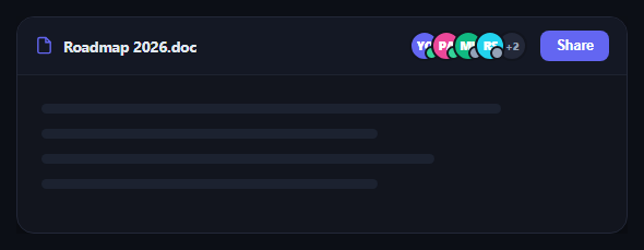
Every collaborative document tool needs a fast answer to "who else is here right now" without opening a separate panel. The presence bar puts that answer directly in the document's top bar: a compact stack of avatar bubbles, a colored status dot showing who's actively editing versus just viewing, and an overflow bubble once the room gets crowded. This snippet builds that bar in plain HTML, CSS, and vanilla JavaScript. Compare it with collaborator presence bar and avatar stack tooltip for related patterns.
Overlapping bubbles from one array
PEOPLE holds everyone currently in the document, each with a name, initials, color, and a status of 'editing' or 'viewing'. render() slices the first MAX_VISIBLE entries and lays them out with a negative left margin so each bubble overlaps the previous one — the same compact-stack technique used in avatar stack, giving a crowd of people a tidy, fixed-width footprint regardless of how many are actually present.
Editing vs viewing at a glance
Rather than a text label per person, each bubble gets a small corner dot: green for actively editing, gray for read-only viewing. This is the same visual grammar used by Google Docs and Notion — a quick color scan tells you whether anyone is actively changing the document right now versus just reading it, which matters far more than an exact headcount when you're deciding whether it's safe to make your own edit.
Overflow that stays honest
When more people are present than MAX_VISIBLE allows, a final "+N" bubble is appended showing exactly how many additional collaborators aren't shown — never silently dropping people from the count. This keeps the bar's width predictable (it never grows past five bubbles) while still being truthful about how many people are actually in the document.
Tooltips confirm identity on demand
Hovering any avatar bubble reveals a small tooltip with the person's full name and their current status in words ("editing" or "viewing"), so the compact initials-only bubbles never leave you guessing who's who — full identity is one hover away, not permanently taking up bar space.
Extending it for real presence
To wire this to real collaboration, replace PEOPLE with live presence data from your backend (a WebSocket channel, Supabase Realtime, Liveblocks, or similar), re-running render() whenever someone joins, leaves, or switches between editing and viewing. Add a click handler on the overflow bubble to open a full presence panel — a natural pairing with team presence list.
Step by step
How to Use
- 1Paste HTML, CSS, and JSA document top bar renders with four overlapping avatar bubbles and a "+2" overflow bubble.
- 2Hover a bubbleA tooltip shows the person's name and whether they're editing or viewing.
- 3Look at the corner dotsGreen dots mean actively editing; gray dots mean read-only viewing.
- 4Check the overflow bubbleIt shows exactly how many additional people aren't shown in the stack.
- 5Change MAX_VISIBLEShow more or fewer bubbles before the overflow count kicks in.
- 6Connect real presenceReplace PEOPLE with live data from your collaboration backend and re-render on change.
Real-world uses
Common Use Cases
Got questions?
Frequently Asked Questions
render() slices the PEOPLE array to the first MAX_VISIBLE entries for bubbles, then computes the overflow as PEOPLE.length minus that visible count. Because the overflow number is always derived from the real array length rather than hard-coded, it stays accurate automatically as people join or leave — there's no separate counter to keep in sync.
Each person in the data has a status of "editing" or "viewing", which maps to a green or gray corner dot on their bubble respectively (plus the matching word in the hover tooltip). This mirrors how Google Docs and Notion distinguish someone actively typing changes from someone who merely has the document open in read mode.
Add a click handler to .sdp-overflow that opens a dropdown, popover, or modal listing the remaining PEOPLE entries beyond MAX_VISIBLE — reusing the same bubble/tooltip markup at a larger scale, similar to how team presence list shows a fuller roster.
Replace the static PEOPLE array with data from your realtime backend (WebSocket, Supabase Realtime, Liveblocks, Firebase, etc.), and call render() again whenever a presence event arrives — someone joining, leaving, or switching between editing and viewing. Because render() is a pure function of the array, you never need to manually patch individual bubbles.
Pass PEOPLE as a prop or reactive state, derive the visible slice and overflow count with a computed value (useMemo, a Vue computed, or an Angular pipe), and map the visible array to bubble components with their status class and tooltip. The overlapping-stack CSS ports unchanged.