


Split Hero — Free HTML CSS Two-Column Snippet
Split Hero · Heroes · Plain HTML & CSS · Live preview
Copy & paste
Source Code
<section class="split">
  <div class="left">
    <span class="badge">✦ Trusted by 10k+ teams</span>
    <h1>The smarter way to build products</h1>
    <p>Stop wrestling with your stack. Get a modern, opinionated setup that lets your team focus on shipping features.</p>
    <div class="ctas">
      <a href="#" class="btn primary">Start free trial</a>
      <a href="#" class="btn ghost">See pricing →</a>
    </div>
    <div class="logos">
      <span>Y Combinator</span><span>Product Hunt</span><span>TechCrunch</span>
    </div>
  </div>
  <div class="right">
    <div class="window">
      <div class="bar"><span></span><span></span><span></span></div>
      <div class="code-preview">
        <div class="line"><em>const</em> result = <em>await</em> api.<b>deploy</b>();</div>
        <div class="line success">✓ Deployed in 1.2s</div>
        <div class="line muted">→ Running on edge CDN</div>
      </div>
    </div>
  </div>
</section>
* { box-sizing: border-box; margin: 0; padding: 0; }
body { font-family: system-ui, sans-serif; background: #0f172a; min-height: 100vh; }
.split { display: grid; grid-template-columns: 1fr 1fr; min-height: 100vh; }
.left { padding: 60px 48px; display: flex; flex-direction: column; justify-content: center; gap: 18px; }
.badge { display: inline-block; font-size: 11px; font-weight: 600; color: #a78bfa; background: rgba(139,92,246,0.12); border: 1px solid rgba(139,92,246,0.25); padding: 4px 12px; border-radius: 20px; width: fit-content; }
h1 { font-size: clamp(24px, 3.5vw, 40px); font-weight: 800; color: #f1f5f9; line-height: 1.15; letter-spacing: -0.5px; }
p { font-size: 15px; color: #64748b; line-height: 1.7; max-width: 400px; }
.ctas { display: flex; gap: 10px; flex-wrap: wrap; }
.btn { padding: 10px 20px; font-size: 13px; font-weight: 600; border-radius: 8px; text-decoration: none; transition: all 0.15s; }
.btn.primary { background: #6366f1; color: #fff; }
.btn.primary:hover { background: #4f46e5; }
.btn.ghost { color: #94a3b8; }
.btn.ghost:hover { color: #f1f5f9; }
.logos { display: flex; gap: 14px; flex-wrap: wrap; }
.logos span { font-size: 11px; font-weight: 600; color: #334155; text-transform: uppercase; letter-spacing: 0.5px; }
.right { background: #0a0e1a; display: flex; align-items: center; justify-content: center; padding: 40px; border-left: 1px solid rgba(255,255,255,0.05); }
.window { background: #1e293b; border-radius: 12px; overflow: hidden; width: 100%; max-width: 320px; border: 1px solid rgba(255,255,255,0.07); box-shadow: 0 24px 60px rgba(0,0,0,0.4); }
.bar { display: flex; gap: 6px; padding: 10px 14px; background: #16202e; border-bottom: 1px solid rgba(255,255,255,0.06); }
.bar span { width: 10px; height: 10px; border-radius: 50%; background: #334155; }
.bar span:nth-child(1) { background: #ef4444; }
.bar span:nth-child(2) { background: #f59e0b; }
.bar span:nth-child(3) { background: #22c55e; }
.code-preview { padding: 18px 16px; display: flex; flex-direction: column; gap: 10px; }
.line { font-family: monospace; font-size: 13px; color: #94a3b8; }
.line em { color: #a78bfa; font-style: normal; }
.line b { color: #60a5fa; }
.line.success { color: #4ade80; }
.line.muted { color: #475569; }Extend with AI
Take This Snippet Further With AI
The AI prompt for this one is for Patreon supporters ($3 a month, 7 days free), along with a site with no ads. Supporters enter the passcode once and it is remembered in this browser.
What's included
Features
About this UI Snippet
Split Hero — Two-Column CSS Grid, Terminal Code Window & Typography
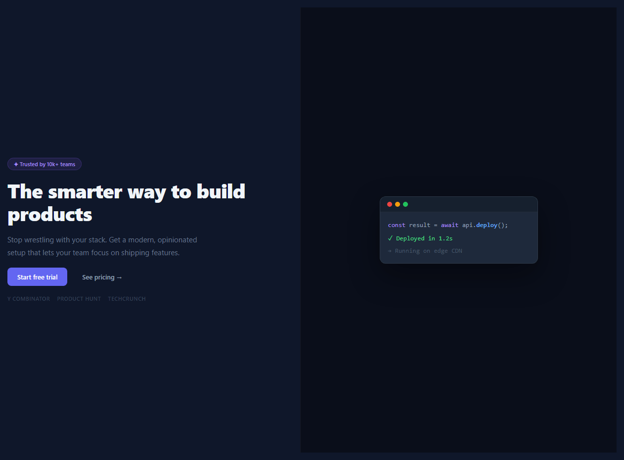
The split hero divides the above-the-fold section into two equal halves: a text-and-CTA column on the left and a visual content column on the right. It is used by developer tools, SaaS products, and CLI applications where showing real code or a product screenshot communicates value more directly than a marketing tagline alone.
The two-column grid
.split { display: grid; grid-template-columns: 1fr 1fr; min-height: 100vh } creates two equal columns that each fill the full viewport height. The dark background (#0f172a) spans both columns. The right panel has a slightly different background (#0a0e1a) and a subtle left border to create visual separation.
The left copy panel
.left uses display: flex; flex-direction: column; justify-content: center; gap: 18px — a vertical flex column centred in the panel with consistent spacing between elements. The headline uses font-size: clamp(24px, 3.5vw, 40px) for fluid scaling without media queries. The brand logo links in .logos are styled with uppercase tracking for a minimal trust signal row.
The terminal window
The right panel contains a .window div that simulates a macOS code editor window — the same chrome as the standalone terminal window snippet. The .bar contains three coloured circles (red #ef4444, yellow #f59e0b, green #22c55e) mimicking macOS traffic light buttons. The code lines inside use <span class="line"> elements with <em> for purple keywords and <b> for blue values — a lightweight syntax colouring system without a library.
The code content
The code lines in the terminal show what appears to be a CLI or configuration output. Change them in the HTML panel to show your product's actual syntax — a terminal command, a config file, an API response, or a code snippet. The .line.success class makes a line green for a success output. .line.muted dims non-essential lines.
Making it responsive
Add @media (max-width: 768px) { .split { grid-template-columns: 1fr; } .right { display: none; } } to stack the layout on mobile and hide the code panel, showing only the copy column at full width.
The 1fr 1fr grid
The split-hero uses display: grid; grid-template-columns: 1fr 1fr — two equal columns. On mobile, this collapses to grid-template-columns: 1fr with the right panel moving below the left content. The 1fr unit distributes available space equally after gaps and padding. For an asymmetric split (e.g., 55/45), use grid-template-columns: 55fr 45fr.
The terminal code panel
The right panel uses a dark background (matching a code editor theme) with monospace font and syntax-coloured spans. Keywords use CSS classes: .kw (blue), .str (green), .cm (grey for comments), .fn (yellow). No syntax highlighting library — just CSS classes and static markup. The terminal window chrome uses three coloured dots (red, yellow, green) as a familiar code editor indicator.
Responsive code panel handling
On mobile (under 768px), the code panel either: (a) hides completely — code is decorative and not worth the space on small screens, (b) shows a simplified version with fewer lines, or (c) remains but scrolls horizontally. Option (a) is the cleanest approach for hero sections where the focus should be the headline and CTA.
Step by step
How to Use
- 1Load the snippetClick "Split Hero" in the sidebar. The preview shows the dark two-column hero with the copy panel left and the terminal window right.
- 2Update the headline and copyIn the HTML panel, replace the h1 text and paragraph with your product headline and subtext. The clamp() font-size scales automatically.
- 3Update the badge and CTAsChange the .badge text and the .btn labels. Add href attributes to the buttons to link to your product pages.
- 4Update the terminal code linesIn the HTML panel, update the .line elements in the terminal window with your product CLI output, config, or code example.
- 5Add mobile responsivenessIn the CSS panel, add @media (max-width: 768px) { .split { grid-template-columns: 1fr; } .right { display: none; } }.
- 6Export in your formatClick "HTML" for a standalone file, "JSX" for a React component, or "Tailwind" for a React + Tailwind version.
Real-world uses
Common Use Cases
Got questions?
Frequently Asked Questions
display: grid; grid-template-columns: 1fr 1fr creates two equal-width columns. min-height: 100vh makes both columns fill the viewport height. The two child divs (.left and .right) each sit in one column.
The .window div has a dark background with a border-radius and box-shadow. The .bar inside has three coloured circle spans (red, yellow, green) mimicking macOS traffic light buttons. The code preview uses monospace font with semantic HTML spans for colouring.
Coloured spans use CSS classes: em { color: #a78bfa } for purple keywords and b { color: #60a5fa } for blue values. This is a lightweight inline approach. For a full standalone version, see the code block snippet.
Add @media (max-width: 768px) { .split { grid-template-columns: 1fr; } .right { display: none; } } to the CSS panel. This collapses to a single column on mobile and hides the terminal panel, showing only the copy at full width.
Remove the .window div and replace it with an img element. Add width: 100%; border-radius: 12px; box-shadow: 0 24px 60px rgba(0,0,0,0.4) to match the existing visual style.
Yes. Click "JSX" to download a React component or "Tailwind" for a Tailwind version. In Tailwind, the grid maps to grid grid-cols-2 min-h-screen. Replace the fixed hex colours with your Tailwind theme tokens.