


Hero Section — Free HTML CSS Dark Landing Snippet
Hero Section · Heroes · Plain HTML & CSS · Live preview
Copy & paste
Source Code
<section class="hero">
  <div class="badge">New → v2.0 just shipped</div>
  <h1>Build faster,<br>ship with confidence</h1>
  <p>The modern toolkit for frontend developers. Zero config, instant preview, works everywhere.</p>
  <div class="ctas">
    <a href="#" class="btn solid">Get started free</a>
    <a href="#" class="btn ghost">
      <svg width="14" height="14" viewBox="0 0 24 24" fill="none" stroke="currentColor" stroke-width="2.5"><polygon points="5 3 19 12 5 21 5 3"/></svg>
      Watch demo
    </a>
  </div>
</section>
* { box-sizing: border-box; margin: 0; padding: 0; }
body { font-family: system-ui, sans-serif; background: #0f172a; }
.hero {
min-height: 100vh;
display: flex;
flex-direction: column;
align-items: center;
justify-content: center;
padding: 40px 24px;
text-align: center;
background: radial-gradient(ellipse at 50% 0%, rgba(99,102,241,0.2) 0%, transparent 65%);
}
.badge {
display: inline-flex;
align-items: center;
gap: 4px;
background: rgba(99,102,241,0.15);
border: 1px solid rgba(99,102,241,0.3);
color: #a5b4fc;
font-size: 12px;
font-weight: 600;
padding: 4px 12px;
border-radius: 20px;
margin-bottom: 24px;
}
h1 {
font-size: clamp(32px, 8vw, 52px);
font-weight: 800;
color: #f1f5f9;
line-height: 1.1;
letter-spacing: -1px;
margin-bottom: 18px;
}
p {
font-size: 16px;
color: #64748b;
line-height: 1.7;
max-width: 440px;
margin-bottom: 32px;
}
.ctas { display: flex; gap: 10px; flex-wrap: wrap; justify-content: center; }
.btn {
display: inline-flex;
align-items: center;
gap: 6px;
padding: 11px 22px;
font-size: 14px;
font-weight: 600;
border-radius: 8px;
text-decoration: none;
transition: all 0.15s;
}
.btn.solid { background: #6366f1; color: #fff; }
.btn.solid:hover { background: #4f46e5; }
.btn.ghost { background: rgba(255,255,255,0.06); color: #94a3b8; border: 1px solid rgba(255,255,255,0.1); }
.btn.ghost:hover { background: rgba(255,255,255,0.1); color: #f1f5f9; }Extend with AI
Take This Snippet Further With AI
The AI prompt for this one is for Patreon supporters ($3 a month, 7 days free), along with a site with no ads. Supporters enter the passcode once and it is remembered in this browser.
What's included
Features
About this UI Snippet
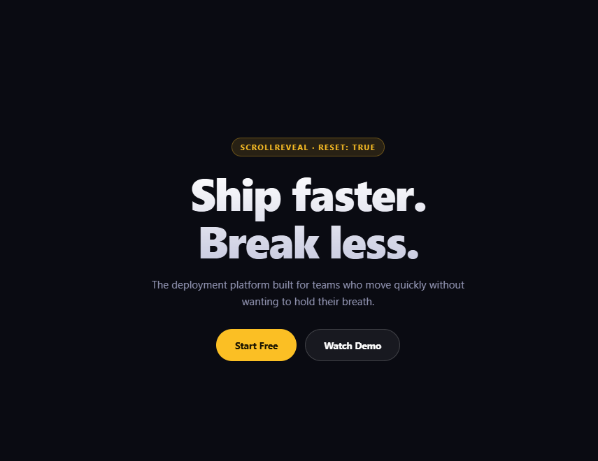
Hero Section — Dark Gradient Background, Badge & Dual CTA Buttons in HTML CSS
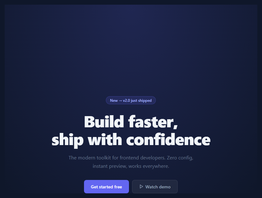
The hero section is the most-read part of any landing page. It is the first thing visitors see and typically determines whether they scroll further or leave. A well-structured hero answers three questions immediately: what is this, who is it for, and what should I do next. This snippet gives you a production-ready hero layout with a dark gradient background, a small announcement badge, a headline, subtext, and two call-to-action buttons — for a more elaborate version with social proof, see the startup hero.
The radial gradient background
The hero uses background: radial-gradient(ellipse at 50% 0%, rgba(99,102,241,0.2) 0%, transparent 65%) on a dark #0f172a base. This places a soft indigo glow at the top-centre of the section — a light source effect that draws the eye to the headline without using an image. The glow fades to transparent at 65%, leaving the edges dark and uncluttered. To change the glow colour, update the rgba value. To move the glow, change 50% 0% to a different position — 0% 50% for a left-edge glow, 100% 50% for a right-edge glow.
The announcement badge
The badge (.badge) is a small pill above the headline with a semi-transparent background and a subtle border: background: rgba(99,102,241,0.15); border: 1px solid rgba(99,102,241,0.3). It draws attention to a recent update or key message without competing with the headline. Common uses: "New → v2.0 just shipped", "Now in beta", "Free forever". To make the badge a link, wrap its contents in an <a> tag.
The dual CTA pattern
Two buttons side by side communicate a clear primary and secondary action. The primary button (.cta.primary) is solid-filled. The secondary/ghost button (.cta.ghost) has a transparent background with a white outline. The visual contrast directs users to the primary action while still offering the secondary option. A common split: "Get started free" (primary) and "View demo" or "Learn more" (ghost).
Typography and spacing
The headline uses font-size: clamp() so it scales fluidly between mobile and desktop without a media query. The subtext has max-width: 480px and opacity: 0.7 to create visual hierarchy — it is important but secondary. All elements are centred with align-items: center; text-align: center on the flex container.
Adapting to a light background
To use this hero on a light background, change background: #0f172a to white or light grey, remove the radial gradient overlay, change text colours from white to dark, and update the badge colours to match your brand — or start from the white-by-default minimal hero. The layout structure remains identical.
Step by step
How to Use
- 1Load the snippetClick "Hero Section" in the sidebar. The preview shows the full dark hero with gradient glow, badge, headline, and CTA buttons.
- 2Update the headline and subtextIn the HTML panel, replace "Build faster, ship with confidence" and the subtext paragraph with your product value proposition.
- 3Update the badge and CTA labelsChange the badge text to your latest announcement. Update the button labels to match your primary and secondary actions.
- 4Change the accent colourFind #6366f1 in the CSS and replace with your brand colour. Updates the glow, badge tint, and primary button together.
- 5Test on mobileSwitch to the 375px preview. The headline uses clamp() so it scales automatically. Check the button row wraps cleanly on small screens.
- 6Export in your formatClick "HTML" for a standalone file, "JSX" for a React component, or "Tailwind" for a React + Tailwind version.
Real-world uses
Common Use Cases
Got questions?
Frequently Asked Questions
The .hero has background: radial-gradient(ellipse at 50% 0%, rgba(99,102,241,0.2) 0%, transparent 65%) layered over the dark #0f172a body background. The ellipse starts at the top centre (50% 0%) with a soft indigo tint at 20% opacity and fades to transparent at 65%. Change the rgba colour to change the glow hue, or move the start position to reposition the light source.
The headline uses font-size: clamp(min, preferred, max). clamp() picks the preferred value (usually a viewport-relative unit like 5vw) but clamps it between a minimum and maximum. This scales fluidly between screen sizes without a media query breakpoint.
Add an img or a div with a background-image below the .cta-row in the HTML. Set max-width: 100% and a reasonable max-height on the image. For a split hero layout with text on the left and an image on the right, see the Split Hero snippet in this library.
Change body background to white or #f8fafc. Change .hero background to a light radial gradient or remove it. Update all text colours from white to dark — typically #1e293b for headings and #475569 for subtext. Adjust the badge colours to use a light tint of your brand colour.
Yes. Add a <video autoplay muted loop playsinline> element inside .hero with position: absolute; inset: 0; width: 100%; height: 100%; object-fit: cover; z-index: 0. Give .hero position: relative and add z-index: 1 to its content wrapper. The radial gradient overlay on .hero acts as a tint over the video.
Yes. Click "JSX" to download a React component or "Tailwind" for a Tailwind CSS version. In Next.js, replace the <section> with a component and pass the headline, subtext, badge, and CTA text as props for easy reuse across pages.