Click any text to edit it · drag a photo to reposition it, scroll to zoom, click to replace
Before & After — Free Social Proof Social Post Template
Social Proof · v1.0.0 · Updated 2026-10-16 · Instagram, Facebook & X · HTML + CSS
What's included
Features
About this template
Before & After — Free Before and After Comparison Post Template
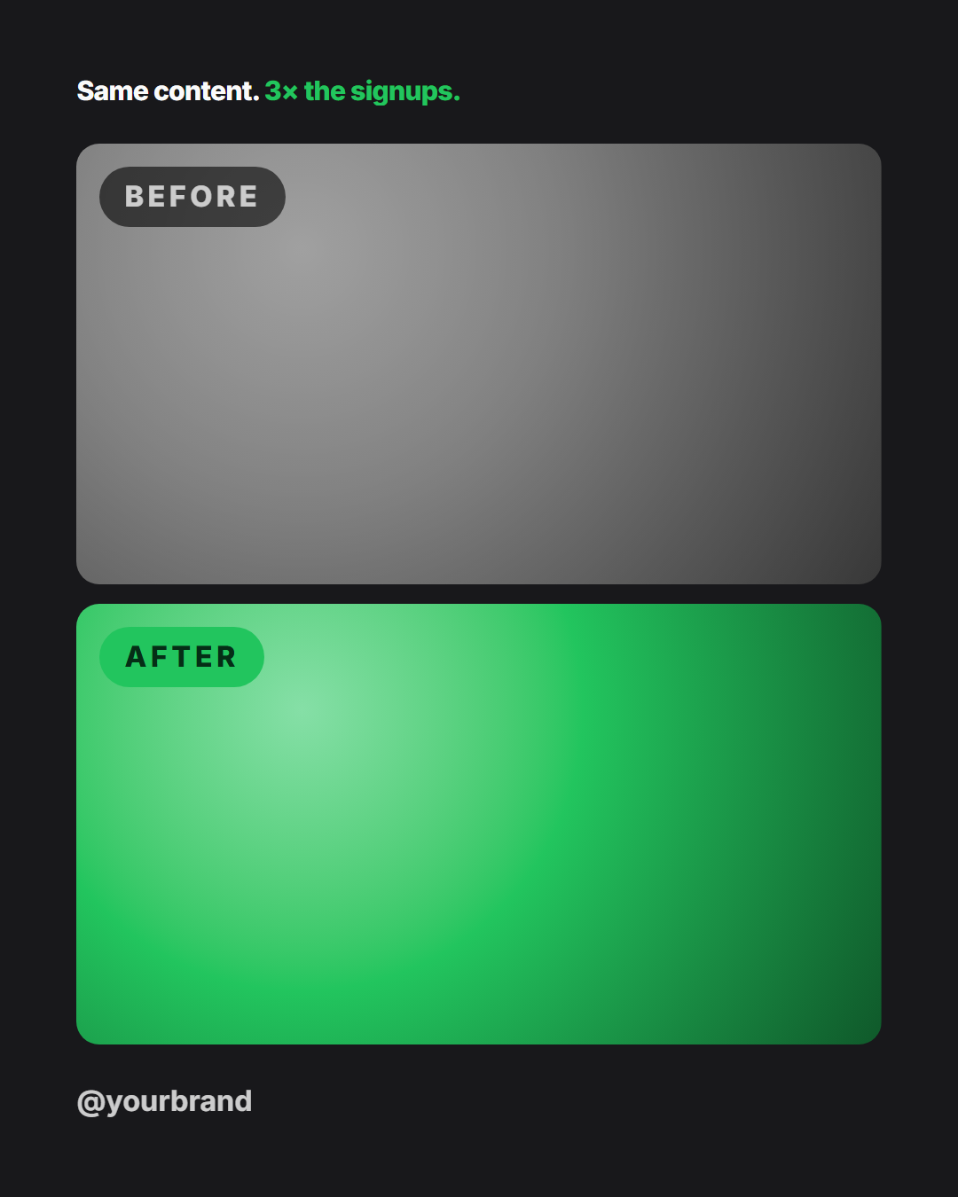
Before & After is a free comparison post template for showing transformations: website redesigns, renovations, fitness progress, cleaning results and photo edits. A results headline sits at the top, two photo panels labelled "Before" and "After" fill the post, and your handle sits at the bottom.
The layout adapts to the size
On tall sizes (4:5 portrait and 9:16 Story) the panels stack top and bottom, so each image stays as wide as possible. On square and 16:9 landscape sizes they sit side by side. The layout uses CSS grid, so both panels are always exactly the same size, which keeps the comparison fair.
Labels that read instantly
Each panel has a pill label in the top-left corner. "Before" is a translucent dark pill, and "After" is filled with the bright accent green, which signals the improvement. Rename them to "Old / New", "Day 1 / Day 90" or "v1 / v2".
Headline with the result
Lead with the outcome: "Same content. *3× the signups*." The highlighted part shows in the accent colour. Long headlines shrink so they never push the photos off the post.
Photos stay private
Upload both images. They're resized and kept in your browser, never sent to a server, and the export is drawn locally. Until you upload, the "Before" panel shows a desaturated placeholder so you can see the effect.
Sharing a client's words about the result too? Combine it with Customer Testimonial.
Why use it
Why Use the Before & After Template
How it’s different
How It’s Different From Canva-Style Templates
Step by step
How to Use
- 1Pick the sizeChoose Portrait 4:5 (the Instagram feed default), Square, Story / Reel or Landscape 16:9 for X. Before & After opens at 1080×1350.
- 2Edit the textClick any text in the preview, or use the fields on the left (headline, before label, after label, handle and more). Wrap words in *asterisks* to colour them.
- 3Add your imagesClick a photo area in the preview or use Images to upload your before photo and after photo. Images stay in your browser.
- 4Match your brandApply one of 12 palettes or set exact colours with the pickers, then choose heading and body fonts.
- 5Download or take the codeDownload a PNG or JPEG at full size, download every size as a ZIP, copy the HTML, or fork it into My Code to keep editing.
Real-world uses
Common Use Cases
Got questions?
Frequently Asked Questions
Open the template, upload the before and after photos, write a results headline, and download it. Portrait and Story sizes stack the photos and square and landscape put them side by side, so try the size that suits your images.
Yes. Both labels are editable, so you can use "Old / New", "Day 1 / Day 90", "v1 / v2" or another language.
Take both photos from the same angle and distance, with similar lighting. Each image is cropped to fill its panel, so keep the subject centred.
No. Both photos stay in your browser, and the export is drawn locally on your device.
Portrait post 1080×1350 (4:5): Instagram feed (recommended), Facebook feed, X portrait. Square post 1080×1080 (1:1): Instagram, Facebook and X feeds. Story / Reel 1080×1920 (9:16): Instagram and Facebook Stories, Reel covers. Landscape post 1600×900 (16:9): X feed image, Facebook landscape. Switch sizes in the editor and the layout adapts, or click "All sizes (ZIP)" to download every size at once.
Yes. "Copy HTML" and "Download .html" give you one self-contained file: the markup, all the CSS and links to the Google Fonts it uses. "Fork to My Code" saves an editable copy in the UI Snippets editor. The file records the template name and version (v1.0.0).
Yes. It is free for personal and commercial posts, with no sign-up and no watermark. Everything runs in your browser and nothing you type or upload is sent to a server.