Click any text to edit it · drag a photo to reposition it, scroll to zoom, click to replace
Mistakes to Avoid — Free How-To & Education Social Post Template
How-To & Education · v1.0.0 · Updated 2026-11-02 · Instagram, Facebook & X · HTML + CSS
What's included
Features
About this template
Mistakes to Avoid — Free "Do This Instead" Post Template
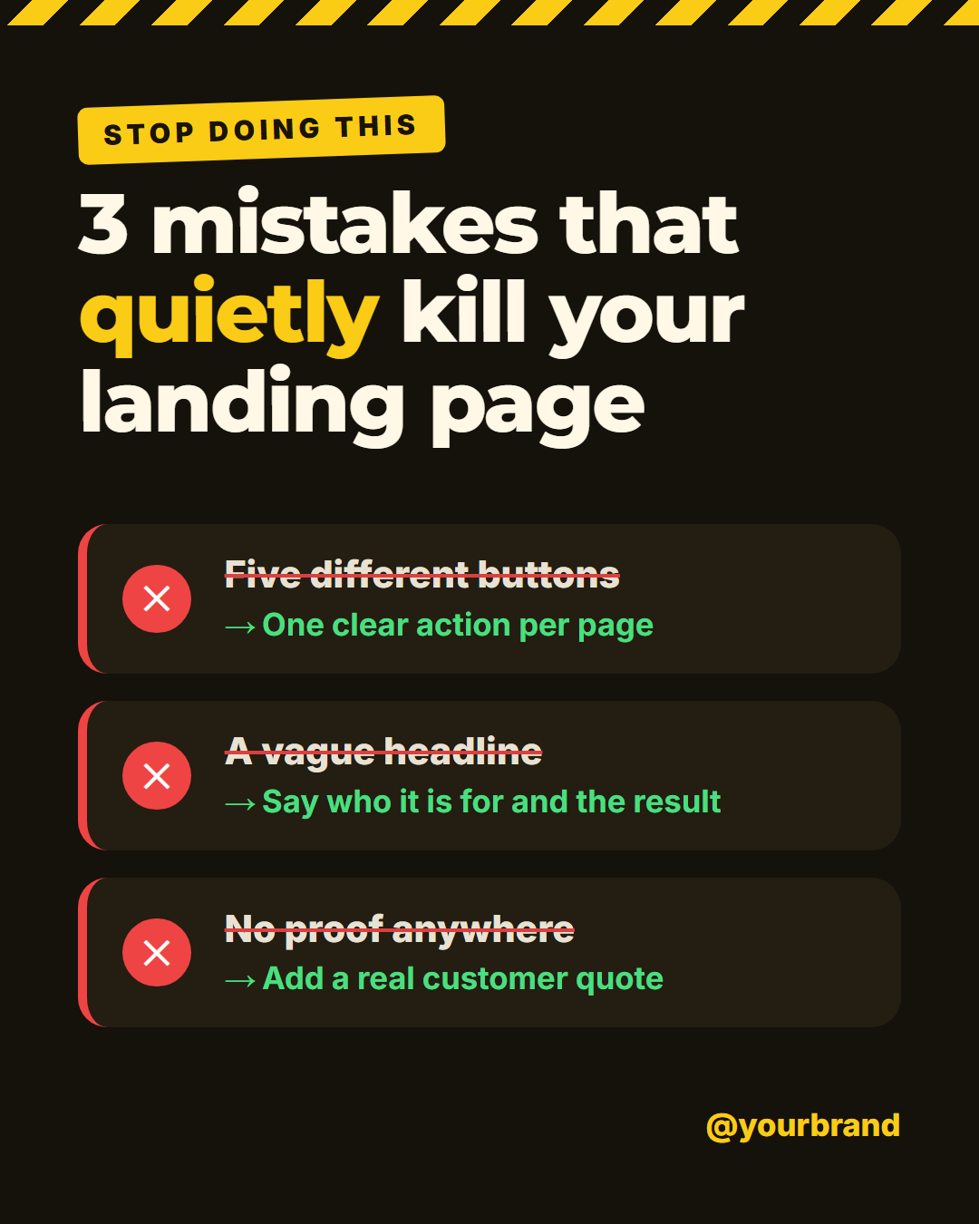
Mistakes to Avoid is a free social media template for the post format that experts reach for when they want to teach by warning: here is what people get wrong, and here is what to do instead. A hazard-tape stripe runs across the top, a yellow "Stop doing this" sticker sits at a slight angle, and each mistake gets its own card.
Wrong way, right way, in one glance
Every card pairs two lines. The mistake is struck through with a red line next to a red cross, and underneath it the fix appears in green after an arrow. A reader sees the problem and the answer together, which is more useful than a list of things not to do. The red edge on each card and the warm-black background make the page read as a warning without shouting.
Three to four mistakes, never a gap
Write up to four pairs. Leave the fourth empty and the card disappears, and the rest centre themselves. If a mistake or fix is long, the type shrinks to fit rather than overflowing. Put part of the headline in *asterisks* to colour it yellow, for example "3 mistakes that *quietly* kill your landing page".
Credible, saveable advice
This format works because it is specific. "Five different buttons" with the fix "One clear action per page" teaches something; "bad design" does not. Use the post to share a lesson from your own work, name the cost of the mistake if you know it, and invite readers to add their own mistakes in the comments.
The layout switches to two columns on the 16:9 and LinkedIn sizes and keeps text clear of the Story bars. Colours are editable, and you can export PNG, JPEG, PDF, animated video or HTML. For the positive version, try How-To Steps, and for a myth-busting angle try Myth vs Fact.
Extend with AI
Take This Post Further With AI
Ask an AI assistant to adapt the Mistakes to Avoid HTML and CSS: write mistake-and-fix pairs for your own field, turn the cards into a reusable component, or make a "myth, mistake, fix" carousel from the same wording.
Prompt to recreate it
Copy this into your AI assistant of choice to build the effect from scratch, or as a jumping-off point for your own variant:
Create a 1080×1350 "mistakes to avoid" social post in plain HTML and CSS.

- Near-black warm background (#15110b) with a yellow-and-black diagonal hazard-tape stripe across the top edge, made with repeating-linear-gradient.
- A small tilted yellow sticker "Stop doing this" in uppercase, then a bold headline "3 mistakes that quietly kill your landing page" with "quietly" in yellow.
- Three dark cards, each with a red left border and a red circular cross badge. In each card a struck-through mistake line, and under it a green line starting with an arrow and the fix.
- Handle at the bottom right in yellow.
- Size everything with a CSS variable --u equal to 1% of the shorter side.
Want to tighten it up first? Run this prompt through the AI Prompt Studio to score it across 8 quality dimensions, catch anti-patterns, and tune the wording for Claude, ChatGPT, or Gemini before you paste it in.
Why use it
Why Use the Mistakes to Avoid Template
How it’s different
How It’s Different From Canva-Style Templates
Step by step
How to Use
- 1Pick the sizeChoose Portrait 4:5 (the Instagram feed default), Square, Story / Reel, Landscape 16:9 for X, a 1200×627 LinkedIn image or a 1000×1500 Pinterest pin. Mistakes to Avoid opens at 1080×1350.
- 2Edit the textClick any text in the preview, or use the fields on the left (label, headline, mistake 1, fix 1 and more). Wrap words in *asterisks* to colour them.
- 3Match your brandApply your saved brand kit or one of 12 palettes, set exact colours, and choose heading and body fonts from any Google Font or your own uploaded font.
- 4Preview it in the feedSwitch the preview to Instagram, Story, X or LinkedIn to see the post with your name, handle and caption, and fix anything the quality checks flag.
- 5Download, save or bulk createDownload PNG, JPG or PDF, every size as a ZIP, or copy the HTML. Save it to My designs to reuse later, or turn a CSV into dozens of posts with Bulk create.
Real-world uses
Common Use Cases
Got questions?
Frequently Asked Questions
Three is the sweet spot for a single post, four at most. The headline can promise the number ("3 mistakes that..."), and fewer, better examples are more convincing than a long list of generic problems.
A post that only criticises feels negative and is rarely saved. Pairing each mistake with a fix gives the reader something to act on, which is what makes the post worth bookmarking and sharing.
Yes. The background, card, text, warning and fix colours are all editable. Soft colours turn the same layout into a gentle "common slip-ups" post, and the hazard stripe uses the warning colour so it changes with it.
Yes. Mistakes-and-fixes posts do well on LinkedIn because they show professional experience. Use the 1200×627 size, where the cards switch to two columns, or the 4:5 portrait for the feed.
Portrait post 1080×1350 (4:5): Instagram feed (recommended), Facebook and LinkedIn feeds, X portrait. Square post 1080×1080 (1:1): Instagram, Facebook, LinkedIn and X feeds. Story / Reel 1080×1920 (9:16): Instagram and Facebook Stories, Reel covers. Landscape post 1600×900 (16:9): X feed image, Facebook landscape. LinkedIn image 1200×627 (1.91:1): LinkedIn shared image and link posts, Facebook link images. Pinterest pin 1000×1500 (2:3): Pinterest standard pin (the recommended 2:3 ratio). Switch sizes in the editor and the layout adapts, or click "All sizes (ZIP)" to download every size at once.
Yes. Choose Export, then "Bulk create from CSV", and paste rows from a spreadsheet or upload a CSV whose column names match the Mistakes to Avoid fields. Every row becomes one post, and you download them all as a ZIP.
Yes. The preview switches between the plain design and mock-ups of an Instagram feed post, an Instagram Story, an X post and a LinkedIn post, using the name, handle and logo from your brand kit and the caption you type.
Yes. "Copy HTML" and "Download .html" give you one self-contained file: the markup, all the CSS and links to the Google Fonts it uses. "Fork to My Code" saves an editable copy in the UI Snippets editor. The file records the template name and version (v1.0.0).
Yes. It is free for personal and commercial posts, with no sign-up and no watermark. Everything runs in your browser and nothing you type or upload is sent to a server.