Learn Coding Visually
Learn to code with interactive, live-preview playgrounds — HTML, CSS, JavaScript, React & more.
 HTML Playground42 lessons · Click-based · Live preview
 CSS PlaygroundLearn CSS with a live editor
 JavaScript Playground60 lessons · DOM · Async · Canvas
 React PlaygroundLearn React with a live code editor
 GSAP PlaygroundLearn GSAP animation interactively
 SVG Playground44 lessons · shapes · paths · animation
 SCSS Playground45 lessons · Sass modules · tokens
 Tailwind PlaygroundLearn Tailwind CSS with a live editor
 Bootstrap 5 Playground50 lessons · live preview
Google AI Mode Button — Rainbow Border Glow That Sweeps & Follows the Cursor
AI Mode Glow Button (Google Search Style) · Buttons · Plain HTML, CSS & JS · Live preview
What's included
Features
About this UI Snippet
Google AI Mode Button — How the Rainbow Glow Sweeps on Load and Tracks the Cursor
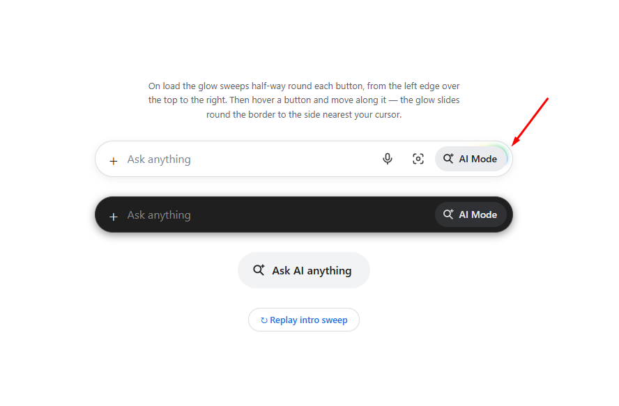
Google uses this button on its own homepage. In the google.com search box, next to the voice search and Google Lens icons, sits an "AI Mode" pill (its tooltip reads "Ask AI Mode in Google Search") that takes your query into Google's AI Mode — the conversational, AI-powered way to search. Because it's on one of the most visited pages on the web, it's become a familiar pattern for how an "AI" entry point looks and behaves.
It also has a small detail you notice without quite knowing why: when the page loads, a soft multicolour glow appears on the left edge, travels over the top to the right edge and fades out. Hover the button and the glow comes back, sliding round the border to whichever side your cursor is on. This snippet rebuilds that effect with the same layering approach Google's button uses (inspected from google.com's live CSS) — light and dark search bars, plus a larger call-to-action that wakes up before the cursor even touches it. It's an independent recreation for learning and for your own projects, not Google's code, and isn't affiliated with Google.
A colour disc behind a moving mask
The colours come from one element: a circle filled with a conic-gradient of blue, violet, pink, red, orange, yellow, green and teal. On its own that would just be a rainbow wheel. It sits inside a mask made of two conic-gradients combined with mask-composite: intersect — each lets through a different slice of the circle, and only the overlap stays visible, leaving a single wedge that is soft at both ends. Both gradients start at from var(--a), so changing --a turns the wedge, and with it the lit part of the border. A second property, --c, rotates the colour disc underneath, so the hues drift as the glow moves.
Stretching the wedge into an arc along a pill
A wedge cut from the centre of a wide pill would light the long top and bottom edges unevenly. The fix is scale: var(--sx) var(--sy) (4 × 1.5 here) on the masked element: the wedge is stretched horizontally so it sweeps along the flat edges and wraps the rounded ends smoothly. The layer around it has overflow: hidden and inset: -1px, so everything outside the button plus one pixel is clipped away.
Two layers: a bloom and an edge
The glow is drawn twice. One layer is blurred by 4px and gives the soft coloured halo that spills just past the button. The other is blurred by only 1px and uses a narrower wedge, giving a crisper line right on the border. The opaque button face sits on top of both, so you never see the rainbow inside the button — only the rim and the bloom around it. The whole group is held at 60% opacity so the effect stays subtle.
The intro sweep, half-way round
About 0.3 seconds after load each button runs a 1.3-second intro. The mask angle travels 180 degrees with an ease-out curve — fast at first, settling at the end — so the glow starts at 9 o'clock, goes over the top and ends at 3 o'clock. It fades in over the first 10%, holds, and fades out over the last 45%, while the colour disc turns about 45 degrees so the hues shift as it goes. Buttons are staggered by 180ms, and the Replay link runs it again.
Following the cursor
A single pointermove listener checks each button. When the cursor is over it (or within its data-proximity distance, like the large CTA's 70px), the script takes the angle from the button's centre to the cursor. Because the mask is stretched, the cursor offset is divided by the same scale first, so the glow really lands on the nearest side. atan2 counts from 3 o'clock and conic gradients from 12 o'clock, so 90 degrees is added, then the wedge's own position inside the mask (257 degrees) is subtracted. The glow eases toward that angle along the shortest path, the colours follow more slowly, and when the cursor leaves the glow fades out where it is.
Cheap to run
JavaScript only writes three custom properties per button. The requestAnimationFrame loop stops once everything has settled, so an idle page does no work. With prefers-reduced-motion the intro is skipped and the glow snaps to the cursor instead of easing. On touch screens, where there is no hover, a tap plays the sweep.
Build with AI
Build, Understand, Optimize, and Extend It With AI
The best way to understand this effect is to take it apart with an AI coding assistant like Claude. Paste the HTML, CSS and JS and ask what the two intersected conic-gradient masks produce on their own, why the masked element is scaled 4 × 1.5, or where the 257-degree offset comes from. Then experiment: ask for a full-lap intro, a "thinking" state where the glow circles continuously while an AI answer streams in, a single-colour brand version, or a React hook that wraps the whole thing. The JavaScript only feeds three numbers into CSS, so each change stays small and easy to follow.
Prompt to recreate it
Copy this into your AI assistant of choice to build the effect from scratch, or as a jumping-off point for your own variant:
Build a Google Search "AI Mode"-style pill button in plain HTML, CSS and JavaScript with no libraries.

Requirements:
- A 36px-tall pill button (search-sparkle icon + "AI Mode") inside a search bar, plus a dark search bar variant and a larger standalone button.
- Behind an opaque button face, add a glow group at 60% opacity containing two layers (inset: -1px, overflow: hidden): one blurred 4px, one blurred 1px.
- In each layer put a masked element scaled 4 × 1.5, whose mask is two conic-gradients starting at var(--a) combined with mask-composite: intersect so a single soft-ended wedge stays visible (the 1px layer uses a narrower wedge). Include -webkit-mask-image and -webkit-mask-composite: source-in.
- Inside the mask, a full-width circle filled with a multicolour conic-gradient (blue, violet, pink, red, orange, yellow, green, teal) and rotated by var(--c).
- JavaScript writes only --a (mask angle), --c (colour rotation) and --o (opacity).
- On load, sweep --a through 180 degrees with an ease-out curve so the glow travels from the left edge over the top to the right edge, fading in quickly and out over the last ~45%; stagger multiple buttons.
- While the cursor is over a button (or within an optional data-proximity distance), point the glow at the cursor: divide the cursor offset from the centre by the mask scale, take atan2, add 90 degrees and subtract the wedge's offset inside the mask. Ease --a along the shortest path and let --c follow more slowly; fade out when the cursor leaves.
- Use a requestAnimationFrame loop that stops when everything has settled, play the sweep on tap for touch devices, and skip the intro / snap instead of easing under prefers-reduced-motion.
Want to tighten it up first? Run this prompt through the AI Prompt Studio to score it across 8 quality dimensions, catch anti-patterns, and tune the wording for Claude, ChatGPT, or Gemini before you paste it in.
Source Code
<div class="aim-page">
<p class="aim-hint">On load the glow sweeps half-way round each button, from the left edge over the top to the right. Then hover a button and move along it — the glow slides round the border to the side nearest your cursor.</p>
<!-- Light search bar -->
<div class="aim-search">
<span class="aim-plus" aria-hidden="true">+</span>
<input class="aim-input" type="text" placeholder="Ask anything" aria-label="Search">
<span class="aim-icon" aria-hidden="true">
<svg width="20" height="20" viewBox="0 0 24 24" fill="none" stroke="currentColor" stroke-width="2" stroke-linecap="round"><rect x="9" y="3" width="6" height="11" rx="3"/><path d="M5 11a7 7 0 0 0 14 0M12 18v3"/></svg>
</span>
<span class="aim-icon" aria-hidden="true">
<svg width="20" height="20" viewBox="0 0 24 24" fill="none" stroke="currentColor" stroke-width="2" stroke-linecap="round"><path d="M4 8V6a2 2 0 0 1 2-2h2M16 4h2a2 2 0 0 1 2 2v2M20 16v2a2 2 0 0 1-2 2h-2M8 20H6a2 2 0 0 1-2-2v-2"/><circle cx="12" cy="12" r="3"/></svg>
</span>
<button class="aim-btn" type="button">
<span class="aim-glow" aria-hidden="true">
<span class="aim-fx">
<span class="aim-layer aim-soft"><span class="aim-mask"><span class="aim-disc"></span></span></span>
<span class="aim-layer aim-sharp"><span class="aim-mask"><span class="aim-disc"></span></span></span>
</span>
</span>
<span class="aim-face"></span>
<span class="aim-label">
<svg width="18" height="18" viewBox="0 0 24 24" fill="none" stroke="currentColor" stroke-width="2.2" stroke-linecap="round" aria-hidden="true"><circle cx="10" cy="10" r="6"/><path d="M14.5 14.5 20 20"/><path d="M19 2.5v5M16.5 5h5" stroke-width="1.8"/></svg>
AI Mode
</span>
</button>
</div>
<!-- Dark search bar -->
<div class="aim-search aim-dark">
<span class="aim-plus" aria-hidden="true">+</span>
<input class="aim-input" type="text" placeholder="Ask anything" aria-label="Search (dark)">
<button class="aim-btn" type="button">
<span class="aim-glow" aria-hidden="true">
<span class="aim-fx">
<span class="aim-layer aim-soft"><span class="aim-mask"><span class="aim-disc"></span></span></span>
<span class="aim-layer aim-sharp"><span class="aim-mask"><span class="aim-disc"></span></span></span>
</span>
</span>
<span class="aim-face"></span>
<span class="aim-label">
<svg width="18" height="18" viewBox="0 0 24 24" fill="none" stroke="currentColor" stroke-width="2.2" stroke-linecap="round" aria-hidden="true"><circle cx="10" cy="10" r="6"/><path d="M14.5 14.5 20 20"/><path d="M19 2.5v5M16.5 5h5" stroke-width="1.8"/></svg>
AI Mode
</span>
</button>
</div>
<!-- Large CTA: data-proximity wakes the glow 70px before the cursor touches it -->
<button class="aim-btn aim-lg" type="button" data-proximity="70">
<span class="aim-glow" aria-hidden="true">
<span class="aim-fx">
<span class="aim-layer aim-soft"><span class="aim-mask"><span class="aim-disc"></span></span></span>
<span class="aim-layer aim-sharp"><span class="aim-mask"><span class="aim-disc"></span></span></span>
</span>
</span>
<span class="aim-face"></span>
<span class="aim-label">
<svg width="20" height="20" viewBox="0 0 24 24" fill="none" stroke="currentColor" stroke-width="2.2" stroke-linecap="round" aria-hidden="true"><circle cx="10" cy="10" r="6"/><path d="M14.5 14.5 20 20"/><path d="M19 2.5v5M16.5 5h5" stroke-width="1.8"/></svg>
Ask AI anything
</span>
</button>
<button class="aim-replay" type="button" id="aimReplay">↻ Replay intro sweep</button>
</div>* { box-sizing: border-box; margin: 0; padding: 0; }
body {
font-family: system-ui, -apple-system, 'Segoe UI', Roboto, sans-serif;
background: #ffffff;
color: #1f1f1f;
min-height: 100vh;
display: flex; align-items: center; justify-content: center;
}
.aim-page {
width: min(640px, 100%);
padding: 40px 20px;
display: flex; flex-direction: column; align-items: center; gap: 28px;
}
.aim-hint { font-size: 13px; line-height: 1.55; color: #5f6368; text-align: center; max-width: 460px; }
/* ── Search bar shell ─────────────────────────────── */
.aim-search {
width: 100%;
display: flex; align-items: center; gap: 4px;
min-height: 52px;
padding: 0 8px 0 18px;
background: #fff;
border: 1px solid #dadce0;
border-radius: 26px;
box-shadow: 0 3px 10px rgba(31, 31, 31, 0.08);
}
.aim-plus { font-size: 24px; font-weight: 300; line-height: 1; padding-right: 8px; }
.aim-input {
flex: 1; min-width: 0;
border: 0; outline: 0; background: transparent;
font: inherit; font-size: 16px; color: inherit;
}
.aim-input::placeholder { color: #80868b; }
.aim-icon { display: grid; place-items: center; width: 40px; height: 40px; color: #3c4043; flex-shrink: 0; }
.aim-dark { background: #1f1f1f; border-color: #3c4043; box-shadow: 0 3px 12px rgba(0, 0, 0, 0.45); color: #e8eaed; }
/* ── The button ──────────────────────────────────────
JS writes three custom properties; everything else is CSS:
--a angle of the glow's mask (which part of the border lights up)
--c rotation of the colour disc (which colours show there)
--o glow opacity 0..1 */
.aim-btn {
--a: 20deg;
--c: 180deg;
--o: 0;
--sx: 4; /* the mask is stretched to the pill's shape… */
--sy: 1.5; /* …so the lit arc hugs a long, flat border evenly */
position: relative;
isolation: isolate;
flex-shrink: 0;
height: 36px;
padding: 0 14px 0 10px;
border: 0;
border-radius: 100px;
background: none;
font: inherit; font-size: 14px; font-weight: 500;
color: #1f1f1f;
cursor: pointer;
}
/* Glow group: sits behind the face; only the 1px rim + blur shows past it. */
.aim-glow { position: absolute; inset: 0; border-radius: inherit; pointer-events: none; opacity: 0.6; z-index: 0; }
.aim-fx { position: absolute; inset: 0; border-radius: inherit; opacity: var(--o); }
/* Two copies of the same glow: a soft 4px bloom and a crisp 1px edge. */
.aim-layer {
position: absolute; inset: -1px;
border-radius: inherit;
overflow: hidden;
filter: blur(4px);
}
.aim-sharp { filter: blur(1px); }
/* The mask: two conic gradients intersected leave one tapered wedge,
rotated by --a. Scaling it turns the wedge into an arc along the pill. */
.aim-mask {
position: absolute; inset: 0;
border-radius: inherit;
scale: var(--sx) var(--sy);
-webkit-mask-image:
conic-gradient(from var(--a), transparent 0, transparent 50%, #000 68%, #000 75%, transparent 89%),
conic-gradient(from var(--a), #000 30%, transparent 50%, #000 70%);
mask-image:
conic-gradient(from var(--a), transparent 0, transparent 50%, #000 68%, #000 75%, transparent 89%),
conic-gradient(from var(--a), #000 30%, transparent 50%, #000 70%);
-webkit-mask-composite: source-in;
mask-composite: intersect;
}
.aim-sharp .aim-mask {
-webkit-mask-image:
conic-gradient(from var(--a), transparent 0, transparent 62%, #000 82%, transparent 89%),
conic-gradient(from var(--a), #000 30%, transparent 50%, #000 70%);
mask-image:
conic-gradient(from var(--a), transparent 0, transparent 62%, #000 82%, transparent 89%),
conic-gradient(from var(--a), #000 30%, transparent 50%, #000 70%);
}
/* The colours: a full disc of blue → violet → pink → red → orange →
yellow → green → teal → blue, spun by --c. */
.aim-disc {
position: absolute; left: 0; right: 0; top: 50%;
aspect-ratio: 1;
translate: 0 -50%;
border-radius: 50%;
rotate: var(--c);
background: conic-gradient(
#3186ff 34%, #9378ff 37%, #f96bd6 39%, #fc413d 41%, #fc413d 48%,
#ff6b2b 50%, #fec700 52%, #ffdb0f 56%, #88de42 58%, #0ebc5f 61%,
#0ebc5f 65%, #2eaab2 70%, #00a9bb 72%, #3186ff 73%, #3186ff 100%
);
}
/* Face and label sit on top of the glow. */
.aim-face {
position: absolute; inset: 0; z-index: 0;
border-radius: inherit;
background: #f1f3f4;
transition: background 0.15s;
}
.aim-btn:hover .aim-face { background: #e9ebee; }
.aim-btn:active .aim-face { background: #dfe2e6; }
.aim-label {
position: relative; z-index: 1;
display: flex; align-items: center; gap: 6px;
height: 100%;
white-space: nowrap;
}
.aim-dark .aim-btn { color: #e8eaed; }
.aim-dark .aim-face { background: #303134; }
.aim-dark .aim-btn:hover .aim-face { background: #3c4043; }
.aim-dark .aim-glow { opacity: 0.85; }
.aim-btn:focus-visible { outline: none; }
.aim-btn:focus-visible .aim-face { outline: 2px solid #1a73e8; outline-offset: 2px; }
.aim-lg { height: 52px; padding: 0 26px 0 20px; font-size: 16px; --sx: 5; }
.aim-lg .aim-label { gap: 9px; }
.aim-replay {
border: 1px solid #dadce0; background: #fff; color: #1a73e8;
font: inherit; font-size: 13px; font-weight: 500;
padding: 7px 16px; border-radius: 999px; cursor: pointer;
}
.aim-replay:hover { background: #f8fafe; border-color: #d2e3fc; }
@media (max-width: 480px) {
.aim-search { padding-left: 14px; }
.aim-icon { display: none; }
}// Google AI Mode–style glow button.
// 1. Intro — soon after load the glow fades in on the left edge, sweeps
// half-way round the border over the top to the right edge, and fades.
// 2. Follow — while the cursor is on a button (or within its optional
// data-proximity distance) the glow slides round to face the cursor.
// JS only writes three custom properties per button (--a, --c, --o);
// the colour disc, the masks and the blur are all CSS.
var INTRO_DELAY = 300; // ms after load before the sweep starts
var INTRO_MS = 1300; // sweep duration
var INTRO_SWEEP = 180; // degrees travelled: left edge -> top -> right edge
var ARC_OFFSET = 257; // where the lit wedge sits inside the mask's 360deg
var FOLLOW = 0.18; // how fast the glow chases the cursor (0..1 per frame)
var HUE_FOLLOW = 0.07; // colours drift after it, more slowly
var reduceMotion = window.matchMedia('(prefers-reduced-motion: reduce)').matches;
var items = Array.prototype.map.call(document.querySelectorAll('.aim-btn'), function (el) {
var a = 20; // mask angle that lights the left edge (20 + 257 = 277deg ≈ 9 o'clock)
return {
el: el,
proximity: parseFloat(el.dataset.proximity) || 0,
a: a, ta: a, c: a + 160, o: 0, to: 0,
intro: null,
};
});
function easeOutQuart(t) { return 1 - Math.pow(1 - t, 4); }
// Shortest signed distance between two angles, so the glow never goes the long way round.
function angleDiff(from, to) { return ((to - from) % 360 + 540) % 360 - 180; }
function write(it) {
var s = it.el.style;
s.setProperty('--a', it.a.toFixed(2) + 'deg');
s.setProperty('--c', it.c.toFixed(2) + 'deg');
s.setProperty('--o', it.o.toFixed(3));
}
var rafId = 0;
function kick() { if (!rafId) rafId = requestAnimationFrame(frame); }
function frame(now) {
rafId = 0;
var busy = false;
items.forEach(function (it) {
if (it.intro) {
var t = (now - it.intro.start) / INTRO_MS;
if (t < 0) { busy = true; return; } // staggered start not reached yet
if (t < 1) {
var e = easeOutQuart(t);
it.a = it.ta = it.intro.from + INTRO_SWEEP * e;
it.c = it.intro.from + 160 + 45 * e; // colours turn a little as it travels
// Fade in fast, hold, then fade out over the last 45%.
it.o = t < 0.1 ? t / 0.1 : t < 0.55 ? 1 : 1 - (t - 0.55) / 0.45;
write(it);
busy = true;
return;
}
it.intro = null;
it.o = 0;
}
var k = reduceMotion ? 1 : FOLLOW;
var d = angleDiff(it.a, it.ta);
it.a += d * k;
var dc = angleDiff(it.c, it.a + 25);
it.c += dc * (reduceMotion ? 1 : HUE_FOLLOW);
it.o += (it.to - it.o) * (reduceMotion ? 1 : 0.12);
write(it);
if (Math.abs(d) > 0.1 || Math.abs(dc) > 0.3 || Math.abs(it.to - it.o) > 0.003) busy = true;
});
if (busy) kick();
}
function playIntro(delay) {
if (reduceMotion) return;
var start = performance.now() + (delay || 0);
items.forEach(function (it, i) {
it.intro = { start: start + i * 180, from: 20 };
});
kick();
}
// ── Follow the cursor ──────────────────────────────
document.addEventListener('pointermove', function (e) {
if (e.pointerType === 'touch') return;
items.forEach(function (it) {
var r = it.el.getBoundingClientRect();
// Distance from the cursor to the nearest point of the button (0 when on it).
var dx = Math.max(r.left - e.clientX, 0, e.clientX - r.right);
var dy = Math.max(r.top - e.clientY, 0, e.clientY - r.bottom);
var dist = Math.sqrt(dx * dx + dy * dy);
if (dist === 0 || dist < it.proximity) {
it.intro = null; // the user took over — continue from wherever the sweep was
var cs = getComputedStyle(it.el);
var sx = parseFloat(cs.getPropertyValue('--sx')) || 1;
var sy = parseFloat(cs.getPropertyValue('--sy')) || 1;
// The mask is stretched by (sx, sy), so measure the angle in its
// un-stretched space. atan2 counts from 3 o'clock, conic gradients
// from 12 o'clock — hence +90. Then back off to where the wedge sits.
var px = (e.clientX - (r.left + r.width / 2)) / sx;
var py = (e.clientY - (r.top + r.height / 2)) / sy;
var cursorAngle = Math.atan2(py, px) * 180 / Math.PI + 90;
it.ta = cursorAngle - ARC_OFFSET;
it.to = dist === 0 ? 1 : 1 - dist / it.proximity; // brighter as it gets closer
} else if (!it.intro) {
it.to = 0;
}
});
kick();
}, { passive: true });
// Cursor left the window: fade everything out.
document.documentElement.addEventListener('mouseleave', function () {
items.forEach(function (it) { if (!it.intro) it.to = 0; });
kick();
});
// Tapping on a touch screen (no hover there) plays the sweep on that button.
items.forEach(function (it) {
it.el.addEventListener('pointerdown', function (e) {
if (e.pointerType !== 'touch' || reduceMotion) return;
it.intro = { start: performance.now(), from: it.a };
kick();
});
});
document.getElementById('aimReplay').addEventListener('click', function () { playIntro(0); });
items.forEach(write);
playIntro(INTRO_DELAY);Step by step
How to Use
- 1Watch the intro sweepReload the preview or click "Replay intro sweep". The glow appears on each button's left edge, travels over the top to the right edge and fades out, one button after another.
- 2Hover and move along a buttonPut the cursor on the AI Mode button and slide it from the left end to the right end, then above and below. The glow slides round the border to face the cursor.
- 3Try the proximity variantApproach the large "Ask AI anything" button. Its data-proximity="70" wakes the glow 70px away, getting brighter as you get closer. Add the attribute to any button, or remove it for hover-only like Google.
- 4Tune the motionIn the JS panel change INTRO_MS and INTRO_SWEEP (try 360 for a full lap), FOLLOW for how quickly the glow chases the cursor, and HUE_FOLLOW for how fast the colours drift.
- 5Change the coloursEdit the conic-gradient stops on .aim-disc in the CSS panel. Use your brand colours, or a two-colour gradient for a calmer look.
- 6Adjust the glow shapeChange --sx and --sy to reshape the lit arc for wider or taller buttons, the blur() values on .aim-layer and .aim-sharp for softness, and the .aim-glow opacity for strength.
- 7Export in your formatClick "HTML" for a standalone file, "JSX" for a React component, or "Tailwind" for a React + Tailwind version.
Real-world uses
Common Use Cases
Got questions?
Frequently Asked Questions
On the google.com homepage, inside the main search box to the right of the voice search and Google Lens icons. Its tooltip reads "Ask AI Mode in Google Search", and clicking it sends your query to Google's AI Mode instead of the classic results page. The glow sweeps round it once when the page loads and follows the cursor when you hover it — the behaviour this snippet recreates.
It stacks a rainbow conic-gradient disc behind a mask made of two intersected conic gradients. The mask leaves one soft wedge visible, and rotating the mask's start angle moves the wedge round the button. The button's opaque face covers the middle, so only the rim and a blurred bloom show. This snippet uses the same approach.
A wedge cut from the centre of a wide, short pill would light the long top and bottom edges unevenly. Stretching the masked layer makes the wedge sweep along the flat edges and wrap round the rounded ends smoothly. The cursor angle is divided by the same scale so the glow still lands on the side nearest the cursor.
One layer is blurred by 4px for the soft coloured halo. The other is blurred by 1px with a narrower wedge for a sharper line on the edge. Together they look lit rather than outlined.
Not by default. Like Google's, it reacts while the cursor is on the button. Add data-proximity="70" (any pixel value) to a button to make it wake up that far away and brighten as the cursor approaches, as the large demo button does.
Current Chrome, Edge, Firefox and Safari. It relies on conic-gradient, mask-image with mask-composite: intersect, and the individual scale/rotate/translate properties. The -webkit-mask-image and -webkit-mask-composite: source-in lines cover older WebKit builds.
No. JavaScript only writes three custom properties per button, and the animation loop stops as soon as everything settles. The only per-move work is one getBoundingClientRect per button.
Yes. Click "JSX" to export. In your own component, attach the pointermove listener in a useEffect and write --a, --c and --o with ref.current.style.setProperty instead of React state, so moving the mouse never triggers re-renders.