

Announcement Bar — Free HTML CSS JS Rotating Banner Snippet
Announcement Bar · Navigation · Plain HTML, CSS & JS · Live preview
Copy & paste
Source Code
<div class="ab-bar" id="abBar" role="region" aria-label="Announcements">
  <button class="ab-nav ab-prev" id="abPrev" aria-label="Previous">‹</button>
  <div class="ab-viewport"><ul class="ab-track" id="abTrack"></ul></div>
  <button class="ab-nav ab-next" id="abNext" aria-label="Next">›</button>
  <button class="ab-close" id="abClose" aria-label="Dismiss">✕</button>
</div>
<div class="ab-page"><h1>Page content</h1><p>The rotating bar sits pinned at the top.</p></div>*{box-sizing:border-box;margin:0;padding:0}
body{font-family:system-ui,-apple-system,sans-serif;background:#0c0c16;color:#fff}
.ab-bar{position:sticky;top:0;z-index:40;display:flex;align-items:center;gap:6px;padding:0 10px;height:44px;background:linear-gradient(90deg,#4f46e5,#9333ea,#db2777);background-size:200% 100%;animation:abShift 12s ease infinite;overflow:hidden}
@keyframes abShift{0%,100%{background-position:0 0}50%{background-position:100% 0}}
.ab-viewport{flex:1;overflow:hidden;height:100%}
.ab-track{list-style:none;display:flex;height:100%;transition:transform .5s cubic-bezier(.4,0,.2,1)}
.ab-msg{flex:0 0 100%;display:flex;align-items:center;justify-content:center;gap:8px;height:100%;font-size:13.5px;font-weight:600;white-space:nowrap;padding:0 8px}
.ab-msg a{color:#fff;font-weight:800;text-decoration:underline;text-underline-offset:2px}
.ab-nav,.ab-close{background:rgba(255,255,255,.14);border:none;color:#fff;width:26px;height:26px;border-radius:7px;cursor:pointer;font-size:15px;line-height:1;flex-shrink:0;transition:background .2s}
.ab-nav:hover,.ab-close:hover{background:rgba(255,255,255,.28)}
.ab-close{margin-left:4px}
.ab-bar.closing{height:0;padding:0;opacity:0;transition:height .3s,opacity .3s,padding .3s}
.ab-page{padding:60px 24px}
.ab-page h1{font-size:32px;font-weight:800}
.ab-page p{color:#8b8ba3;margin-top:8px}var MSGS = [
'🚀 v2.0 is live — <a href="#">see what shipped</a>',
'🎁 Use code <strong>SPRING30</strong> for 30% off annual plans',
'🌍 New edge regions in Sydney & São Paulo — <a href="#">read more</a>',
'📅 Join our launch webinar this Thursday — <a href="#">save a seat</a>'
];
var track = document.getElementById('abTrack');
var bar = document.getElementById('abBar');
MSGS.forEach(function (m) {
var li = document.createElement('li');
li.className = 'ab-msg';
li.innerHTML = m;
track.appendChild(li);
});
var idx = 0, timer = null;
function go(n) {
idx = (n + MSGS.length) % MSGS.length;
track.style.transform = 'translateX(' + (-idx * 100) + '%)';
restart();
}
function restart() { clearInterval(timer); timer = setInterval(function () { go(idx + 1); }, 5000); }
document.getElementById('abNext').addEventListener('click', function () { go(idx + 1); });
document.getElementById('abPrev').addEventListener('click', function () { go(idx - 1); });
document.getElementById('abClose').addEventListener('click', function () {
clearInterval(timer);
bar.classList.add('closing');
bar.addEventListener('transitionend', function () { bar.remove(); }, { once: true });
});
// Pause rotation on hover so messages can be read or clicked.
bar.addEventListener('pointerenter', function () { clearInterval(timer); });
bar.addEventListener('pointerleave', restart);
restart();Extend with AI
Take This Snippet Further With AI
The AI prompt for this one is for Patreon supporters ($3 a month), along with a site with no ads. Supporters enter the passcode once and it is remembered in this browser.
What's included
Features
About this UI Snippet
Announcement Bar — Rotating Sticky Banner With Controls
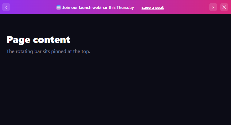
The announcement bar is the slim banner pinned to the top of a site that cycles through short messages — a launch, a promo code, an event — auto-advancing on a slide, with manual controls and a dismiss button. This snippet builds it with plain HTML, CSS, and vanilla JavaScript, including the details that make it usable rather than annoying.
A sliding message track
The messages are list items in a flex track, each flex: 0 0 100% so exactly one fills the viewport. Advancing translates the track by -idx * 100% with a cubic-bezier transition, sliding the next message in from the right. This is the same horizontal-carousel mechanic used for sliders, here applied to a single-line bar. Messages can contain links and bold text (a promo code, a "read more"), since they are rendered as HTML from the data array.
Auto-rotation that respects the reader
A setInterval advances the bar every 5 seconds, but it pauses on pointerenter and resumes on pointerleave — so a visitor can stop on a message to read it or click its link without it sliding away. Every manual navigation also restarts the timer (restart()), so the next auto-advance is a full interval after your interaction rather than firing immediately. These two behaviors are what separate a respectful announcement bar from a frustrating one.
Manual controls and looping
Previous and next buttons let users step through messages, and the go(n) function wraps the index with modulo arithmetic so next from the last message loops to the first and previous from the first loops to the last. The controls and the auto-rotation share the same go(), so they stay in sync.
Dismissable, and it stays dismissed-feeling
A close button collapses the bar: it adds a .closing class that transitions height, padding, and opacity to zero, then removes the element on transitionend. Collapsing the height (rather than just hiding) means the page content slides up to reclaim the space smoothly. In production you would set a cookie or localStorage flag here so it does not reappear on the next visit.
A living gradient
The bar background is a three-color gradient sized at 200% and slowly shifted via the abShift keyframe, so the banner subtly flows between colors — eye-catching without being loud. It is pure CSS and costs nothing.
Sticky and layered
The bar is position: sticky; top: 0 with a high z-index, so it stays pinned above the page as you scroll and over other content. The demo page below shows it holding its place at the top.
Customizing it
Edit the MSGS array (with links and emphasis), change the rotation interval, recolor or retime the gradient, swap the slide for a fade, or persist dismissal. Pair it with a sticky promo bar variant or a floating pill nav below it.
Step by step
How to Use
- 1Paste HTML, CSS, and JSA gradient announcement bar pins to the top.
- 2Watch it rotateMessages slide in and out every few seconds.
- 3Use prev/nextStep through messages manually; they loop.
- 4Hover to readRotation pauses so you can read or click a link.
- 5Dismiss itThe close button collapses the bar away.
- 6Edit the messagesChange the MSGS array with links and emphasis.
Real-world uses
Common Use Cases
translateX.Got questions?
Frequently Asked Questions
The messages are flex items each sized to 100% of the viewport, and advancing translates the track by negative index times 100% with a cubic-bezier transition, sliding the next message in. It is the same horizontal-carousel mechanic as a slider, applied to a single-line bar, and go() wraps the index with modulo so it loops past the ends.
The auto-rotation pauses on pointerenter and resumes on pointerleave, so hovering stops the bar to let you read a message or click its link. Every manual navigation also restarts the timer, so the next auto-advance is a full interval after your interaction rather than firing right away.
The close button adds a closing class that transitions the height, padding, and opacity to zero, then removes the element on transitionend. Collapsing the height lets the page content slide up to reclaim the space smoothly. In production you would also set a cookie or localStorage flag so it stays dismissed on the next visit.
Yes. Messages are rendered as HTML from the MSGS array, so they can include anchors and bold text — a promo code, a read-more link, a save-a-seat call to action. Because hovering pauses rotation, users have time to actually click those links before the bar advances.
Render the messages from data and keep the active index in state, advancing it on an interval set up in a mount effect with cleanup, and pausing it via hover handlers. Drive the track transform from the index. For dismissal, toggle a state flag and persist it to storage. In Tailwind, build the track with flex and translate utilities and animate the gradient with a keyframe in the config.
Yes. While the Announcement Bar snippet gives you one pattern to copy, the free Responsive Navbar Builder at webdevpuneet.com/navbar-builder/ designs a whole navigation bar: logo, links and dropdown menus, a mobile hamburger menu (dropdown panel, slide-in drawer or full screen) and a scroll effect (sticky, shrink, hide on scroll or transparent). It has six presets, a live preview that runs the real code, and exports HTML + CSS + vanilla JS, React, Tailwind, Vue 3 or Angular — or you can click Fork & Edit to keep editing it in My Code.