


Nested Dropdown Menu — Free HTML CSS JS Flyout Snippet
Nested Dropdown Menu · Navigation · Plain HTML, CSS & JS · Live preview
Copy & paste
Source Code
<nav class="nd-bar">
  <button class="nd-root" id="ndRoot" aria-haspopup="true" aria-expanded="false">Menu ▾</button>
  <ul class="nd-menu" id="ndMenu" role="menu"></ul>
</nav>*{box-sizing:border-box;margin:0;padding:0}
body{font-family:system-ui,-apple-system,sans-serif;background:#0b0b14;color:#e8e8f2;display:flex;justify-content:center;padding:80px 24px;min-height:100vh}
.nd-bar{position:relative;align-self:flex-start}
.nd-root{background:#17172a;border:1px solid #2a2a44;color:#fff;font-family:inherit;font-size:14px;font-weight:600;padding:10px 16px;border-radius:10px;cursor:pointer}
.nd-root[aria-expanded=true]{background:#1f1f38}
.nd-menu,.nd-sub{list-style:none;position:absolute;min-width:210px;background:#15152a;border:1px solid #2a2a44;border-radius:12px;padding:6px;box-shadow:0 18px 44px -18px rgba(0,0,0,.75);opacity:0;visibility:hidden;transform:translateY(-6px);transition:opacity .16s,transform .16s,visibility .16s;z-index:10}
.nd-menu{top:calc(100% + 8px);left:0}
.nd-menu.open{opacity:1;visibility:visible;transform:none}
.nd-sub{top:-6px;left:100%;margin-left:6px}
.nd-item{position:relative}
.nd-item.open > .nd-sub{opacity:1;visibility:visible;transform:none}
.nd-link{display:flex;align-items:center;gap:10px;width:100%;background:none;border:none;color:#d4d4e6;font-family:inherit;font-size:13.5px;text-align:left;padding:9px 11px;border-radius:8px;cursor:pointer}
.nd-link:hover,.nd-link.active{background:#262647;color:#fff}
.nd-ico{width:16px;text-align:center;flex-shrink:0;opacity:.85}
.nd-caret{margin-left:auto;opacity:.6;transition:transform .15s}
.nd-item.open > .nd-link .nd-caret{transform:rotate(0)}
.nd-kbd{margin-left:auto;font-size:10.5px;color:#7a7a96;border:1px solid #33334e;border-radius:5px;padding:1px 5px}var DATA = [
{ ico: '📄', label: 'New file', kbd: '⌘N' },
{ ico: '📁', label: 'Open recent', children: [
{ ico: '•', label: 'dashboard.tsx' }, { ico: '•', label: 'api/routes.ts' }, { ico: '•', label: 'styles.css' }
] },
{ ico: '🔗', label: 'Share', children: [
{ ico: '✉', label: 'Email link' },
{ ico: '👥', label: 'Invite people', children: [
{ ico: '✏', label: 'Can edit' }, { ico: '👁', label: 'Can view' }, { ico: '💬', label: 'Can comment' }
] }
] },
{ ico: '⚙', label: 'Preferences', kbd: '⌘,' },
{ ico: '🚪', label: 'Sign out' }
];
function build(items, level) {
var ul = document.createElement('ul');
ul.className = level === 0 ? 'nd-menu' : 'nd-sub';
ul.setAttribute('role', 'menu');
items.forEach(function (it) {
var li = document.createElement('li');
li.className = 'nd-item';
var hasKids = it.children && it.children.length;
li.innerHTML = '<button class="nd-link" role="menuitem"' + (hasKids ? ' aria-haspopup="true"' : '') + '>' +
'<span class="nd-ico">' + it.ico + '</span><span>' + it.label + '</span>' +
(hasKids ? '<span class="nd-caret">›</span>' : it.kbd ? '<span class="nd-kbd">' + it.kbd + '</span>' : '') +
'</button>';
if (hasKids) li.appendChild(build(it.children, level + 1));
ul.appendChild(li);
});
return ul;
}
var root = document.getElementById('ndRoot');
var menu = build(DATA, 0);
document.getElementById('ndMenu').replaceWith(menu);
menu.id = 'ndMenu';
var open = false;
function setOpen(v) {
open = v; menu.classList.toggle('open', v);
root.setAttribute('aria-expanded', v ? 'true' : 'false');
if (!v) closeAllSubs(menu);
}
function closeAllSubs(scope) {
scope.querySelectorAll('.nd-item.open').forEach(function (i) { i.classList.remove('open'); });
}
root.addEventListener('click', function (e) { e.stopPropagation(); setOpen(!open); });
// Hover opens submenus; clicking a leaf closes everything.
menu.addEventListener('pointerover', function (e) {
var li = e.target.closest('.nd-item');
if (!li || !menu.contains(li)) return;
// Close sibling submenus at this level, then open the hovered one if it has kids.
var siblings = li.parentElement.children;
Array.prototype.forEach.call(siblings, function (s) { if (s !== li) closeAllSubs(s), s.classList.remove('open'); });
if (li.querySelector(':scope > .nd-sub')) li.classList.add('open');
});
menu.addEventListener('click', function (e) {
var btn = e.target.closest('.nd-link');
if (!btn) return;
var li = btn.parentElement;
if (li.querySelector(':scope > .nd-sub')) return; // parent items just expand
e.stopPropagation();
setOpen(false);
});
document.addEventListener('click', function () { if (open) setOpen(false); });
document.addEventListener('keydown', function (e) { if (e.key === 'Escape' && open) setOpen(false); });Extend with AI
Take This Snippet Further With AI
The AI prompt for this one is for Patreon supporters ($3 a month), along with a site with no ads. Supporters enter the passcode once and it is remembered in this browser.
What's included
Features
About this UI Snippet
Nested Dropdown Menu — Recursive Multi-Level Flyout Menus
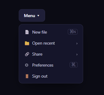
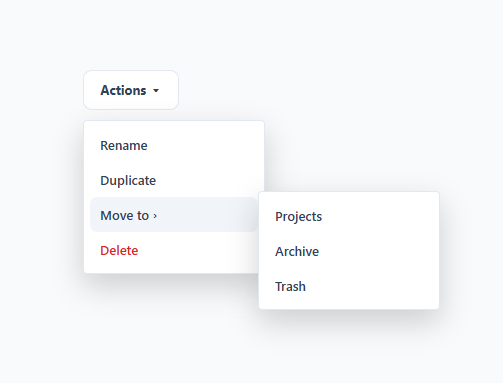
The nested dropdown is the desktop-app menu pattern where a top-level menu opens, and hovering an item with children flies a submenu out to the right — which can itself contain further submenus, several levels deep. This snippet builds it from a data tree with plain HTML, CSS, and recursive vanilla JavaScript, so the menu structure is data, not hand-written markup.
Recursive rendering from a tree
The menu is described as a nested DATA array where any item can have a children array. A build(items, level) function turns that tree into DOM: it creates a <ul>, adds a button for each item, and — if an item has children — calls itself to build the child <ul> and nests it inside. Because it's recursive, the menu supports arbitrary depth (the demo goes three levels: Share → Invite people → Can edit) with no extra code per level. Restructuring the menu is just editing the data.
Flyout submenus
The root menu drops below the button (top: 100%), while every submenu is positioned left: 100% of its parent item, so it flies out to the side like a classic cascading menu. Submenus start hidden (opacity: 0; visibility: hidden) and reveal when their parent <li> gets an .open class, transitioning opacity and a small slide. Using visibility alongside opacity ensures closed submenus aren't focusable or hoverable.
Hover logic that closes siblings
On pointerover, the handler finds the hovered item and first closes any sibling submenus at that level (so two branches are never open at once), then opens the hovered item's submenu if it has children. Closing siblings is what keeps a cascading menu tidy — moving from one parent to another collapses the old branch. The :scope > .nd-sub selector ensures it only opens the item's direct submenu, not deeper ones.
Clicks: expand vs. act
A click is interpreted by whether the item has children. Parent items only expand their submenu (handled by hover), so clicking them does nothing destructive. Clicking a leaf item (no children) is a real action, so it closes the entire menu. This mirrors how native menus behave — folders open, commands execute and dismiss.
Dismissal and accessibility
The whole menu closes on a document click outside it (the root button stops propagation so opening doesn't immediately self-close) and on the Escape key. The root carries aria-haspopup and an aria-expanded that flips with state, each submenu trigger is marked aria-haspopup, and items use role="menuitem" within role="menu" lists. Keyboard shortcuts are shown inline for leaf commands.
Customizing it
Edit the DATA tree to change the menu — add items, nest deeper, or attach icons, shortcuts, and handlers. Restyle the surfaces, adjust the flyout offset, or change the open transition. Wire each leaf's click to a real action by reading an id from the data. Pair it with a context menu or a command palette for a complete app navigation set.
Step by step
How to Use
- 1Paste HTML, CSS, and JSA Menu button renders, built from a nested data tree.
- 2Open the menuClick the button to drop the top-level menu.
- 3Hover a parent itemIts submenu flies out to the right.
- 4Go deeperHover a nested parent to open a further submenu.
- 5Click a leafA command item closes the whole menu.
- 6Edit the treeChange the DATA array to restructure the menu.
Real-world uses
Common Use Cases
left: 100%.:scope selectors open just the direct submenu, with click-away dismissal closing everything.Got questions?
Frequently Asked Questions
The menu is rendered by a recursive build(items, level) function. It creates a list, adds a button per item, and when an item has a children array it calls itself to build and nest the child list. Because it recurses, any number of levels works with no per-level code — the demo nests three deep. Changing depth is just editing the data tree.
The root menu is positioned below the button at top: 100%, while each submenu is positioned at left: 100% of its parent item with a small margin, so it appears to the right like a cascading menu. Submenus are hidden with opacity and visibility and revealed when their parent li gets an open class, with a short transition.
So only one branch is open per level, which keeps a cascading menu readable. On pointerover the handler closes sibling submenus at the hovered item's level before opening the hovered one. The :scope > .nd-sub selector ensures it opens only the item's direct submenu, not a deeper descendant.
Clicking a parent item only expands its submenu (which hover already handles), so it does nothing destructive — matching how folders work in native menus. Clicking a leaf item with no children is treated as a real command and closes the entire menu. This expand-vs-act distinction is what users expect from desktop menus.
Render the menu with a recursive component that maps the data tree, passing each node's children to a nested instance of itself. Track open submenu paths in state keyed by item id, and handle hover and click to update it. The CSS flyout positioning ports directly. In Tailwind, use group and group-hover or data-state variants to reveal submenus, with absolute left-full positioning.
Yes. While the Nested Dropdown Menu snippet gives you one pattern to copy, the free Responsive Navbar Builder at webdevpuneet.com/navbar-builder/ designs a whole navigation bar: logo, links and dropdown menus, a mobile hamburger menu (dropdown panel, slide-in drawer or full screen) and a scroll effect (sticky, shrink, hide on scroll or transparent). It has six presets, a live preview that runs the real code, and exports HTML + CSS + vanilla JS, React, Tailwind, Vue 3 or Angular — or you can click Fork & Edit to keep editing it in My Code.