


Mega Menu — Free HTML CSS JS Dropdown Snippet
Mega Menu · Navigation · Plain HTML, CSS & JS · Live preview
Copy & paste
Source Code
<div class="page">
<nav class="nav" id="nav">
<div class="nav-logo">
<svg width="22" height="22" viewBox="0 0 24 24" fill="none" stroke="#6366f1" stroke-width="2.5" stroke-linecap="round"><polygon points="13 2 3 14 12 14 11 22 21 10 12 10 13 2"/></svg>
<span>Acme</span>
</div>
<ul class="nav-list" role="menubar">
<li class="nav-item" role="none"><a class="nav-link" href="#" role="menuitem">Home</a></li>
<li class="nav-item has-mega" id="products-item" role="none">
<button class="nav-link nav-trigger" id="products-btn" role="menuitem" aria-haspopup="true" aria-expanded="false">
Products
<svg class="nav-chevron" width="12" height="12" viewBox="0 0 24 24" fill="none" stroke="currentColor" stroke-width="2.5"><polyline points="6 9 12 15 18 9"/></svg>
</button>
<div class="mega" id="mega" role="region" aria-label="Products menu">
<div class="mega-inner">
<div class="mega-col">
<div class="mega-col-head">Design</div>
<a class="mega-link" href="#">
<div class="mega-link-icon" style="background:#f0f4ff">🎨</div>
<div><div class="mega-link-name">Design Studio</div><div class="mega-link-desc">Visual design tools</div></div>
</a>
<a class="mega-link" href="#">
<div class="mega-link-icon" style="background:#f0fdf4">🖼️</div>
<div><div class="mega-link-name">Asset Library</div><div class="mega-link-desc">Icons, images, fonts</div></div>
</a>
<a class="mega-link" href="#">
<div class="mega-link-icon" style="background:#fdf4ff">✨</div>
<div><div class="mega-link-name">Prototyping</div><div class="mega-link-desc">Interactive wireframes</div></div>
</a>
</div>
<div class="mega-col">
<div class="mega-col-head">Developer</div>
<a class="mega-link" href="#">
<div class="mega-link-icon" style="background:#fff7ed">⚡</div>
<div><div class="mega-link-name">API Platform</div><div class="mega-link-desc">REST & GraphQL APIs</div></div>
</a>
<a class="mega-link" href="#">
<div class="mega-link-icon" style="background:#fefce8">📦</div>
<div><div class="mega-link-name">CLI Tools</div><div class="mega-link-desc">Terminal productivity</div></div>
</a>
<a class="mega-link" href="#">
<div class="mega-link-icon" style="background:#f0fdf4">🔌</div>
<div><div class="mega-link-name">Integrations</div><div class="mega-link-desc">500+ app connectors</div></div>
</a>
</div>
<div class="mega-col">
<div class="mega-col-head">Analytics</div>
<a class="mega-link" href="#">
<div class="mega-link-icon" style="background:#fdf2f8">📊</div>
<div><div class="mega-link-name">Dashboards</div><div class="mega-link-desc">Real-time metrics</div></div>
</a>
<a class="mega-link" href="#">
<div class="mega-link-icon" style="background:#eff6ff">🔍</div>
<div><div class="mega-link-name">Insights</div><div class="mega-link-desc">AI-powered reports</div></div>
</a>
<a class="mega-link" href="#">
<div class="mega-link-icon" style="background:#fff7ed">🎯</div>
<div><div class="mega-link-name">Attribution</div><div class="mega-link-desc">Track conversions</div></div>
</a>
</div>
<div class="mega-featured">
<div class="featured-badge">✨ New</div>
<div class="featured-title">Introducing AI Copilot</div>
<div class="featured-desc">Generate components, write queries, and build flows with natural language.</div>
<a class="featured-cta" href="#">Try it free →</a>
</div>
</div>
</div>
</li>
<li class="nav-item" role="none"><a class="nav-link" href="#" role="menuitem">Pricing</a></li>
<li class="nav-item" role="none"><a class="nav-link" href="#" role="menuitem">Docs</a></li>
</ul>
<div class="nav-actions">
<a class="btn-ghost" href="#">Log in</a>
<a class="btn-primary" href="#">Get started</a>
</div>
</nav>
<div class="hero-placeholder">
<p>Hover or click <strong>Products</strong> in the nav above</p>
</div>
</div>* { box-sizing: border-box; margin: 0; padding: 0; }
body { font-family: system-ui, -apple-system, sans-serif; background: #f8fafc; min-height: 100vh; }
.page { min-height: 100vh; }
.nav {
background: #fff;
border-bottom: 1px solid #e2e8f0;
padding: 0 24px;
height: 58px;
display: flex;
align-items: center;
gap: 32px;
position: relative;
z-index: 100;
box-shadow: 0 1px 3px rgba(0,0,0,0.05);
}
.nav-logo { display: flex; align-items: center; gap: 8px; font-size: 16px; font-weight: 800; color: #1e293b; flex-shrink: 0; }
.nav-list { display: flex; align-items: center; gap: 2px; list-style: none; flex: 1; }
.nav-link {
display: flex; align-items: center; gap: 5px;
padding: 6px 12px; border-radius: 8px;
font-size: 14px; font-weight: 500; color: #475569;
text-decoration: none; border: none; background: none; cursor: pointer;
transition: background 0.15s, color 0.15s;
white-space: nowrap;
}
.nav-link:hover { background: #f1f5f9; color: #1e293b; }
.nav-trigger.open { background: #f1f5f9; color: #1e293b; }
.nav-chevron { transition: transform 0.2s; flex-shrink: 0; }
.nav-trigger.open .nav-chevron { transform: rotate(180deg); }
.has-mega { position: static; }
.mega {
position: absolute;
top: 100%;
left: 50%;
transform: translateX(-50%);
width: 680px;
background: #fff;
border: 1px solid #e2e8f0;
border-radius: 16px;
box-shadow: 0 12px 40px rgba(0,0,0,0.12), 0 2px 8px rgba(0,0,0,0.06);
opacity: 0;
transform: translateX(-50%) translateY(-8px) scale(0.98);
pointer-events: none;
transition: opacity 0.2s, transform 0.2s;
overflow: hidden;
}
.mega.open {
opacity: 1;
transform: translateX(-50%) translateY(0) scale(1);
pointer-events: all;
}
/* arrow — hidden when positioned under full nav; gap provides spacing */
.mega-inner {
display: grid;
grid-template-columns: 1fr 1fr 1fr 200px;
padding: 20px;
gap: 12px;
}
.mega-col { display: flex; flex-direction: column; gap: 4px; }
.mega-col-head { font-size: 11px; font-weight: 700; text-transform: uppercase; letter-spacing: 0.6px; color: #94a3b8; padding: 0 8px 8px; }
.mega-link {
display: flex; align-items: center; gap: 12px;
padding: 8px; border-radius: 10px;
text-decoration: none; color: inherit;
transition: background 0.12s;
}
.mega-link:hover { background: #f8fafc; }
.mega-link-icon {
width: 36px; height: 36px; border-radius: 9px;
display: flex; align-items: center; justify-content: center;
font-size: 16px; flex-shrink: 0;
}
.mega-link-name { font-size: 13px; font-weight: 600; color: #1e293b; }
.mega-link-desc { font-size: 11.5px; color: #64748b; margin-top: 1px; }
.mega-featured {
background: linear-gradient(135deg, #6366f1 0%, #8b5cf6 100%);
border-radius: 12px;
padding: 18px;
display: flex; flex-direction: column; gap: 8px;
color: #fff;
}
.featured-badge {
display: inline-flex; align-items: center; gap: 4px;
background: rgba(255,255,255,0.2);
border-radius: 99px; padding: 3px 10px;
font-size: 11px; font-weight: 700;
width: fit-content;
}
.featured-title { font-size: 15px; font-weight: 800; line-height: 1.2; }
.featured-desc { font-size: 12px; opacity: 0.85; line-height: 1.4; }
.featured-cta {
display: inline-block; margin-top: 4px;
background: rgba(255,255,255,0.2);
border: 1px solid rgba(255,255,255,0.3);
border-radius: 8px; padding: 7px 14px;
font-size: 12px; font-weight: 700; color: #fff;
text-decoration: none; transition: background 0.15s;
width: fit-content;
}
.featured-cta:hover { background: rgba(255,255,255,0.35); }
.nav-actions { display: flex; align-items: center; gap: 8px; margin-left: auto; }
.btn-ghost { font-size: 13px; font-weight: 600; color: #475569; text-decoration: none; padding: 7px 14px; border-radius: 8px; transition: background 0.15s; }
.btn-ghost:hover { background: #f1f5f9; }
.btn-primary { font-size: 13px; font-weight: 700; color: #fff; background: #6366f1; padding: 7px 16px; border-radius: 8px; text-decoration: none; transition: background 0.15s; }
.btn-primary:hover { background: #4f46e5; }
.hero-placeholder { display: flex; align-items: center; justify-content: center; height: calc(100vh - 58px); color: #94a3b8; font-size: 15px; }const trigger = document.getElementById('products-btn');
const mega = document.getElementById('mega');
const item = document.getElementById('products-item');
let closeTimer = null;
function open() {
clearTimeout(closeTimer);
mega.classList.add('open');
trigger.classList.add('open');
trigger.setAttribute('aria-expanded', 'true');
}
function close() {
mega.classList.remove('open');
trigger.classList.remove('open');
trigger.setAttribute('aria-expanded', 'false');
}
function scheduleClose() {
closeTimer = setTimeout(close, 150);
}
item.addEventListener('mouseenter', open);
item.addEventListener('mouseleave', scheduleClose);
mega.addEventListener('mouseenter', () => clearTimeout(closeTimer));
mega.addEventListener('mouseleave', scheduleClose);
trigger.addEventListener('click', e => {
e.stopPropagation();
mega.classList.contains('open') ? close() : open();
});
document.addEventListener('click', e => {
if (!item.contains(e.target)) close();
});
document.addEventListener('keydown', e => {
if (e.key === 'Escape') close();
});
mega.querySelectorAll('a').forEach(a => a.addEventListener('click', e => e.preventDefault()));Extend with AI
Take This Snippet Further With AI
The AI prompt for this one is for Patreon supporters ($3 a month), along with a site with no ads. Supporters enter the passcode once and it is remembered in this browser.
What's included
Features
About this UI Snippet
Mega Menu — HTML CSS JavaScript
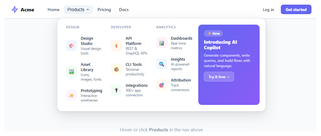
Desktop mega menu with 3 linked columns, featured card, hover and click open, arrow indicator, and Escape-to-close. Pure HTML/CSS/JS.
A mega menu is an expanded navigation dropdown that reveals multiple columns of categorised links, often with a featured promotional panel. It is the standard pattern for product-heavy SaaS sites, e-commerce stores, and enterprise dashboards where a simple one-level dropdown cannot surface enough destinations without overwhelming users. This snippet builds a full mega menu with three linked columns, a gradient featured card, a CSS arrow pointer, and combined hover + click behaviour — all in vanilla HTML, CSS, and JavaScript.
Panel positioning and the CSS arrow
The mega panel is position: absolute; left: 50%; transform: translateX(-50%) on the .has-mega nav item. This centres the panel below the trigger regardless of where the nav item sits in the bar. The open state composes two transforms on a single property: transform: translateX(-50%) translateY(0) scale(1) — the closed state uses translateX(-50%) translateY(-8px) scale(0.98). Both transforms must be written together or the translateX centering is lost when the other transforms change. The decorative arrow pointer is a pseudo-element ::before rotated 45° with the same border-left and border-top as the panel border, positioned absolutely above the panel top edge.
Hover-intent with timer guard
A plain mouseenter / mouseleave approach causes flickering as the mouse moves from the nav trigger across the 14px gap into the panel. The solution is a scheduleClose() function that sets a 150ms setTimeout on mouseleave. Both the trigger's parent <li> and the mega panel itself call clearTimeout on mouseenter, cancelling the pending close. This creates a "hover bridge" — the user can move the mouse across the gap without the panel closing mid-movement.
Dual open trigger (hover + click)
The trigger button also supports click-to-toggle, which is essential for keyboard users and touch devices where hover events do not fire reliably. The click handler calls e.stopPropagation() to prevent the document-level click listener from immediately closing a panel that was just opened. The document listener closes the panel when a click lands outside the .has-mega container, using .contains() to check ancestry.
Keyboard accessibility
An Escape keydown listener on the document always closes the panel regardless of focus position. The trigger button carries aria-haspopup="true" and aria-expanded which is toggled on every open/close. The mega div uses role="region" with aria-label="Products menu" so screen readers announce the region when focus enters.
Featured panel
The fourth column is a gradient card using background: linear-gradient(135deg, #6366f1, #8b5cf6) — the indigo-to-violet diagonal is a common SaaS brand treatment. The featured CTA button uses rgba(255,255,255,0.2) background so it adapts to any gradient colour behind it without needing a hardcoded contrasting colour. The width: fit-content on the CTA prevents it from stretching to full column width.
Step by step
How to Use
- 1Hover over "Products"The mega panel slides down with a scale-and-fade animation and a CSS arrow indicator points up to the trigger button.
- 2Browse the three columnsEach column has a category heading and three links with icon, name, and description. Hover each link for the background highlight.
- 3See the featured cardThe fourth column shows a gradient promotional card with a "New" badge, title, description, and a CTA button.
- 4Move mouse awayMoving the mouse off the panel or the trigger starts a 150ms close timer. Moving back into either cancels it — no accidental closes.
- 5Press EscapePressing Escape closes the panel from anywhere on the page, resetting the trigger's aria-expanded to false.
- 6Add more mega menusDuplicate the .has-mega <li> structure for other nav items. Each needs its own trigger, mega div, and JS listener wired to separate element IDs.
Real-world uses
Common Use Cases
Got questions?
Frequently Asked Questions
Duplicate the .has-mega <li> with a new id on both the trigger button and the mega div. Add a second set of open/close event listeners in JS referencing the new IDs. Each mega menu is fully independent.
On mobile, hide .mega and replace with an off-canvas drawer or accordion. Use a media query to switch the .has-mega from position:relative + hover behaviour to a full-width collapsible panel on small screens.
CSS transform is a single property — setting transform in one rule overwrites any previously set transform values. If the open state only sets translateY(0) scale(1), it loses the translateX(-50%) centering from the base rule. All transforms must be written together.
Fetch your navigation data on page load, then generate the .mega-inner HTML using a template literal map over the response data. Re-attach event listeners after innerHTML is set, or use event delegation with a single listener on .mega-inner.
Listen for ArrowDown on the trigger to move focus into the first mega link. Then listen for ArrowDown/ArrowUp on .mega-link elements to move between them with element.nextElementSibling?.focus(). Tab naturally moves focus forward through links.
Yes. Export it as a React, Vue, or Angular component with the buttons above the preview. The hover-to-open dropdown and the multi-column panel grid are pure CSS, so they port over unchanged; the only JavaScript — the click-outside close and the keyboard focus handling — moves into a useEffect (React), onMounted (Vue), or ngAfterViewInit (Angular) lifecycle hook so listeners attach after the menu mounts. The link data is a natural fit for an array you map over with JSX, v-for, or *ngFor. The Tailwind export rewrites the mega-panel grid, spacing, and hover states as utility classes for a Tailwind project.
Yes. While the Mega Menu snippet gives you one pattern to copy, the free Responsive Navbar Builder at webdevpuneet.com/navbar-builder/ designs a whole navigation bar: logo, links and dropdown menus, a mobile hamburger menu (dropdown panel, slide-in drawer or full screen) and a scroll effect (sticky, shrink, hide on scroll or transparent). It has six presets, a live preview that runs the real code, and exports HTML + CSS + vanilla JS, React, Tailwind, Vue 3 or Angular — or you can click Fork & Edit to keep editing it in My Code.