

Quill Rich Text Editor with Custom Toolbar and Character Limit

CodeMirror JSON Editor with Validation Gutter
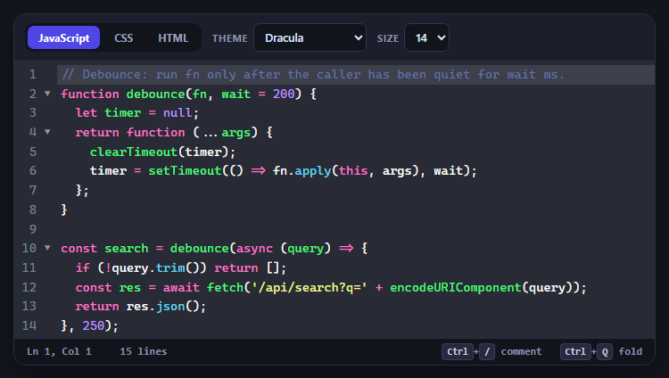
CodeMirror Code Editor with Line Numbers, Folding and Themes

Marked + DOMPurify Live Markdown Preview
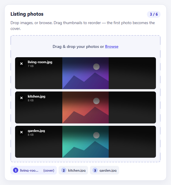
FilePond Image Upload with Preview and Reorder

Cropper.js Aspect-Ratio Presets for Social Posts
Chip Multiselect — Free HTML CSS JS Tag Token Input Field
Chip Multiselect · Forms · Plain HTML, CSS & JS · Live preview
Copy & paste
Source Code
<div class="cm-field" id="cmField">
  <label class="cm-label">Skills</label>
  <div class="cm-box" id="cmBox">
    <span class="cm-chips" id="cmChips"></span>
    <input type="text" class="cm-input" id="cmInput" placeholder="Add a skill…" autocomplete="off" />
    <ul class="cm-menu" id="cmMenu" role="listbox"></ul>
  </div>
  <p class="cm-hint">Type to filter · Enter to add · Backspace to remove</p>
</div>*{box-sizing:border-box;margin:0;padding:0}
body{font-family:system-ui,-apple-system,sans-serif;background:#0d1018;display:flex;justify-content:center;align-items:flex-start;min-height:100vh;padding:80px 24px}
.cm-field{width:340px}
.cm-label{display:block;color:#aeb6cc;font-size:13px;font-weight:600;margin-bottom:8px}
.cm-box{position:relative;display:flex;flex-wrap:wrap;align-items:center;gap:6px;min-height:48px;padding:7px 9px;background:#161a26;border:1.5px solid #2a3144;border-radius:12px;cursor:text;transition:border-color .16s,box-shadow .16s}
.cm-box.is-focus{border-color:#6366f1;box-shadow:0 0 0 4px rgba(99,102,241,.16)}
.cm-chips{display:contents}
.cm-chip{display:inline-flex;align-items:center;gap:6px;background:#252b3d;color:#e6eaf5;font-size:13px;font-weight:500;padding:5px 6px 5px 10px;border-radius:8px;animation:cmPop .14s ease}
@keyframes cmPop{from{transform:scale(.7);opacity:0}to{transform:scale(1);opacity:1}}
.cm-chip button{background:#39415a;border:0;color:#c0c7da;width:17px;height:17px;border-radius:5px;cursor:pointer;font-size:12px;line-height:1;display:flex;align-items:center;justify-content:center}
.cm-chip button:hover{background:#ef4444;color:#fff}
.cm-input{flex:1;min-width:90px;background:none;border:0;outline:0;color:#fff;font-family:inherit;font-size:14px;padding:5px 2px}
.cm-input::placeholder{color:#5e6680}
.cm-menu{position:absolute;top:calc(100% + 6px);left:0;right:0;list-style:none;background:#1a1f2e;border:1px solid #2c3346;border-radius:11px;padding:5px;max-height:190px;overflow-y:auto;box-shadow:0 16px 40px rgba(0,0,0,.5);z-index:5;display:none}
.cm-menu.is-open{display:block}
.cm-menu li{padding:9px 11px;border-radius:8px;color:#c7cde0;font-size:13px;cursor:pointer}
.cm-menu li.is-active,.cm-menu li:hover{background:#262d40;color:#fff}
.cm-menu li.cm-empty{color:#6b7290;cursor:default}
.cm-hint{font-size:12px;margin-top:8px;color:#6b7290}var ALL = ['JavaScript','TypeScript','React','Vue','Svelte','Node.js','Python','Go','Rust','CSS','HTML','GraphQL','PostgreSQL','Docker','Figma'];
var selected = [];
var active = -1;
var field = document.getElementById('cmField');
var box = document.getElementById('cmBox');
var chips = document.getElementById('cmChips');
var input = document.getElementById('cmInput');
var menu = document.getElementById('cmMenu');
function available() {
var q = input.value.trim().toLowerCase();
return ALL.filter(function (s) {
return selected.indexOf(s) === -1 && s.toLowerCase().indexOf(q) !== -1;
});
}
function renderChips() {
chips.innerHTML = '';
selected.forEach(function (s) {
var chip = document.createElement('span');
chip.className = 'cm-chip';
chip.textContent = s;
var x = document.createElement('button');
x.type = 'button';
x.innerHTML = '×';
x.addEventListener('click', function (e) { e.stopPropagation(); remove(s); });
chip.appendChild(x);
chips.appendChild(chip);
});
}
function renderMenu() {
var list = available();
active = list.length ? Math.min(active, list.length - 1) : -1;
menu.innerHTML = '';
if (!list.length) {
var empty = document.createElement('li');
empty.className = 'cm-empty';
empty.textContent = 'No matches';
menu.appendChild(empty);
return;
}
list.forEach(function (s, i) {
var li = document.createElement('li');
li.textContent = s;
li.setAttribute('role', 'option');
if (i === active) li.className = 'is-active';
li.addEventListener('mousedown', function (e) { e.preventDefault(); add(s); });
menu.appendChild(li);
});
}
function add(s) { selected.push(s); input.value = ''; active = -1; renderChips(); renderMenu(); input.focus(); }
function remove(s) { selected = selected.filter(function (x) { return x !== s; }); renderChips(); renderMenu(); input.focus(); }
function open() { menu.classList.add('is-open'); box.classList.add('is-focus'); renderMenu(); }
function close() { menu.classList.remove('is-open'); box.classList.remove('is-focus'); }
box.addEventListener('click', function () { input.focus(); });
input.addEventListener('focus', open);
input.addEventListener('blur', close);
input.addEventListener('input', function () { active = 0; renderMenu(); });
input.addEventListener('keydown', function (e) {
var list = available();
if (e.key === 'ArrowDown') { active = (active + 1) % list.length; renderMenu(); e.preventDefault(); }
else if (e.key === 'ArrowUp') { active = (active - 1 + list.length) % list.length; renderMenu(); e.preventDefault(); }
else if (e.key === 'Enter' && active > -1 && list[active]) { add(list[active]); e.preventDefault(); }
else if (e.key === 'Backspace' && !input.value && selected.length) { remove(selected[selected.length - 1]); }
});
renderChips();Extend with AI
Take This Snippet Further With AI
The AI prompt for this one is for Patreon supporters ($3 a month, 7 days free), along with a site with no ads. Supporters enter the passcode once and it is remembered in this browser.
What's included
Features
About this UI Snippet
Chip Multiselect — A Token Input With Filtered Suggestions

The chip multiselect is the token-style input used for tags, skills, recipients, and categories — each choice becomes a removable chip inside the field, and a filtered dropdown suggests what's left to add as you type. This snippet builds a fully keyboard-operable one with plain HTML, CSS, and vanilla JavaScript, with no dependency.
Chips inside a flex field
The field is a flex container with flex-wrap that holds the chips and a flexible text input that grows to fill the remaining space and drops to the next line when chips fill the row. Clicking anywhere in the box focuses the input, so the whole control behaves like one field. Each chip animates in with a small scale pop and carries a remove button that turns red on hover — the standard token affordances.
A filtered, deduplicated dropdown
As you type, available() returns the source options minus anything already selected and filtered by a case-insensitive substring match, so the menu only ever offers valid, new choices. The menu opens on focus and re-renders on every keystroke, showing a "No matches" row when nothing fits. Because selection removes an item from the available pool, you can't add a duplicate.
Full keyboard control
The input handles a complete keyboard model: Arrow Down and Up move an active highlight through the filtered list (wrapping at the ends), Enter adds the highlighted option, and Backspace on an empty input removes the last chip — the behaviour people expect from Gmail's recipient field. Suggestion clicks use mousedown with preventDefault so the selection happens before the input's blur would close the menu, a subtle but essential detail for click-to-add dropdowns.
State drives the DOM
A selected array is the single source of truth; renderChips() and renderMenu() rebuild their sections from it after every change. Keeping state separate from the DOM means adding, removing, and filtering are simple array operations, and the rendered chips and menu always reflect the current selection.
Focus styling
The box shows a focus ring (accent border plus soft shadow) whenever the input is focused, matching a good text input, and a hint line documents the keyboard shortcuts. These small touches make the control feel finished and discoverable.
Customizing it
Swap the option list for your own data or an async source, allow free-text entries that aren't in the list, cap the number of selections, or restyle the chips. Read selected on submit to get the chosen values. Pair it with a tag input, an autocomplete input, or a multi select dropdown.
Step by step
How to Use
- 1Paste HTML, CSS, and JSAn empty skills field renders with a hint.
- 2Focus and typeA dropdown filters the remaining options.
- 3Press EnterThe highlighted option becomes a chip.
- 4Press BackspaceAn empty input removes the last chip.
- 5Click a chip ×That selection is removed and re-offered.
- 6Swap the optionsReplace the ALL array with your data.
Real-world uses
Common Use Cases
Got questions?
Frequently Asked Questions
The available function returns the source options minus anything already in the selected array, then filters by a case-insensitive substring match on what you have typed. Because chosen items leave the available pool, the dropdown only ever offers valid new choices and you cannot add the same value twice.
When you click a suggestion, the input would blur first and close the menu before a click handler runs. Using mousedown with preventDefault commits the selection before blur fires, so click-to-add works reliably. It is a subtle but essential detail for any dropdown that closes on blur.
Arrow Down and Up move an active highlight through the filtered list and wrap at the ends, Enter adds the highlighted option, and Backspace on an empty input removes the last chip. This matches the recipient-field behaviour people know from email clients, so the control is fully usable without a mouse.
A selected array is the single source of truth. After any add or remove, renderChips and renderMenu rebuild their sections from that array, so the chips and the available suggestions always reflect the current selection. Keeping state separate from the DOM makes every operation a simple array update.
Hold the selected array and the query in state and derive the filtered suggestions with useMemo / computed rather than manual DOM rendering. Map selected to chips and the filtered list to options in your template, and handle the same keydown logic on the input. Use onMouseDown with preventDefault for option clicks so blur does not close the menu first.