
Quill Rich Text Editor with Custom Toolbar and Character Limit

CodeMirror JSON Editor with Validation Gutter
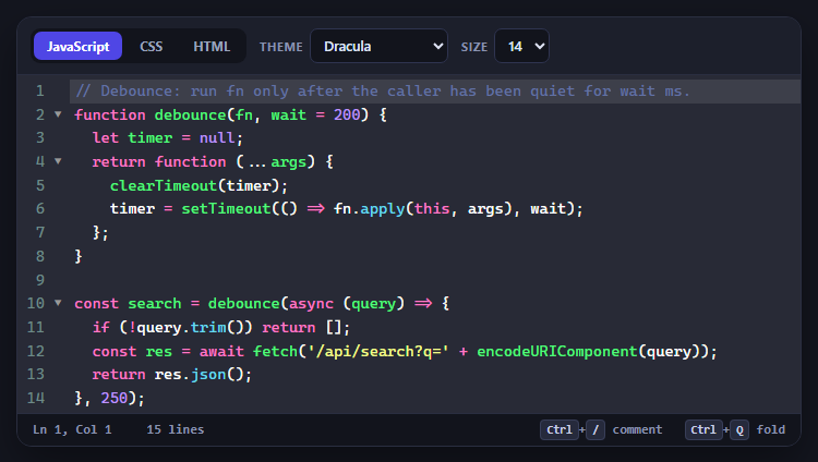
CodeMirror Code Editor with Line Numbers, Folding and Themes

Marked + DOMPurify Live Markdown Preview
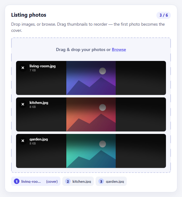
FilePond Image Upload with Preview and Reorder

Cropper.js Aspect-Ratio Presets for Social Posts
Login Form with Social Buttons — Free HTML CSS JS Snippet
Login Form with Social Buttons · Forms · Plain HTML, CSS & JS · Live preview
What's included
Features
About this UI Snippet
Login Form with Social Buttons — Validated Email/Password Login with Social Auth
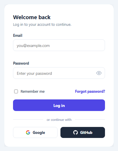
This snippet builds a complete login form covering the elements most real login screens need: email and password fields with inline validation, a password visibility toggle, a "Remember me" checkbox, a "Forgot password?" link, and a divider leading into branded social login buttons for Google and GitHub.
Show/hide password
The password field's type attribute is toggled between "password" and "text" by a single eye-icon button. The button also tracks its own active state with a class toggle (recoloring the icon) and updates its aria-label between "Show password" and "Hide password" so the control stays accurately described for assistive technology as its behavior changes.
Inline validation on submit
Submitting the form calls preventDefault() and checks two conditions before allowing the "login": the email field must be non-empty and contain an @ character, and the password field must be non-empty. Each field has its own dedicated error paragraph that's populated with a specific message when invalid, or cleared when the corresponding field passes — so errors don't leak between fields and a fixed error no longer shows once corrected.
Social buttons as a visual pattern
The Google and GitHub buttons use inline SVG icons matching each brand's real logo colors, with GitHub styled as a dark, high-contrast button and Google as a light, bordered button — reflecting the actual brand guidelines those companies publish for their sign-in buttons, rather than generic identical-looking buttons.
Step by step
How to Use
- 1Load the snippetClick "Login Form with Social Buttons" in the sidebar to load its HTML, CSS, and JS into the editor panels. The preview updates instantly.
- 2Edit the codeModify any panel — HTML, CSS, or JS. The preview refreshes as you type. Use Reset in each panel header to restore the original.
- 3Preview on devicesClick the Mobile (375px), Tablet (768px), or Desktop buttons in the preview header to check responsiveness.
- 4Export in your formatClick "HTML" to download a standalone file, "JSX" for a React component, "Tailwind" for a React + Tailwind CSS component, "Tailwind HTML" for a standalone HTML file with Tailwind CDN, "Vue" for a Vue 3 SFC with <template>/<script setup>/<style scoped>, or "Angular" for a standalone Angular .component.ts file. "Copy all" copies the full code to clipboard.
- 5Save your versionClick "Save as", type a name, and press Enter. Your snippet saves to IndexedDB and appears in the Saved tab.
Real-world uses
Common Use Cases
aria-label.Got questions?
Frequently Asked Questions
Clicking the eye icon button swaps the password input's type attribute between "password" and "text", toggles an active-state class on the button for its own styling, and updates the button's aria-label to describe the next action.
The email field must be non-empty and contain an "@" character; the password field must simply be non-empty. Each check populates or clears its own dedicated error message element independently.
They are visual/UI-only in this snippet — clicking them does not perform real OAuth. Wire them to your own authentication provider's sign-in flow (e.g. redirecting to an OAuth endpoint) to make them functional.
Each button mirrors that provider's own published brand guidelines for sign-in buttons — GitHub's as a solid dark button with a white logo, Google's as a light bordered button with its multicolor "G" logo.
Build with AI
Build, Understand, Optimize, and Extend It With AI
Hand this snippet's HTML, CSS, and JavaScript to an AI coding assistant like Claude and ask it to adapt "Login Form with Social Buttons" to your project — restyle it to match your design system, wire it up to real data instead of the static example, or port it to the framework you're building in.
Prompt to recreate it
Copy this into your AI assistant of choice to build the effect from scratch, or as a jumping-off point for your own variant:
Build a forms component called "Login Form with Social Buttons" using plain HTML, CSS, and vanilla JavaScript — no framework, no build step.

Requirements:
- Match the structure and behavior of the "Login Form with Social Buttons" snippet from the UI Snippets Library.
- Keep the markup semantic and the styling self-contained (no external dependencies beyond what the original snippet uses).
- Keep the JavaScript vanilla, with no framework runtime required.
- Make it easy to restyle via CSS custom properties or class overrides so it can be dropped into a real project.
Want to tighten it up first? Run this prompt through the AI Prompt Studio to score it across 8 quality dimensions, catch anti-patterns, and tune the wording for Claude, ChatGPT, or Gemini before you paste it in.
Source Code
<div class="lf-card">
  <h2>Welcome back</h2>
  <p class="lf-sub">Log in to your account to continue.</p>

  <form id="lfForm" novalidate>
    <label class="lf-field">
      <span>Email</span>
      <input type="text" id="lfEmail" placeholder="you@example.com" autocomplete="email" />
      <p class="lf-error" id="lfEmailError"></p>
    </label>

    <label class="lf-field">
      <span>Password</span>
      <div class="lf-password-wrap">
        <input type="password" id="lfPassword" placeholder="Enter your password" autocomplete="current-password" />
        <button type="button" class="lf-eye-btn" id="lfEyeBtn" aria-label="Show password">
          <svg width="18" height="18" viewBox="0 0 24 24" fill="none" stroke="currentColor" stroke-width="2" stroke-linecap="round" stroke-linejoin="round"><path d="M1 12s4-8 11-8 11 8 11 8-4 8-11 8-11-8-11-8z"/><circle cx="12" cy="12" r="3"/></svg>
        </button>
      </div>
      <p class="lf-error" id="lfPasswordError"></p>
    </label>

    <div class="lf-row">
      <label class="lf-remember">
        <input type="checkbox" id="lfRemember" />
        <span>Remember me</span>
      </label>
      <a href="#" class="lf-forgot">Forgot password?</a>
    </div>

    <button type="submit" class="lf-submit">Log in</button>
  </form>

  <div class="lf-divider"><span>or continue with</span></div>

  <div class="lf-social">
    <button class="lf-social-btn lf-google">
      <svg width="16" height="16" viewBox="0 0 24 24"><path fill="#4285F4" d="M22.5 12.2c0-.8-.1-1.5-.2-2.2H12v4.2h5.9c-.3 1.4-1 2.5-2.2 3.3v2.7h3.6c2.1-1.9 3.2-4.7 3.2-8z"/><path fill="#34A853" d="M12 23c2.9 0 5.4-1 7.2-2.6l-3.6-2.7c-1 .7-2.2 1.1-3.6 1.1-2.8 0-5.1-1.9-6-4.4H2.3v2.8C4.1 20.6 7.8 23 12 23z"/><path fill="#FBBC05" d="M6 14.4c-.2-.7-.4-1.4-.4-2.2s.1-1.5.4-2.2V7.2H2.3C1.5 8.8 1 10.6 1 12.2s.5 3.4 1.3 5l3.7-2.8z"/><path fill="#EA4335" d="M12 5.4c1.6 0 3 .5 4.1 1.6l3.1-3.1C17.4 2 14.9 1 12 1 7.8 1 4.1 3.4 2.3 7.2L6 10c.9-2.5 3.2-4.6 6-4.6z"/></svg>
      Google
    </button>
    <button class="lf-social-btn lf-github">
      <svg width="16" height="16" viewBox="0 0 24 24" fill="#fff"><path d="M12 .5C5.6.5.5 5.6.5 12c0 5.1 3.3 9.4 7.9 11 .6.1.8-.3.8-.6v-2.1c-3.2.7-3.9-1.5-3.9-1.5-.5-1.4-1.3-1.7-1.3-1.7-1.1-.7.1-.7.1-.7 1.2.1 1.8 1.2 1.8 1.2 1.1 1.8 2.8 1.3 3.5 1 .1-.8.4-1.3.7-1.6-2.6-.3-5.3-1.3-5.3-5.7 0-1.3.5-2.3 1.2-3.1-.1-.3-.5-1.5.1-3.1 0 0 1-.3 3.3 1.2a11.4 11.4 0 016 0c2.3-1.5 3.3-1.2 3.3-1.2.6 1.6.2 2.8.1 3.1.8.8 1.2 1.9 1.2 3.1 0 4.4-2.7 5.4-5.3 5.7.4.4.8 1.1.8 2.2v3.3c0 .3.2.7.8.6 4.6-1.6 7.9-5.9 7.9-11C23.5 5.6 18.4.5 12 .5z"/></svg>
      GitHub
    </button>
  </div>
</div>
* { box-sizing: border-box; }
body { font-family: system-ui, -apple-system, sans-serif; background: #f1f5f9; margin: 0; min-height: 100vh; display: flex; align-items: center; justify-content: center; padding: 24px; }
.lf-card { width: 100%; max-width: 380px; background: #fff; border: 1px solid #e2e8f0; border-radius: 16px; padding: 30px; box-shadow: 0 10px 30px rgba(15,23,42,0.06); }
.lf-card h2 { margin: 0 0 4px; font-size: 19px; color: #1e293b; }
.lf-sub { margin: 0 0 22px; font-size: 13px; color: #64748b; }
.lf-field { display: block; margin-bottom: 14px; }
.lf-field span { display: block; font-size: 12.5px; font-weight: 700; color: #475569; margin-bottom: 6px; }
.lf-field input { width: 100%; padding: 10px 12px; border: 1.5px solid #e2e8f0; border-radius: 9px; font-size: 13.5px; font-family: inherit; }
.lf-field input:focus { outline: none; border-color: #4f46e5; }
.lf-error { min-height: 15px; font-size: 11.5px; color: #dc2626; font-weight: 600; margin: 5px 0 0; }
.lf-password-wrap { position: relative; }
.lf-password-wrap input { padding-right: 40px; }
.lf-eye-btn { position: absolute; right: 8px; top: 50%; transform: translateY(-50%); background: none; border: none; color: #94a3b8; cursor: pointer; padding: 4px; display: flex; }
.lf-eye-btn.lf-eye-active { color: #4f46e5; }
.lf-row { display: flex; align-items: center; justify-content: space-between; margin-bottom: 18px; }
.lf-remember { display: flex; align-items: center; gap: 6px; font-size: 12.5px; color: #475569; font-weight: 600; cursor: pointer; }
.lf-forgot { font-size: 12.5px; color: #4f46e5; font-weight: 700; text-decoration: none; }
.lf-forgot:hover { text-decoration: underline; }
.lf-submit { width: 100%; background: #4f46e5; color: #fff; border: none; padding: 11px; border-radius: 9px; font-weight: 700; font-size: 13.5px; cursor: pointer; font-family: inherit; }
.lf-divider { display: flex; align-items: center; gap: 12px; margin: 22px 0 18px; color: #94a3b8; font-size: 11.5px; font-weight: 600; }
.lf-divider::before, .lf-divider::after { content: ''; flex: 1; height: 1px; background: #e2e8f0; }
.lf-social { display: flex; gap: 10px; }
.lf-social-btn { flex: 1; display: flex; align-items: center; justify-content: center; gap: 8px; padding: 10px; border-radius: 9px; font-size: 12.5px; font-weight: 700; cursor: pointer; font-family: inherit; border: 1.5px solid #e2e8f0; background: #fff; color: #334155; }
.lf-github { background: #1e293b; color: #fff; border-color: #1e293b; }var emailInput = document.getElementById('lfEmail');
var passwordInput = document.getElementById('lfPassword');
var emailError = document.getElementById('lfEmailError');
var passwordError = document.getElementById('lfPasswordError');
var eyeBtn = document.getElementById('lfEyeBtn');
var form = document.getElementById('lfForm');
eyeBtn.addEventListener('click', function () {
var showing = passwordInput.type === 'text';
passwordInput.type = showing ? 'password' : 'text';
eyeBtn.classList.toggle('lf-eye-active', !showing);
eyeBtn.setAttribute('aria-label', showing ? 'Show password' : 'Hide password');
});
form.addEventListener('submit', function (e) {
e.preventDefault();
var email = emailInput.value.trim();
var password = passwordInput.value;
var valid = true;
if (!email || email.indexOf('@') === -1) {
emailError.textContent = 'Please enter a valid email address.';
valid = false;
} else {
emailError.textContent = '';
}
if (!password) {
passwordError.textContent = 'Please enter your password.';
valid = false;
} else {
passwordError.textContent = '';
}
if (valid) {
form.querySelector('.lf-submit').textContent = 'Logging in...';
}
});