

Mouse-Tilt 3D Extruded Text — Cursor-Driven Depth in CSS
Mouse-Tilt 3D Extruded Text · Text Animation · Plain HTML, CSS & JS · Live preview
Copy & paste
Source Code
<main class="stage" id="stage">
  <p class="hint">Move your pointer across the page</p>
  <h1 class="block" id="block">DEPTH</h1>
  <div class="swatches" id="swatches" role="group" aria-label="Extrusion colour">
    <button type="button" class="sw on" data-c="#f97316" style="--c:#f97316" aria-label="Orange"></button>
    <button type="button" class="sw" data-c="#22d3ee" style="--c:#22d3ee" aria-label="Cyan"></button>
    <button type="button" class="sw" data-c="#a3e635" style="--c:#a3e635" aria-label="Lime"></button>
    <button type="button" class="sw" data-c="#f472b6" style="--c:#f472b6" aria-label="Pink"></button>
  </div>
</main>*{box-sizing:border-box;margin:0;padding:0}
body{min-height:100vh;background:#f4efe6;font-family:system-ui,sans-serif;overflow:hidden}
.stage{min-height:100vh;display:grid;place-items:center;align-content:center;gap:40px;perspective:900px;padding:20px}
.hint{font-size:12px;letter-spacing:.28em;text-transform:uppercase;color:#8a8170}
.block{font:900 clamp(80px,19vw,200px)/1 'Arial Black',Impact,sans-serif;letter-spacing:-.02em;color:#fffdf8;transform-style:preserve-3d;will-change:transform,text-shadow;user-select:none}
.swatches{display:flex;gap:12px}
.sw{width:30px;height:30px;border-radius:50%;border:3px solid #fff;background:var(--c);box-shadow:0 0 0 1px rgba(0,0,0,.2);cursor:pointer}
.sw.on{box-shadow:0 0 0 2px #1c1a16}
.sw:focus-visible{outline:2px solid #1c1a16;outline-offset:3px}var stage = document.getElementById('stage');
var block = document.getElementById('block');
var color = '#f97316';
var DEPTH = 22; // how many stacked shadows make the sides of the letters
var cur = { x: 0, y: 0 }; // current tilt, -1..1
var goal = { x: 0, y: 0 }; // where the pointer is
var reduce = window.matchMedia('(prefers-reduced-motion: reduce)').matches;
function paint() {
// Shadows march away from the light: the more you tilt, the longer and more sideways the sides get
var dx = -cur.x * 1.1, dy = -cur.y * 1.1 + 0.55, parts = [];
for (var i = 1; i <= DEPTH; i++) {
parts.push((dx * i).toFixed(1) + 'px ' + (dy * i).toFixed(1) + 'px 0 ' + shade(color, i / DEPTH));
}
parts.push((dx * DEPTH * 1.2).toFixed(1) + 'px ' + (dy * DEPTH * 1.2 + 14).toFixed(1) + 'px 28px rgba(0,0,0,.28)');
block.style.textShadow = parts.join(',');
block.style.transform = 'rotateY(' + (cur.x * 26).toFixed(2) + 'deg) rotateX(' + (-cur.y * 20).toFixed(2) + 'deg)';
}
// Darken the colour toward the back of the extrusion so the sides look lit from the front
function shade(hex, t) {
var n = parseInt(hex.slice(1), 16);
var k = 1 - t * 0.55;
var r = Math.round((n >> 16) * k), g = Math.round(((n >> 8) & 255) * k), b = Math.round((n & 255) * k);
return 'rgb(' + r + ',' + g + ',' + b + ')';
}
function tick() {
cur.x += (goal.x - cur.x) * 0.12;
cur.y += (goal.y - cur.y) * 0.12;
paint();
requestAnimationFrame(tick);
}
stage.addEventListener('pointermove', function (e) {
goal.x = (e.clientX / window.innerWidth - 0.5) * 2;
goal.y = (e.clientY / window.innerHeight - 0.5) * 2;
});
stage.addEventListener('pointerleave', function () { goal.x = 0; goal.y = 0; });
document.getElementById('swatches').addEventListener('click', function (e) {
var b = e.target.closest('.sw');
if (!b) return;
color = b.getAttribute('data-c');
this.querySelectorAll('.sw').forEach(function (s) { s.classList.toggle('on', s === b); });
if (reduce) paint();
});
if (reduce) { goal.x = -0.35; goal.y = -0.2; cur.x = goal.x; cur.y = goal.y; paint(); }
else tick();Extend with AI
Take This Snippet Further With AI
Ask an AI coding assistant to explain why the extrusion is built from many zero-blur shadows that get darker toward the back instead of one blurred shadow, and how the light direction vector links to the pointer. A good second question is why the tilt uses a lerp inside requestAnimationFrame rather than a CSS transition.
Prompt to recreate it
Copy this into your AI assistant of choice to build the effect from scratch, or as a jumping-off point for your own variant:
Build an interactive extruded 3D headline in plain HTML, CSS and JavaScript, using only text-shadow and CSS 3D transforms (no WebGL).

Requirements:
- One very heavy display word on a light background, inside a container with a perspective of around 900px.
- Every frame, build the text-shadow in JavaScript as about 22 zero-blur shadows, each offset one step further along a direction vector, each darker than the last, plus one soft blurred shadow further out to ground the word.
- Track the pointer over the page, normalise it to -1..1, and use it both to rotate the word (rotateY and rotateX up to about 26 and 20 degrees) and to set the direction the extrusion travels, so tilting right swings the sides to the left.
- Smooth the values with an exponential lerp inside requestAnimationFrame, and ease back to flat when the pointer leaves.
- Add colour swatches that change the extrusion colour, with a helper that darkens the hex colour toward the back layers.
- Under prefers-reduced-motion, draw it once at a fixed angle and do not start the animation loop.
Want to tighten it up first? Run this prompt through the AI Prompt Studio to score it across 8 quality dimensions, catch anti-patterns, and tune the wording for Claude, ChatGPT, or Gemini before you paste it in.
What's included
Features
About this UI Snippet
Mouse-Tilt 3D Extruded Text — Stacked Text-Shadow Depth With Perspective Tilt
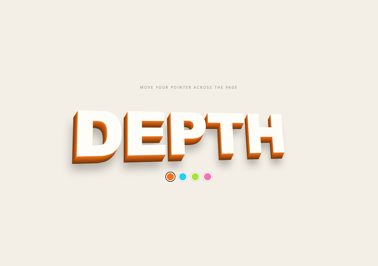
CSS can't extrude text, but it can fake it convincingly: pile up dozens of zero-blur shadows, each one pixel further along the same direction, and the shadows merge into a solid side wall. This snippet does that for a block headline, then ties the direction of the wall to your pointer so the word seems to be a physical object you can look around.
The extrusion is generated, not written
JavaScript builds the text-shadow string on every frame: 22 shadows, each offset by i times a direction vector, and each darker than the last. The darkening matters as much as the offset. Colour fades by 55% toward the back, so the sides read as shaded geometry instead of a flat smear. One last soft, blurred shadow is added far out to ground the letters.
Light direction follows the pointer
The pointer position (-1 to 1 across the window) sets both a rotateY/rotateX tilt on the word and the vector that the shadows travel along. Tilting right swings the extrusion left, as if the sides are being revealed. The perspective of 900px on the container is what makes the tilt read as 3D and not a skew.
Smoothed with a lerp, not a transition
Mouse movement is jumpy, so the displayed tilt eases 12% of the way toward the target each animation frame. This also means the word keeps drifting after you stop, and it settles back flat when the pointer leaves. The swatches recolour the front-to-back gradient. For reduced motion the word is painted once at a fixed angle with no animation loop.
Step by step
How to Use
- 1Paste the three blocksA cream page appears with an oversized white word, orange sides, and four colour dots underneath. Move your pointer and the word turns toward it.
- 2Change the wordEdit the text in
#block. Short, heavy words (4–7 letters) work best; very long words get wide enough that the extrusion gets noisy. - 3Set the depth
DEPTHis how many shadows build the side wall. 12 is a thin slab, 22 is chunky, and 40 is dramatic but costs more to paint. - 4Pick the tilt strengthThe 26 and 20 in the
rotateYandrotateXvalues are the maximum degrees. Lower them for a subtler effect, or drop the rotation and keep only the moving shadow. - 5Match your paletteChange the
colordefault and the swatchdata-cvalues. Theshade()function darkens whatever colour you give it toward the back.
Real-world uses
Common Use Cases
Got questions?
Frequently Asked Questions
Text-shadow keeps the headline as real, selectable, SEO-readable text and needs no library. The trade-off is that depth is a visual trick: it works best on heavy, simple letterforms.
For one headline it is fine on modern devices. Lower DEPTH, or only run the loop while the pointer is over the stage, if you have a lot of text or target older phones.
Pointer events fire on touch drags, so it tilts as the finger moves. Without movement it stays flat. For devices with tilt sensors you could feed deviceorientation into the same goal values.
Yes for the front, using background-clip:text, but shadows then draw over the fill in some browsers. Test, and consider a pseudo-element copy for the face if you need a gradient.