




Scroll Accordion — Free GSAP Pinned Panels Snippet
Scroll Accordion · Scroll · Plain HTML, CSS & JS · Live preview
Copy & paste
Source Code
<section class="sac-top"><p>Scroll ↓</p></section>
<section class="sac-stage" id="sacStage">
  <div class="sac-list">
    <div class="sac-item">
      <div class="sac-head"><span class="sac-idx">01</span><h3>Design</h3><span class="sac-chev">▾</span></div>
      <div class="sac-body"><p>Wireframes become prototypes in days. Every decision is tested against real users before a line of code ships.</p></div>
    </div>
    <div class="sac-item">
      <div class="sac-head"><span class="sac-idx">02</span><h3>Build</h3><span class="sac-chev">▾</span></div>
      <div class="sac-body"><p>Small teams, weekly releases. CI keeps main deployable and feature flags keep launches boring.</p></div>
    </div>
    <div class="sac-item">
      <div class="sac-head"><span class="sac-idx">03</span><h3>Measure</h3><span class="sac-chev">▾</span></div>
      <div class="sac-body"><p>Every release ships with its own dashboard. If a number moves, you know which commit moved it.</p></div>
    </div>
    <div class="sac-item">
      <div class="sac-head"><span class="sac-idx">04</span><h3>Scale</h3><span class="sac-chev">▾</span></div>
      <div class="sac-body"><p>What works gets budget. What does not gets archived. The roadmap writes itself from the data.</p></div>
    </div>
  </div>
</section>
<section class="sac-bottom"><p>Each scroll segment opened one panel and closed the last.</p></section>*{box-sizing:border-box;margin:0;padding:0}
body{font-family:system-ui,-apple-system,sans-serif;background:#07080d;color:#fff}
.sac-top,.sac-bottom{min-height:70vh;display:flex;justify-content:center;align-items:center;color:#8a90a8;font-size:15px;letter-spacing:.1em;text-transform:uppercase}
.sac-stage{height:100vh;display:flex;align-items:center;justify-content:center;overflow:hidden;background:radial-gradient(75% 65% at 50% 45%,#11162e,#07080d)}
.sac-list{width:min(620px,92vw);display:flex;flex-direction:column;gap:12px}
.sac-item{border-radius:16px;background:#0d1122;border:1px solid rgba(255,255,255,.09);overflow:hidden}
.sac-head{display:flex;align-items:center;gap:16px;padding:20px 22px}
.sac-idx{font-size:13px;font-weight:700;letter-spacing:.14em;color:#9fb4ff}
.sac-head h3{font-size:clamp(18px,3vw,24px);font-weight:800;letter-spacing:-.01em;flex:1}
.sac-chev{color:#8a90a8;transition:transform .3s}
.sac-item.is-open{border-color:rgba(159,180,255,.4)}
.sac-item.is-open .sac-chev{transform:rotate(180deg)}
.sac-body{height:0;opacity:0;overflow:hidden}
.sac-body p{padding:0 22px 22px;color:#aeb4ca;font-size:15px;line-height:1.65;max-width:520px}gsap.registerPlugin(ScrollTrigger);
var items = gsap.utils.toArray('.sac-item');
var bodies = gsap.utils.toArray('.sac-body');
var OPEN_H = 96; // fixed open height keeps the scrub math simple
var tl = gsap.timeline({
scrollTrigger: {
trigger: '#sacStage',
start: 'top top',
end: '+=' + (items.length * 70) + '%',
scrub: 0.35,
pin: true
}
});
// Sequentially: open panel i while closing panel i-1. Each hand-off
// occupies one unit of timeline time, so scroll pacing is even.
items.forEach(function (item, i) {
tl.to(bodies[i], { height: OPEN_H, opacity: 1, ease: 'none', duration: 0.6 }, i);
tl.call(function () { item.classList.toggle('is-open'); }, null, i + 0.05);
if (i > 0) {
tl.to(bodies[i - 1], { height: 0, opacity: 0, ease: 'none', duration: 0.6 }, i);
tl.call(function () { items[i - 1].classList.toggle('is-open'); }, null, i + 0.05);
}
});Extend with AI
Take This Snippet Further With AI
The AI prompt for this one is for Patreon supporters ($3 a month, 7 days free), along with a site with no ads. Supporters enter the passcode once and it is remembered in this browser.
What's included
Features
About this UI Snippet
Scroll Accordion — Panels That Open and Close Themselves on Scroll
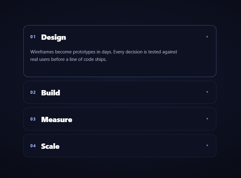
The scroll accordion replaces clicking with scrolling: the list pins in the viewport, and each segment of scroll expands the next panel while collapsing the previous one — a self-guiding tour through a process or feature list where the reader's scroll position *is* the open panel. Scrolling up walks backward through the panels. This snippet builds it with GSAP ScrollTrigger (from a CDN) and a paired open/close choreography.
Open and close are paired at the same timeline position
For each panel i, two tweens are placed at position i on the master timeline: panel i animates to its open height while panel i − 1 animates back to zero. Because they share a position and duration, the hand-off is a perfect crossfade of heights — the list's total height stays nearly constant during transitions, so the pinned stage never visibly grows or shifts vertically mid-scroll.
A fixed open height keeps the scrub honest
The bodies open to a constant OPEN_H of 96px rather than height: 'auto'. Auto heights force GSAP to measure and lock a pixel value the first time the tween runs — fine for click accordions, but under a scrub that measurement can happen mid-gesture and produce a subtle pop. A fixed height (sized to fit the longest paragraph) makes every hand-off geometrically identical and perfectly reversible. If your content varies a lot, measure each body's scrollHeight up front and tween to that stored number instead.
Class toggles ride the timeline with .call()
The border highlight and chevron rotation are CSS states, not tweens, so they're flipped by tl.call() entries placed just after each hand-off starts. Crucially, the callbacks use classList.toggle rather than add/remove: a scrubbed timeline re-fires calls when the playhead crosses them in either direction, and a toggle self-inverts on reverse passes, keeping the visual state correct no matter how erratically the user scrolls.
Scroll distance scales with the panel count
The trigger's end is items.length × 70%, granting each panel the same scroll budget regardless of how many you add. Each open/close pair occupies one unit of timeline duration, so pacing stays even — panel three doesn't rush by faster than panel one.
Why height animation is safe here
Height tweens normally cause layout thrash, but this accordion animates one (or two) small bodies inside a pinned stage with everything else static — the browser relayouts a 600px-wide column, not the page. overflow: hidden on the bodies clips the text during the collapse, and animating opacity alongside height keeps half-open text from looking cropped.
The reader can't get lost
Because exactly one panel is open at any scroll position and the mapping is deterministic, the accordion doubles as a progress indicator: seeing "03 Measure" open tells you you're 60% through the section. That's the advantage over click accordions in narrative contexts — no decision fatigue, no skipped steps.
Customizing it
Add panels (the math adapts), swap the fixed height for measured scrollHeight, or put media in the bodies. For a click-driven version see the accordion FAQ; pair this one with scroll pin steps for a panel-swap cousin or a scroll timeline dots rail alongside.
Step by step
How to Use
- 1Add the GSAP CDNsInclude gsap and ScrollTrigger from the CDN panel.
- 2Paste HTML, CSS, and JSFour closed accordion rows render in a pinned list.
- 3Scroll into the stagePanel 01 expands as the section pins.
- 4Keep scrollingEach segment opens the next panel, closing the last.
- 5Scroll back upThe accordion walks backward through its panels.
- 6Add your contentDuplicate a row; the timeline scales automatically.
Real-world uses
Common Use Cases
Got questions?
Frequently Asked Questions
A pinned, scrubbed timeline places an open tween for panel i and a close tween for panel i − 1 at the same position i. As the scrubbed playhead moves through positions 0–3, exactly one panel is open at any scroll offset, and moving backward replays the hand-offs in reverse. Scroll position maps deterministically to accordion state.
height: 'auto' makes GSAP measure and lock a pixel value the first time the tween runs, which under a scrub can happen mid-gesture and pop. A constant OPEN_H makes every hand-off geometrically identical and cleanly reversible. For varied content, measure each body's scrollHeight once up front and tween to those stored values.
They're flipped by tl.call entries using classList.toggle rather than add/remove. A scrubbed timeline re-fires call() whenever the playhead crosses it in either direction, and a toggle self-inverts on the reverse pass — so the is-open class tracks the true state no matter how erratically the user scrubs back and forth.
Height tweens do trigger layout, but here only one small body (two during hand-offs) inside a pinned 620px column changes — the rest of the page is static, so the relayout cost is tiny. The paired open/close also keeps total list height nearly constant, which is why the pinned stage doesn't visibly shift during transitions.
Render rows from an array and build the timeline in a mount effect (useEffect, onMounted, or ngAfterViewInit) inside gsap.context scoped to a list ref, reverting it on cleanup so the pin unregisters. Keep is-open as classes toggled by the timeline rather than framework state — routing it through state would re-render on every reverse crossing. Row styling converts directly to Tailwind utilities.