

Quill Rich Text Editor with Custom Toolbar and Character Limit

CodeMirror JSON Editor with Validation Gutter
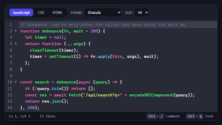
CodeMirror Code Editor with Line Numbers, Folding and Themes

Marked + DOMPurify Live Markdown Preview
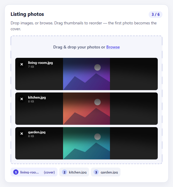
FilePond Image Upload with Preview and Reorder

Cropper.js Aspect-Ratio Presets for Social Posts
Product Variant Selector — HTML CSS JS Snippet
Product Variant Selector · Forms · Plain HTML, CSS & JS · Live preview
Copy & paste
Source Code
<div class="pv-card">
  <div class="pv-image" id="pvImage" style="background:linear-gradient(135deg,#475569,#1e293b)">
    <span class="pv-emoji">👟</span>
    <span class="pv-badge" id="pvBadge"></span>
  </div>

  <div class="pv-body">
    <div class="pv-name">Aero Runner</div>
    <div class="pv-price" id="pvPrice">$129.00</div>

    <div class="pv-group">
      <div class="pv-glabel">Colour: <strong id="pvColorName">Slate</strong></div>
      <div class="pv-swatches">
        <button class="pv-swatch active" style="--c:#475569" data-color="Slate" data-grad="135deg,#475569,#1e293b" data-price="$129.00" onclick="selectColor(this)" aria-label="Slate"></button>
        <button class="pv-swatch" style="--c:#ef4444" data-color="Crimson" data-grad="135deg,#ef4444,#b91c1c" data-price="$129.00" onclick="selectColor(this)" aria-label="Crimson"></button>
        <button class="pv-swatch" style="--c:#3b82f6" data-color="Cobalt" data-grad="135deg,#3b82f6,#1d4ed8" data-price="$139.00" onclick="selectColor(this)" aria-label="Cobalt"></button>
        <button class="pv-swatch" style="--c:#10b981" data-color="Mint" data-grad="135deg,#10b981,#047857" data-price="$129.00" onclick="selectColor(this)" aria-label="Mint"></button>
        <button class="pv-swatch oos" style="--c:#f59e0b" data-color="Amber" data-grad="135deg,#f59e0b,#b45309" data-price="$129.00" data-oos="1" onclick="selectColor(this)" aria-label="Amber (sold out)"></button>
      </div>
    </div>

    <div class="pv-group">
      <div class="pv-glabel">Size <span class="pv-guide">Size guide</span></div>
      <div class="pv-sizes">
        <button class="pv-size" onclick="selectSize(this)">7</button>
        <button class="pv-size" onclick="selectSize(this)">8</button>
        <button class="pv-size" onclick="selectSize(this)">9</button>
        <button class="pv-size oos" disabled>10</button>
        <button class="pv-size" onclick="selectSize(this)">11</button>
        <button class="pv-size" onclick="selectSize(this)">12</button>
        <button class="pv-size oos" disabled>13</button>
      </div>
    </div>

    <div class="pv-stock" id="pvStock">Select a size to see availability.</div>

    <button class="pv-add" id="pvAdd" onclick="addToBag()" disabled>Select a size</button>
  </div>
</div>*{box-sizing:border-box;margin:0;padding:0}
body{font-family:system-ui,-apple-system,sans-serif;background:#f1f5f9;min-height:100vh;display:flex;align-items:center;justify-content:center;padding:24px}
.pv-card{background:#fff;border:1px solid #e2e8f0;border-radius:18px;overflow:hidden;width:100%;max-width:340px;box-shadow:0 14px 44px rgba(15,23,42,.07)}
.pv-image{position:relative;height:180px;display:flex;align-items:center;justify-content:center;transition:background .35s}
.pv-emoji{font-size:72px;filter:drop-shadow(0 10px 16px rgba(0,0,0,.25))}
.pv-badge{position:absolute;top:12px;left:12px;font-size:10px;font-weight:800;letter-spacing:.04em;text-transform:uppercase;padding:4px 9px;border-radius:999px;background:rgba(255,255,255,.9);color:#b45309;opacity:0;transform:translateY(-4px);transition:opacity .2s,transform .2s}
.pv-badge.show{opacity:1;transform:translateY(0)}
.pv-body{padding:18px 20px 22px}
.pv-name{font-size:18px;font-weight:800;color:#1e293b}
.pv-price{font-size:16px;font-weight:700;color:#6366f1;margin-top:2px;margin-bottom:18px}
.pv-group{margin-bottom:18px}
.pv-glabel{font-size:12px;font-weight:700;color:#475569;margin-bottom:9px;display:flex;justify-content:space-between;align-items:center}
.pv-glabel strong{color:#1e293b}
.pv-guide{font-size:11px;color:#6366f1;cursor:pointer;font-weight:600}
.pv-swatches{display:flex;gap:10px}
.pv-swatch{width:30px;height:30px;border-radius:50%;background:var(--c);border:1px solid rgba(0,0,0,.1);cursor:pointer;position:relative;transition:transform .12s}
.pv-swatch:hover{transform:scale(1.1)}
.pv-swatch.active{box-shadow:0 0 0 2px #fff,0 0 0 4px #1e293b}
.pv-swatch.oos{cursor:not-allowed}
.pv-swatch.oos::after{content:'';position:absolute;left:50%;top:50%;width:130%;height:2px;background:#94a3b8;transform:translate(-50%,-50%) rotate(-45deg)}
.pv-sizes{display:flex;flex-wrap:wrap;gap:8px}
.pv-size{min-width:42px;height:42px;padding:0 6px;border:1.5px solid #e2e8f0;background:#fff;border-radius:10px;font-size:14px;font-weight:700;color:#334155;cursor:pointer;font-family:inherit;transition:all .14s}
.pv-size:hover:not(.oos){border-color:#94a3b8}
.pv-size.active{border-color:#6366f1;background:#6366f1;color:#fff}
.pv-size.oos{color:#cbd5e1;cursor:not-allowed;background:#f8fafc;position:relative;overflow:hidden}
.pv-size.oos::after{content:'';position:absolute;left:-10%;top:50%;width:120%;height:1.5px;background:#e2e8f0;transform:rotate(-22deg)}
.pv-stock{font-size:12px;font-weight:600;color:#94a3b8;margin-bottom:16px;min-height:16px;transition:color .15s}
.pv-stock.low{color:#f59e0b}
.pv-stock.in{color:#10b981}
.pv-add{width:100%;padding:13px;background:#6366f1;color:#fff;border:none;border-radius:12px;font-size:15px;font-weight:700;cursor:pointer;font-family:inherit;transition:background .15s,transform .1s}
.pv-add:hover:not(:disabled){background:#4f46e5}
.pv-add:active:not(:disabled){transform:scale(.99)}
.pv-add:disabled{background:#e2e8f0;color:#94a3b8;cursor:not-allowed}
.pv-add.added{background:#10b981!important}var STOCK = { '7': 12, '8': 5, '9': 2, '11': 8, '12': 3 };
var selectedColor = 'Slate';
var selectedSize = null;
function selectColor(btn) {
if (btn.dataset.oos) {
flashBadge('Sold out');
return;
}
document.querySelectorAll('.pv-swatch').forEach(function (s) { s.classList.remove('active'); });
btn.classList.add('active');
selectedColor = btn.dataset.color;
document.getElementById('pvColorName').textContent = selectedColor;
document.getElementById('pvImage').style.background = 'linear-gradient(' + btn.dataset.grad + ')';
document.getElementById('pvPrice').textContent = btn.dataset.price;
}
function selectSize(btn) {
document.querySelectorAll('.pv-size').forEach(function (s) { s.classList.remove('active'); });
btn.classList.add('active');
selectedSize = btn.textContent.trim();
var left = STOCK[selectedSize] || 0;
var stock = document.getElementById('pvStock');
if (left <= 3) {
stock.textContent = 'Only ' + left + ' left in size ' + selectedSize + ' — order soon!';
stock.className = 'pv-stock low';
flashBadge('Low stock');
} else {
stock.textContent = 'In stock · ships in 1–2 days';
stock.className = 'pv-stock in';
}
var add = document.getElementById('pvAdd');
add.disabled = false;
add.textContent = 'Add to bag';
add.classList.remove('added');
}
function flashBadge(text) {
var badge = document.getElementById('pvBadge');
badge.textContent = text;
badge.classList.add('show');
}
function addToBag() {
if (!selectedSize) return;
var add = document.getElementById('pvAdd');
add.textContent = '✓ Added — ' + selectedColor + ' / ' + selectedSize;
add.classList.add('added');
}Extend with AI
Take This Snippet Further With AI
The AI prompt for this one is for Patreon supporters ($3 a month, 7 days free), along with a site with no ads. Supporters enter the passcode once and it is remembered in this browser.
What's included
Features
data-color, data-grad, and data-price; selectColor reads them to retint the image, rename the colour, and update the price in one call.background transitions between gradient strings, so switching colours feels like the product itself is changing.data-price, so the displayed price updates with the variant — no separate price logic needed.disabled attribute (not just CSS), so they cannot be focused or selected; sold-out colours flash a badge instead.disabled reading "Select a size" and only unlocks once selectSize records a choice — preventing invalid, sizeless cart adds.STOCK map drives honest copy: amber "Only N left" under a threshold, green "In stock" above it, with a matching badge flash.box-shadow ring with a white gap so the active colour reads clearly without resizing the chip.addToBag echoes the exact colour and size and turns the button green, closing the loop on what was added.About this UI Snippet
Product Variant Selector — Colour Swatches, Size Pills, Sold-Out States & Stock-Aware Add to Bag
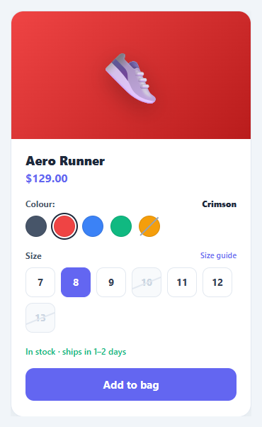
Almost every physical product comes in variants — sizes, colours, materials — and the variant selector is where shoppers translate "I want this" into "I want this specific one". Done badly, it lets people add out-of-stock combinations, hides the price impact of a premium colour, or enables checkout before a size is chosen. Done well, it guides the shopper to a valid, in-stock selection and is honest about scarcity. This snippet implements the complete pattern in plain HTML, CSS, and vanilla JavaScript: colour swatches that retint the product image and update price, size pills with sold-out states, live stock messaging, and an add-to-bag button that stays disabled until a size is selected.
Colour swatches with live retint and price
Each swatch is a button carrying its data on attributes: data-color, data-grad (a gradient string), and data-price. selectColor moves the .active ring, updates the colour name label, swaps the product image's background to the new gradient with a CSS transition, and sets the price — because some colours (like Cobalt) cost more. The active state uses a layered box-shadow to draw a ring with a white gap, the standard way to show a selected swatch without altering its size.
Sold-out variants are visibly blocked
A swatch marked .oos gets a diagonal slash via a pseudo-element and a not-allowed cursor; clicking it flashes a "Sold out" badge instead of selecting it. Sold-out sizes use the native disabled attribute plus an .oos style with a strike-through line, so they cannot be focused, clicked, or chosen — the browser enforces it, not just CSS.
Size pills gate the call to action
The add-to-bag button starts disabled and reads "Select a size". selectSize moves the active pill, records selectedSize, and only then enables the button and changes its label to "Add to bag". This gate is the single most important conversion-safety mechanism in the component: it makes it impossible to add an item without a size, which prevents the most common cause of fulfilment errors and refunds.
Honest, stock-aware messaging
A STOCK map holds remaining units per size. When a size is selected, selectSize reads the count: three or fewer shows an amber "Only N left in size X — order soon!" message and flashes a "Low stock" badge; more than three shows a green "In stock · ships in 1–2 days". This scarcity signalling is a well-documented conversion lever, but here it is driven by real numbers rather than fabricated urgency.
Add-to-bag confirmation
addToBag confirms the exact variant ("✓ Added — Cobalt / 11") and turns the button green, closing the loop so the shopper knows precisely what entered their cart.
Pair this selector with an order summary, a product card grid, an add to cart button micro-interaction, or a quantity stepper.
Step by step
How to Use
- 1Paste HTML, CSS, and JSA product card shows a slate sneaker, a $129 price, five colour swatches (one sold out), a size row (two sizes struck out), and a disabled "Select a size" button.
- 2Pick a colourClick Cobalt — the product image retints with a smooth transition, the colour name updates, and the price changes to $139 since that colour costs more.
- 3Try a sold-out colourClick the struck-through Amber swatch — instead of selecting, a "Sold out" badge flashes on the image.
- 4Choose a sizeClick size 9 — it highlights, a low-stock amber message warns "Only 2 left", and the add button unlocks and reads "Add to bag".
- 5Notice blocked sizesSizes 10 and 13 are struck through and disabled — the browser will not let you select them at all.
- 6Add to bagClick "Add to bag" — it turns green and confirms the exact variant, e.g. "✓ Added — Cobalt / 9".
Real-world uses
Common Use Cases
data-price pattern handles "256GB +\$100" upsells cleanly.Got questions?
Frequently Asked Questions
Render the swatch and size buttons from your product data, setting data-grad, data-price, and disabled per variant, and replace the STOCK object with live inventory from your API. selectSize already reads from that map, so accurate stock messaging follows automatically once the numbers are real.
Keep a matrix of availability keyed by color + size. In selectColor, after switching colour, loop the size pills and toggle disabled based on the matrix for the new colour. This prevents selecting a size that exists for one colour but not the chosen one — a common edge case in apparel.
Place a small − / + stepper above the add-to-bag button and track quantity in a variable. Multiply it into the cart payload in addToBag, and optionally clamp the max to the remaining STOCK count for the selected size so users cannot order more than exist.
Sizes and swatches are real <button> elements, so they are keyboard-focusable and respect disabled. Add aria-pressed to reflect the selected state, group each set with role="radiogroup" and an accessible label, and announce stock changes via an aria-live="polite" region so screen-reader users hear "Only 2 left".
In React, hold selectedColor and selectedSize in useState, derive the image gradient, price, and button disabled from them, and render stock copy from a lookup. In Vue, use refs with :class and :disabled bindings. In Angular, track selection on the component and bind [class.active]/[disabled]. The swatch and pill CSS port unchanged.