


Vertical Content Carousel — HTML CSS JS Snippet
Vertical Content Carousel · Carousels · Plain HTML, CSS & JS · Live preview
Copy & paste
Source Code
<div class="vcc-wrap">
  <button class="vcc-btn vcc-up" id="vccUp" aria-label="Previous">▲</button>
  <div class="vcc-viewport">
    <div class="vcc-track" id="vccTrack">
      <div class="vcc-slide" style="background:linear-gradient(160deg,#6366f1,#4338ca)"><span>🎧</span><h3>Headphones</h3></div>
      <div class="vcc-slide" style="background:linear-gradient(160deg,#0ea5e9,#0369a1)"><span>📷</span><h3>Camera</h3></div>
      <div class="vcc-slide" style="background:linear-gradient(160deg,#ec4899,#9d174d)"><span>⌚</span><h3>Watch</h3></div>
      <div class="vcc-slide" style="background:linear-gradient(160deg,#10b981,#047857)"><span>🎮</span><h3>Console</h3></div>
    </div>
  </div>
  <button class="vcc-btn vcc-down" id="vccDown" aria-label="Next">▼</button>
  <div class="vcc-dots" id="vccDots"></div>
</div>*{box-sizing:border-box;margin:0;padding:0}
body{font-family:system-ui,-apple-system,sans-serif;background:#f6f7f9;min-height:100vh;display:flex;align-items:center;justify-content:center;padding:24px}
.vcc-wrap{display:grid;grid-template-columns:auto auto;grid-template-areas:"up ." "view dots" "down .";justify-items:center;align-items:center;gap:12px 16px}
.vcc-up{grid-area:up}.vcc-viewport{grid-area:view}.vcc-down{grid-area:down}.vcc-dots{grid-area:dots}
.vcc-viewport{width:220px;height:220px;overflow:hidden;border-radius:16px;box-shadow:0 12px 30px rgba(15,23,42,.16);touch-action:none;user-select:none;cursor:grab}
.vcc-track{display:flex;flex-direction:column;transition:transform .4s cubic-bezier(.4,0,.2,1)}
.vcc-slide{flex:0 0 220px;height:220px;display:flex;flex-direction:column;align-items:center;justify-content:center;gap:10px;color:#fff}
.vcc-slide span{font-size:42px}
.vcc-slide h3{font-size:16px;font-weight:800}
.vcc-btn{width:36px;height:36px;border-radius:50%;background:#fff;border:1.5px solid #e3e5ea;color:#4b5563;font-size:14px;cursor:pointer;display:flex;align-items:center;justify-content:center;transition:border-color .15s,color .15s}
.vcc-btn:hover{border-color:#6366f1;color:#6366f1}
.vcc-dots{display:flex;flex-direction:column;gap:7px}
.vcc-dot{width:7px;height:7px;border-radius:50%;background:#d1d5db;border:none;cursor:pointer;transition:background .2s,height .2s}
.vcc-dot.active{background:#6366f1;height:20px;border-radius:4px}var track = document.getElementById('vccTrack');
var slides = document.querySelectorAll('.vcc-slide');
var dotsWrap = document.getElementById('vccDots');
var current = 0;
slides.forEach(function (s, i) {
var d = document.createElement('button');
d.className = 'vcc-dot';
d.setAttribute('aria-label', 'Go to slide ' + (i + 1));
d.addEventListener('click', function () { goTo(i); });
dotsWrap.appendChild(d);
});
var dots = document.querySelectorAll('.vcc-dot');
function render() {
// translateY % is relative to the TRACK (all slides tall), so step by one slide's share of it
track.style.transform = 'translateY(' + (-current * (100 / slides.length)) + '%)';
dots.forEach(function (d, i) { d.classList.toggle('active', i === current); });
}
function goTo(i) { current = i; render(); }
function next() { goTo((current + 1) % slides.length); }
function prev() { goTo((current - 1 + slides.length) % slides.length); }
document.getElementById('vccDown').addEventListener('click', next);
document.getElementById('vccUp').addEventListener('click', prev);
document.addEventListener('keydown', function (e) {
if (e.key === 'ArrowDown') next();
else if (e.key === 'ArrowUp') prev();
});
// Vertical drag / swipe (pointer events cover mouse, pen and touch, so no separate touch handlers)
var dragging = false;
var startY = 0;
var viewport = document.querySelector('.vcc-viewport');
viewport.addEventListener('pointerdown', function (e) { dragging = true; startY = e.clientY; });
window.addEventListener('pointerup', function (e) {
if (!dragging) return;
dragging = false;
var dy = e.clientY - startY;
if (Math.abs(dy) > 30) { dy < 0 ? next() : prev(); }
});
window.addEventListener('pointercancel', function () { dragging = false; });
render();Extend with AI
Take This Snippet Further With AI
The AI prompt for this one is for Patreon supporters ($3 a month, 7 days free), along with a site with no ads. Supporters enter the passcode once and it is remembered in this browser.
What's included
Features
About this UI Snippet
Vertical Content Carousel — Every Axis Swapped, Same Underlying Mechanic
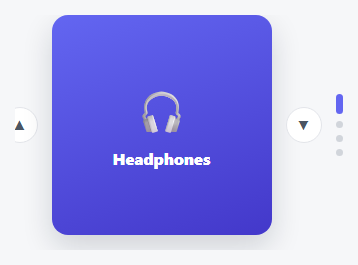
This is the same offset-driven slide mechanic used throughout this library's horizontal carousels, with every axis consistently swapped: translateX becomes translateY, the track is a flex-direction: column instead of a row, the up/down buttons replace left/right arrows, and even the indicator dots rotate to stack vertically and grow in *height* (not width) when active, so the whole visual language stays internally consistent with the vertical motion rather than just reusing horizontal styling with the transform swapped.
Why this needed a genuinely new snippet, not a CSS-only reskin
Swapping translateX for translateY in isolation is trivial — but the *drag/swipe direction* has to change too. A horizontal carousel's swipe logic compares clientX deltas; this one compares clientY deltas instead, since a vertical carousel should respond to an up/down finger or mouse drag, not a left/right one. Get that mismatched (vertical slides, horizontal swipe detection) and the carousel would visually move the wrong way relative to the gesture, which is a subtle, easy-to-miss bug when adapting a horizontal component rather than building the vertical version from its own first principles.
Dots that grow taller, not wider
The active dot indicator grows to height: 20px rather than width: 20px — a small but deliberate detail, since a horizontal pill-shaped active dot in a *vertical* stack of dots would look visually disconnected from the rest of the column, while a vertically-elongated one reads immediately as "this dot, in this vertical list, is the active one."
Step by step
How to Use
- 1Paste HTML, CSS, and JSA vertical carousel appears with up/down buttons and a column of dots beside it.
- 2Click the down arrowThe content slides upward to reveal the next item — motion runs vertically, not sideways.
- 3Click a dotJump directly to that slide; the active dot grows taller to mark its position in the column.
- 4Drag or swipe verticallySwipe up to advance, down to go back — gesture direction matches the slide direction.
- 5Use Up/Down arrow keysFull keyboard control, matching the carousel's vertical orientation.
Real-world uses
Common Use Cases
Got questions?
Frequently Asked Questions
More than just the transform axis — the track's flex-direction, the indicator dots' growth axis, and critically the swipe/drag gesture detection (comparing clientY instead of clientX) all need to change together, or the carousel will visually move inconsistently with the gesture driving it.
Change .vcc-viewport's fixed height and each .vcc-slide's matching flex-basis/height together — they must stay equal or slides will show partial neighbors or leave gaps.
Not directly — auto-height measures and animates the container's height to fit content, which conflicts with this snippet's fixed-height vertical viewport. For variable-height vertical slides, you'd need a hybrid that measures height while still tracking translateY offsets carefully.
Without a minimum distance threshold, a small accidental mouse movement or a light tap could unintentionally trigger a slide change — the threshold distinguishes a deliberate swipe gesture from incidental pointer movement.
Up/down buttons are real labeled buttons, dots are labeled and clickable, and Up/Down arrow keys provide full keyboard navigation matching the visual orientation.