



Vertical Thumbnail-Nav Carousel — HTML CSS JS Snippet
Vertical Thumbnail-Nav Carousel · Carousels · Plain HTML, CSS & JS · Live preview
Copy & paste
Source Code
<div class="vtn-wrap">
  <div class="vtn-thumbs" id="vtnThumbs"></div>
  <div class="vtn-main">
    <div class="vtn-track" id="vtnTrack">
      <div class="vtn-slide" style="background:linear-gradient(160deg,#6366f1,#4338ca)"><span>👟</span></div>
      <div class="vtn-slide" style="background:linear-gradient(160deg,#0ea5e9,#0369a1)"><span>👟</span></div>
      <div class="vtn-slide" style="background:linear-gradient(160deg,#ec4899,#9d174d)"><span>👟</span></div>
      <div class="vtn-slide" style="background:linear-gradient(160deg,#10b981,#047857)"><span>👟</span></div>
    </div>
  </div>
</div>*{box-sizing:border-box;margin:0;padding:0}
body{font-family:system-ui,-apple-system,sans-serif;background:#f6f7f9;min-height:100vh;display:flex;align-items:center;justify-content:center;padding:24px}
.vtn-wrap{display:flex;gap:12px;height:320px}
.vtn-thumbs{display:flex;flex-direction:column;gap:10px;overflow-y:auto;padding-right:2px}
.vtn-thumb{flex:0 0 62px;width:62px;border-radius:10px;border:2.5px solid transparent;cursor:pointer;display:flex;align-items:center;justify-content:center;font-size:26px;opacity:.55;transition:border-color .15s,opacity .15s}
.vtn-thumb.active{border-color:#6366f1;opacity:1}
.vtn-main{position:relative;flex:1;border-radius:16px;overflow:hidden;box-shadow:0 12px 30px rgba(15,23,42,.16)}
.vtn-track{display:flex;flex-direction:column;height:100%;transition:transform .4s cubic-bezier(.4,0,.2,1)}
.vtn-slide{flex:0 0 100%;display:flex;align-items:center;justify-content:center;font-size:90px}var track = document.getElementById('vtnTrack');
var slides = document.querySelectorAll('.vtn-slide');
var thumbsWrap = document.getElementById('vtnThumbs');
var current = 0;
slides.forEach(function (s, i) {
var t = document.createElement('button');
t.className = 'vtn-thumb';
t.style.background = s.style.background;
t.innerHTML = '<span>👟</span>';
t.setAttribute('aria-label', 'View image ' + (i + 1));
t.addEventListener('click', function () { goTo(i); });
thumbsWrap.appendChild(t);
});
var thumbs = document.querySelectorAll('.vtn-thumb');
function render() {
track.style.transform = 'translateY(' + (-current * 100) + '%)';
thumbs.forEach(function (t, i) {
t.classList.toggle('active', i === current);
if (i === current) t.scrollIntoView({ block: 'nearest', behavior: 'smooth' });
});
}
function goTo(i) { current = i; render(); }
function next() { goTo((current + 1) % slides.length); }
function prev() { goTo((current - 1 + slides.length) % slides.length); }
document.addEventListener('keydown', function (e) {
if (e.key === 'ArrowDown') next();
else if (e.key === 'ArrowUp') prev();
});
render();Extend with AI
Take This Snippet Further With AI
The AI prompt for this one is for Patreon supporters ($3 a month, 7 days free), along with a site with no ads. Supporters enter the passcode once and it is remembered in this browser.
What's included
Features
About this UI Snippet
Vertical Thumbnail-Nav Carousel — A Side Rail Instead of a Strip Underneath
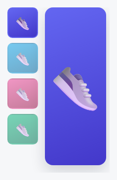
The Synced Main + Thumbnail Carousel elsewhere in this library places a horizontal thumbnail *strip* beneath a sliding main image. This one takes the same core idea — one shared index driving both a main view and a set of thumbnails — and lays it out the other common way real product pages do it: a vertical thumbnail *rail* running down the left side, with the main image sliding vertically in sync beside it.
Same single-source-of-truth pattern, different geometry
Just like its horizontal sibling, this carousel builds every thumbnail from the main slide track's own data at load time (no duplicated markup), and every interaction — a thumbnail click, an arrow key — funnels through one goTo/render() pair that updates both the main track's translateY and every thumbnail's active state together. The *only* structural difference is that the main track flows vertically (translateY, flex-direction: column) while the thumbnail rail is its own independently-scrollable vertical column beside it, rather than a horizontal strip below.
The active thumbnail still auto-scrolls into view — vertically
Just as the horizontal version calls scrollIntoView({ inline: 'nearest' }) to keep the active thumbnail visible in a horizontally-scrolling strip, this one calls scrollIntoView({ block: 'nearest' }) — the vertical equivalent — so a long list of thumbnails that overflows its own column height still keeps the currently-active one in view as the main image advances.
Step by step
How to Use
- 1Paste HTML, CSS, and JSA large image appears beside a vertical rail of four thumbnails, the first one highlighted.
- 2Click a thumbnailThe main image slides vertically to match, and that thumbnail gets the active border.
- 3Use Up/Down arrow keysStep through the gallery vertically without touching a thumbnail directly.
- 4Add a fifth thumbnailAdd one more .vtn-slide to the main track — a matching thumbnail is generated automatically.
- 5Scroll a long thumbnail railIf there are more thumbnails than fit, the active one auto-scrolls into view as it changes.
Real-world uses
Common Use Cases
Got questions?
Frequently Asked Questions
That one lays the thumbnail strip out horizontally beneath a horizontally-sliding main image (translateX). This one lays the thumbnail rail out vertically beside a vertically-sliding main image (translateY) — the underlying single-shared-index synchronization pattern is otherwise identical.
.vtn-thumbs already has overflow-y: auto — give it (or its parent .vtn-wrap) an explicit max-height in pixels matching your desired rail height, and it will scroll internally once thumbnails exceed that height.
Yes — reorder the two child elements in .vtn-wrap's HTML (thumbnails after the main image instead of before), no other changes needed since it's a plain flex row.
Attach a touchstart/touchend listener to .vtn-main comparing vertical (clientY) delta, mirroring the pattern used in the Vertical Content Carousel snippet elsewhere in this library.
Thumbnails are real, labeled buttons, and Up/Down arrow keys provide full keyboard navigation of the main image, matching the vertical visual layout.