
Desktop · 1280px · shown at 0% · edit the text, images and colours in the panel
Profile & Preferences Form — Free Website Section Template
Forms · v1.0.0 · Updated 2026-11-12 · Responsive · GSAP animation · HTML, React & Vue
Extend with AI
Take This Section Further With AI
The AI prompt for this one is for Patreon supporters ($3 a month), along with a site with no ads. Supporters enter the passcode once and it is remembered in this browser.
What's included
Features
About this section
Profile & Preferences Form — Free Settings Page With Every Control
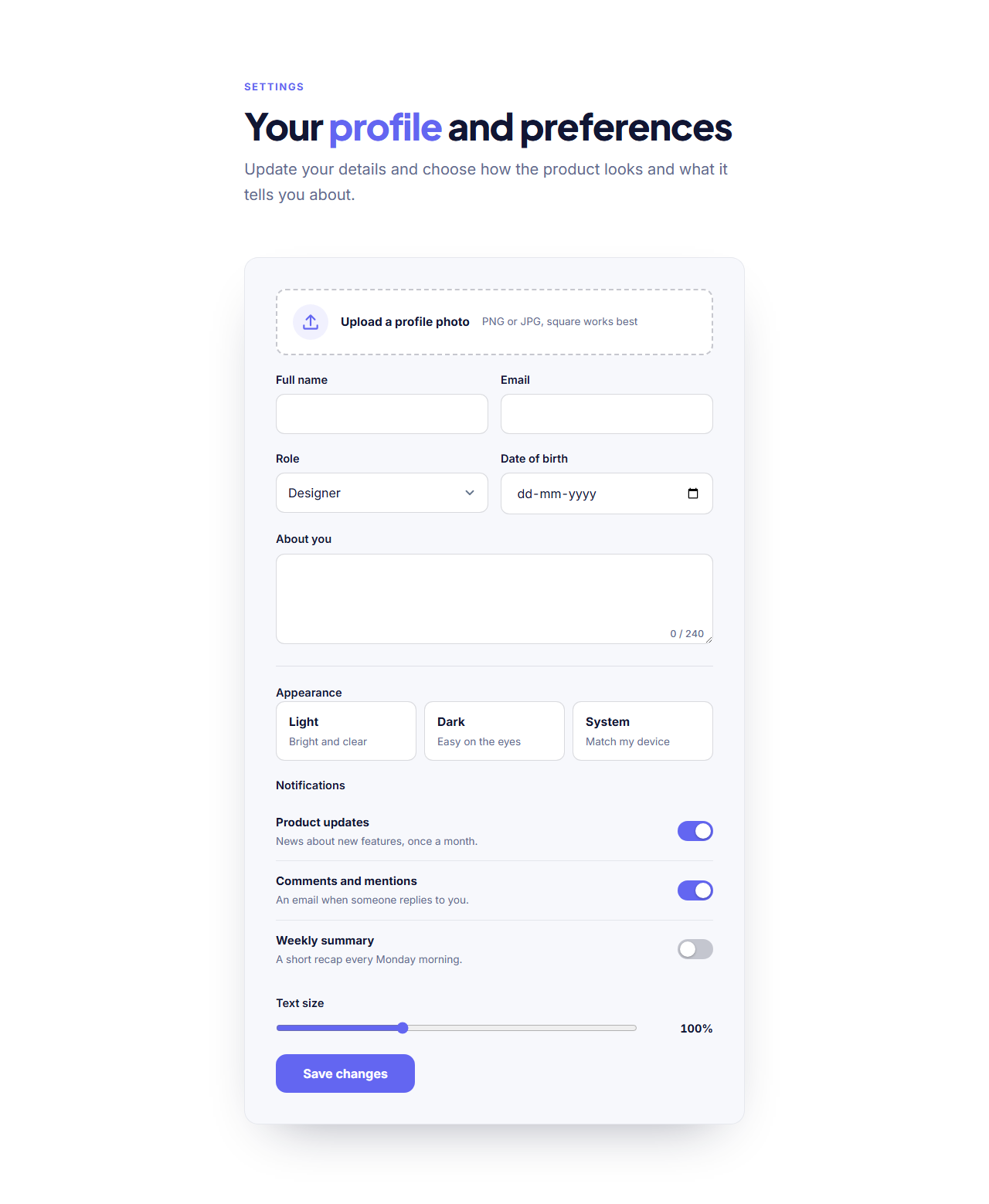
Profile & Preferences Form shows every common form control in one consistent style, and works as a real settings page. It has an avatar drop area, text and email fields, a select menu, a date picker, a bio box with a counter, theme option cards, three toggle switches with descriptions and a range slider that shows its value.
Controls that match
All controls share the same radius, border, focus ring and colours, which come from your theme. The switches are real checkboxes with role="switch", so assistive technology announces them as on or off. The option cards are radio buttons, the range slider uses the browser's native control tinted with your brand colour, and the date picker is the native one, which is best on phones.
Use it three ways
As a profile page in an account area; as a preferences step in an onboarding flow; or as a reference when you need to style your own forms the same way, since you can copy any control from the exported HTML. For shorter flows use the Multi-Step Form.
Sending
Every form posts to the address you paste into "Form URL" (Formspree, Basin, Getform or your own server), shows a success message, shows an error message when something fails and contains a hidden spam-trap field. Without JavaScript it is an ordinary form post. Fields sent: avatar, name, email, role, birthday, bio, theme, the notification switches and the text size.
Why use it
Why Use the Profile & Preferences Form
How it’s different
How It’s Different From Other Free Section Templates
Step by step
How to Use
- 1Edit the contentFill in the heading, profile, preferences, choices and form in the panel. Wrap words in *asterisks* to colour them.
- 2Add your imagesUpload your own images (resized in your browser and kept on your device) or paste a hosted image URL.
- 3Match your brandPick a colour preset or exact colours, choose heading and body fonts from Google Fonts or your own uploaded font, set the corner radius and width, or apply your brand kit.
- 4Animate and previewChoose a GSAP entrance effect and speed, press Play animation, and check the section on desktop, tablet and mobile.
- 5Save and exportSave it to My designs, then export a single HTML file, a ZIP with your images, a React or Vue component, or fork it into My Code.
Real-world uses
Common Use Cases
Got questions?
Frequently Asked Questions
Yes. They are checkboxes with role="switch", so screen readers announce on and off, and they have visible focus rings and large targets.
A small script writes the slider value into the output element next to it, with an optional prefix or suffix set by data-prefix and data-suffix.
Yes, edit the Appearance options list. Each option has a name and a short description.
It posts them to your form endpoint. To save them in an account, send the post to your own API and update the user’s record.
Yes. Export the HTML or fork to My Code and copy any block, such as another switch or a select. They all use the same CSS classes.
It saves an editable copy of your Profile & Preferences Form in My Code, the UI Snippets code editor: the section markup goes in the HTML panel, its CSS (theme variables, base styles and layout) in the CSS panel, and the GSAP library is added as a CDN link, so you can keep refining the code and save your own versions.
Yes. Every section is free for personal and commercial work, with no account, no watermark and no attribution: export it on its own as HTML, React, Vue or Next.js from its page, or use it in a website you build and export in the Website Builder.