

ApexCharts Mixed Bar and Line Chart with Dual Y-Axes — Free Snippet
ApexCharts Mixed Bar and Line Chart with Dual Y-Axes · Charts · Plain HTML, CSS & JS · Live preview
What's included
Features
About this UI Snippet
ApexCharts Mixed Bar and Line Chart — Two Units, Two Axes, One Chart
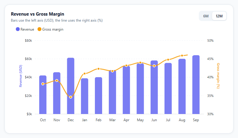
Revenue and margin belong on the same chart because they explain each other: a month with record revenue and a sagging margin tells a very different story from a month where both climb. They do not belong on the same axis, though. Revenue is measured in tens of thousands of dollars and margin in percentage points, so plotting both against one scale flattens the margin line into a straight line along the bottom. This snippet gives each series its own axis.
The series type decides the shape, not the chart type
ApexCharts builds a mixed chart when individual series declare their own type. The chart-level type: 'line' is only the default; the revenue series overrides it with type: 'column'. Because of that, stroke.width and markers.size are passed as arrays — [0, 3] means no outline on the columns and a 3px stroke on the line.
seriesName binds each axis to its series
yaxis is an array of two axis objects. Each one names the series it measures with seriesName, and the second sets opposite: true to draw on the right. The margin axis also pins min: 30 and max: 50 so small margin movements are visible instead of being squashed into a 0–100 range. Pinning bounds is a deliberate choice worth questioning in your own data — a range that is too tight exaggerates noise.
One tooltip for both series
tooltip.shared: true with intersect: false shows revenue and margin together when hovering anywhere in a month's column, which is the comparison people actually want. The y.formatter checks seriesIndex so dollars and percentages each get their own formatting.
Updating without a mismatch frame
The 6M/12M toggle calls updateOptions once with the new categories and both series. Calling updateSeries and then a separate x-axis update would briefly render 12 bars against 6 labels.
Reusing it
Swap in any pair of related measures with different units: sessions and conversion rate, orders and average order value, tickets and resolution time.
Step by step
How to Use
- 1Load ApexChartsInclude apexcharts.min.js from the CDN before the snippet's script.
- 2Paste the HTML, CSS and JSTwelve months of revenue columns and a margin line render in one card.
- 3Hover a monthThe shared tooltip shows revenue and margin for that month together.
- 4Switch the rangeUse the 6M/12M toggle; categories and both series update in one call.
- 5Replace the dataEdit the MONTHS, REVENUE and MARGIN arrays with your own values.
- 6Tune the right axisAdjust min and max on the margin axis to fit your real range.
Real-world uses
Common Use Cases
seriesName.seriesIndex picks currency or percentage formatting inside the shared tooltip.Got questions?
Frequently Asked Questions
Give each series its own type property — for example type: 'column' for bars and type: 'line' for the line — inside the series array. ApexCharts then renders a mixed chart. Options that differ per series, such as stroke.width and markers.size, accept arrays with one value per series.
Pass yaxis as an array of axis objects instead of a single object. Set seriesName on each axis to the name of the series it measures, and set opposite: true on the axis that should appear on the right side of the chart.
Margin moves by a few percentage points month to month. With automatic 0-100 bounds those changes would look flat. Fixing the range makes movement visible, but a range that is too narrow exaggerates noise, so choose bounds from the realistic spread of your own data.
The categories on the x-axis and the data in both series must change together. updateOptions accepts xaxis and series in one call and redraws once, while separate calls can render a frame where the data and labels do not match.
Yes. The official react-apexcharts and vue3-apexcharts wrappers take the same options and series objects. Keep the series array in state and pass new arrays when the range changes; the wrapper calls the update methods for you.
Build with AI
Build, Understand, Optimize, and Extend It With AI
Paste this snippet into an AI coding assistant like Claude and ask it to explain how per-series type values turn a line chart into a mixed chart, and how seriesName connects each y-axis to the right series. It can also help you adapt the chart: ask it to add a third series such as a revenue target line on the left axis, to annotate the month with the lowest margin, or to load the data from a JSON endpoint and refresh it on an interval. Ask whether the fixed 30–50% margin range is honest for your data, or whether automatic bounds would tell the story better.
Prompt to recreate it
Copy this into your AI assistant of choice to build the effect from scratch, or as a jumping-off point for your own variant:
Build a mixed bar and line chart with ApexCharts (loaded from a CDN) using plain HTML, CSS and JavaScript.

Requirements:
- Show twelve months of revenue as columns and gross margin percentage as a smooth line in the same plot area.
- Put revenue on a left y-axis formatted in thousands of dollars and margin on a right y-axis formatted as a percentage, binding each axis to its series by name.
- Use a shared tooltip that shows both values for the hovered month, with currency formatting for revenue and one decimal place for margin.
- Round only the top corners of the columns, hide data labels, and use a light dashed grid.
- Add a 6-month / 12-month toggle that updates the x-axis categories and both series in a single update call, and exposes its state with aria-pressed.
- Keep the chart responsive to its container width.
Want to tighten it up first? Run this prompt through the AI Prompt Studio to score it across 8 quality dimensions, catch anti-patterns, and tune the wording for Claude, ChatGPT, or Gemini before you paste it in.
Source Code
<div class="amx-wrap">
  <div class="amx-card">
    <div class="amx-head">
      <div>
        <div class="amx-title">Revenue vs Gross Margin</div>
        <div class="amx-sub">Bars use the left axis (USD), the line uses the right axis (%)</div>
      </div>
      <div class="amx-toggle" role="group" aria-label="Range">
        <button type="button" data-range="6" aria-pressed="false">6M</button>
        <button type="button" data-range="12" aria-pressed="true">12M</button>
      </div>
    </div>
    <div id="amxChart"></div>
  </div>
</div>*{box-sizing:border-box;margin:0;padding:0}
body{font-family:system-ui,-apple-system,sans-serif;background:#f8fafc;min-height:100vh;display:flex;align-items:center;justify-content:center;padding:24px}
.amx-wrap{width:100%;max-width:760px}
.amx-card{background:#fff;border:1px solid #e2e8f0;border-radius:16px;padding:20px 20px 8px;box-shadow:0 1px 8px rgba(15,23,42,.06)}
.amx-head{display:flex;justify-content:space-between;align-items:flex-start;gap:12px;margin-bottom:6px}
.amx-title{font-size:15px;font-weight:700;color:#0f172a}
.amx-sub{font-size:12px;color:#64748b;margin-top:3px}
.amx-toggle{display:flex;background:#f1f5f9;border-radius:9px;padding:3px}
.amx-toggle button{border:0;background:transparent;font:600 12px system-ui;color:#475569;padding:6px 12px;border-radius:7px;cursor:pointer}
.amx-toggle button[aria-pressed="true"]{background:#fff;color:#0f172a;box-shadow:0 1px 3px rgba(0,0,0,.1)}var MONTHS = ['Oct','Nov','Dec','Jan','Feb','Mar','Apr','May','Jun','Jul','Aug','Sep'];
var REVENUE = [42000, 45500, 61200, 38900, 40100, 47800, 52300, 55100, 58900, 57200, 63400, 69800];
var MARGIN = [38.2, 39.1, 34.6, 41.0, 42.3, 41.7, 43.2, 44.0, 43.1, 44.8, 45.9, 46.4];
function slice(n) {
return {
categories: MONTHS.slice(-n),
revenue: REVENUE.slice(-n),
margin: MARGIN.slice(-n),
};
}
var start = slice(12);
var chart = new ApexCharts(document.getElementById('amxChart'), {
chart: { type: 'line', height: 340, toolbar: { show: false }, fontFamily: 'system-ui, sans-serif' },
// One series per axis. The 'type' on each series is what makes this a
// mixed chart; the chart-level type is only the default.
series: [
{ name: 'Revenue', type: 'column', data: start.revenue },
{ name: 'Gross margin', type: 'line', data: start.margin },
],
colors: ['#6366f1', '#f59e0b'],
stroke: { width: [0, 3], curve: 'smooth' },
markers: { size: [0, 4], strokeWidth: 2, hover: { size: 6 } },
plotOptions: { bar: { columnWidth: '52%', borderRadius: 5, borderRadiusApplication: 'end' } },
dataLabels: { enabled: false },
xaxis: { categories: start.categories, axisTicks: { show: false } },
// Two y-axes. seriesName ties each axis to a series by name, so the
// margin line is measured against 0-100% instead of against dollars.
yaxis: [
{
seriesName: 'Revenue',
title: { text: 'Revenue (USD)', style: { fontWeight: 600, color: '#6366f1' } },
labels: { formatter: function (v) { return '$' + Math.round(v / 1000) + 'k'; } },
},
{
seriesName: 'Gross margin',
opposite: true,
min: 30,
max: 50,
tickAmount: 4,
title: { text: 'Gross margin (%)', style: { fontWeight: 600, color: '#f59e0b' } },
labels: { formatter: function (v) { return v.toFixed(0) + '%'; } },
},
],
tooltip: {
shared: true,
intersect: false,
y: {
formatter: function (v, o) {
return o.seriesIndex === 0 ? '$' + v.toLocaleString('en-US') : v.toFixed(1) + '%';
},
},
},
legend: { position: 'top', horizontalAlign: 'left', markers: { shape: 'circle' } },
grid: { borderColor: '#eef2f7', strokeDashArray: 4 },
});
chart.render();
// Switching range replaces both series AND the categories in one call so the
// bars, the line and the x-axis never disagree for a frame.
document.querySelectorAll('.amx-toggle button').forEach(function (btn) {
btn.addEventListener('click', function () {
document.querySelectorAll('.amx-toggle button').forEach(function (b) {
b.setAttribute('aria-pressed', b === btn ? 'true' : 'false');
});
var d = slice(Number(btn.dataset.range));
chart.updateOptions({
xaxis: { categories: d.categories },
series: [
{ name: 'Revenue', type: 'column', data: d.revenue },
{ name: 'Gross margin', type: 'line', data: d.margin },
],
});
});
});