

Circular Text Spin — Rotating SVG textPath Badge in CSS
Circular Text Spin · Text Animation · Plain HTML, CSS & JS · Live preview
Copy & paste
Source Code
<main class="stage">
  <a class="badge" href="#contact" aria-label="Available for work, let's talk">
    <svg class="ring" viewBox="0 0 200 200" aria-hidden="true">
      <defs><path id="circle" d="M100,100 m-76,0 a76,76 0 1,1 152,0 a76,76 0 1,1 -152,0"/></defs>
      <text><textPath href="#circle" textLength="474" lengthAdjust="spacing">Available for work • Let's talk • Open to projects • </textPath></text>
    </svg>
    <span class="core" aria-hidden="true">
      <svg width="34" height="34" viewBox="0 0 24 24" fill="none" stroke="currentColor" stroke-width="2.4" stroke-linecap="round" stroke-linejoin="round"><path d="M7 17 17 7"/><path d="M8 7h9v9"/></svg>
    </span>
  </a>

  <a class="badge small" href="#about" aria-label="Scroll to learn more">
    <svg class="ring rev" viewBox="0 0 200 200" aria-hidden="true">
      <text><textPath href="#circle" textLength="474" lengthAdjust="spacing">Scroll down • Scroll down • Scroll down • </textPath></text>
    </svg>
    <span class="core" aria-hidden="true">
      <svg width="26" height="26" viewBox="0 0 24 24" fill="none" stroke="currentColor" stroke-width="2.4" stroke-linecap="round" stroke-linejoin="round"><path d="M12 5v14"/><path d="m6 13 6 6 6-6"/></svg>
    </span>
  </a>
</main>*{box-sizing:border-box;margin:0;padding:0}
body{min-height:100vh;display:grid;place-items:center;background:#f6f3ee;font-family:system-ui,sans-serif}
.stage{display:flex;flex-wrap:wrap;gap:56px;align-items:center;justify-content:center;padding:30px}
.badge{position:relative;display:grid;place-items:center;width:200px;height:200px;border-radius:50%;background:#111;color:#f6f3ee;text-decoration:none;transition:transform .3s cubic-bezier(.3,1.4,.5,1)}
.badge.small{width:140px;height:140px;background:#f6f3ee;color:#111;border:2px solid #111}
.ring{position:absolute;inset:0;width:100%;height:100%;animation:spin 16s linear infinite}
.ring.rev{animation-direction:reverse;animation-duration:12s}
.ring text{font:600 15.5px 'Courier New',monospace;text-transform:uppercase;fill:currentColor;letter-spacing:.05em}
.small .ring text{font-size:15px}
.core{display:grid;place-items:center;width:84px;height:84px;border-radius:50%;background:#ff5a36;color:#fff;transition:transform .3s}
.small .core{width:56px;height:56px;background:#111}
.badge:hover{transform:scale(1.06)}
.badge:hover .ring{animation-duration:6s}
.badge:hover .core{transform:rotate(45deg)}
.badge:focus-visible{outline:3px solid #ff5a36;outline-offset:5px}
@keyframes spin{to{transform:rotate(360deg)}}
@media (prefers-reduced-motion:reduce){.ring{animation:none}.badge:hover .ring{animation:none}}// Optional: slow the ring while the page is hidden, and keep the ring text length in step with its circumference.
// The ring is drawn on a circle of radius 76, so the full path is 2 * PI * 76 = about 477.5 units.
var rings = document.querySelectorAll('.ring textPath');
var CIRC = 2 * Math.PI * 76;
rings.forEach(function (tp) {
tp.setAttribute('textLength', String(Math.round(CIRC - 3))); // leave a hair of gap so the end never overlaps the start
});
document.addEventListener('visibilitychange', function () {
document.querySelectorAll('.ring').forEach(function (r) {
r.style.animationPlayState = document.hidden ? 'paused' : 'running';
});
});Extend with AI
Take This Snippet Further With AI
Ask an AI coding assistant to explain how the two arc commands draw a full circle as a path, why textLength with lengthAdjust="spacing" is used instead of adjusting font size, and where the circumference value in the script comes from. A good follow-up is how to offset the starting position with startOffset.
Prompt to recreate it
Copy this into your AI assistant of choice to build the effect from scratch, or as a jumping-off point for your own variant:
Build a rotating circular text badge in plain HTML, CSS and a little JavaScript, with SVG textPath and no libraries.

Requirements:
- A round link element that contains an SVG ring and a centred circular "core" with an arrow icon. The ring is a viewBox of 200 by 200 with a defs path drawing a circle of radius 76 using two arc commands, and a text element with a textPath pointing to it.
- Use textLength and lengthAdjust="spacing" so the phrase fills the circle evenly, and set textLength in JavaScript from 2 * PI * radius so changing the radius keeps it closed.
- The ring rotates 360 degrees with a 16-second linear infinite CSS animation. Make a second, smaller outlined badge whose ring spins in reverse at a different speed.
- On hover, speed the ring up, scale the badge slightly, and rotate the centre arrow 45 degrees.
- Give each badge an aria-label and hide the SVG from assistive technology, because the repeated text is not useful read aloud.
- Disable rotation under prefers-reduced-motion and pause the animation when the document is hidden.
Want to tighten it up first? Run this prompt through the AI Prompt Studio to score it across 8 quality dimensions, catch anti-patterns, and tune the wording for Claude, ChatGPT, or Gemini before you paste it in.
What's included
Features
textLength is set from the circle's circumference so the phrase always closes the ring evenly.aria-label, and the decorative SVG is hidden from screen readers.About this UI Snippet
Circular Text Spin — SVG textPath on a Circle With a Rotating Ring
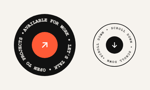
That little round badge with words running around the edge has become a portfolio and agency cliché for a reason: it makes a plain link look designed, and it takes almost no space. Here it's built properly with an SVG textPath, so the words are real text that bends along a circle, not an image, and the whole ring turns with a single CSS animation.
How text follows a circle
A circle is defined as a <path> using two arc commands (a76,76 0 1,1 152,0 then back), starting at the left edge. The <textPath href="#circle"> places each glyph along that path. textLength stretches the letter spacing so the phrase fills the circumference exactly, and lengthAdjust="spacing" makes sure it widens the gaps rather than squashing the letters. The script recomputes the length as 2πr so if you change the radius, the text still closes the circle.
Spin is one line of CSS
The ring is an SVG with a rotate(360deg) keyframe, 16s linear and infinite. The second badge runs the same animation in reverse at 12s, which makes the pair feel like gears. On hover the ring's duration drops to 6s and the core arrow rotates 45°, which gives the link a clear "yes, I'm clickable" signal.
Accessible by design
A rotating ring of words is poor for screen readers (they'd read a repeated phrase), so each badge is a link with its own aria-label, and the SVG is hidden from assistive tech. Rotation stops under prefers-reduced-motion, and pauses while the tab is hidden so it doesn't burn cycles in the background.
Step by step
How to Use
- 1Paste the HTML, CSS and JSTwo round badges appear on a warm background: a black one with an orange arrow core and a smaller outlined one with a down arrow, each with text rotating around it.
- 2Write your phraseEdit the text inside
<textPath>. Keep a separator such as • at the end so the last word doesn't run straight into the first, and aim for 35–55 characters at the default size. - 3Change the sizeResize
.badgeand keep the SVGviewBox. If you change the circle's radius (76), update the path's arc values and theCIRCconstant in the JS together. - 4Retarget the linkSet the
hrefandaria-labelon each badge to the contact section, a booking page or a scroll anchor. - 5Swap the centre iconReplace the SVG inside
.corewith a logo, an initial or an emoji. Keep it under about 45% of the badge width.
Real-world uses
Common Use Cases
Got questions?
Frequently Asked Questions
The phrase length and the circumference don't match. The script sets textLength to the circumference, but very long text gets squeezed. Shorten the phrase or increase the circle's radius.
The path starts at the left and runs clockwise. To start at the top, rotate the SVG by 90° in the keyframe's starting angle, or use startOffset on the textPath as a percentage.
Yes in all current browsers. Use href (the older xlink:href is only needed for very old Safari). Fonts must be available as web fonts or system fonts since SVG text uses CSS font rules.
A single transform animation on a compositor layer is cheap. Keep the number of spinning badges small and avoid animating the text itself, only the SVG wrapper.