


CSS Carousel Without JavaScript: scroll-marker Dots
CSS Carousel Without JavaScript: scroll-marker Dots · Carousels · Plain HTML, CSS & JS · Live preview
About this UI Snippet
A Carousel Built From CSS Pseudo-Elements, Not a Library
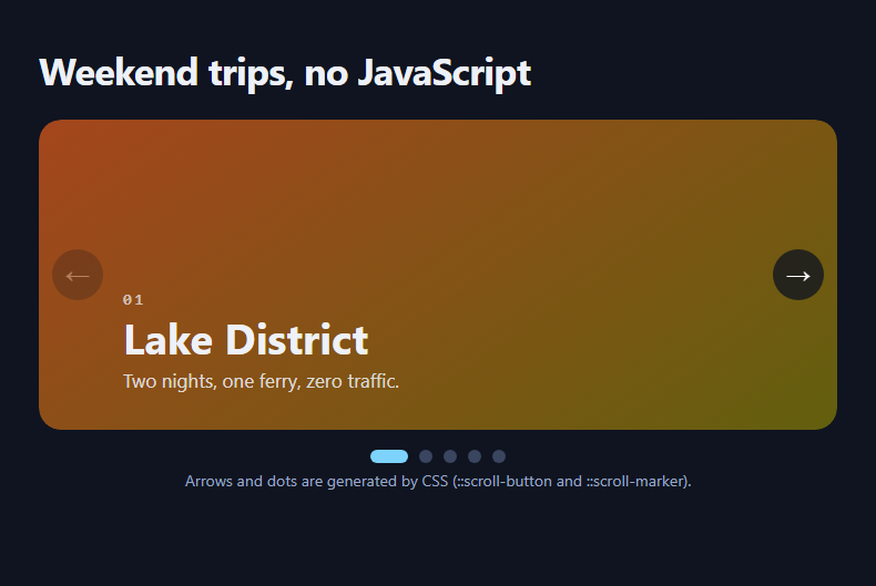
Chrome now builds carousel controls for you. Give a scroll container scroll-marker-group and the browser generates a dot for every slide, marks the one in view, and adds previous and next buttons you can style like any other element. This snippet is a five-slide travel carousel that uses exactly that, with no slider library and no script on the happy path.
Dots from ::scroll-marker
Each .nc-slide::scroll-marker becomes one dot inside the group that scroll-marker-group: after places below the track. The active dot uses :target-current, so the browser keeps it in sync with the slide in view and the dot stretches into a pill with a plain transition. Dots are real focusable controls and pressing one scrolls to its slide.
Arrows from ::scroll-button
::scroll-button(inline-start) and (inline-end) are generated buttons that scroll the container by one page. The content value takes an alt text after a slash, so screen readers announce "Previous slide" instead of an arrow glyph. They disable themselves at either end, which the CSS styles with :disabled. Anchor positioning pins them to the middle of the track.
Scroll snap does the motion
The track is a flex row with scroll-snap-type: x mandatory and each slide snaps to centre. Touch swipe, trackpad, arrow keys and wheel all work without any handler, and overscroll-behavior-x: contain stops the page from navigating back on a hard swipe.
Fallback for other browsers
A short script tests CSS.supports('selector(::scroll-button(*))'). Where it fails, two ordinary buttons appear and call scrollBy. The slides, snapping and swiping still work everywhere, so nothing breaks while support spreads.
Customising
Change flex-basis to show two or three slides at once, recolour the dots, or move the group above the track. For a drag-driven version with momentum see the magnetic snap carousel.
Accessibility
The generated buttons and dots are real focusable controls, the arrows are announced as "Previous slide" and "Next slide", and the track itself is focusable so keyboard users can scroll it with the arrow keys. Smooth scrolling is switched off for people who prefer reduced motion.
What's included
Features
Step by step
How to Use
- 1Give the list scroll-snapSet overflow-x: auto and scroll-snap-type: x mandatory on the ul, and scroll-snap-align: center on each li. This alone gives you a swipeable carousel in every browser.
- 2Turn on the generated dotsAdd scroll-marker-group: after to the list and a ::scroll-marker with content: "" to each slide. Chrome creates one dot per slide and fills :target-current for the one in view.
- 3Turn on the generated arrowsStyle ::scroll-button(inline-start) and (inline-end). Put the spoken name after a slash in content, as in content: "→" / "Next slide".
- 4Pin the arrows to the trackName the list with anchor-name: --nc, then use position-anchor and top: anchor(center) so the buttons sit over the edges without a wrapper.
- 5Keep the fallback scriptIt tests CSS.supports for ::scroll-button and, only if that fails, reveals two ordinary buttons that call scrollBy by one container width.
- 6Show more than one slideChange flex: 0 0 100% to 0 0 calc(50% - 8px) for two slides at a time and keep scroll-snap-align on each.
Real-world uses
Common Use Cases
Got questions?
Frequently Asked Questions
Chromium browsers from version 135 (Chrome and Edge). Safari and Firefox do not support them yet, which is why the snippet includes a feature test and a two-button fallback. Snapping and swiping work in every browser regardless.
Not in supporting browsers. The script only checks CSS.supports and, if the pseudo-elements are missing, reveals fallback buttons. You can delete it if you accept a plain swipe carousel without arrows in older browsers.
The dots and arrows are real focusable controls generated by the browser, the arrows get spoken names from the content alt text, and the track is focusable for keyboard scrolling. Add a clear aria-label for the list and keep contrast high.
Change the slide's flex-basis from 100% to 50% or 33.33% (subtract the gap), and keep scroll-snap-align on each slide. The dots then represent each slide, so consider fewer slides or grouping them.
Copy & paste
Source Code
<section class="nc-stage">
<h1 class="nc-title">Weekend trips, no JavaScript</h1>
<div class="nc-frame">
<ul class="nc-carousel" aria-label="Weekend trip ideas" tabindex="0">
<li class="nc-slide" style="--h:18"><span>01</span><h2>Lake District</h2><p>Two nights, one ferry, zero traffic.</p></li>
<li class="nc-slide" style="--h:350"><span>02</span><h2>Isle of Skye</h2><p>Fairy pools and a very long drive.</p></li>
<li class="nc-slide" style="--h:150"><span>03</span><h2>Peak District</h2><p>Hill walks and a pub at the end.</p></li>
<li class="nc-slide" style="--h:285"><span>04</span><h2>Cornish Coast</h2><p>Cliff paths, pasties and surf.</p></li>
<li class="nc-slide" style="--h:215"><span>05</span><h2>Norfolk Broads</h2><p>Slow boats and wide skies.</p></li>
</ul>
<div class="nc-fallback" hidden>
<button type="button" data-dir="-1" aria-label="Previous slide">←</button>
<button type="button" data-dir="1" aria-label="Next slide">→</button>
</div>
</div>
<p class="nc-note" id="ncNote"></p>
</section>*{box-sizing:border-box;margin:0;padding:0}
body{font-family:system-ui,-apple-system,'Segoe UI',sans-serif;background:#0f1420;color:#eef1f8;min-height:100vh}
.nc-stage{max-width:760px;margin:0 auto;padding:40px 20px 56px}
.nc-title{font-size:clamp(24px,4.5vw,34px);letter-spacing:-.02em;margin-bottom:22px}
.nc-frame{position:relative}
.nc-carousel{list-style:none;display:flex;gap:16px;overflow-x:auto;scroll-snap-type:x mandatory;scroll-behavior:smooth;overscroll-behavior-x:contain;border-radius:20px;scrollbar-width:none;anchor-name:--nc;scroll-marker-group:after}
.nc-carousel::-webkit-scrollbar{display:none}
.nc-carousel:focus-visible{outline:3px solid #7dd3fc;outline-offset:4px}
.nc-slide{flex:0 0 100%;scroll-snap-align:center;min-height:280px;padding:34px 76px;border-radius:20px;display:flex;flex-direction:column;justify-content:flex-end;gap:6px;background:linear-gradient(145deg,hsl(var(--h) 70% 38%),hsl(calc(var(--h) + 40) 75% 22%))}
.nc-slide span{font:700 14px/1 ui-monospace,Menlo,monospace;letter-spacing:.2em;opacity:.7}
.nc-slide h2{font-size:clamp(26px,5vw,38px);line-height:1.1}
.nc-slide p{opacity:.85;font-size:17px}
/* Native dots: the browser builds one ::scroll-marker per slide */
.nc-carousel::scroll-marker-group{display:flex;justify-content:center;gap:10px;padding-top:18px}
.nc-slide::scroll-marker{content:'';width:12px;height:12px;border-radius:99px;background:#3a4560;transition:width .25s ease,background .25s ease}
.nc-slide::scroll-marker:target-current{width:34px;background:#7dd3fc}
.nc-slide::scroll-marker:focus-visible{outline:3px solid #fff;outline-offset:3px}
/* Native arrows, positioned with anchor positioning */
.nc-carousel::scroll-button(inline-start),.nc-carousel::scroll-button(inline-end){position:absolute;position-anchor:--nc;top:anchor(center);translate:0 -50%;width:46px;height:46px;border:0;border-radius:50%;background:rgb(15 20 32 / .78);color:#fff;font-size:22px;cursor:pointer;backdrop-filter:blur(6px)}
.nc-carousel::scroll-button(inline-start){content:'\2190' / 'Previous slide';left:anchor(left);margin-left:12px}
.nc-carousel::scroll-button(inline-end){content:'\2192' / 'Next slide';right:anchor(right);margin-right:12px}
.nc-carousel::scroll-button(*):hover{background:#7dd3fc;color:#0f1420}
.nc-carousel::scroll-button(*):disabled{opacity:.3;cursor:default}
/* Fallback for browsers without the feature: plain snap carousel plus two buttons */
.nc-fallback{display:flex;justify-content:center;gap:12px;padding-top:16px}
.nc-fallback[hidden]{display:none}
.nc-fallback button{width:46px;height:46px;border:0;border-radius:50%;background:#26304a;color:#fff;font-size:20px;cursor:pointer}
.nc-fallback button:hover{background:#7dd3fc;color:#0f1420}
.nc-fallback button:focus-visible{outline:3px solid #fff;outline-offset:2px}
.nc-note{margin-top:18px;text-align:center;font-size:14px;color:#9aa6c4}
@media (prefers-reduced-motion:reduce){.nc-carousel{scroll-behavior:auto}.nc-slide::scroll-marker{transition:none}}// The carousel itself needs no script. This only runs where ::scroll-button is NOT supported,
// so older browsers still get working previous / next buttons.
var native = CSS.supports('selector(::scroll-button(*))') && CSS.supports('selector(::scroll-marker)');
var note = document.getElementById('ncNote');
if (native) {
note.textContent = 'Arrows and dots are generated by CSS (::scroll-button and ::scroll-marker).';
} else {
var track = document.querySelector('.nc-carousel');
var fb = document.querySelector('.nc-fallback');
fb.hidden = false;
note.textContent = 'This browser has no native carousel pseudo-elements yet, so a small fallback is active.';
fb.addEventListener('click', function (e) {
var b = e.target.closest('button');
if (!b) return;
track.scrollBy({ left: track.clientWidth * Number(b.dataset.dir), behavior: 'smooth' });
});
}Extend with AI
Take This Snippet Further With AI
Paste this snippet into an AI coding assistant and ask it to explain how ::scroll-marker, :target-current and ::scroll-button work and why the fallback is feature-detected. Useful follow-ups: show three slides at once on desktop, move the dots above the track, or add an autoplay that pauses on hover and focus. Ask it to keep the alt text on the arrow content values.
Prompt to recreate it
Copy this into your AI assistant of choice to build the effect from scratch, or as a jumping-off point for your own variant:
Build a carousel with no JavaScript carousel logic, using the CSS scroll-marker and scroll-button features, in plain HTML and CSS plus a tiny feature-detect script.

Requirements:
- A ul with five full-width slides (gradient cards with a number, heading and sentence) in a flex row with scroll-snap-type x mandatory, snap-align center, hidden scrollbar and overscroll-behavior-x contain. Make the list focusable and give it an aria-label.
- On the scroll container set scroll-marker-group: after and style ::scroll-marker-group as a centred flex row. Give each slide a ::scroll-marker (content '') as a small dot, and use :target-current to stretch the active dot into a wider pill with a transition.
- Add ::scroll-button(inline-start) and ::scroll-button(inline-end) with arrow content plus a slash alt text ("Previous slide", "Next slide"), round styling, :hover, :disabled, and anchor positioning (anchor-name on the track, position-anchor and top: anchor(center)) so they sit over the left and right edges.
- Script: if CSS.supports('selector(::scroll-button(*))') is false, unhide two normal fallback buttons that call scrollBy by one container width; otherwise show a note that the controls are native.
- Respect prefers-reduced-motion and work at phone width.
Want to tighten it up first? Run this prompt through the AI Prompt Studio to score it across 8 quality dimensions, catch anti-patterns, and tune the wording for Claude, ChatGPT, or Gemini before you paste it in.