


Laptop Mockup — Free CSS MacBook Device Frame Snippet
Laptop Mockup · Layouts · Plain HTML, CSS & JS · Live preview
Copy & paste
Source Code
<div class="lm-stage">
  <div class="lm-laptop">
    <div class="lm-lid">
      <div class="lm-cam"></div>
      <div class="lm-screen">
        <div class="lm-top"><span class="lm-dots"><i></i><i></i><i></i></span><span class="lm-addr">acme.studio</span></div>
        <div class="lm-page">
          <div class="lm-nav"><span class="lm-brand"></span><span class="lm-links"><i></i><i></i><i></i></span></div>
          <div class="lm-hero">
            <h1>Design that ships</h1>
            <p>A studio site rendered live inside a CSS laptop.</p>
            <span class="lm-btn">Explore work</span>
          </div>
          <div class="lm-thumbs"><span></span><span></span><span></span><span></span></div>
        </div>
      </div>
    </div>
  </div>
  <div class="lm-base"><div class="lm-notch"></div></div>
</div>*{box-sizing:border-box;margin:0;padding:0}
body{font-family:system-ui,-apple-system,sans-serif;background:#e2e8f0;display:flex;flex-direction:column;justify-content:center;align-items:center;min-height:100vh;padding:24px}
.lm-lid{position:relative;width:420px;max-width:86vw;background:#0b1220;border-radius:16px;padding:11px;box-shadow:0 26px 50px -24px rgba(15,23,42,.55),inset 0 0 0 2px #1e293b}
.lm-cam{position:absolute;top:5px;left:50%;transform:translateX(-50%);width:5px;height:5px;border-radius:50%;background:#1e293b}
.lm-screen{aspect-ratio:16/10;border-radius:7px;overflow:hidden;background:#fff;display:flex;flex-direction:column}
.lm-top{display:flex;align-items:center;gap:10px;background:#f1f5f9;border-bottom:1px solid #e2e8f0;padding:7px 11px}
.lm-dots{display:flex;gap:5px}
.lm-dots i{width:9px;height:9px;border-radius:50%;background:#cbd5e1}
.lm-dots i:nth-child(1){background:#ff5f57}.lm-dots i:nth-child(2){background:#febc2e}.lm-dots i:nth-child(3){background:#28c840}
.lm-addr{font-size:11px;color:#94a3b8;background:#fff;border-radius:6px;padding:3px 12px;font-weight:600}
.lm-page{flex:1;overflow:hidden;background:linear-gradient(160deg,#faf5ff,#fff 45%);padding:0}
.lm-nav{display:flex;align-items:center;justify-content:space-between;padding:12px 20px}
.lm-brand{width:34px;height:12px;border-radius:6px;background:linear-gradient(135deg,#8b5cf6,#ec4899)}
.lm-links{display:flex;gap:10px}
.lm-links i{width:26px;height:7px;border-radius:4px;background:#e2e8f0}
.lm-hero{text-align:center;padding:18px 20px 14px}
.lm-hero h1{font-size:26px;font-weight:800;color:#0f172a;background:linear-gradient(90deg,#8b5cf6,#ec4899);-webkit-background-clip:text;background-clip:text;-webkit-text-fill-color:transparent}
.lm-hero p{font-size:12.5px;color:#64748b;margin:7px 0 12px}
.lm-btn{display:inline-block;background:#0f172a;color:#fff;border-radius:8px;padding:8px 18px;font-size:12px;font-weight:700}
.lm-thumbs{display:grid;grid-template-columns:repeat(4,1fr);gap:9px;padding:0 20px 18px}
.lm-thumbs span{height:50px;border-radius:9px;background:#fff;border:1px solid #ece9f5;box-shadow:0 8px 16px -12px rgba(0,0,0,.3)}
.lm-thumbs span:nth-child(odd){background:linear-gradient(135deg,#ede9fe,#fce7f3)}
.lm-base{width:480px;max-width:96vw;height:14px;background:linear-gradient(#cbd5e1,#94a3b8);border-radius:0 0 12px 12px;position:relative;box-shadow:0 14px 24px -14px rgba(15,23,42,.5)}
.lm-base::before{content:'';position:absolute;top:0;left:50%;transform:translateX(-50%);width:84%;height:4px;background:#b6c0cd}
.lm-notch{position:absolute;top:0;left:50%;transform:translateX(-50%);width:90px;height:7px;background:#94a3b8;border-radius:0 0 9px 9px}// Pure-CSS mockup — no script required. Parallax tilt on pointer move for life.
var lid = document.querySelector('.lm-lid');
var stage = document.querySelector('.lm-stage');
stage.addEventListener('pointermove', function (e) {
var r = stage.getBoundingClientRect();
var dx = (e.clientX - r.left) / r.width - 0.5;
lid.style.transform = 'perspective(1200px) rotateY(' + (dx * 6).toFixed(2) + 'deg) rotateX(' + (-dx * 0).toFixed(2) + 'deg)';
});
stage.addEventListener('pointerleave', function () { lid.style.transform = ''; });Extend with AI
Take This Snippet Further With AI
The AI prompt for this one is for Patreon supporters ($3 a month, 7 days free), along with a site with no ads. Supporters enter the passcode once and it is remembered in this browser.
What's included
Features
About this UI Snippet
Laptop Mockup — Pure-CSS MacBook-Style Frame
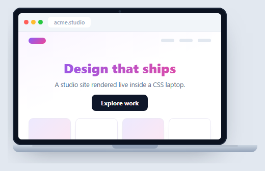
A laptop mockup presents a website or app inside a MacBook-style frame — the standard device shot for landing pages, portfolios, and case studies. This one is built entirely in HTML and CSS: a lid with a 16:10 screen, a hinge base with a notch, and a live web page inside, plus a gentle pointer-driven parallax tilt in vanilla JavaScript. No device photo, no dependency.
Lid, screen, and base in three pieces
The structure mirrors a real laptop: a dark .lm-lid (the bezel) wrapping the .lm-screen, and a separate .lm-base wedge below it for the deck. The base uses a vertical gradient to suggest the aluminium taper, a ::before strip for the keyboard-edge highlight, and a centered .lm-notch for the thumb cutout — together they read as the bottom half of an open laptop without a single image.
Aspect-ratio screen
The screen uses aspect-ratio: 16/10 so it keeps authentic laptop proportions at any width, and max-width with a viewport unit lets the whole device shrink responsively on small screens. Inside, a mini browser bar (traffic lights plus an address) and a sample studio page demonstrate that the screen holds real, styled content — including a gradient background-clip: text headline — rather than a flat screenshot.
Subtle parallax for life
A pointer-move handler reads the cursor's horizontal position over the stage, normalizes it to roughly −0.5…0.5, and applies a small rotateY within a perspective so the laptop appears to turn slightly toward the cursor. The rotation is gentle (a few degrees) and resets on pointerleave, adding a premium, interactive feel that a static mockup can't — and it degrades gracefully since the frame is fully styled without it.
Why CSS over an image
A CSS device frame is resolution-independent, recolorable, and — crucially — can contain live, scrolling, interactive UI. You can drop an actual running component into the screen, switch its theme, or animate it, which is exactly what you want when demonstrating a product rather than just illustrating one.
Reusing it
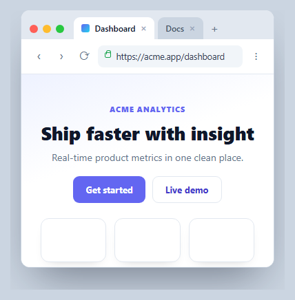
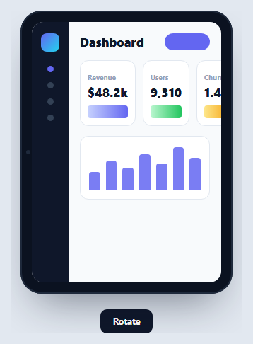
Replace the .lm-page contents with your site or an <img>, and keep the device as a wrapper component. Pair it with a browser window mockup or a phone mockup to present a responsive design across form factors.
Step by step
How to Use
- 1Paste HTML, CSS, and JSA CSS laptop renders with a sample studio site on its screen.
- 2Move your pointerThe laptop tilts subtly toward the cursor with parallax.
- 3Note the proportionsThe screen keeps a 16:10 aspect ratio at any width.
- 4Resize the pageThe device shrinks responsively on narrow viewports.
- 5Drop in your siteReplace the page content with your own UI or screenshot.
- 6Reuse as a wrapperKeep the frame as a component with a screen slot.
Real-world uses
Common Use Cases
aspect-ratio and no device photo.Got questions?
Frequently Asked Questions
Pure CSS. It's three pieces — a dark lid wrapping the screen, and a separate base wedge with a gradient, an edge highlight pseudo-element, and a center notch. There's no device image, so it scales without blurring and every part can be recolored or resized through CSS.
The screen uses the CSS aspect-ratio property set to 16/10, so it maintains laptop proportions automatically regardless of the device's width. Combined with a max-width in viewport units on the lid, the whole laptop scales down responsively while keeping its shape on small screens.
A pointermove listener on the stage reads the cursor's horizontal position, normalizes it to about minus a half to plus a half, and applies a small rotateY inside a CSS perspective so the laptop turns slightly toward the pointer. It resets on pointerleave, and because the frame is fully styled without it, the effect is purely an enhancement.
Yes — that's the benefit of a CSS frame. The screen is live DOM, so you can place a running component, a scrolling page, or any other snippet inside and it will function normally. Replace the .lm-page contents with your UI, or drop in an <img> if you only need a static shot.
Make the device a component that renders a screen slot for children, so any page can be wrapped. Put the pointer parallax in a mount effect with cleanup, or omit it. In Tailwind, build the lid and base with rounded utilities and gradients, set the screen with aspect-[16/10], and add a perspective wrapper for the tilt.